Can You Re-Order Divi Columns On Mobile? Yes! It’s Very Easy!
In the last tutorial, we learned how easy it is to resize Divi columns. The next logical tutorial now is how to change the stacking order of Div columns on tablet and mobile. The two tutorials combined create an amazingly simple system that no one else has achieved. So I’m excited about this, and know it is going to be super helpful to so many people.
▶️ Please watch the video above to get all the exciting details! 👆
Change Divi Colum Mobile Stacking Order
Here’s a quick visual Of What We Want To Do
I set up a quick demo with a row with two columns, the one on the left with a Text Module and the one on the right with an Image Module. By default, Divi will stack these from left to right, so on mobile, the Text Module would be on top and the Image Module on the bottom.
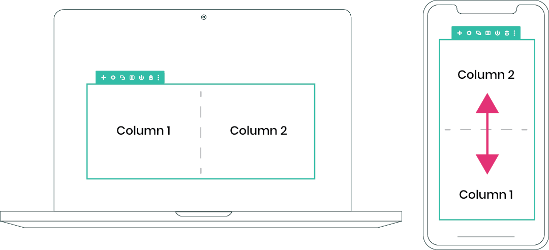
Divi does not have this feature…so will this take a tone of coding?
You will need some CSS, but don’t be too scared. We are not going to add a bunch of confusing CSS classes and long code snippets like Elegant Themes did in their tutorial…instead, we are going to literally solve this missing Divi feature with a few words of code right in the Divi builder!
How To Control Divi Column Stacking Order on Mobile
Step #1. Add 2 Lines of CSS to Your Row Settings
The first to do is to add some CSS to the Divi row settings. This CSS is needed to tell the columns inside the row to display with flex, with a type of CSS. Once this simple step is completed, you will already be half way to controlling your Divi column stacking order on mobile.
Go to the Row Settings>Advanced Tab>Custom CSS toggle. Paste the following snippet of CSS there in the Main Element.
display: flex;
flex-wrap: wrap;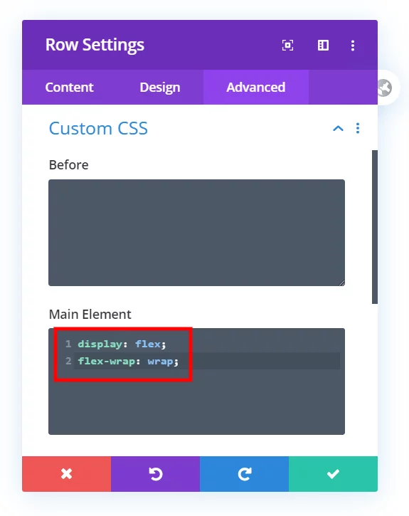
Manually Set The Divi Column Stacking Order
Step #2. Tell Each Column Which Order Number They Are
If you thought step #1 was easy, you are in luck. The last step is even easier, and a bit more fun as well.
Inside the row settings you will see a list of your columns. Click on the settings icon and got the column’s Advanced Tab>Custom CSS toggle.
For each column, you need to decide which order you want them to stack on mobile. All you have to do is add the words “order: 1;” and “order: 2” etc. to the columns. Write or paste those simple words in the Main Element.
order: 1;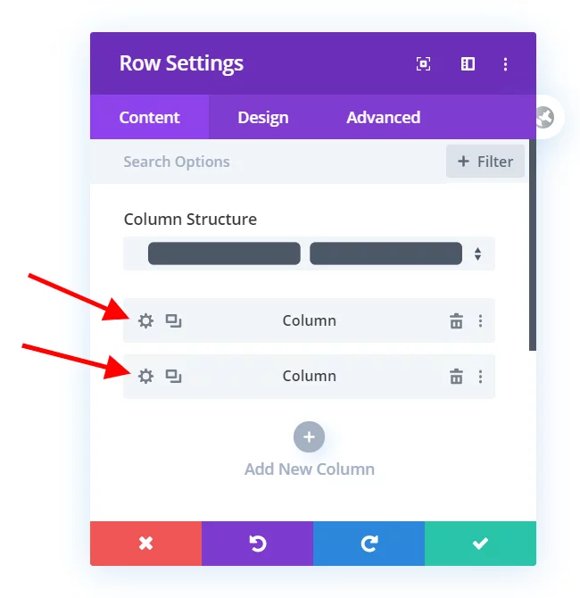
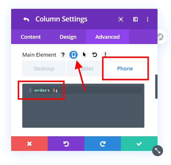
You can do this for as many columns as you want, 2, 3, 4, 5, or 6.
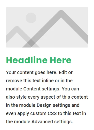
And that’s pretty much it! Here’s how example Divi columns stack now that we are finished. The column that was on the left on desktop, the text, is now on the right. The column that was on the right on desktop, the image, is now on the top.

Do It With A Setting!
Make life easier and use the Divi Responsive Helper instead, the ultimate Divi responsive toolkit with awesome features and settings to help make your website look and work great on all devices!





Great tutorial, works like a charm! Thank you 🙂
Hi Maksym,
I’m very happy you found this and that it worked out so well for you! 🙂
Hi Nelson,
Love your snippets, they’ve been super helpful! I just tried this one, and I must have missed something, as it flipped on desktop! Do I need an @media{} on the first part?
Never mind, I didn’t click the mobile icon first! Perfect!!! Thanks Nelson! Great stuff!
Hey Kathy,
Yes I was just going to say, you need to adjust it for Desktop, Tablet, or Phone. Glad you got it!
Wonderful !
Un mot pour les francophones comme moi : Bravo ça marche super !
I’m so glad it works! Thanks for the greed feedback! 🙂
Hi There
I just could not get to work on my site. I then insert a new section with two modules and did everything as recommended but still didn’t work.
I then followed the Divi link below and all worked fine:
https://www.elegantthemes.com/blog/divi-resources/how-to-change-divis-column-stacking-order-on-mobile-devices
Hi Francois, my tutorial works great and is much simpler than theirs. But if you got it to work and are satisfied, then that’s all that matters.
I had the same issue, that it didn’t work with this simple approach, that I was hoping to use, instead of the much more complicated solution from the elegantthemes site.
While checking out F12 on the involved elements it suggested that the css order had no influence because the parent was “display: block”
so I changed the parent element where the 2 columns are in, using the customCSS on the advanced tab and set the value to:
display: flex;
flex-direction: column;
after that it worked like a charm
I can;t seem to get this to work, it simply isn’t changing the stacking order. Any idea why?
Yes I am definitely putting the CSS in the right place.
incredible
Thank you, I really love how easy this is!
Brilliant!!! Not sure if it’s just me but can’t see the date of the post but still working a treat in April 2020!
Thanks Tracey, yes I choose not to show the date because some people think if this said 2019 that is would be outdated. I keep all of my tutorials up to date 🙂
Is there something else I need?
I can’t make it work.
Hi Bautista,
This works, I’d have to know what you tried in order to help much beyond that. Let me know.
Love the tutorial! It was working great then it suddenly stopped. Was there an update that might have broken it?
Hi Adam,
I certainly still works, I just double checked. It may not show in the Visual Builder, but that’s to be expected.
This!!!!!!!
I’ll bet most people who said it doesn’t work are still in visual builder…
This would be a great note to add to the tutorial.
Great job, and Thanks!
Thanks for creating this tutorial. I’ve run into this problem on my last two websites and you helped me solve it. Thanks so much.
You’re welcome, Dave! So glad I could help solve the issues!
Super awesome tutorials. Using flex layout techniques is super easy. Thanks for the tips.
You’re welcome, Aiman! I’m glad you like the tutorials!
Is there any way to get this to work inside the builder as well? As currently I have to exit the builder to test it.
CSS is usually not affected in the Visual Builder, so no. The only way to get this live is in our Divi Responsive Helper plugin.
a few issues I have noticed with this method.
Unless you explicitly enable the screens size option and add the custom css to MOBILE ONLY, it doesn’t work.
If you just add it to custom CSS in general, it does nothing.
I also have to add it to EVERY ROW, even though I only need it on alternate rows.
So as most people do, I alternate the image and text column on each row.
Row 1 image left, text right
Row 2 text left image right
So technically I only need to change the stacking order on the even rows numbers to make the image always be first on mobile, since it is already correct on odd rows (1,3,5 etc).
However, if I do this, it it always applies the settings from the previous row. So my stacking order from row 1 will also be applied to row 2, so I have to add the CSS there as well.
Correct, you need adjust this on Tablet and/or Phone, so that is not an issue. What you mentioned about odd and even rows is an issue but not with Divi, must be something weird going on with your site.
Hi Nelson – thanks for all your amazing tutorials
Should this code work or tablet as well as mobile if i change the orfer in both
I just can’t seem to get it to work at all – its the first one of yur snippets I’ve had a brain freeze about
with the code i assumed anything that was specified as column 1 would be on the left desktop and top tablet and mobile and anything specified column 2 would be on the right on desktop and below on tablet and mobile
BASICALLY I a layout lat alternates pic left – text right and pic right text left as you go down the page .. but i always want the pic at the top and the text underneath on tablet and mobile>>
this seemed like the dream solution but I can’t seem to make it work – I’m sure its me not you 😉
Thanks in advance
Hi Kenin,
The way Divi usually works is the larger devices carries over to the smaller. You should be able to change the order as you want for Desktop, Tablet, and Phone.
Don;t you just need to enable “equalise column heights” on the row to enable flex?
Yes but that would be an extra step. Still need my CSS flex wrap, so yeah, an extra step.
Fix works, then after save doesn’t stick. ???
Hi John, not sure what you mean, the code is not there when you go back in to the builder?
The code is there in the right places even after edit, yet it won’t stack in the order I told it to. Two columns in a row in a section.
Left column order2, right order1. Since adding this code it also messed up the viewport display on mobile and wants to horizontally scroll for the right column.
Here is the page.
https://www.uhsm.com/health-share-programs/
Argh, it’s working now. horizontally scroll may be something else
This works perfectly. HOWEVER, I spent a good 10 minutes messing around with it NOT working. The key thing to know is that it won’t show in the order you want IN THE VISUAL BUILDER. You have to exit and then it displays in the order you want.
Thanks a million.
I love the simplicity of this solution! No need for CSS classes or plugins.
Yes it is a great solution!
Awesome! How can i make it work on a specialty section?
Hi Rafael,
Specialty sections will not work since those are not columns, but rather a weird combination of section and rows.
thank you SO much for this simple hack!!
You’re welcome Emily, glad you like it!
Great post!
Thank you!
Stacked nicely on mobile thought still needs tweaking. But on a desktop the CSS extended the borders around my short left column downward to match the long main column to its right — 3/4 empty space inside the borders down to the bottom of the page. Any solution? Link below: A simple newsletter site at the early stage of construction.
Hi John,
Make sure you are only applying the code to Tablet and Phone in the CSS tabs and that should solve that.
Got it. Thanks! Another question. I am experimenting with changing my layout to a specialty section with a left sidebar. And I tried different combinations, but can’t seem to make this CSS trick apply. Suggestion?
Hi John, this tutorial only applies to columns, and specialty sections are unfortunately not columns. Sorry! 🙂
Hi Nelson, Thank you very much. It works perfectly for me.
Can/should I save this customization of the CSS in the child theme? If so, how should I proceed in this case?
I’m afraid that with a Divi update everything will be deleted.
Thank you very much for the great website and for your excellent support.
You are for me one of the Best-Support on the web;-).
I have learned so many things about Divi and CSS from you.
CSS will not be broken with any Divi update, but a child theme is always recommended.
Thank you so much Nelson!
I know this is not the right topic here, but how can I hide the premade layouts for the clients registered as Editor. I mean only the premade layout.
I would be very grateful for your support.
You can try the toggles in Divi>Role Editor>Portability.
Total gamechanger. Thanks!
You’re welcome, James!
THIS WAS AWESOME!!!!!!!!!!!!! It worked perfectly and took me about 5 minutes and I do NOT do code! Thank you times a million for fixing my mobile view!
That’s so great to hear Janita! Love this!
Exxxxcellent! I even tried another option first and it was a catastrophe. You never disappoint, Nelson!
Great Drew, so happy to hear this!
WOW, thank you I searched for this! ET themselves recommends to duplicate and swap the columns but that doesn’t seem smart… THANK YOU!
Hi Jan,
We are glad to know we could offer some help to you. 🙂
Hi, I tried this tutorial but it still keeps a single column on mobile.
Would appreciate some ideas to trouble shoot 🙂
superbsummit .buzz
Hi Lee, Our tutorial if sine so please share what you have done exactly and the link if you want us to help troubleshoot.
Hi – great tutorial thanks.
Just wondering if it is possible to use similar coding to stop multiple modules within a column stacking on top of each other on mobiles/tablets i.e. display side by side.
Thanks
Hey Neil,
The flex-wrap property is the one that is making the module stack over each other in smaller devices for a cleaner look but if you remove that property and just provide display: flex then it will display the modules side by side but then you have to put some more code to make the adjustments.
Let me know if that helps.
Thank you very much, i was looking for this tutorial! But i have a little problem, i can’t hide it on small smartphone screens? Id do not look very good! Any solution?
Hi Ernesto,
First of all, we are really glad that you liked our tutorial. About the issue, I am afraid that I didn’t understand the issue properly. Could you please elaborate a little more and point me to the section on your webpage where the issue is happening?
thanck u very much
You’re welcome!
Hi,
How would I write this code with media queries?
I’m using an older divi version with mobile icon selector.
Hi Alex,
You can check our guide on media queries here: https://www.peeayecreative.com/how-to-add-custom-css-media-queries-to-divi-for-making-your-site-responsive/
This is awesome. Exactly what I was looking for.
I can’t believe that Divi does not include the ability to set this
I appreciate your simple explanation
Hey Jake,
We are glad to hear that. Please let us know if you need any assistance.
Thanks for these tutorials! Quick question —
Without using visibility settings, is there a way to control the order by module for mobile?
For example:
Let’s say I have two columns. The first column is module 1 and below it is module 2. The second column is module 3 and below it is module 4.
On mobile, I need the stacking order to be module 4, module 1, module 3, module 2.
Visibility settings aren’t working because Google Page Speed won’t render the invisible image as a webp (imagify’s fault).
Can I apply code to order the modules on mobile?
Thanks!!
Hey TJ,
We can surely do that using CSS. Could you please provide me the URL of the page where the modules are for me to check and write the code?
Thank you. Grateful for the simplicity of this. The other was too much faffing.
This works still as of 2022.
NOTE: if it’s not working for you, it may be that you only selected it for phone in the main element. You need to select it for phone and for tablet, or you won’t see it when you are checking on your computer browser unless you reduce the window size down to almost nothing.
Of course, your post was last in the string. I’ve used this on several websites, never been a problem until today. Yes, setting it for both tablet and phone did the trick. Thank you!
You’re officially my favorite person today!! Thank you so much for posting this – it’s WAY better than duplicating sections and hiding them, etc. It’s so simple I almost didn’t try it. Glad I did!
I’m so glad you like it1
Extremely useful, simple, and clearly presented. Thanks for this!
You’re very welcome!
Thank you very much – elegant and very quick solution!
You’re welcome, glad you like it!
This is amazing Nelson! It works great for a row.
Am i right to assume that this needs to be done on a row by row basis, which will take quite some time when there are quite a few rows in my staging site? Is there a way to insert CSS once that covers all rows on a site pls?
With any code you can add a custom class and then add the code in Theme Options and add the CSS selector into the row. Not sure if that would be easier or not.
I just have to say THANK YOU for your tutorials! I’ve used several of them when I’ve had a Divi customization issue, this one included 🙂 They are always so concise and helpful!
You are most welcome Kathryn!
We are glad to know that our guide helped you in some way. Stay tuned for more of such guides.
I don’t understand how this works with multiple rows? Are you saying there is a way to make a module from row one appear as the 6th module (2 rows down) on mobile? Can you get modules to “skip” rows with this method?
No, you would need JavaScript to move elements from one parent div into another div.
Hello
This works great however.. when I use this css my links behind the text are no longer working on mobile. Any idea how to solve this?
https://irelish.be/blink/
Thanks a lot for your reply!
Hi Kirsten!
I have checked the website and the issue is not with the code suggested in this article.
It looks like the problem is caused by the fact that you used a negative margin-top value in the hero section settings.
https://prnt.sc/DsN8s6TXqeAt
You can add the padding-top value to 0px instead of the negative margin-top value.
Hope this helps!
Great tutorial! I found that it gets tedious doing this for an entire site so here is a code snippet that might help, Nelson feel free to remove if this is not allowed:
Just add the CSS Class of “pa_flip” in the Advanced Tab of the row module…no need to put it in each column. Also note this code adds 30px of padding to the bottom of each row in mobile since it seems that the “gutter width” doesn’t hold up when using flex. Lastly this code ONLY works for rows with 2 columns, if you have more than 2 I don’t know what will happen.
@media only screen and (max-width: 980px) {
.pa_flip.et_pb_row_0 {
display: flex;
flex-wrap: wrap;
flex-direction: column-reverse;
}
.pa_flip.et_pb_column_3_5.et_pb_column_0,
.pa_flip.et_pb_column_2_5.et_pb_column_1 {
width: 100%;
padding-bottom:30px;
}
}
Hi Sean!
Thank you for sharing the solution with me. We will take it under consideration.
Thank you so much for this and every tutorial you share.
You are my first stop for help with designing in Divi.
Your tutorials are clear, simple and lots of fun.
I love them!
That’s awesome to hear, Wendy! So glad you are enjoying the resources!
Very good, but do you know how to tell each module (instead of Column) which order number they are? I want module to be in order, not Columns…
You could probably do it, but it would take some CSS which is beyond this tutorial. You can check this: https://developer.mozilla.org/en-US/docs/Web/CSS/order
Hello,
How do I reorder the columns if I use the special orange section in DIVI? In the left column I have the row used (green) and in it the module for the image and in the right column I have only the modules for the text. On mobile I would need to display the text first and the image below it. How to do this using the special orange section. Thank you.
I have Divi Responsive Helper and unfortunately I can’t find any option for this there either.
Hi, thank you! Your guide was very useful for us!
You’re welcome, I am glad to hear that!
This works great, but I’m only able to get 2 columns side-by-side. How do I get 3 columns side-by-side?
Hi Chris,
To get 3 columns side by side in Divi on mobile, you would simply change the percentage to 33.33%.
How would this be set up in one of the orange speciality sections? There is no column structure section like the Rows have. Thanks!
Hi Justin!
It seems you’re referring to the single column where the module can be added. We cannot apply the customization to it. However, it can be applied to the rows in the specialty section.
Hi
This solution doesn’t seem to be working anymore. I have applied it to a website but it is changing the order on desktop and mobile.
Hi Sally,
Nothing has changed with Divi or the tutorial. Make sure to only apply the code on the device size you want by opening the responsive tabs first.
Hi.
Is there a way to control column stacking order on mobile using Speciality section? I have tried using this way, by assigning css classes to columns, but it doesn’t work.
Thanks.
Hi Emilis!
It seems you’re referring to the specialty section column. Try adding only the following code in the Speciality section settings > Advanced > Custom CSS > Column main element:
display: flex;
Let me know how it goes!
Thank you so much! I’ve had smoke coming out of my ears trying to figure out how to switch the column order for mobile. It works like a charm and was so easy to implement.
Haha Deb, sorry to hear of the smoke 🙂 Glad you could find our resources!
You are a DIVI God! I prefer going to your pages over Divi documentation. Thanks for sharing your knowledge. This saves me so much time…Now I don’t have to duplicate modules and mess with mobile/desktop visibility anymore.
Hi Calvin,
I’m so happy to hear you have this new workflow! It’s something I use all the time!