Use Any Image Size or Shape In The Divi Blog Module!
Change Divi Blog Images to Square or Any Other Proportion
Welcome to our fourth and final (we think) tutorial in our “change image aspect ratio” series. Today, we will be using the same math, same code, and the same process as before to change the Divi Blog Module featured image aspect ratio. You can do this by a snippet of CSS code to your Divi website. Be sure to follow along the video to help you easily understand how this works!
▶️ Please watch the video above to get all the exciting details! 👆
NOTE: You might want to also check out a similar but very different tutorial called How To Stop Divi Image Crop. That one actually make the blog use the original uploaded image aspect ratio instead.
Explanation & Calculations
How To Force Divi Blog Image Aspect Ratios
Most of us are familiar with image or video aspect ratios. Lots of times our devices are made to these proportions as well. The first number in the ratio is the width, and the second number is the height. As you can see in the CSS examples below, the CSS trick works with padding and uses a percentage. Basically, the percentage is the height divided by width. To calculate what percentage to use in the CSS for the Divi Blog Module featured image aspect ratios, just use this math formula.
- Divide the second number by the first number
- Move the decimal over two places to the right
- Add a percent sign
Square 1:1 – 1 / 1 = 1.00 = 100%
Landscape 16:9 – 9 / 16 = 0.5625 = 56.25%
Landscape 4:3 – 3 / 4 = 0.75 = 75%
Landscape 3:2 – 2 / 3 = 0.6667 = 66.67%
Portrait 9:16 – 16 /9 = 1.7778 = 177.78%
Portrait 3:4 – 4 / 3 = 1.3334 = 133.34%
Portrait 2:3 – 3 / 2 = 1.5 = 150%
Now you can use this formula for other sizes as well!
Examples & CSS Snippets
NOTE: Always be sure to add the correct class to the Divi Blog Module so that it can change to the desired aspect ratio. In this tutorial, I kept it very simple! (Just take out the period at the beginning.)
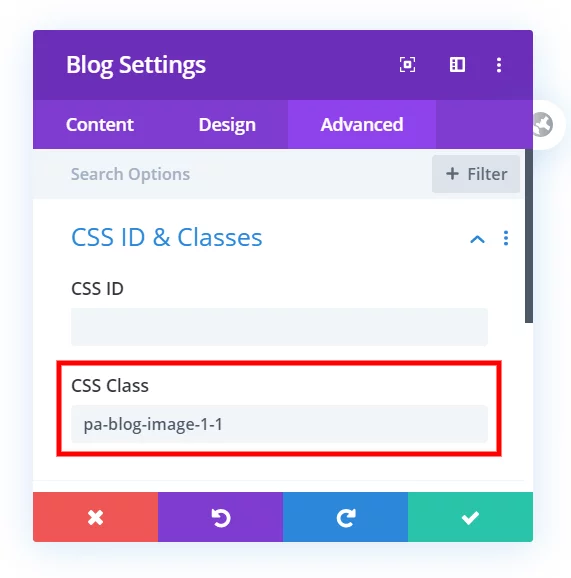
Where To Paste The CSS Code
1. Divi Assistant
If you are using our Divi Assistant plugin, simply paste the code in the CSS tab in the custom code window in the Divi Visual Builder.
2. Child Theme
If you are using a child theme, paste this code into the style.css file. If you don't have a child theme, you can generate a child theme directly on your site or download our free child theme.
3. Divi Theme Options Integration
Otherwise, paste this code in your Divi>Theme Options>Custom CSS code box.
If you need help understanding where to paste the code, please check out our complete guide about where to add custom code In Divi.
Square 1:1
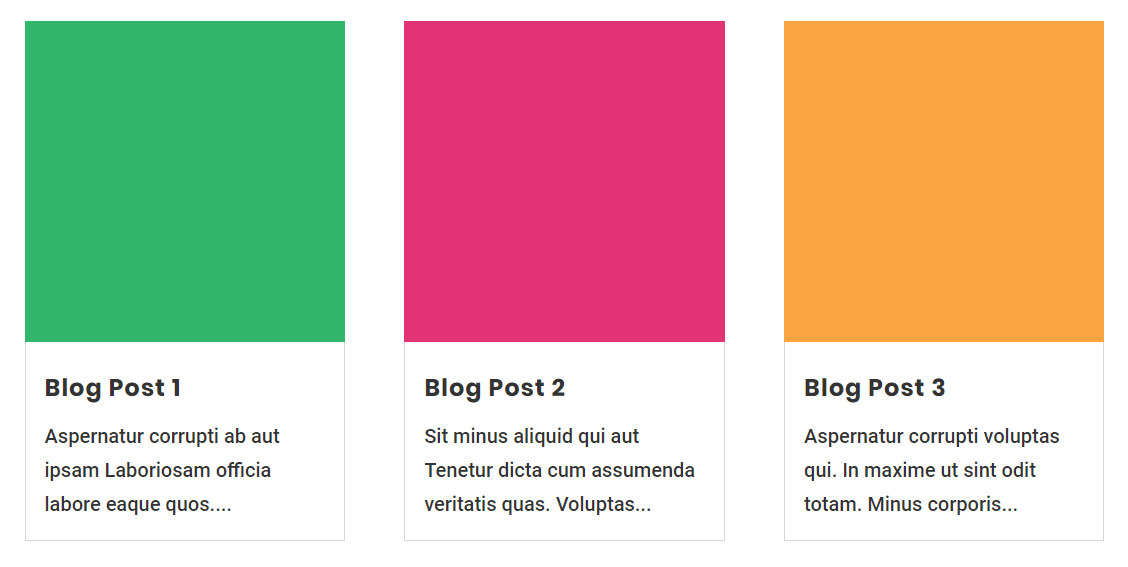
/*blog image aspect ratio square 1:1*/

.pa-blog-image-1-1 .entry-featured-image-url {
  padding-top: 100%;
  display: block;
}

.pa-blog-image-1-1 .entry-featured-image-url img {
  position: absolute;
  height: 100%;
  width: 100%;
  top: 0;
  left: 0;
  right: 0;
  bottom: 0;
  object-fit: cover;
}
Landscape 16:9
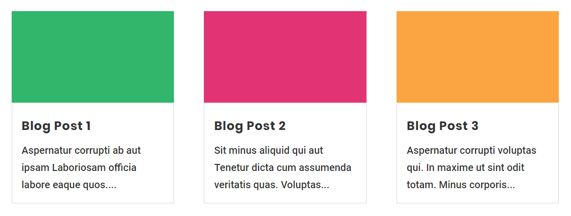
/*blog image aspect ratio landscape 16:9*/

.pa-blog-image-16-9 .entry-featured-image-url {
  padding-top: 56.25%;
  display: block;
}

.pa-blog-image-16-9 .entry-featured-image-url img {
  position: absolute;
  height: 100%;
  width: 100%;
  top: 0;
  left: 0;
  right: 0;
  bottom: 0;
  object-fit: cover;
}
Landscape 4:3
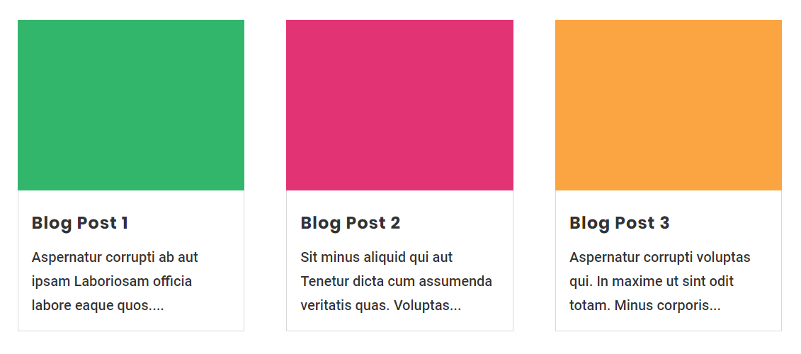
/*blog image aspect ratio landscape 4:3*/

.pa-blog-image-4-3 .entry-featured-image-url {
  padding-top: 75%;
  display: block;
}

.pa-blog-image-4-3 .entry-featured-image-url img {
  position: absolute;
  height: 100%;
  width: 100%;
  top: 0;
  left: 0;
  right: 0;
  bottom: 0;
  object-fit: cover;
}
Landscape 3:2
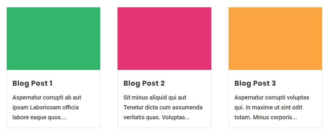
/*blog image aspect ratio landscape 3:2*/

.pa-blog-image-3-2 .entry-featured-image-url {
  padding-top: 66.66%;
  display: block;
}

.pa-blog-image-3-2 .entry-featured-image-url img {
  position: absolute;
  height: 100%;
  width: 100%;
  top: 0;
  left: 0;
  right: 0;
  bottom: 0;
  object-fit: cover;
}
Portrait 9:16
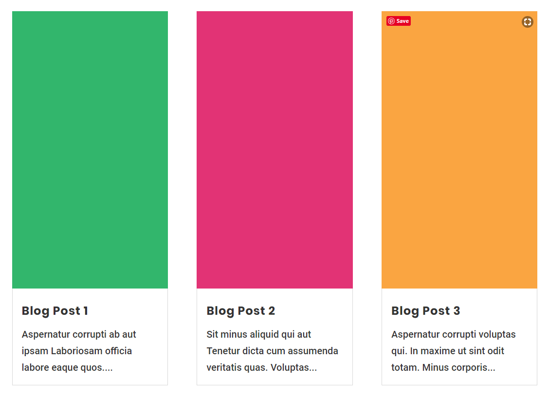
/*blog image aspect ratio portrait 9:16*/

.pa-blog-image-9-16 .entry-featured-image-url {
  padding-top: 177.77%;
  display: block;
}

.pa-blog-image-9-16 .entry-featured-image-url img {
  position: absolute;
  height: 100%;
  width: 100%;
  top: 0;
  left: 0;
  right: 0;
  bottom: 0;
  object-fit: cover;
}
Portrait 3:4
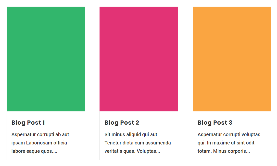
/*blog image aspect ratio portrait 3:4*/

.pa-blog-image-3-4 .entry-featured-image-url {
  padding-top: 133.33%;
  display: block;
}

.pa-blog-image-3-4 .entry-featured-image-url img {
  position: absolute;
  height: 100%;
  width: 100%;
  top: 0;
  left: 0;
  right: 0;
  bottom: 0;
  object-fit: cover;
}
Portrait 2:3
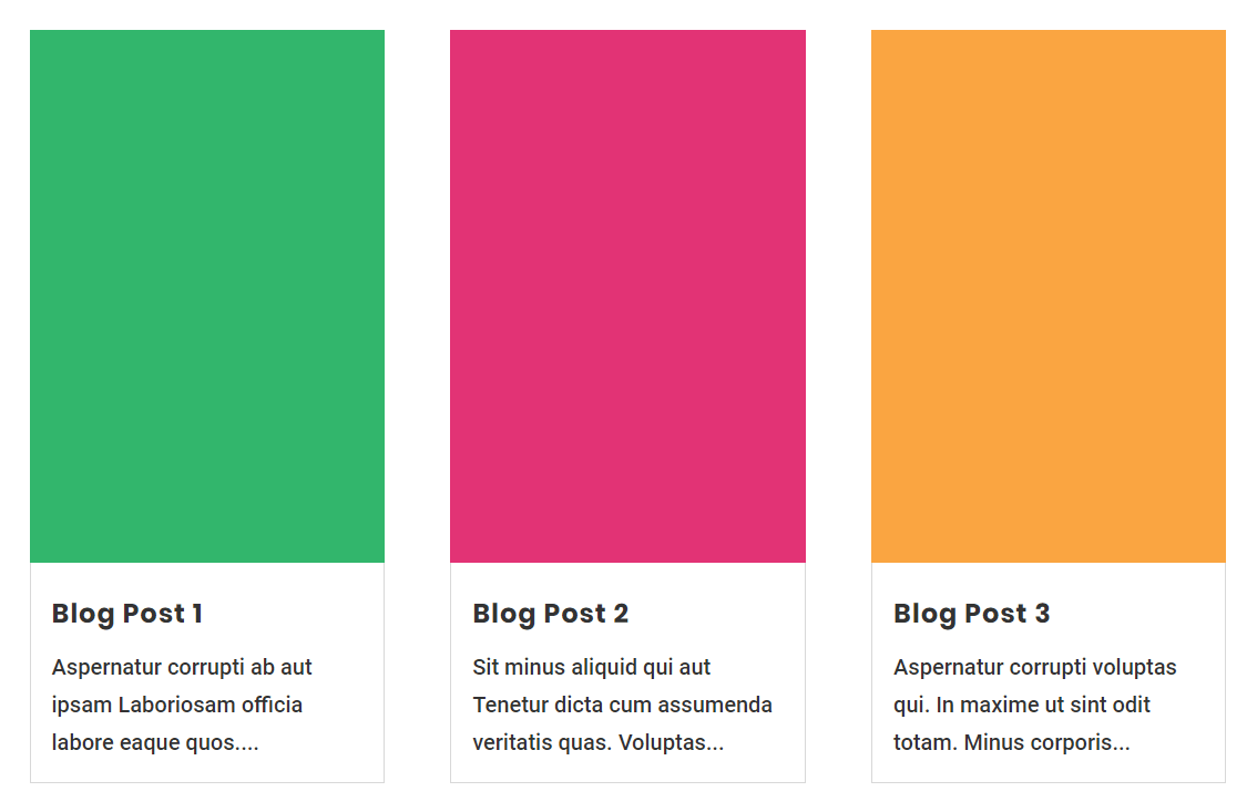
/*blog image aspect ratio portrait 2:3*/

.pa-blog-image-2-3 .entry-featured-image-url {
  padding-top: 150%;
  display: block;
}

.pa-blog-image-2-3 .entry-featured-image-url img {
  position: absolute;
  height: 100%;
  width: 100%;
  top: 0;
  left: 0;
  right: 0;
  bottom: 0;
  object-fit: cover;
}



Hi great tutorial will this work with Divi Extra category layouts. Thank you. Best
Hi Nick, glad you like it! This concept would work anywhere, yes. You just have to find the CSS classes of the image and the image container and replace those in the snippet.
Any way to combine portrait and landscape feature images and have a masonry grid?
Sure, if you use our other tutorial they will appear in their original aspect ratio: https://www.peeayecreative.com/how-to-stop-divi-image-crop/
This is awesome, but it’s not quite solved my issue.
In each post the featured image is square, they’re like profile images, and in the blog module, currently the tops of their heads are getting clipped off.
I hoped that making the blog image module square would solve this issue, but it’s just croppped the actual blog image module, so although the image is square, I stll have the same issue.
Is there an option to use the complete sqaure image from the post, instead of just cropping the blog module image?
Hi Lucie,
Yes, we have a different tutorial linked in this one for that situation: https://www.peeayecreative.com/how-to-stop-divi-image-crop/
Hi Nelson,
In relation to this question (to avoid heads being cut off), how can I vertical align a feature image to the top within the 16:9 aspect ratio?
By default it is vertically aligned centered it seems
You can play around and try object-position https://css-tricks.com/almanac/properties/o/object-position/
This only works for me when the blog is set to “fullwith” and does not work while I’m using “grid”.
Hey Marcus,
Not sure why you are saying that. Not true. Care to elaborate?
So this worked great for me and i love the way it looks, BUT… im using the 3:2 ratio, and i uploaded a portrait style photo as the blog post preview image, but the image is really zoomed in and cropped, even though it would fit totally fine normally.. do you know how to fix this?
Hi Jessica,
Do you mean you uploaded the same ration image as what you are trying with the code? In that case, the tutorial we have linked in the one above would be better suited for your situation.
Awesome, super helpful for equalizing the ratio when you have a mixture of video and text articles pulling into a blog feed. Used the Landscape 16:9 option and it lined up almost perfectly. As the videos are fluid iframes I utilized the following code:
/* Blog Page */
/* Article */
.your-chosen-class .entry-featured-image-url {
padding-top: 56.25%;
display: block;
}
.your-chosen-class .entry-featured-image-url img {
position: absolute;
height: 100%;
width: 100%;
top: 0;
left: 0;
right: 0;
bottom: 0;
object-fit: cover;
}
/* Video */
.your-chosen-class .fluid-width-video-wrapper {
padding-top: 56.25% !important;
display: block;
}
Thanks for sharing, James!
I appreciate the attempt. Yes, it’s a simple fix. But what is it really…?
Lets say I would upload a square image for my featured image. Divi would first crop it to the custom size 400×250.
What we then do with this “fix” to make it square again is hiding the overflowing part. So what we are left with is 250×250. Instead of the already square image we uploaded we now are left with only 62.5% of the original width and 62.5% of the original height.
Instead of not cropping it at all, since it’s already square, we have now cropped it twice. Yeay…
Not what the basic user would really expect, I think.
As if that wasn’t enogh we then enlargen the image to fill the space it posess. This differs based on the padding and other settings, but could be somewhere between 25-30%, totally messing up the image quality.
WordPress comes with the function to set custom image sizes, why not use that instead?
Hi Rickard,
I’m not sure what your point is, but I don’t make Divi, I make solutions for it. Be sure to check the other tutorial that is linked to uncrop the photos to the original aspect ration you upload it at.
Thanks for the tips, worked perfect.
You’re welcome, John!
Thank you – this will save a heap of time cropping images
You’re welcome Elizabeth, you are absolutely right about that! 🙂
Hello! Thank you so much for this helpful tutorial. I did this and followed instructions, however, when I changed the aspect ratios, all my images got super pixelated and all image quality was lost. I even tried replacing the featured images with square aspect ratios to see if that would help and still got pixelated images.
Is there any way to fix the aspect ratios without ruining the quality of my photos? Thanks!
Hi Juli,
I’m not sure but that is not normal, so I don’t know what to say as this does not affect the images unless they would be majorly zoomed in. You could try the other tutorial: https://www.peeayecreative.com/how-to-stop-divi-image-crop/
Hey Nelson! This is exactly what I’ve been looking for! Thanks!!
One small issue I seem to be having though – should this code result in a cropped image? That’s what I want, but mine seems to be smushing the image into the assigned aspect ratio and distorting the photo, instead of cropping it.
Hey, Nelson, great tutorial.
For me it’s only working with Blog Module set to Fullwidth too (as posted by Marcus a while ago). As I’m trying to achieve a Widget Recent Posts (square image left) look, I’ll add some additional CSS to make it like the attached screen capture.
I’ll share the result and the snippet when I’m done.
Hi, I loved the explanation as my photos have a better fit now. I do however have one problem which you can maybe help me with. The photos are cut off and go further underneath them. It looks very weird, but I can’t fix it. Could you maybe help with this?
Hi Dieuwertje,
It looks like the issue is actually related to having 4 columns. I assume you used my other tutorial for that, and if so it looks like you missed the code at the end. You need to have this added:
.et_pb_posts .et_pb_post {
-webkit-column-break-inside: avoid; /* Chrome, Safari, Opera */
page-break-inside: avoid; /* Firefox */
break-inside: avoid; /* IE 10+ */
}
I added the CSS and used your tutorial for the images. It adds now a big white part on my website and it happens when I add the image CSS.
Thank you so much! Looks perfect now:)
Thank you… thank you… thank you!!! I have been fighting with adjusting the images for a while.
You are welcome Sam! Happy to help!
HI, great tutorial, but when I enter the code in the css it did not work, it tells me “expected rbrase” what does that mean ?
It sounds to me like you are maybe putting this code in the wrong place. Make sure sure to add it to Theme Options or a child theme style.css file.
Hello.
I was happy to find this tutorial to make my blog module display square pictures. Unfortunately, it scales the image, nut does not display the entire image. The image is a square image, so theoretically all of it should show.
Any thoughts?
Hi Patrick,
It sounds like you actually need my other tutorial instead, which is linked in the guide.
hey, this concept is applicable but this code degrade the quality of image , so do you have any solution to fix this
This code does not degrade the quality of the image.
Hi, when I paste in the 1 x 1. Divi gives me unexpected brace issues. When I remove the braces, Divi gives me other error messages. Any advice/
Could you please share the screenshot of the braces issue or the error that you are getting for our better understanding?
Thank you for this tutorial! I applied this on an image slider and it worked out! However, the slider somehow has a big space in its padding-bottom. If I set the slider’s padding bottom to 0, the ratio of the image got changed, too. My design is to place the image slider in the left column and some text of description in the right column where the text should be vertically aligned to the centre. Now, since there’s extra space created from the image slider from the padding-bottom, the text doesn’t visually seem aligned to the centre anymore.
Is there anyway to remove the extra padding from the image slider?
.full-image-slider .et_pb_slide_image img {
position: absolute;
height: 100%;
width: 100%;
top: 0;
left: 0;
right: 0;
bottom: 0;
object-fit: cover;
}
.full-image-slider .et_pb_slide_image {
padding-top: 75%;
display: block !important;
}
Hi Aurora,
Could you please share the URL where you are facing this issue for me to investigate further?
I have a square image and have set the blog to display as square above – however it doesn’t show the whole image, just a section of it… https://celebratedifference.co.uk/blog/
Hey Alan,
I am afraid that I am not able to spot any issue with the blog featured images as they look perfectly fine on my end. Please try using a different browser and see if that helps.
Let me know how it goes. 🙂
Thank you for this tutorial, I find it very useful!
Right now I have a blog that features mainly books, magazines etc (portrait-format stuff), so when I use a different (landscape) aspect-ratio I would like to show not the middle portion of these images but the top (so that the title is on the image). Is that possible somehow?
Thank you!
(Sorry, site’s under construction right now)
Hey Sonja,
I am afraid but I need the URL so that I can spot or replicate the issue on my end and then provide a best solution for the same. Whenever the website get’s ready, please share the link so that I can see what can be done. 🙂
Hello,
is it at all possible to control the portion of the image that’s being cropped? For example, if you don’t want to display the middle but the top section?
Thank you!
I just discovered your blog and it’s amazing! I am trying to make the images square and also overlay text on them, but the two pieces of css code seems to be conflicting and I’m not sure I understand where.
I used the code here to overlay text : https://www.peeayecreative.com/how-to-move-the-divi-blog-title-text-and-button-over-the-image/
Is this a simple fix? Do you have any posts on it?
Hey Rachel,
I guess the issue is already resolved on the website. Please let us know if you need any further assistance.
This tutorial has saved my bacon a couple of times! I will never know why Divi doesn’t include these options in the blog module, but this post is extremely beneficial. Thank you!
Hey Spencer,
If you check my Divi past, present, and future post it will explain why they havn’t yet. Glad you find it helpful!
Hi Nelson,
Great tutorial again, keep up the work! I really appreciate your always great videos.
I tried to combine the styles of this blog with the blog text over image tutorial. I pasted both styles in the CSS and put both CSS classes in the blog module. It didn’t work. How to combine it? I would like to use the text over blog and with a 1:1 image ratio.
This is the other blog: https://www.peeayecreative.com/how-to-move-the-divi-blog-title-text-and-button-over-the-image/
Hope you can help me out!
Hey Leon,
I tried to replicate what you are trying to achieve on my end and everything is working fine. Please make sure that you are following the steps properly.
Your tutorials are a lifesaver!! Question–is it possible to combine this code with “pa-blog-list”? I am trying to force a square ratio with a row of three blog list modules but not sure how to combine. Thank you in advance!
Hi, I am using an image around 300x500px for 2:3 aspect ratio. The problem is, the output image seems to be zoomed out. Is there a way to make it appear to have the maximum image size?
Another thing, when some of the titles are two to three lines, the next rows may not be of the same height anymore. I understand that you have a tutorial for that. How can we incorporate these two tutorials together? Meaning, we have the same height for every row, and we will have these new aspect ratio without zooming the featured image?
Hi Vince!
The zoomed out of the images means the images are getting cropped. You can uncrop them using our guide: https://www.peeayecreative.com/how-to-stop-divi-image-crop/ or add property object-fit: fill; instead of object-fit: cover; in the above code.
For equalizing the grid height, check our guide: https://www.peeayecreative.com/how-to-make-the-divi-blog-grid-equal-height/
Let me know how it goes!
Haha! I knew if I looked long enough through your notes I’d find what I was looking for. I still say you should incorporate all of these style settings into one Ultimate Divi Blog Module (you can have the name if it’s not already being used… 😉 ) Thank you for taking the time to publish these blog articles for us!
John F.
I would consider it, but I know Divi is redoing the blog so I have decided not to make any plugin for it.
It was very helpful for my blog, thnk you so much!
You are welcome!
Dear Nelson,
Since I would like to have the button centered of the image, I use the background as image instead. Your code doesn’t works for this purpose but perhaps you can also help me to get the “whole” post square instead of the image only.
Kind regards.
Just be aware that using the background changes your SEO value to nothing for the image, since backgrounds are decorative. For that specific use case you may need to just crop the image before uploading.
hello
I like your blog and video, I’ll ask a stupid question, I tried to put the code in css class but no change happened. had I put the words in pink and black or in black only? I try these days to study HTML and my plan to study CSS. but until that Ihave a problem, please put the code alone in square to be easier. thank you
Hey Amany!
Thank you very much! The pink part in the code is the custom Class. You need to add the whole code (pink + black). We will consider adding the code in more simpler way.
Hi Nelson,
I love your blog and just subscribed!
Yesterday I used another tutorial of yours to make my blog module 4 columns rather than three. Worked perfectly. Today I followed the instructions to make the photos in the blog module all the same size, and this time I got an error message. Are the two sets of code not compatible? I suspect it’s me doing something incorrectly, but wanted to double check.
Thanks in advance!
Mary
Hi Mary Pope-Handy!
Could you please share the URL where you are facing this issue for me to investigate further?
I need to pair the 3:4 code with the CSS class “pa-blog-list” for mobile only. I have multiple blog lists but this is the only one i want to crop the images on.
Where / how would I include “pa-blog-list” in this code so that it only crops the desired blog images?
/*blog image aspect ratio portrait 3:4*/
.pa-blog-image-3-4 .entry-featured-image-url {
padding-top: 133.33%;
display: block;
}
.pa-blog-image-3-4 .entry-featured-image-url img {
position: absolute;
height: 100%;
width: 100%;
top: 0;
left: 0;
right: 0;
bottom: 0;
object-fit: cover;
}
On the other tutorial about the blog list we already have this addressed, can you be sure to use that?
I see the step I missed now, oh my gosh 🤦🏻♀️ I tested the code on one blog module and the image is cropped now, but not correctly. It’s extremely tall and very skinny (again, using the 3:4 code). I have no idea where I’m going wrong here! 😭 Including my URL so you can see what I mean!
I am seeing square images on your link.
I have a section of blogs with square images but that should only be in “the latest” section. The blog modules below that section are the images I’m trying to crop. On desktop, they show as squares (I don’t know why), but I’m wanting them to be 3:4 on mobile. On my end, on mobile, the first module that I tested this on is not cropped correctly to be 3:4. Are you seeing it on mobile?
On mobile they are 3:4, 133% tall.
This works on the default Divi Blog Module but does NOT work when using the Custom Divi Blog Module from this website. (Only the first image is shown 100% width over the full webpage covering all content).
The weird thing is that if I add the Custom Divi Blog Module on the same page where the Default Blog Module is loaded, the problem goes away.
It looks like the Custom Divi Blog Module plugin from this website is missing something that is loaded when the default Divi Blog Module is used.
I’m guessing the Divi Blog Module got updated on the way and these changes are not reflected in the Custom Divi Blog Module. For example here is 1 difference I could find in a minute.
‘border_radii’ => ‘%%order_class%% .et_pb_post .entry-featured-image-url img, %%order_class%% .et_pb_post .et_pb_slides, %%order_class%% .et_pb_post .et_pb_video_overlay’,
‘border_styles’ => ‘%%order_class%% .et_pb_post .entry-featured-image-url img, %%order_class%% .et_pb_post .et_pb_slides, %%order_class%% .et_pb_post .et_pb_video_overlay’,
vs
‘border_radii’ => ‘%%order_class%% .et_pb_post .entry-featured-image-url, %%order_class%% .et_pb_post .et_pb_slides, %%order_class%% .et_pb_post .et_pb_video_overlay’,
‘border_styles’ => ‘%%order_class%% .et_pb_post .entry-featured-image-url, %%order_class%% .et_pb_post .et_pb_slides, %%order_class%% .et_pb_post .et_pb_video_overlay’,
Hi Martin!
Could you please share the URL where you are facing this issue for me to investigate further?
why doesn’t the video work anymore? When I click play it just does nothing or refreshes the page?
Hi Andrew!
The video in the guide is working fine. Can you please try another browser? Here’s the direct link: https://www.youtube.com/watch?v=Y_kTa4VGILY&t=191s
Hi Nelson! I’ve loved using this technique throughout my website. It’s helped me create a super personal and special site!! However, I’ve been using Page Speed Insights to test my website speed and one of the issues I’m having is with “properly sizing images.” The blog images that this website calls out are some that I’ve used these snippets for. Would these CSS snippets cause website lagging and be the cause of poor page speed? Or would this problem that Page Speed Insights highlighted be caused by something else?
Thanks in advance!! 🙂
There is nothing in this tutorial that would affect performance in any way.
Thank you so much. My client wanted square images so as not to have to create a zillion versions for social etc. This is so helpful for us both.
Hi:
I thought this worked but when I recreated my image as a square, it enlarges it in the Divi grid. Am I missing something? It works fine in my customized blog layout when the image is clicked but in the grid, it’s cutting off the image. You can see it here: https://calamitycocktails.com/blog. It’s the middle first row where I recreated the art as a square. Our aim is to not have to create multiple sizes of the same art.
Hi Katie!
I can see that the image dimension is in a 1:1 ratio as assigned by you. You can check it by inspecting the images in the browser inspector. The images also don’t seems to be cropped, but if you find them cropped, then follow the guide: https://www.peeayecreative.com/how-to-change-crop-divi-image-aspect-ratios-in-the-builder/
Let me know if it helps!
This was exactly what I was looking for, solved my problem immediately. Thank you for providing such useful content!
You’re welcome, Tarmara!
Hi – thanks for sharing this tip. It helped. Curious if you might have any idea why my square featured image is getting cut off.
https://client-sandbox.com/resources/#radio
There should be approx another 20px all around.
Hi Jake,
That seems to be coming from this CSS:
.et_pb_image_container {
margin: -20px -20px 29px;
}
Hi there, thank you for sharing! It seems to work, however; my images stay the smaller size while the rest of module blog items are getting larger (without the images getting to the 3:4 size. Any idea what I’m doing wrong?
Hi Maudy!
Can you please share the URL of the page to check further?