What’s New In Divi Responsive Helper Version 1.3
A Big Update With Little Changes
This new update for our popular Divi Responsive Helper plugin includes several helpful improvements to the existing features and adds two new features. Whether you have already purchased this plugin, or are just learning about it, we hope you can clearly see the value this plugin brings and will continue to bring as we continue to bring updates like this to you.
You can check out the updated changelog in our documentation area, but this post and video is the best place to see what’s new in detail.
▶️ Please watch the video above to get all the exciting details! 👆
#1. Improvements
Divi Theme Builder Support
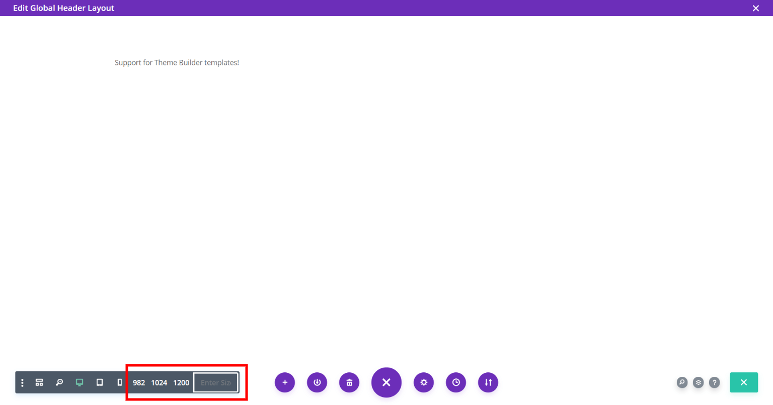
The Preview Size feature now works within the Theme Builder templates! We totally missed this in the last update, so we are happy to have that sorted out now.
Removed Auto-Open Tabs Feature from content fields
We improved the Auto-Open Responsive Tabs feature by excluding content fields like text input fields or image picker fields. The reason for this is because if you were to add an image in the Image Module and with the Desktop, Tablet, and Phone tabs open, you could accidently miss the fact that it wasn’t also added for Tablet and Phone. The same thing could be said for text and title text fields. We wanted to avoid this, so this is a small update that makes a big difference!
#2. New Features
Exclude Pages from Widow Fixer
This is a new feature for the Widow Fixer allows you to toggle on a display of all the pages on your site and click on them to include or exclude them from the settings.
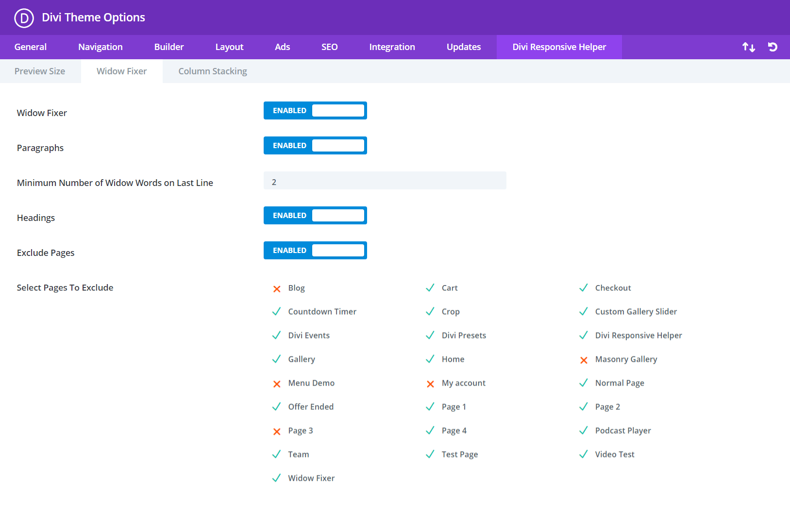
Once you enable the “Exclude Pages” toggle in the Theme Options, the group of pages appears below. The Widow Fixer settings will then only apply to pages that are selected, allowing you to easily turn off the feature for certain pages. Learn more about this new feature in our Widow Fixer Documenation.
Separate Column Stacking Order For Tablet and Phone
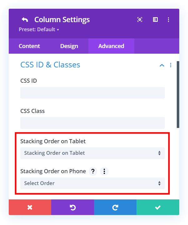
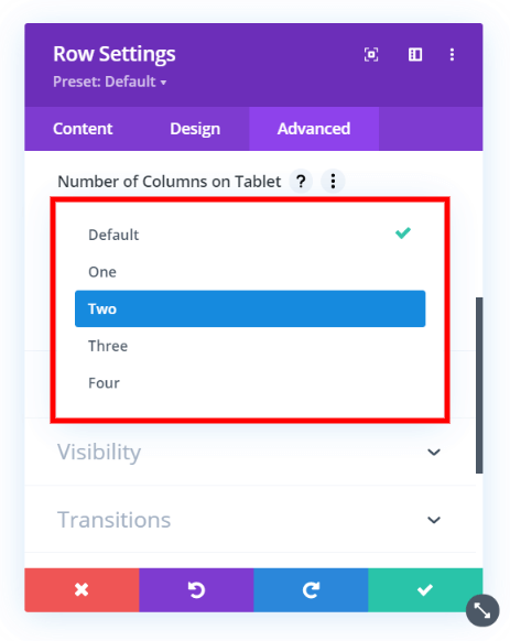
Another improvement we made is the ability to set a different column stacking order for both Tablet and Phone. In the past, the option was limited to Tablet AND Phone, so instead of “either/all” they will be separate. Learn more about this feature in our updated Column Stacking Documenation.
#3. Fixes
Bug Fixes
There were a couple of minor issues with some of the latest Divi and WordPress updates, as well some improvements needed to pass the Divi Marketplace standards. Just to name an example, when a module was docked in the Visual Builder and you used our Preview Size feature, the preview was not quite centered on the screen.
Terminology Updates
We went through the settings with a fresh look and updated some labels and such. For example, instead of “mobile” we said “phone” to be consistent.
Learn More About Divi Responsive Helper
If you are not using this plugin yet, please visit the product page and learn how you can use make your website look great and function well on all devices with the help of our huge suite of over 50 awesome features and unique settings in this ultimate Divi responsive toolkit!






0 Comments