What’s New In Divi Responsive Helper Version 2.1
A Helpful Update To A Helpful Plugin
Our Divi Responsive Helper plugin continues to be one of the most popular 3rd party products in the Divi world, and for good reason — it keeps getting better! We are continually working on new ideas and features, and are excited to release version 2.1 to you for you to start using. Overall here at Pee-Aye Creative we are switching to smaller release cycles so that we can get completed new features released without waiting on others. There are some really great new features, so please be sure to watch the video and browse the post below.
▶️ Please watch the video above to get all the exciting details! 👆
New Features
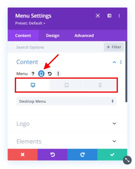
Responsive Settings For Navigation Menu Per Device
This feature was released with version 2.0.2 but it was not announced in a major update post yet. This is one of the most exciting updates this year! it was also the most difficult to develop. I personally use this and it is a real headache saver when you want to show different menus on Desktop, Tablet, and Phone devices.
Disable Hover Effects On Touch Devices
Hover effects do not work well on devices without a mouse, and this has always been an issue in Divi. Now with our new toggle, you can simply disable any hover effects added in Divi modules on devices that are touchscreens. So now hover effects will not awkwardly appear after touching something on tablets and phone.
If you want to disable this feature on any element, simply add the CSS class “pac_drh_responsive_hover_effect” in the section, row, or module.
Show Open Menu On Mobile
Sometimes you want to remove the hamburger menu icon and open the menu instead on Phone devices. There are many use cases for this, and it’s nice to have this as a simple setting. Enabling the setting in Theme Options activates an additional setting in the Menu module for showing an open menu instead of a hamburger menu.
Totally Custom Media Queries
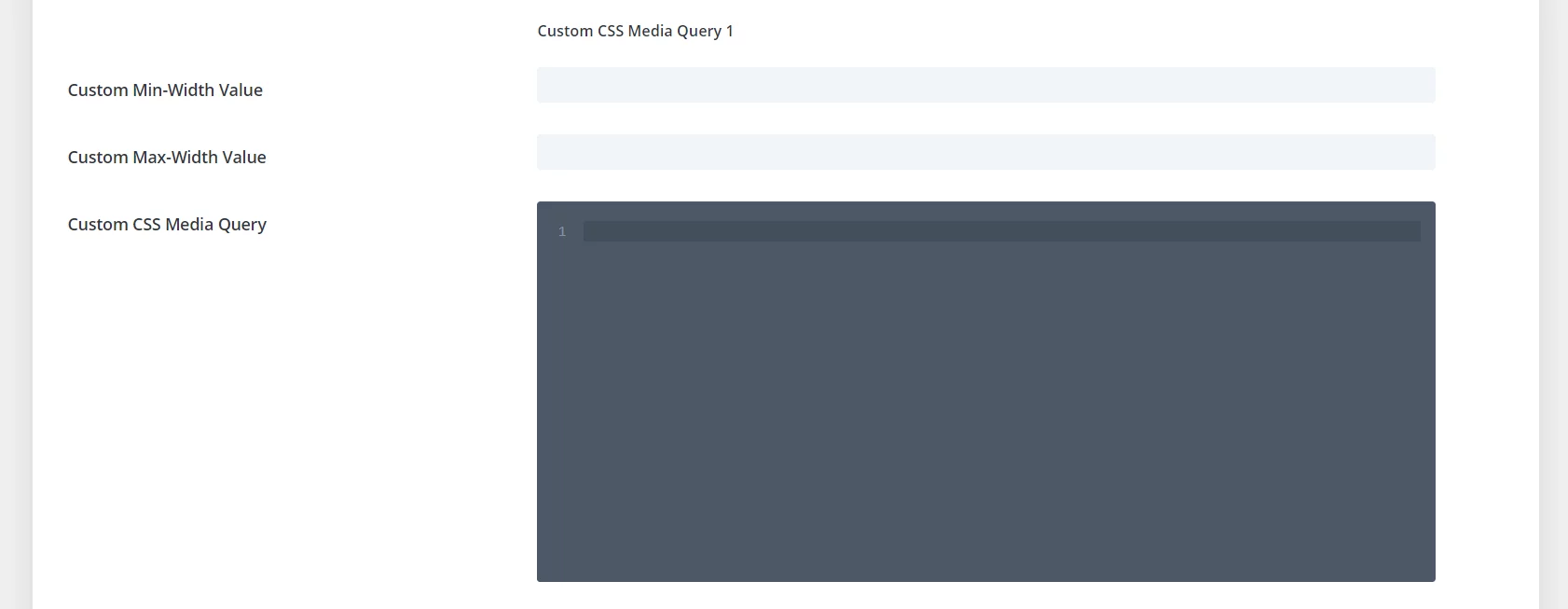
You can now create your own media queries! Simply enter a min-width and max-width value into the settings, and write or paste any CSS code into the box. Any code in the box will apply on your website between those custom sizes! No need to mess around with writing your own media queries anymore! Once you add the min and max width values, go ahead and add your CSS to the boxes. Remember, there is no need to wrap the code in a media query, the plugin does that for you!
Exclude Sections, Rows, Modules From Widow Fixer
This feature gives you more granular control of the Widow Fixer, allowing you to exclude any section, row, or module. This feature first needs to be enabled in Divi>Theme Options>Divi Responsive Helper>Widow Fixer.
Once the feature is enabled, you need to add a CSS class to the section, row, or module that you want to exclude from the Widow Fixer. To do this, simply open the settings of that element and go to the Advanced tab. There you will see a toggle called CSS ID & Classes. Open that toggle and place the CSS class “exclude-drh-widow-fixer” into the CSS Class input field.
Theme Options Export/Import
As you know, we cleverly added our settings to the Divi Theme Options panel. One thing we overlooked, and a customer pointed out, was that when using the portability feature to export the Theme Option settings from one site to another, our settings were not included. We made some adjustments to the code, and now our Divi Responsive Helper settings will export and import as well. This is a really great way to save time by using the export file as a preset of Divi Theme Option settings that can be used on all your new sites.
Widow Fixer On Responsive Content
Another feature is support for the automatic widow fixer when different written content is used per device in the responsive Desktop, Tablet, and Phone tabs.
Disabled Divi Responsive Views In The Backend
Our lovely feature to disable the built-in Divi responsive viewer worked fine on the frontend visual builder, but now we have improved it to also remove their settings in the backend as well.
Don’t forget, we have a live demo site showing all the features. We keep our changelog updated always. And be sure to browse the documentation to see everything in detail.
Learn More About Divi Responsive Helper
If you are not using this plugin yet, please visit the product page and learn how you can use make your website look great and function well on all devices with the help of our huge suite of over 50 awesome features and unique settings in this ultimate Divi responsive toolkit!






0 Comments