What’s New In Divi Responsive Helper Version 2.3
Our Divi Responsive Helper plugin continues to be one of the most popular 3rd party products in the Divi world, and for good reason — we are continually making it better! We love hearing your new ideas and developing new features, and are excited to release version 2.3 with new number of columns settings for Woo modules, column stacking support for Specialty sections, custom gutter width value setting, collapse submenus when opening another submenu setting, menu open/close icon pickers, viewport size, and more improvements and fixes. Be sure to watch the video and browse the post below to get a full overview of everything that is new.
▶️ Please watch the video above to get all the exciting details! 👆
New Features
Number Of Columns In Woo Modules
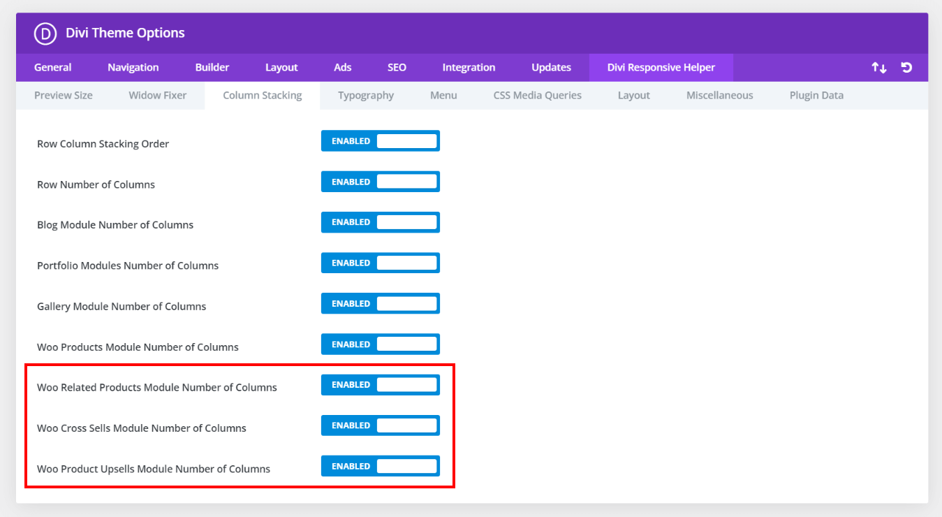
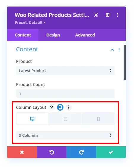
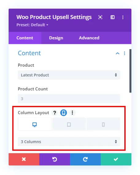
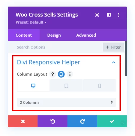
As you probably know, some of the Divi WooCommerce modules are quite lacking in features. There is no way to set the number of columns,but now we have added responsive settings to set the number of columns on Desktop, Tablet, and Phone in the three Woo modules:
- Woo Related Products
- Woo Product Upsell
- Woo Cross Sells
Custom Gutter Width
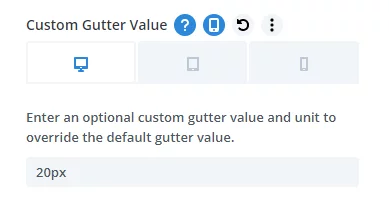
The default gutter width setting in Rows is limited to 1-4, with each number representing a percentage. But what if you want to use pixels or other units? And What if you want a different gutter width value on Desktop, Tablet, and Phone? Until now, it was impossible. But We have added a new feature in the Layout tab of the Divi Theme Options to enable a custom gutter width option in the Divi Builder rows. First, enable the setting in Theme Options. Then in any Row, after turning on the Use Custom Gutter Width setting, you will see our new setting:
Note this custom gutter width feature does not work with any of our custom number of columns features, as this would require a lot of work to make this compatible. It will work for default rows and columns and also in Specialty Sections.
Column Stacking For Specialty Sections
Now you can use the row column stacking and number of column features in rows inside Specialty Sections! The same settings now appear there, just like rows in regular sections.
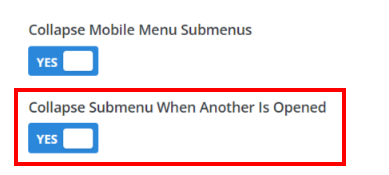
Collapse Submenu When Another Is Opened
We added another setting related to the menu and collapsing submenus. Now, you can enable an additional setting that closes any opened submenu as soon as you open another submenu. This way, there is only one submenu open at one time.
Opened/Closed Icon Picker For Menu Module
Until now, we set the default hamburger icon and X icon for open and closing the mobile menu in the Menu module, but now you have the options to choose any icon you want.
Viewport Size
Now you can see the current size of your viewport! Just enable this setting in Theme Options in the Preview Size tab, and this will add the current viewport width and height size in the Visual Builder page settings.


Improved The Fixed Navigation Bar On Tablet/Mobile
We recently added the setting for Fixed Navigation Bar on mobile for the default header menu. But this only worked when you also enabled the main Fixed Navigation Bar in Divi Theme Options. Now this setting will work to make the menu fixed on Tablet and Phone even if you do not have the main setting enabled (which affects Desktop).
Remove Plugin Data When Uninstalled
This new setting in the Theme Options will remove all plugin data and saved settings when you uninstall the plugin. This setting is OFF by default. You should only enable this setting if you are removing the plugin permanently, so please use this setting carefully with the understanding that if you enable the setting you will lose all saved settings when you uninstall the plugin.

Documentation & Demos
Don’t forget, we have a live demo site showing all the features. We keep our changelog updated always. And be sure to browse the documentation to see everything in detail.
Learn More About Divi Responsive Helper
If you are not using this plugin yet, please visit the product page and learn how you can use make your website look great and function well on all devices with the help of our huge suite of over 50 awesome features and unique settings in this ultimate Divi responsive toolkit!





Is there a way to add an option that allows one to change the default Divi breakpoint for responsive output, which I believe is 980px wide? For example, I test all my designs for the “Chromebook” width of 1366px. Also, the newer Apple iPad Pros have some unusual viewport widths. It would be helpful if I could change that breakpoint from 980px globally. Please accept my apologies if there is already a setting to do this that I am missing. Thank you for continuing to build valuable features into the Divi Responsive Helper! Your plugin has become a must-have for me to build any Divi site for clients and myself.
No, this is not possible unfortunately. We will wait and see what happens after 5.0!
Has anyone else had issues with the custom gutter function not working? is there some quick fix or trick that I’m missing?
https://www.loom.com/share/c6327e2804ec4b49b9a66be27dd63408?sid=ae6b5650-a2a5-4f0b-b312-44da1187434d
We are not aware of any issue, if there is one on your site, please be sure to let us know by submitting a support request.