Can You Still Have A Transparent Header In Divi Over The First Section? Yes!
The new Divi Theme Builder has brought a lot of change and adjustment to those choosing to active the Theme Builder for the header area of their sites. There are lots of new possibilities, but there are also some things that are not impossible now. We’ve been covering a lot of the new hidden features here on the blog and on our YouTube channel, so be sure to subscribe for all the goodies!
I know some of you were hoping to still be able to achieve the transparent header like we could do with the menu prior to Divi 4.0. It was quite easy – just set the header background slider to transparent, and walah! The content in the first section magically moved up behind it. But there’s no Customizer settings anymore once you have the Theme Builder enabled, so how can we do this?
Easy peasy! You can do this directly in the Divi Builder now since the Divi 4.2 version update, and we are proud to once again be the first to offer a solution to a common request in the Divi community.
Here’s an example of one I threw together:

▶️ Please watch the video above to get all the exciting details! 👆
#1. Set Up The Transparent Header
To achieve the transparent header menu, there are a few settings in to adjust in your header section and in the Divi Menu Module.
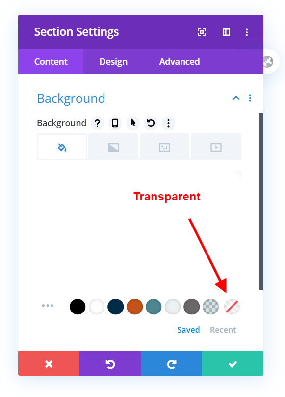
Make the section background transparent in Theme Builder layout.
First of all, make sure the main background section in your Divi Theme Builder is set to transparent. By default, it may look like it already set to nothing, but this step is crucial for it to work. Divi now has a transparent color in the color picker, so select that for the header section background.
Make the Menu Module background transparent in Theme Builder layout.
By default the new Divi menu module has a white background, so set that to to transparent as well. By default, this is set to a color, so the Menu Module also needs changed to transparent along with the background of the entire section.
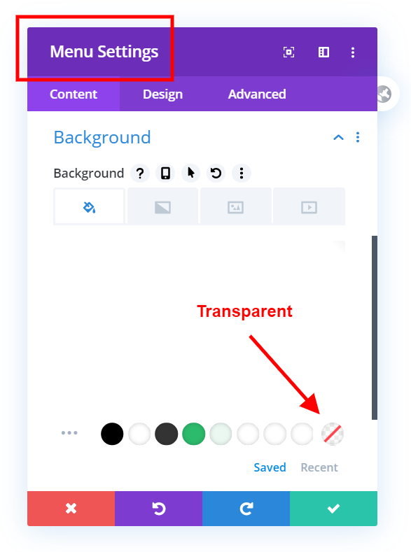
But then this happens? Everything is white instead of transparent! 🙁
That’s okay, we just need to go to the next step which is going to be super easy!

#2. Move The Theme Builder Over Top Of the First Section
The Solution You’ve All Been Wanting
Now for the real deal! In Divi 4.2, there is a new option to set the Position of any module, row, or section. There are several new settings, which we could do previously with a simple line of CSS, but now we can set the position right here in the Divi Builder.
Go to the header section settings to the Advanced tab and look for the Position toggle. Inside, change the Position to Absolute.
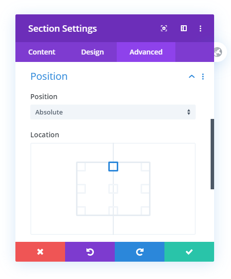
Now your header section will be over top of the first section on your page! Save the Theme Builder layout and go take a look at the page where this layout is assigned. For more on that, go to step #3 below.
#3. Assign The Transparent Divi Header In The Theme Builder
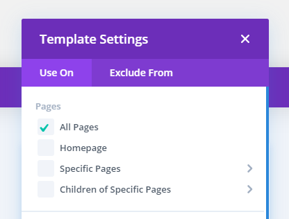
Sitewide Transparent Divi Header
The first solution will make your Divi Theme Builder header transparent across your entire website. It will move the first section of the page up behind the header. When using this method, make sure you have adequate padding in the first section of your pages to make room for the menu on top of it.
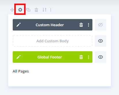
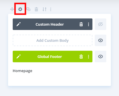
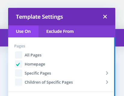
Homepage Transparent Divi Header
This second solution will only affect the home page (the one you have set as homepage in WordPress settings).
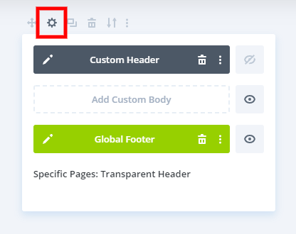
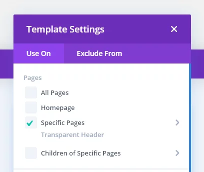
Specific Page Transparent Divi Header
The last option here is if you want a specific page on your website to have a transparent header. Choose the
#4. Improve Readability
Set text to a light color in the Theme Builder layout.
This goes without saying, but it can be a little confusing to do because the background will be white (even though it is set to transparent)
Add A Color Overlay To The Hero Section
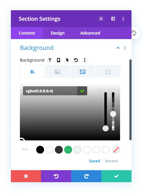
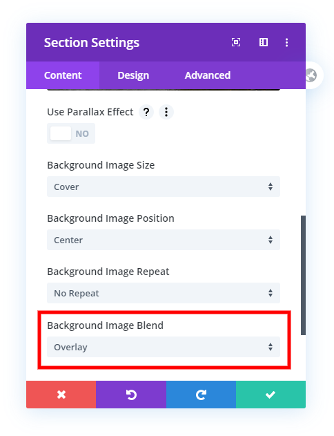
Now, to make the white text stand out, let’s add a color overlay to the background image in the first section of the page.
Here’s another look at the final result of our transparent Divi header built in Divi 4.2 and upward.

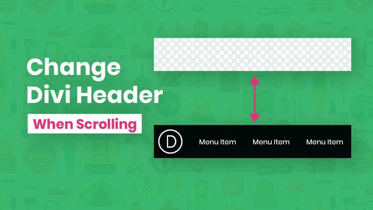
Make Fixed and Change The Color When Scrolling
You may want to take this a step farther and make the header stay fixed, and then also change the color of the fixed header when scrolling. To do that, check out our related tutorials on those topics.





Hello, great help! This works, but I can’t seem to get the header to have a transparent gradient background.
If I assign a gradient to the .home .et_pb_section_0_tb_header.et_pb_section div, it just doesn’t show.
I actually did it with z-index.
Had the same issue. It kept disappearing, but dragged z-index to 500 and it stuck.
Hi I was trying to do this but at the moment I have on scroll a background header, different colour text and different logo. Is this possible with the new theme builder?
Hi Theresa,
It is possible, but only with my tutorial here: https://www.peeayecreative.com/how-to-change-the-color-of-a-fixed-divi-header-menu-when-scrolling/
That should do it for you! 🙂
Thank you so much! I just spent the last hour trying to figure out why my background was white!
Hey Tim, yes that is confusing! Glad I could help!
I am facing same issue, can you please advise me why my header looks white background instead of transparent as per tutorial? Can you please attach json file for header here?
Could you please share the URL of the website for us to investigate further?
Great article – but my header has two sections – I’m trying to make this work with a main menu section (transparent) and a top-bar (with background) – very much like the traditional Divi menu where we have a thin row above the main menu section. If I add absolute positions to these I lose my top-bar section. (thanks)
Hi Keith, you should be able to have the thin bar be a separate row, so have two rows within the section. Would that work?
I made the header static and transparent, following this great tutorial. Now can I add some color once the page starts scrolling? If not, then the text and the menu are not readable. Any tips will be highly appreciated.
Hi Jorge,
Yes, you can learn how to do that in this tutorial: https://www.peeayecreative.com/how-to-change-the-color-of-a-fixed-divi-header-menu-when-scrolling/
I’ve updated the post with this link as well! 🙂
Awesome! Thank you for the quick follow up. That worked perfectly.
Nice, glad to help!
So I was able to replicate what you have over here and it’s awesome. Exactly what I wanted! Kudos. But when I am trying to use the top menu or anything on the header, nothing is clickable. I checked on the inspector but nothing conclusive from what I see. I am still working on the site but I was wondering if it is something like a z-index issue or something overlayed on top of the menu?
Hi Morris,
Nothing in the tutorial would have caused that. If you can share the link we can take a look.
Thank you very much for this very helpful post. I have not done this since prior to the Divi Theme Builder and found myself totally stuck again… Until reading your easy to follow article…
Hi David,
I’m so glad I could help you solve this! 🙂
I make the menu transparent, but the problem is that the menu is behind the background full-width image I have in the page (hero section). How could I solve it?
My other post will help with that. https://www.peeayecreative.com/how-to-fix-the-hidden-divi-menu/
Thank you! It works perfectly.
I was using divi with another theme and the menu was placed behind the content, but I solved changing to divi theme.
Sounds good, Jorge!
Doesn’t work for me 🙁
1 Transparent backgrund in Section and menu item
2 Adjuste position to top absolute
Hi Santiago, what’s not working exactly? Have a link I can see?
Doens’t work for me neither.
Nelson:
I love your site and all of the tips, Keep them coming!!!
http://wellvationdesign.flywheelsites.com/
I have a minor issue. I had the transparent header (using Theme builder) working fine, I set off to work on the slider and somewhere along the line, the header is now white. I retraced my steps, but still can’t seem to fix it. Anyway you could take a look and give me some suggestions?
Thanks and stay safe,
Ben
Hi Ben, I’m so glad you like my site and the tips! I’ll be sure to keep them coming as much as possible! 🙂
So I took a look at your site, and it was like I suspected. The header is white (rather than the expected transparent) because the header is not positioned properly. I’ve said it before, and it’s kind of a joke, but you can’t have it transparent or we could see into your computer monitor. 🙂 It can only be transparent if it is over top of other content, but I can see the slider below is not being cut off by the header, which tells me the position is not set or not working on the header.
Got it. I have 2 different custom headers. Home page uses your transparency trick, but on the inside pages, I tried using the script to prevent Fixed Divi Header From Overlapping The Page. Looks like I caused the conflict.
Can I use script on all, but home page? or do I manually fix it each page?
Thanks for your patience.
Ben
You can certainly have a different Theme Builder header for any page. I believe that may be what you are looking for but if not let me know.
Nelson: Thanks for the quick response. I still need a bit of help if possible.
I use the code from https://www.peeayecreative.com/how-to-automatically-stop-your-fixed-divi-header-from-overlapping-the-page-and-push-it-down-instead/ on all pages except the home page )and one other). Is there a way to have a single page ignore this code?
I am able to EITHER have a transparent header OR fix the overlapping issue. I’d love to be able to do both.
Stay safe,
Ben
Hi Ben,
You can’t physically have both. You kind of have to to stop and think about it…you can’t have a transparent header above the content or we would see into your monitor 😉
This was a great article. I’m wondering how you can do at fixed global header and make your logo and menu stay in place. Her is a example
https://www.premierpressureclean.com/
I can get the quote and phone number to work in a global header but when I add the menu and logo it doesn’t work.
Is my approach correct
Thank you
Hi Tim,
We have several tutorials for fixed headers. Here’s one to get you started: https://www.peeayecreative.com/how-to-make-a-fixed-divi-header-menu-on-desktop-or-mobile/
thank you
Thank you! You saved me a TON of time.
Nelson, thanks for all of your tutorials and tips. Seriously, since coming across Pee-Aye, you have saved me so much time and so many headaches. Cannot thank you enough.
This is a great tutorial as well, and it’s worked really well. Only one hang-up that I keep running into. With the dropdown menus on mobile and tablet, the dropdown menu items themselves also have a transparent background. When I go to change that in the module settings (I want a white dropdown background), it doesn’t change the transparent background. So then my dropdown menu items blend in with the header.
Here’s a link to my staging homepage: http://rediscoveredself.com/2-0-home
Any ideas on how to get a white dropdown menu when the changes I make in the module don’t seem to do the trick?
Thanks,
Shane
Hi Shane,
Our tutorial does not affect the mobile menu, and from looking at the code it doesn’t look like the background color has been set in the dropdown menu background. Can you double check that?
Hi Nelson,
I have the same issue as Shane. No matter what I do, the mobile hamburger dropdown menu background is transparent.
This seems like it may not be connected to this post, but I’m hoping you can help anyway!
I can change the dropdown background menu in Divi to white, which works while in the builder, but as soon as I exit the Visual Builder and test out the live site, it’s back to transparent. For some reason, the changes don’t seem to be taking effect. I have tried clearing my cache numerous times and testing out different browsers as well.
Any options for me?
Link: http://www.dandoerksen.me/workwithme
Hi Ryan,
Are you referring to the mobile menu? I checked and the background is black.
Love this! It was exactly what I was looking for with the exception of spacing. Can you add distance between the logo and text so it appears more like the traditional nav bar?
Hi Jeni, so if I understand correctly your question is not related to this post. I’m sure you could do that, you could either add a separate image module for the logo or come up with some CSS to add some margin right to the image or margin left to the first nav item.
Didn’t work for me
What didn’t work? Do you want help? Let me know exactly what you tried.
Hi
Great support…
I tried your guidance, but a white background is coming in top header, while scrolling down its shows transparent. but in header its white.
Pls help to remove the white bg, tried some methods using Apperance>customize…
this is my site link “https://navlensstudio.com/”
thank you
Hi Henry,
I’m not sure what you mean, the header I see is not even fixed, and not white. You can elaborate if you still need help.
Hi, this works like a charm.
Only problem is; I’m using this code for creating a full screen mobile menu. And by using an absolute position, it doesn’t work anymore on that page (I only need a transparent menu on the homepage) do you have a solution how I can still use both? Or maybe a better solution for full screen mobile menu? See: https://opuscbd.nl/home
#mobile_menu, .opened #mobile_menu {
position: fixed;
display: flex;
flex-direction: column;
justify-content: center;
min-height: 100%;
max-height: 100%;
z-index: 10;
top: 0;
border: none;
overflow-y: auto;
max-width: 100%;
float: left;
transition: all cubic-bezier(0.5, 0, 0, 1) 800ms;
background: linear-gradient(rgba(0,0,0,0.5),rgba(0,0,0,0.5)),url( insert your image URL here );
background-size: cover;
background-repeat: no-repeat;
}
.opened #mobile_menu {

transform: none;

}
.opened #mobile_menu a {
transform: none;
opacity: 1;
}
.opened #mobile_menu .menu-item:nth-child(1) a, .closed #mobile_menu .menu-item:nth-last-child(1) a {
transition-delay: 100ms;
}
.opened #mobile_menu .menu-item:nth-child(2) a, .closed #mobile_menu .menu-item:nth-last-child(2) a {
transition-delay: 200ms;
}
.opened #mobile_menu .menu-item:nth-child(3) a, .closed #mobile_menu .menu-item:nth-last-child(3) a {
transition-delay: 300ms;
}
.opened #mobile_menu .menu-item:nth-child(4) a, .closed #mobile_menu .menu-item:nth-last-child(4) a {
transition-delay: 400ms;
}
.opened #mobile_menu .menu-item:nth-child(5) a, .closed #mobile_menu .menu-item:nth-last-child(5) a {
transition-delay: 500ms;
}
.opened #mobile_menu .menu-item:nth-child(6) a, .closed #mobile_menu .menu-item:nth-last-child(6) a {
transition-delay: 600ms;
}
.mobile_nav.opened .mobile_menu_bar:before {
content: ‘\4d’;
color: #fff;
transition: all ease-in-out 300ms;
z-index: 100;
}
.mobile_nav.closed .mobile_menu_bar:before {
transition: all ease-in-out 300ms;
}
If you want to use the CSS Styling only for the homepage then you can add the class home in the start of the selector and it will work on the home page only.
For example if you want to use this code:
.opened #mobile_menu {
transform: none;
}
for the home page only then add the home class like this:
.home .opened #mobile_menu {

transform: none;

}
and this code will work for the homepage only.
Please let us know if this helps. 🙂
Thanks, Nelson. Something that finally works.
I’m happy to hear that, enjoy!
Hi. I’m going from a transparent header with a white logo, to a white header with a black logo. How would I swap out the logos using your code?
thanks
Hi Mark,
We usually have different tutorials for specific things like that: https://www.peeayecreative.com/how-to-replace-the-divi-theme-builder-logo-when-scrolling/
Hello – Thanks for this tutorial? I am getting a white strip along the top of the pages even though the menu is transparent. Any idea what could be causing this?
Problem solved! I made sure the Absolute setting was on both the section and row sections as well and it fixed the issue! Thanks again.
Hi Meghan,
We are glad that the issue is resolved now. Please let us know if you need any other help.
I think divi may have changed something. Works great on desktop. on mobile, everything stacks on top of eachother. (the first section doesn’t move down past the header.)
Ive used this fix for the time being. its not great. I bet you have a better solution 😀
/* clear transparent menu in mobile */
@media only screen and (max-width: 981px) {
.et_pb_section_0 {padding-top:50% !Important;}
}
Hey Trisha,
It would be great if you share the URL for me to investigate further on this issue.
Hello,
Thank you for this tutorial but I doesn’t work well for me. I’ve got only bg color, not picture in the first section. If I set position of this section to absolute, it’s still under the header so I have to set negative margin to it to make this section reach the top of the page. And whole section has so small height when I set it to absolute that content of this section is not shown (it’s hidden somwhere “behind” the second section) and no size or margin/padding settings don’t change it. I can’t share link since this website is not public yet but I tried everything and don’t know how to solve this. Do you have any advice?
Hey Adela,
Could you please share the URL of the website for me to investigate it further?
awesome
Hi Nelson!! I’ve used this great tutorial in the past and it’s worked fine! Recently though, when I apply the “absolute” quality to the position of the section, it will “disappear” and the other body sections will move up over it, but not behind the header. Was there an update with Divi? Am I missing something? I’ve seen this happen on at least one other demo site i’ve been working on. I can make the section go behind the header with spacing, but the following body sections still cover a large part of the hero image. Current test site is http://impressive-vest.flywheelsites.com/ (be sure to use HTTP)
Hi Adrienne!
Please set the section position to relative and then set the row position to absolute and it should work fine.
Let me know how it goes!
hi, thanks for the tutorial. The problem is that once the position is set to absolute the sticky setting doesn’t work anymore.
Hi Joseph!
Please enable the sticky position in the Advanced > Scroll effects. Then set the position sticky option to relative.
Comment *Hello, I’ve followed your tutorial, and it works great! However, I want my menu to scroll with the page, but when I scroll down, it disappears.
Section: Position: Absolute
Scrolling effect: does not stick
Row: Position: Relative
Scrolling effect: does not stick
Menu: Position: Default
Scrolling effect: Stick to the top
Top sticky offset: 30px
Offset for surrounding sticky elements: yes
Default and sticky transition style: yes
I would like the menu to be transparent as in your tutorial but to scroll with the page.
I have more than 60 pages on the site (currently local), and it needs to be in the Divi Builder’s “Global Header.”
If you have a solution, I am all ears.
Thank you very much for your help.
Adrien
Hi Adrien!
Please set the section to stick to the top in Advanced > Scroll effects. After that, set the row to absolute in normal mode and relative in sticky mode. Keep the Menu module to default.
Hope it helps!