Overview
The Divi Carousel Maker plugin provides tons of navigation options for enabling your website visitors to scroll through the carousel. In this guide, you will learn everything you need to know about the carousel navigation buttons settings and how they work. You can choose to show an arrow icon, custom text, or both. They can be positioned in many different locations. They include all the necessary position, alignment, and design settings, and you can even adjust each setting per device to make everything responsive. The navigation buttons settings can all be found in with the other carousel settings in Row settings>Column settings>Carousel tab in the Navigation Buttons Settings toggle. You should also check out the navigation controls settings demo to get some inspiration, or download our free layouts in the demo site to give you a quick start!
View Live Demo
View Settings List
Setting Tabs
The navigation button settings are divided into tabs to make it easier to user.
- Common
- Left
- Right

Common
The Common tab has any shared settings that affect the overall navigation buttons in general. This includes any settings that affect both the left and right button.
Left
The Left tab has any setting related to the left/previous navigation button. This includes the icon and the vertical and horizontal position settings.
Right
The Left tab has any setting related to the left/previous navigation button. This includes the icon and the vertical and horizontal position settings.
Show Navigation Buttons
To show the carousel navigation buttons and adjust the settings, you first need to enable the option. To do this, open up the Navigation Buttons Settings toggle and enable the setting toggle called Show Navigation Buttons. Once this is enabled, all the navigation button settings will appear below for you to customize and style.

Navigation Buttons Type
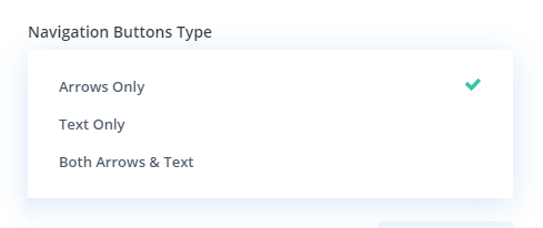
There are three options to choose from for the navigation buttons:
- Arrows Only
- Text Only
- Both Arrows & Text
By default, this will be set to Arrows Only. This is the most common type of navigation, but we also include the option for Text Only and Both Arrows & Text.
Navigation Buttons Location
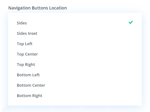
This setting allows us to choose the placement and position of the navigation buttons. There are currently eight different options to choose from in a dropdown selector list.
- Sides
- Sides Inset
- Top Left
- Top Center
- Top Right
- Bottom Left
- Bottom Center
- Bottom Right
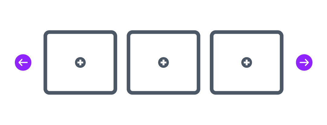
Sides
This option places the navigation arrows on both sides of the carousel centered vertically outside the carousel. This is the default position.
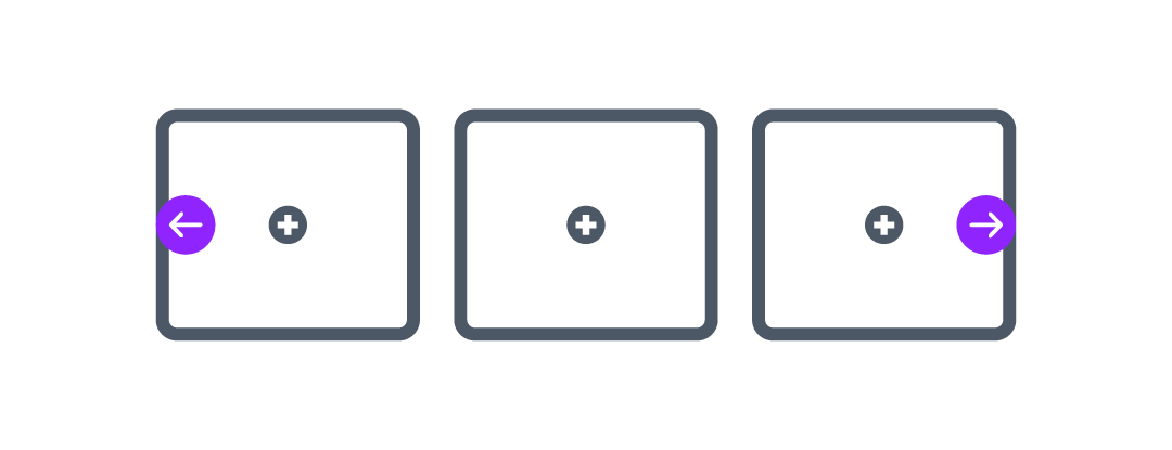
Sides Inset
This option places the navigation arrows on both sides of the carousel centered vertically inside the carousel. This option is great for fullwidth carousels which extend the modules all the way to both edges of the screen. This is also a great responsive setting to choose for smaller screen sizes like Tablet and Phone.
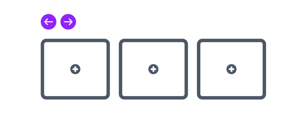
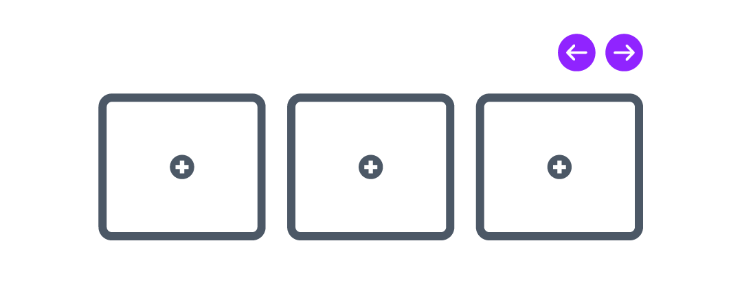
Top Left
This option places the navigation arrows above the top left corner of the carousel.
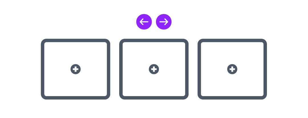
Top Center
This option places the navigation arrows above the top center of the carousel.
Top Right
This option places the navigation arrows above the top right corner of the carousel.
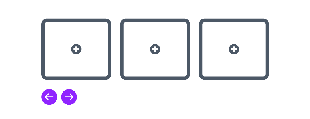
Bottom Left
This option places the navigation arrows below the bottom left corner of the carousel.
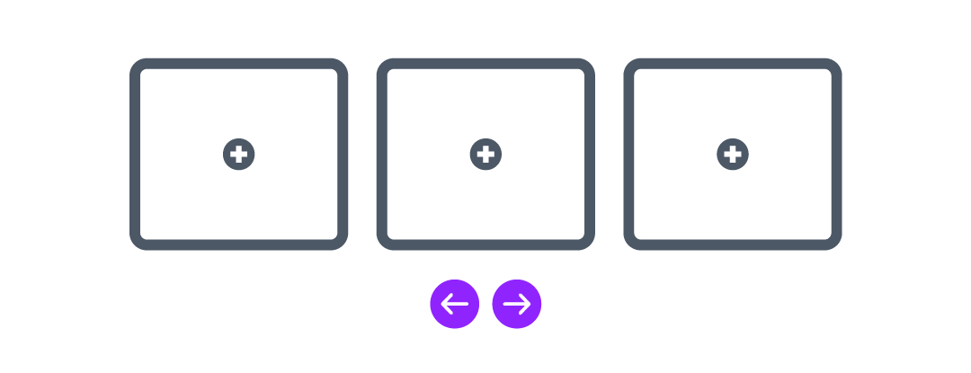
Bottom Center
This option places the navigation arrows below the bottom center of the carousel.
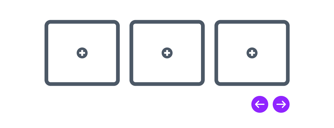
Bottom Right
This option places the navigation arrows below the bottom right corner of the carousel.
Navigation Buttons Text Font Size
This setting allows you to adjust the size of the navigation button arrows and text.

Navigation Buttons Background Color
This setting allows you to set the background color of the navigation buttons.

Navigation Buttons Color
This setting allows you to set the arrow color for the navigation buttons icons and text.
Navigation Buttons Padding
This setting allows you to adjust the spacing around the inside of the navigation buttons.

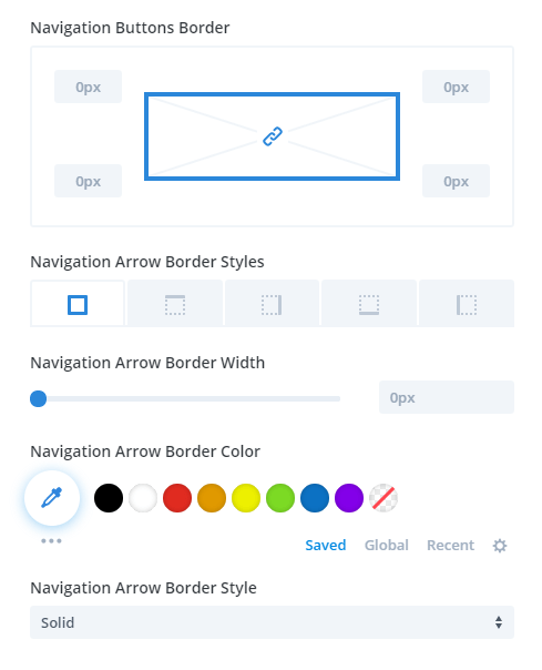
Navigation Buttons Border Settings
Border
This setting allows you to adjust the corners of the border on the navigation buttons to make them square or rounded.
Border Width
This setting allows you to increase or decrease the width of the border around the navigation buttons.
Border Color
By setting allows you to set the color of the border around the navigation buttons.
Border Style
This setting allows you to select which type of border you want to use for the navigation buttons.
Left Navigation Button Icon
You can choose any icon you want for the left/previous navigation arrow using any of the icons built into the ETModules Font Family that comes included with Divi.
Left Navigation Button Text
This option appears when using either the Text Only or Both Arrows & Text Navigation Buttons Type options. By default, this say “Next” but you can write your own custom text for the left/previous/back button.

Left Navigation Button Vertical Position
This option allows you to adjust the vertical position of the left navigation button.

Left Navigation Button Horizontal Position
This option allows you to adjust the horizontal position of the left navigation button.

Right Navigation Button Icon
You can choose any icon you want for the right/next navigation arrow using any of the icons built into the ETModules Font Family that comes included with Divi.
Right Navigation Button Text
This option appears when using either the Text Only or Both Arrows & Text Navigation Buttons Type options. By default, this say “Next” but you can write your own custom text right/next button.

Right Navigation Button Vertical Position
This option allows you to adjust the vertical position of the right navigation button.

Right Navigation Button Horizontal Position
This option allows you to adjust the horizontal position of the right navigation button.

