Overview
In this guide, you will learn everything you need to know about creating a beautiful WooCommerce product carousel directly in the Divi Builder with Divi Woo Products module (formerly named Shop module) and the Divi Carousel Maker! As you set up the carousel, I highly recommend you also reference our full settings list of all the settings and features included in the plugin. Be sure to browse and download our free carousel demo layouts to inspire your creativity and give you a quick start!
1. Set Up Your WooCommerce Products
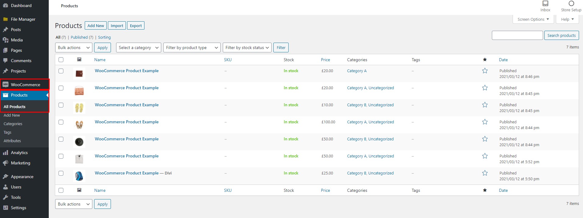
Naturally the first step before you can create a product carousel is to actually add the products in WooCommerce. If you haven’t done that yet, go ahead and take care of that. If you already have products, awesome, you’re one step ahead.
2. Add The Divi Woo Products Module To Your Layout
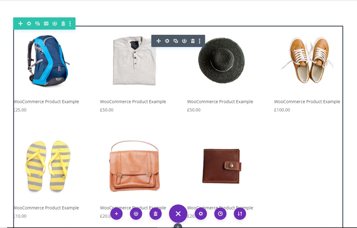
Go to the page where you want to create a product carousel. Locate your desired section and row and add a Woo Products module to your layout.
FYI: The Woo Products module was formerly named the Shop module and changed in Divi 4.14.
3. Set The Number Of Slides To 1
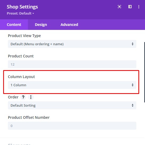
The Divi Carousel Maker changes any module into a carousel item. Each individual module is a separate carousel item, so some modules are not quite suited for a carousel. For example, the Divi Woo Products module displays a grid layout of products, usually with 4 columns on Desktop. So for this to work well, we use a little trick which you will learn about in step 5. For now, you need to make a few adjustments. The first step is to change the number of columns to 1. This now works perfectly, and can be used with the Offset feature to add as many products in separate Woo Product modules as you want.
4. Set The Product Count To 1
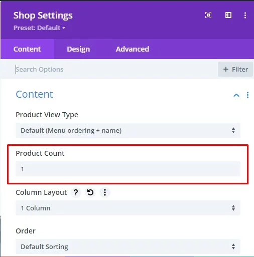
After setting the column number to 1 Column, now it is time to set the Product Count to 1 as well. This may seem strange, but it will make sense once you complete step 5. Setting the product count to 1 will allow us to show only one product in the Woo Products module, and then we will actually duplicate the module later based on the number of products you want to show in the carousel.
5. Finalize The Module Design
This step is optional, but I recommend making sure you adjust the design of your Woo Products module now. You may want to change the text sizes of the title or price, adjust some colors, add a border, make the image rounded corners, etc. If you do this all now, you can finalize how you want the module to look before you duplicate the module in the next step.
6. Duplicate The Woo Products Module And Assign An Offset Number
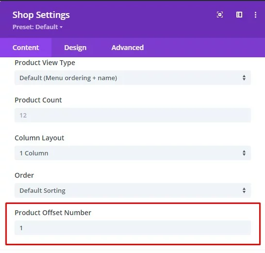
We are taking advantage of the Product Offset Number feature in Divi which allows you to use the Divi Woo Products module in the Divi Carousel Maker! This setting can be confusing, but just follow the instructions, and it will work great. The offset feature is required in order to use multiple modules, each showing 1 WooCommerce product in 1 column.
Each Woo Products module will contain one product. So to make a carousel of multiple products, you need to first duplicate the Woo Products module as many times as the quantity of products you want to show. You can use any number you prefer, but it would probably be best to not go too crazy with it, maybe keep it under 10 products or so.
The first Woo Products module is fine, you don’t need to add any offset. But each of the other modules need to have an offset number assigned. Here is the pattern that you need to follow for it all to work correctly:
- Woo Products module 1 = Product Offset Number 0
- Woo Products module 2 = Product Offset Number 1
- Woo Products module 3 = Product Offset Number 2
- Woo Products module 4 = Product Offset Number 3
- Woo Products module 5 = Product Offset Number 4
- Woo Products module 6 = Product Offset Number 5
That same pattern would always continue if more products are needed. Here’s how it works. The second module with an offset of 1 will skip the first item, and that’s great because the first module already shows that product. The third module with an offset of 2 will skip the first 2 products, and that’s great because the first two modules already show those. You get the idea. The offset number is the number of products that are skipped.
7. Fix WooCommerce/Divi Product Width On Mobile
One last important step is to solve an annoying nuance with WooCommerce and Divi. Something changed recently, either with Divi or WooCommerce, and it is putting two product columns side-by-side on mobile. This is quite stupid, because there is not enough room for two product side by side and would almost never work, so don’t ask me why they did this. To solve it, please add the following CSS snippet to your Divi>Theme Options>Custom CSS box.
/*fix Divi/WooCommerce product column width on phone*/

@media (max-width: 980px) {
	.et-db #et-boc .et-l .et_pb_shop ul.products.columns-1 li.product,
	.et-db #et-boc .et-l .et_pb_shop ul.products.columns-2 li.product,
	.et-db #et-boc .et-l .et_pb_shop ul.products.columns-3 li.product,
	.et-db #et-boc .et-l .et_pb_shop ul.products.columns-4 li.product,
	.et-db #et-boc .et-l .et_pb_shop ul.products.columns-5 li.product,
	.et-db #et-boc .et-l .et_pb_shop ul.products.columns-6 li.product,
	.et-db #et-boc .et-l .et_pb_wc_related_products ul.products.columns-1 li.product,
	.et-db #et-boc .et-l .et_pb_wc_related_products ul.products.columns-2 li.product,
	.et-db #et-boc .et-l .et_pb_wc_related_products ul.products.columns-3 li.product,
	.et-db #et-boc .et-l .et_pb_wc_related_products ul.products.columns-4 li.product,
	.et-db #et-boc .et-l .et_pb_wc_related_products ul.products.columns-5 li.product,
	.et-db #et-boc .et-l .et_pb_wc_related_products ul.products.columns-6 li.product,
	.et-db #et-boc .et-l .et_pb_wc_upsells ul.products.columns-1 li.product,
	.et-db #et-boc .et-l .et_pb_wc_upsells ul.products.columns-2 li.product,
	.et-db #et-boc .et-l .et_pb_wc_upsells ul.products.columns-3 li.product,
	.et-db #et-boc .et-l .et_pb_wc_upsells ul.products.columns-4 li.product,
	.et-db #et-boc .et-l .et_pb_wc_upsells ul.products.columns-5 li.product,
	.et-db #et-boc .et-l .et_pb_wc_upsells ul.products.columns-6 li.product {
		width: 100%!important;
		margin-right: 0%!important;
	}
}
8. Enable The Carousel
At this point you should have your modules set up and designed and are ready to turn them into a carousel. To create a carousel, first go into the Row settings and then into the Column settings. There you will see this new fourth tab called “Carousel” which is added by our plugin. Inside that tab you will see a toggle called “Carousel Settings.” Click to open this toggle and then you will see the setting called “Make This Column A Carousel.” This setting is off by default, so you need to turn it on to enable the carousel. Any modules added to this column will be displayed in the carousel.

9. Adjust The Carousel Settings And Design
After enabling the carousel, all the other carousel settings will appear in their respective toggles within the carousel tab. These settings give you complete control over the functionality and design styling of the carousel. You can check the links in our documentation area under the “settings” heading for links to each of the main groups of settings to get all the details about each setting. Go ahead and explore the settings and adjust everything as needed. Be sure to save your changes, and when you exit the Divi builder, you will see the modules transformed into a working carousel!
Due to the unique nature of this plugin and the limited ability to customize the core Divi Builder, it is not possible to provide a preview of the carousel in the Visual Builder. The carousel settings will take effect when you exit the Visual Builder. If Elegant Themes makes this possible in the future, we will definitely add support. Please refer to our Suggested Workflow Guide for our recommended workaround for this.

