Gallery Module Responsive Image Count Feature Overview
Why Do We Need This
The Divi Gallery module has a setting to enter the desired number of images to show. However, this is very limited because it does not have responsive settings, meaning the number of images that looks good on desktop will get super long on phones, and this is not a good user experience. It would be great to have responsive options for this, which is exactly what our plugin provides!
What This Feature Does
The Divi Responsive Helper plugin includes a responsive icon and tabs inside the existing Gallery module Image Count setting which allows you to enter the number of images you want to display on Desktop, Tablet, and Phone devices.
How To Use The Gallery Module Responsive Image Count Feature
1. Enable The Feature In Theme Options
To begin using the Gallery module image count feature, go to the Divi>Theme Options. There you will see a new tab that our plugin adds called “Divi Responsive Helper.” Once you click on that, you will see more tabs. Click on the “Miscellaneous” tab, then you will see the “Gallery Module Image Count” setting. Enabling this toggle activates the additional settings located in the Images tab of the Divi Gallery module settings for choosing the number of images to show on each device.

2. Enter The Image Count In The Gallery Module
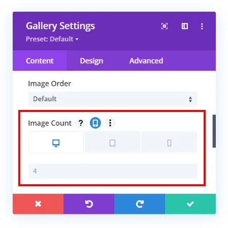
Once the Gallery Module Image Count setting is enabled in Divi Theme Options, a new responsive icon will appear in the Image Count setting in every Gallery Module in the Divi Builder.
- Open up the Gallery Module Settings by clicking the gear icon.
- Go to the Content tab.
- Open the Images Toggle.
- Hover over the Image Count setting and click the responsive phone icon.
- Enter the desired number in Image Count for Desktop, a number for Tablet, and another number for Phone.

View Live Demo Of The Divi Gallery Module Image Count Feature
We have a full demo site where you can view the Gallery module set to a different number of images for each device.

