Menu Settings Overview
The Divi Responsive Helper plugin includes several features related to the menu. The purpose of these features is to make it easier for you to make your Divi website responsive. In this document, we will explain what each of these features are and what they do and how to use them.
To begin using the menu settings, go to the Divi>Theme Options. There you will see a new tab that our plugin adds called “Divi Responsive Helper.” Once you click on that, you will see more tabs. Click on the “Menu” tab to see all the menu related features in the plugin.
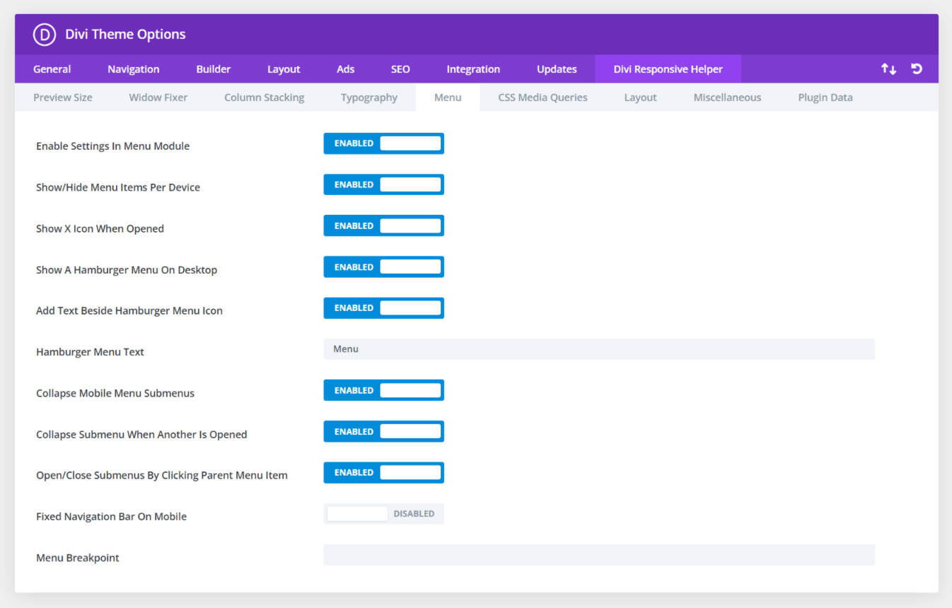
The first toggle in the Menu tab is a setting called Enable Settings In Menu Module. This does exactly what it says, it activates settings created by the Divi Responsive Helper plugin inside the existing Menu module.
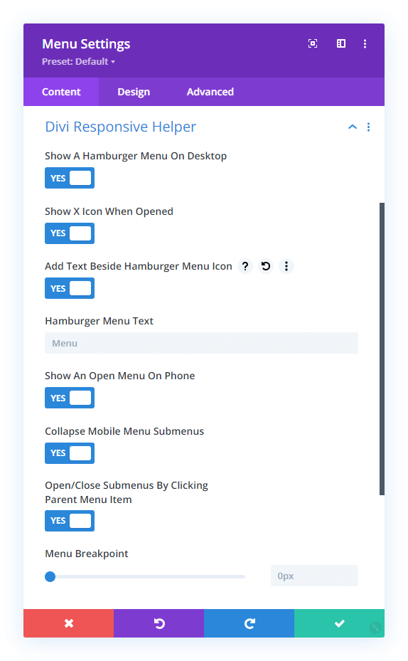
You will notice that the Menu module and Theme Options have identical settings. This is because the settings in Theme Options affect the default header menu, while the settings in the Menu module affect just that module. Having the separate settings in the Menu module, a huge breakthrough and introduces many convenient options that can be enabled or disabled per module.
Show/Hide Menu Items
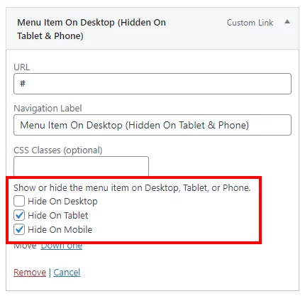
Enable this feature to add new checkmarks in the WordPress navigation menu items to show or hide the menu items on Desktop, Tablet, or Phone. Once enabled, each menu item in Appearance>Menus will have checkmark boxes which allow you to choose on which device sizes you want that particular menu item to be visible.
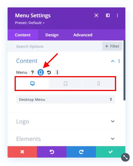
Choose Navigation Menu Per Device In Menu Module
The Divi Menu module is limited because it only allows you to select one WordPress navigation menu, and that menu shows on all devices. So we hacked the Divi Menu module and added responsive settings to the menu selection dropdown! Now you can choose a completely different navigation menu to show on Desktop, Tablet, and Phone!
Show A Hamburger Menu On Desktop
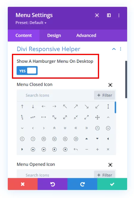
Opened/Closed Icon Picker For Menu Module
Choose which icons you want to use for both the opened and closed hamburger menu icons. The icon picker allows you to choose any icon included with Divi.
Add Text Beside Hamburger Menu Icon
Enable this feature to show a word or text to the left side the of the hamburger menu icon. This gives the visitor a visual indication or prompt to make it clear that it is the menu.
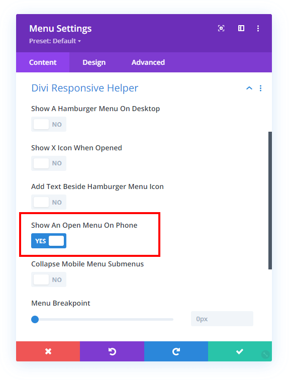
Show An Open Menu On Mobile
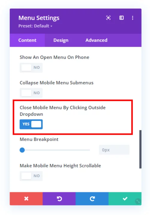
Close Mobile Menu By Clicking Outside Dropdown
If you are viewing a Divi site on mobile and open the menu, but then want to close it, you may tend to click (or touch) the area around the outside of the dropdown, thinking it will work like other apps and close the menu. But not so, it does not do that in Divi. So we created a setting to do just that, now you can close the mobile menu by clicking outside it!
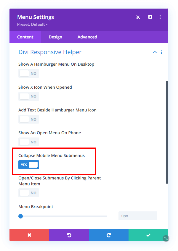
Collapse Mobile Menu Submenus
This feature allows you to collapse the submenus rather than keep them open, which is the default behavior. This really helps tidy up the menu and makes it much shorter as well.
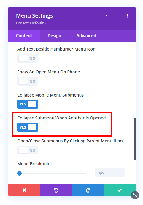
Collapse Submenu When Another One Is Opened
This setting makes any open submenu closes as soon as another submenu is clicked open. This way, there is only one submenu open at one time.
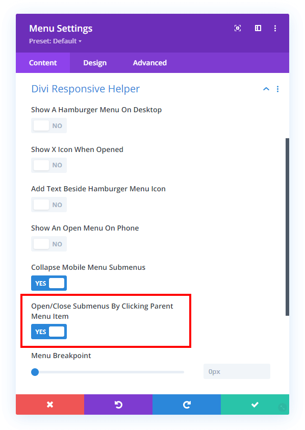
Open/Close Submenus By Clicking Parent Menu Item
This next new setting takes it a step further. After the submenus are collapsed, you can also choose to open and close the submenu by clicking the parent menu item. So for this, just keep in mind that it effectively disables the parent menu link. The parent link becomes the clicking point to open or close the submenu, just like the icon.
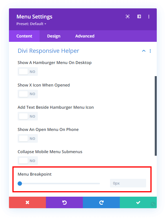
Menu Breakpoint
Enter the screen width pixel value for the responsive breakpoint for when the menu changes between desktop and mobile versions. This is helpful especially when you have a larger number of menu items that start to overlap due to space issues. Increasing the breakpoint higher than the default 981px allows the hamburger menu to appear on larger device sizes to prevent the ugly and unprofessional stacking issue.
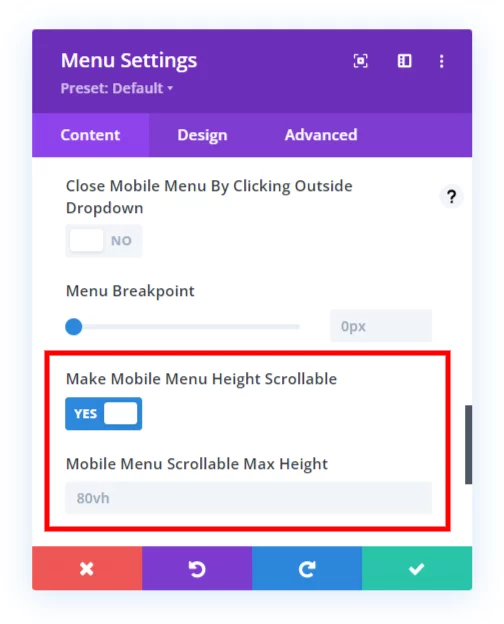
Make Mobile Menu Height Scrollable
You may find if you have too many menu items in your Divi menu that it will expand down below the screen, making some of the items cut off and out of reach. The background of the page scrolls, but the dropdown menu remains stationary by default. This quite the problem, and I am happy to say that our plugin solves this with a new setting that will allow you to make the mobile menu scrollable and set the height of the scrollable area.
