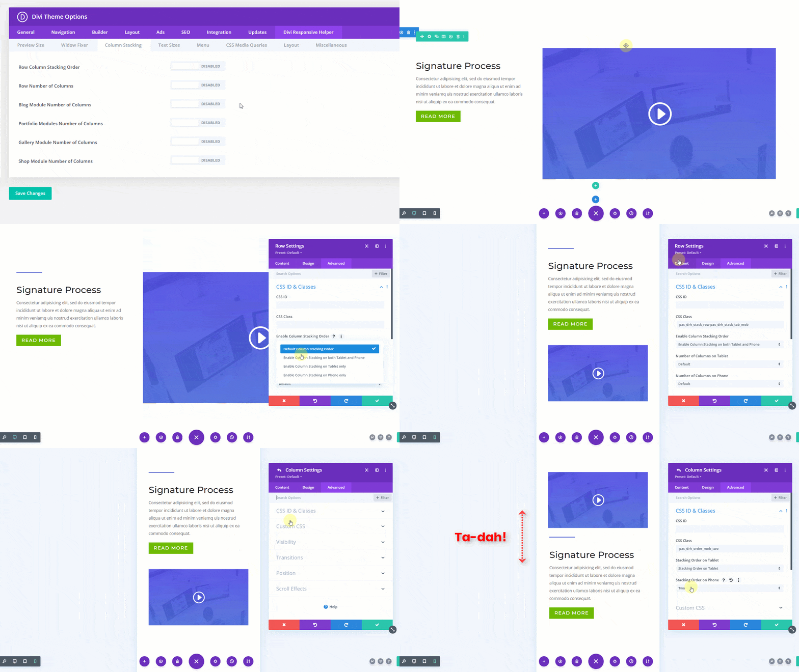
Row Column Stacking Overview
The Divi Responsive Helper plugin comes with two separate but related column stacking features that affect the columns inside any Row in the Divi Builder:
- Row Column Stacking Order
- Row Number of Columns
These two features allow you to control your Divi layouts on all devices and help make your sites responsive. In this document, we will look at the first one, the Row Column Stacking Order feature. This allows you to manually change the order in which the columns stack on top of each other on Desktop and Phone device sizes.
NOTE: This feature works great with the Row Number of Columns feature.
How To Use The Row Column Stacking Order Feature
1. Enable This Feature In Theme Options
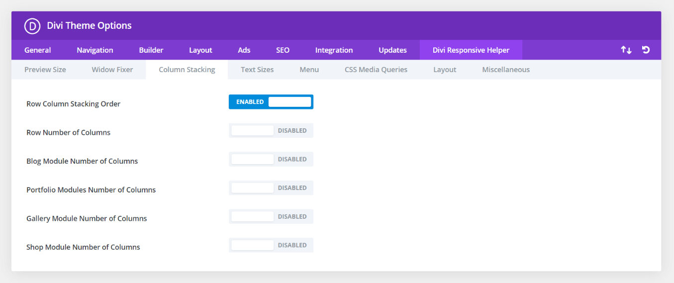
To begin using the column stacking settings, go to the Divi>Theme Options. There you will see a new tab that our plugin adds called “Divi Responsive Helper.” Once you click on that, you will see more tabs. Click on the “Column Stacking” tab to see all of the column stacking features in the plugin.
Enable the setting toggle called “Row Column Stacking Order.” Enabling this feature activates the additional settings located in the Advanced tab of the Divi Builder Row and Column settings for choosing the order in which columns stack on each device.
2. Adjust Column Order In The Divi Builder
Once the Row Column Stacking Order setting is enabled in Divi Theme Options, a new set of settings will appear in every Row in the Divi Builder.
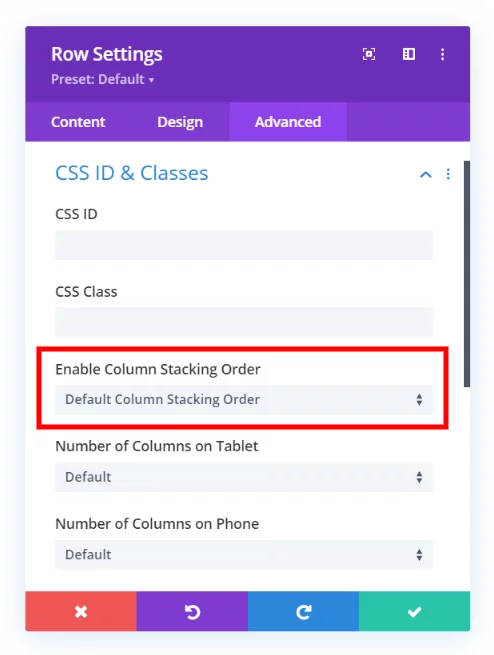
- Open up the Row Settings by clicking the gear icon.
- Go to the Advanced tab.
- Open the CSS ID & Classes Toggle.
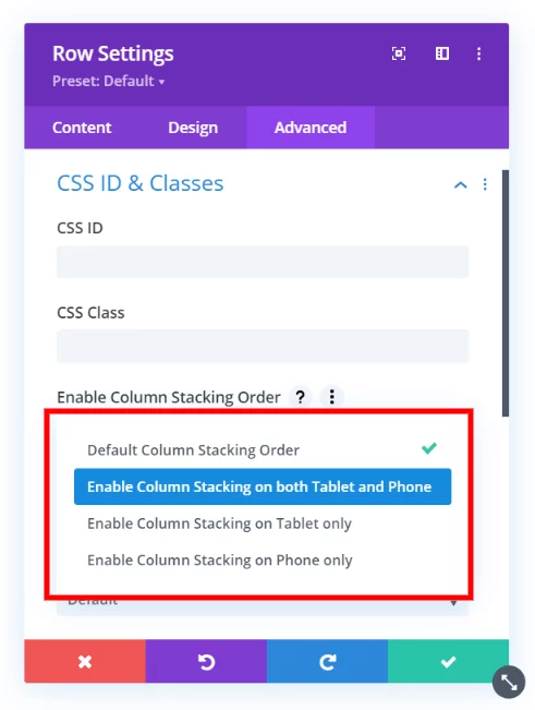
There you will see a new option called Enable Column Stacking Order. This is on the normal Divi stacking order by default, so you need to choose one of the following options three options:
- Enable Column Stacking Order on both Tablet and Phone
- Enable Column Stacking Order on Tablet only
- Enable Column Stacking Order on Phone only
3. Select The Individual Column Stacking Order
Once you enable the column stacking order setting you desire, you can proceed to the Content tab of the Row Settings.
- Open up the individual Column Settings by clicking the gear icon.
- Go to the Advanced tab.
- Open the CSS ID & Classes Toggle.
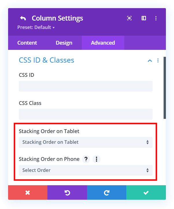
There you will see two new options:
- Column Stacking Order On Tablet
- Column Stacking Order On Phone
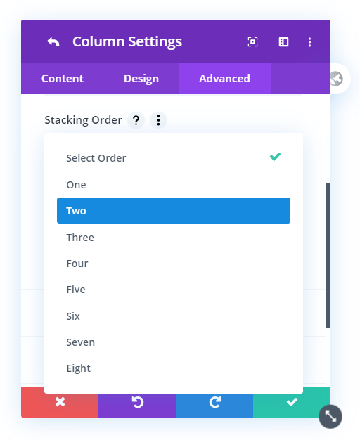
Each of these has a dropdown where you can select your choice of numbers from one through eight.
NOTE: You need to assign an order to EACH column!
When changing the column stacking order on Tablet or Phone, you need to make sure you set an order for each column. This important, otherwise the order will be conflicting with the default order and it won’t know what to do. Setting a different number for each column clearly specifies the order you want them to stack on each device.
For example, if you have a row with three columns, and want to swap columns one and three on mobile, you would also have to assign “Two” to column two.
Example Of The Divi Row Column Stacking Order In Action
The GIF below demonstrates the Row Column Stacking Order feature.
