Fun With Blurbs
Every Divi user loves the Blurb module, and for good reason! It is very versatile, and we have several Divi Blurb Module tutorials here on our blog and YouTube. In this guide, we will see how we can make our Blurb modules more stylish and user-friendly by adding a beautiful hover effect.
We created this when we were making demos for our new plugin called Divi Carousel Maker. You can see this blurb live and in action to test it out on our demo site here.
▶️ Please watch the video above to get all the exciting details! 👆
Add A Custom CSS Class To The Divi Blurb Module
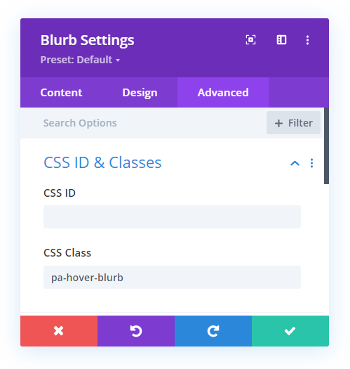
The first step is to place the Divi Blurb module in your layout and add an image, title text, and body text. Now go to the Blurb module settings>Advanced tab>CSS ID & Classes toggle and add the class “pa-hover-blurb” to the CSS Class input field. This allows us to only target this particular module with the CSS.
Make Some Design Adjustments
After adding your image and text, you can style the blurb however you want. If you want to match our example in the video and match the CSS, then I will provide the items I modified here for you to replicate.
- Add an image
- Center the text
- Add 15px border radius to the image
Note that if the image is horizontal, you will need to take extra care to make sure everything fits well. This may require you to make the title text smaller and shorten the body text.
Add The CSS Snippet For The Hover Effect
Now for the fun part! Go ahead and copy the CSS snippet below and add it to your site. Then afterwards I will note a few important parts of the code that you will need to adjust depending on your image size and amount of text. I recommend watching the video to see this in action.
If you are using our free Divi child theme, place this snippet into the style.css file. Otherwise, place this in your Divi>Theme Options>Custom CSS code box. If you need help, check out our complete guide on Where To Add Custom Code In Divi.
/*change the cursor when hovering over the module*/

.pa-hover-blurb .et_pb_blurb_content {
	cursor: pointer;
}


/*restrict the display of the description text before hovering*/

.pa-hover-blurb .et_pb_blurb_description {
	display: none
}


/*add a smooth ransition effect*/

.pa-hover-blurb .et_pb_blurb_container,
.pa-hover-blurb .et_pb_image_wrap {
	transition: all 0.4s ease-in-out;
}


/*restrict the triggering of hover effect when we hover on the title and align title to center*/

.pa-hover-blurb .et_pb_module_header {
	position: absolute;
	left: 60%;
	transform: translateX(-60%);
	pointer-events: none;
	width: 100%;
}


/*provide padding to description text so is doesn’t take the full width*/

.pa-hover-blurb .et_pb_blurb_description {
	padding: 0 5%;
}


/*place the whole content on image on hover and place it in center with different text color*/

.pa-hover-blurb .et_pb_blurb_content:hover .et_pb_blurb_container {
	position: absolute;
	top: 35%;
	transform: translateY(-35%);
	color: #ffffff !important;
	cursor: pointer;
}


/*place the overlay effect on the image on hover*/

.pa-hover-blurb .et_pb_blurb_content:hover .et_pb_image_wrap:before {
	content: "";
	position: absolute;
	width: 100%;
	height: 100%;
	background-color: #000;
	left: 0;
	top: 0;
	opacity: 0.5;
	border-radius: 15px!important;
}


/*make the position of the title relative on hover*/

.pa-hover-blurb .et_pb_blurb_content:hover .et_pb_module_header {
	position: relative;
	text-align: center;
}


/*change the title text color and font size on hover*/

.pa-hover-blurb .et_pb_blurb_content:hover .et_pb_blurb_container .et_pb_module_header {
	color: #ffffff;
	font-size: 2rem;
}


/*show the description text on hover*/

.pa-hover-blurb .et_pb_blurb_content:hover .et_pb_blurb_description {
	display: block;
}


/*zoom the image on hover*/

.pa-hover-blurb .et_pb_blurb_content:hover .et_pb_image_wrap {
	transform: scale(1.10);
}
Normal
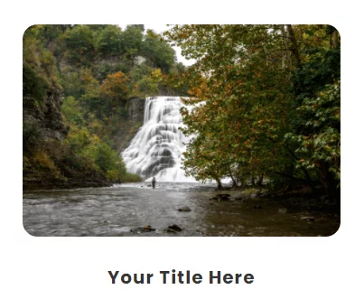
Hover
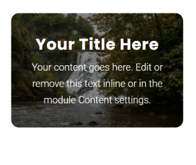
As mentioned, you will probably need to make some slight adjustments. The code snippet above is the one I used in the video, but your situation may be a little different. This is trial and error and you will need to use what works best for you.
It’s hard to show by words, so please watch the video. But some things to check are the header position (60% in my code), the description padding (0 5% in my code), the blurb container position (35% in my code), the header font size (2rem in my code), and the image scale (1.10 in my code). Adjust those to your liking and you are done!




I set up the Hover Reveal Effect on the second row but it doesn’t look like way how you set it up. you might have to update this blog
Hey Jonathan,
I am afraid that I am not able to spot the row where you are trying to have a revealing effect. Could you please share the exact URL for me to investigate further?
hi – we want a content box to appear, not the title.. how do we hide the title? the title takes up a lot of the hover box.
Hey Amanda,
Could you please guide me to the exact section where this issue is happening?
Hi There .. I am unable to centre the title text without having body text in place as well. Without any body text, the title text aligns to the left, even though it’s centred in the module. I tried altering your position values, but that also moves the visible text at the bottom of the box. Is it possible to just have title text on hover?
Hey Leonie,
Could you please share the URL of the page where you are facing this issue?
Really like this effect however how can I adjust the title text size on hover? It’s still massive and cuts off other text in some of of the content boxes. Site: melinanacos.com
Divi has hover effects for all settings, so you can use that built-in feature.
Hello Sir,
Thank you very much for this tutorial that is excellent as usual, You are the best from far in terms of divi tutorials.
I have two little issue with the blurb that you can maybe help me to solve.
1- When i t s not hover the title does not appear at the bottom of the image
2 – my bottom border is broken when it s hover
The module is the one under “Votre métier”
Good morning,
I’m using your child theme and added the code from the blurb hover effect tutorial to the style.css file. The changes are unsuccessful. If instead I add the code in divi option everything works. Where am I doing wrong ?
Thanks for any help.
It just sounds like cache, child theme files are typically cached, but theme options are not.
Hello, Thank you so much for this tutorial !
I just have a little issue, the code doesn’t work very well on the website I’m building, the blurb header does not center on hover. It’s set as centered in the blurb module options but it does not appear centered on hover.
Can you help me with that ?
Thank you so much !
Hi Celia!
Please add the following code along with the above codes and see if it helps.
.pa-hover-blurb .et_pb_blurb_content:hover .et_pb_blurb_container{
height: 100%;
display: flex;
flex-direction: column;
align-items: center;
justify-content: center;
}
Thanks for this snippet bundle (lol)
My text was not centered, so I added some padding… I don’t know if it is the proper way to do it but it works for me.
It was:
/*show the description text on hover*/
.pa-hover-blurb .et_pb_blurb_content:hover .et_pb_blurb_description {
display: block;
}
and now it is:
/*show the description text on hover*/
.pa-hover-blurb .et_pb_blurb_content:hover .et_pb_blurb_description {
display: block;
padding-left: 30px;
}
Maybe other people may need this too.