Add Icons Between Divi Columns
I often see sites that say three easy steps, 1 – 2- 3, or something like. One way to improve these is to add an arrow icon between the columns. So in this tutorial, I am going to show you how to add arrow icons between Divi columns. The arrow will be responsive on the right on Desktop, and the bottom on Tablet and Phone. I admit this is perhaps not the most valuable tutorial I ever did, but nonetheless I have seen people ask about it and I think it is worth knowing how to do.
▶️ Please watch the video above to get all the exciting details! 👆
Setup
Add Row, Columns, And Modules
There are a few setup steps that are needed for this, and then we will get to the CSS snippets that make this happen. First, I suggest creating your row with columns and add any modules into them. You could use a blurb, text, buttons, images, etc. You can also adjust any settings in the columns like adding a background color, padding, border, etc.
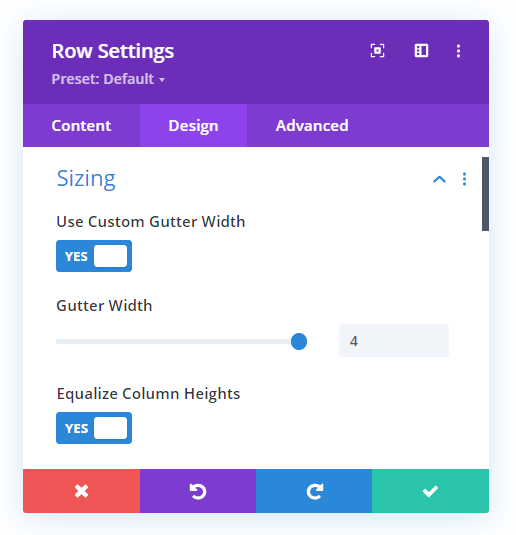
Adjust Row Gutter And Equalize Columns
This step is optional, but recommended. If you want more space between columns, this is called the gutter. So I suggest changing the row gutter width to 4 in the Design tab of the Row settings. Below that setting is another setting, and this is helpful if your content in the columns is not exactly equal. If you have a background color on the columns, turning this setting on will make them equal height.
Adjust The Column Margin Bottom On Mobile
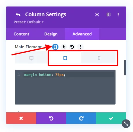
That solves the spacing issue on Desktop, but what about when the columns stack? We also need to add more space for responsive layouts to make more room for the icon at the bottom on Tablet and Phone. To do this, go to the settings of first two cololumns to the Advanced tab. Open the Custom CSS toggle and click on the responsive phone icon beside Main Element. Click on the Tablet tab and write “margin-bttom: 75px” (which will also apply to Phone too).
Overflow Visible
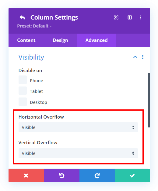
Another setting that may be necessary is setting the overflow on the columns to visible. You can do this by going to the Column settings to the Advanced tab to the Visibility toggle. There you will see Horizontal Overflow and Vertical Overflow. Set both of these to Visible.
Add The CSS
We have two snippets here that are slightly different. One of them has an arrow pointing to the right, while the other has an arrow pointing down. The position of the arrow is also different based on where the icon is added.
Where To Paste The CSS Code
1. Divi Assistant
If you are using our Divi Assistant plugin, simply paste the code in the CSS tab in the custom code window in the Divi Visual Builder.
2. Child Theme
If you are using a child theme, paste this code into the style.css file. If you don't have a child theme, you can generate a child theme directly on your site or download our free child theme.
3. Divi Theme Options Integration
Otherwise, paste this code in your Divi>Theme Options>Custom CSS code box.
If you need help understanding where to paste the code, please check out our complete guide about where to add custom code In Divi.
Add The Icon For Desktop
Go to the settings for both the first and second columns to the Advanced tab and open the Custom CSS toggle. Go down to the “After” input field. Hover over the setting and click on the responsive phone icon. This opens the Desktop, Tablet, and Phone responsive tabs. Paste this first snippet in the Desktop tab only.
Desktop
content: '\24'!important;
font-family: 'ETMODULES';
font-size: 50px!important;
font-weight: bold;
color: #d2007f;
position: absolute;
top: 50%;
right: -55px;
Add The Icon For Tablet And Phone
Go to the settings for both the first and second columns to the Advanced tab and open the Custom CSS toggle. Go down to the “After” input field. Hover over the setting and click on the responsive phone icon. This opens the Desktop, Tablet, and Phone responsive tabs. Paste this second snippet in the Tablet tab only. This will actually affect both Tablet and Phone, so no need to paste it into Phone.
Tablet & Phone
content: '\22'!important;
font-family: 'ETMODULES';
font-size: 50px!important;
font-weight: bold;
color: #d2007f;
position: absolute;
left: calc(50% - 25px);
bottom: -50px;
Here is how this looks with the design settings used in the video and the CSS snippets.
Edit To Your Own Liking
Now obviously these snippets are just starter snippets, and are meant to be modified. You can change the icon using the ETModules font family, change the color, change the size, position, etc. Have fun!






Thank you! I have a place where I could use this!
Nice Janis! Happy to hear it is benefiting at least one person 🙂
Nelson, Will this work with 4 columns?
Yes this should work for any number of columns, although you start to lose space when the number increases.
So glad you addressed this issue. Very useful! thanks so much Nelson!
Sure Javier, I’m so glad you like it!
Nice tutorial Nelson, but how do i insert a line or border between columns?
Please go to the Row Settings > Column Settings > Design > Border and there you can place the border right or left to the column to show a line in between.
Let us know if that helps. 🙂
Dear Nelson, Thanks for sharing this information. I followed every step, but I get two icons next to each other. Have you any idea how this is possible?
Hey Maarten,
Could you please share the URL of the website for me to investigate further?
Dear Nelson!
Thank you for this tutorial, i have the same problem as mentioned by Maarten, two icons next to each other.
Can you help me please what did i do wrong?
Tank you,
Mariann
Dear Nelson!
Thank you for this tutorial, i have the same problem as mentioned by Maarten, two icons next to each other.
Can you help me please what did i do wrong?
Tank you,
Mariann
Hi Mariann!
There seems to be an issue with the icon code. I have updated the code. Use ”\24″ as icon code content instead of previous one.
Thank you very much it totally solved the desktop view.
If i would like to use 4 columns on mobile view the arrows are overlapping to the image I use.
Can you tell me what variable could solve this?
Thanks a lot
Can you please share the page URL to investigate further?
Just what I needed! You may want to change “margin-bttom: 75px” to “margin-bottom: 75px”