Are We Missing Something?
Finding The Right-Align Divi Menu Setting
When the Divi Theme Builder was released with Divi 4.0, it brought with it a new Menu Module. This is a great new module with a lot of potential, but it also brought with it some confusion. The old standard menu was right-aligned by default, but the new Menu Module is left-aligned by default. Strange, right?
Many people started asking about this in the Facebook groups, and many were confused and upset. But the answer is quite simple — There are alignment options right there in the module settings, they are just not where you would expect.
▶️ Please watch the video above to get all the exciting details! 👆
How To Align The Divi Menu Text
Layout Toggle
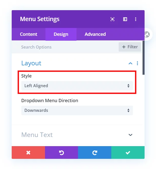
When you open the Menu Module to the Design tab, you will notice the menu Style has three options:
- Left Aligned
- Centered
- Inline Centered Logo
This is certainly confusing. The “Left Aligned” should say something like “Default” or “Custom,” so I’m not sure how that slipped through. Keep it on this setting, or if you had it on something else, set it back to “Left-Aligned” for this to work.
Menu Text Toggle
The answer is to go to the next toggle, the “Menu Text” toggle. Once there, scroll down and you will find the typical text-alignment options that we have for any other type of text.
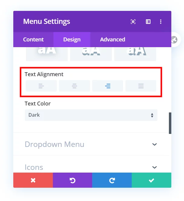
As you can see, there are options for left, center, right and justified text here. Changing this aligns the entire Divi menu text, and this is the hidden solution to an otherwise puzzling situation.




OK but… I have NOT this option when I try. Above text color, I don’t have text alignment
Hi Cédric, are you using the Menu Module?
Yes, of course (but in french)
1 : Select Layout Styel ” Left Aligned ”
2 : Go to “Menu Text ” you can visible ” Text Align ” option under “Text Shadow”
I also do not have this option. I’m using the Fullwidth Section with the Fullwidth Menu Module, and there is NO text alignment setting under Menu Text. I have looked everywhere online and cannot find a solution to this. Going to try Divi support next, I guess!
I figured this out! For anyone else stuck with this issue — make sure you have the Left-Aligned options selected under Layout. If you change the setting to Centered (which I had done) then the Menu Text alignment settings are not available. Change it back to Left-Aligned, then you can see the text alignment settings and choose Right, as suggested in this article 🙂
Yup, that’s why we made this tutorial…it can be confusing!
Hi Nelson, It would be good to update the tutorial to mention that you have to set the Layout Style to “Left Aligned” for the Text Alignment option to appear. Sure, you have a picture of it being selected, and you say that it should be called “Custom” or something like that, but you don’t actually mention that we have to select it for the second choice to appear.
Thanks Clay, I updated the wording to make it clearer.
Thank you very much, this was confusing.
Sure Jelske, it certainly is. Glad I could help point this out!
Hi Raeanne,
In my humble opinion, I do not recommend anything labeled “fullwidth” because they are very outdated. You would be better off using regular modules.
Thanks man – just what I was looking for!
You’re welcome John, and just an FYI, there is still a bug with the responsive Menu Text alignment that ET is working on.
PERFECT! Thanks!
Glad I could help, Holly!
Wow. Thank you!! I spent far too much time looking for this.
Haha Ryan, I know what you mean!
Thank you Nelson! So simple – really appreciate you posting this!
You’re welcome, I am glad this is helpful!
Is there a way to use the Inline Centered Logo for the Desktop and the left Alligned Version for the mobile devices?
That’s a great question, I think that would be a good feature but I don’t think you can.
Thank you for your answer. Okay i thought with some CSS it would be possible, but i am not good at it 😀
In my case i made in the Theme Builder 2 Headers – One is only activated for the Desktop Browser and the other for the mobile devices.
Can this cause some performance issues or something else?
Technically maybe but with that we’re talking a very, very, very tiny amount of difference. It is not a good thing to do a lot, but just one module duplicated like that is no issue.
Awesome man, thanks for this tip! Helped me fixed up the nav real quick.
You’re welcome Ryan! Glad to help!
Thank you so much, Nelson! I’ve been looking so long for this, while it’s just such a simple fix 😉
You’re welcome katrin!
This is great, Nelson, however, the dropdown menu is being cutoff (off screen) to the right.
Could you please share the URL of the page for us to investigate further?
I’m am experiencing the same thing. Is there a solution to this yet?
Is there a way to shift the logo also? The logo and menu text are now too far apart on desktop view.
I guess change the max-width of the menu?
How to move the menu to the top left corner, not just to the left a little bit?
You mean swap the menu and logo? Here: https://www.peeayecreative.com/how-to-move-the-divi-menu-to-the-left-and-logo-to-the-right/
HI. Is it possible to have some text in line with the mobile burger menu?
Hey Cherise,
I am afraid that I am not able to inspect the website due to some protection plugin you are saying. Please disable it and let me know so I can investigate further.
Thanks! this is absolutely nonsensical, what they’ve done. *facepalm*
I’m glad I could help!
Hey, when i set text-alignment to center, how can i set the hamburger menu to the right ?
Hey Cara,
Could you please share the URL of the website for me to investigate it further?
Hi Sir, Hope You are doing well
I want to create a header like a logo on the left navigation menu in the center and search icon on right side
if you provide me CSS i am very thankful to you
thanks Sir
Hey Arun,
You are using the Theme Builder header so there is no need to place the logo in the center using the CSS, you can create a column to place it.
Thank you so much for this, the setting for Layout > Style > Left Align was the ticket for me. Once I set that to its ‘default’ state I was easily able to right align my menu. Thanks for the tip!
You’re welcome!
Thank you! that was so simple!
You’re welcome Fred, glad you like it!
Is there a way to have the menu and logo centered on computer sizes but then on mobile be logo left and menu right? Not a fan of the mobile version of the centered menu. Would be super helpful.
Hi Jenna!
Please add the following code for left logo menu on mobile and tablet (Add the class ‘pa-menu-left’ in the Menu module):
@media all and (max-width:980px){
.pa-menu-left .et_pb_menu_inner_container {
display: flex;}
}
I am not sure where do I fond the Menu Module ? Thanks for advising.
Hi Matt!
Sorry, I’m not sure I understood the issue properly. The Menu module is present in the normal modules list and fullwidth menu module under fullwidth section.
Thank you very much!!! just what I was looking for…
I’m so glad this was helpful!
OMG Thank you. I was tearing my hair out.
Hi Wyn,
I’m so glad you found this! I for one do not have much hair left 😉
Thank you so much!
However, on mobile the hamburger menu still displays on the right and, if I switch to an open menu on mobile instead of hamburger, the mobile open menu displays on the right too…
Any tip to fix this issue would be much appreciated!
Thank you!
Hi Anais!
Can you share the URL of the page to investigate further?