
This Is Going To Be Fun One!
Math + CSS + Photography = Fun! 🙂
When I was designing my Divi Paving Child Theme, I needed three images to be the same proportion no matter what size the end user uploaded, since they may not be as familiar with how to adjust that in Photoshop. So I thought I’d share with all my great Divi friends how to do this too!
▶️ Please watch the video above to get all the exciting details! 👆
Explanation & Calculations
How To Force Change Divi Image Aspect Ratios
Most of us are familiar with image or video aspect ratios. Lots of times our devices are made to these proportions as well. The first number in the ratio is the width, and the second number is the height. As you can see in the CSS examples below, the CSS trick works with padding and uses a percentage. Basically, the percentage is the height divided by width. To calculate what percentage to use in the CSS for the Divi image aspect ratios, just use this math formula.
- Divide the second number by the first number
- Move the decimal over two places to the right
- Add a percent sign
Square 1:1 – 1 / 1 = 1.00 = 100%
Landscape 16:9 – 9 / 16 = 0.5625 = 56.25%
Landscape 4:3 – 3 / 4 = 0.75 = 75%
Landscape 3:2 – 2 / 3 = 0.6667 = 66.67%
Portrait 9:16 – 16 /9 = 1.7778 = 177.78%
Portrait 3:4 – 4 / 3 = 1.3334 = 133.34%
Portrait 2:3 – 3 / 2 = 1.5 = 150%
Now you can use this formular for other sizes as well!
NOTE: We just found out if the image link is set to open in a lightbox this will not work. However, this is uncommon and we will look for a solution.
Examples & CSS Snippets
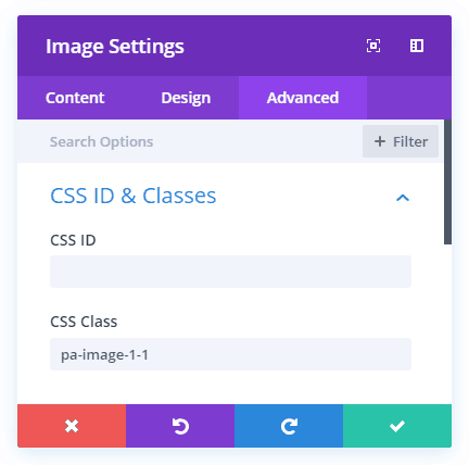
NOTE: Always be sure to add the correct class to the image module for your desired aspect ratio. In this tutorial, I kept it very simple! 🙂 (Just take out the dot at the beginning.)
Where To Paste The CSS Code
1. Divi Assistant
If you are using our Divi Assistant plugin, simply paste the code in the CSS tab in the custom code window in the Divi Visual Builder.
2. Child Theme
If you are using a child theme, paste this code into the style.css file. If you don't have a child theme, you can generate a child theme directly on your site or download our free child theme.
3. Divi Theme Options Integration
Otherwise, paste this code in your Divi>Theme Options>Custom CSS code box.
If you need help understanding where to paste the code, please check out our complete guide about where to add custom code In Divi.
Square 1:1
/*image aspect ratio square 1:1*/

.pa-image-1-1 .et_pb_image_wrap {
padding-top: 100%;
display: block;
}

.pa-image-1-1 .et_pb_image_wrap img {
position: absolute;
height: 100%;
width: 100%;
top: 0;
left: 0;
right: 0;
bottom: 0;
object-fit: cover;
}
Landscape 16:9
/*image aspect ratio landscape 16:9*/

.pa-image-16-9 .et_pb_image_wrap {
padding-top: 56.25%;
display: block;
}

.pa-image-16-9 .et_pb_image_wrap img {
position: absolute;
height: 100%;
width: 100%;
top: 0;
left: 0;
right: 0;
bottom: 0;
object-fit: cover;
}
Landscape 4:3
/*image aspect ratio landscape 4:3*/

.pa-image-4-3 .et_pb_image_wrap {
padding-top: 75%;
display: block;
}

.pa-image-4-3 .et_pb_image_wrap img {
position: absolute;
height: 100%;
width: 100%;
top: 0;
left: 0;
right: 0;
bottom: 0;
object-fit: cover;
}
Landscape 3:2


/*image aspect ratio landscape 3:2*/

.pa-image-3-2 .et_pb_image_wrap {
padding-top: 66.66%;
display: block;
}

.pa-image-3-2 .et_pb_image_wrap img {
position: absolute;
height: 100%;
width: 100%;
top: 0;
left: 0;
right: 0;
bottom: 0;
object-fit: cover;
}
Portrait 9:16

/*image aspect ratio landscape 9:16*/

.pa-image-9-16 .et_pb_image_wrap {
padding-top: 177.77%;
display: block;
}

.pa-image-9-16 .et_pb_image_wrap img {
position: absolute;
height: 100%;
width: 100%;
top: 0;
left: 0;
right: 0;
bottom: 0;
object-fit: cover;
}
Portrait 3:4
/*image aspect ratio landscape 3:4*/

.pa-image-3-4 .et_pb_image_wrap {
padding-top: 133.33%;
display: block;
}

.pa-image-3-4 .et_pb_image_wrap img {
position: absolute;
height: 100%;
width: 100%;
top: 0;
left: 0;
right: 0;
bottom: 0;
object-fit: cover;
}
Portrait 2:3
/*image aspect ratio landscape 2:3*/
.pa-image-2-3 .et_pb_image_wrap {
padding-top: 150%;
display: block;
}
.pa-image-2-3 .et_pb_image_wrap img {
position: absolute;
height: 100%;
width: 100%;
top: 0;
left: 0;
right: 0;
bottom: 0;
object-fit: cover;
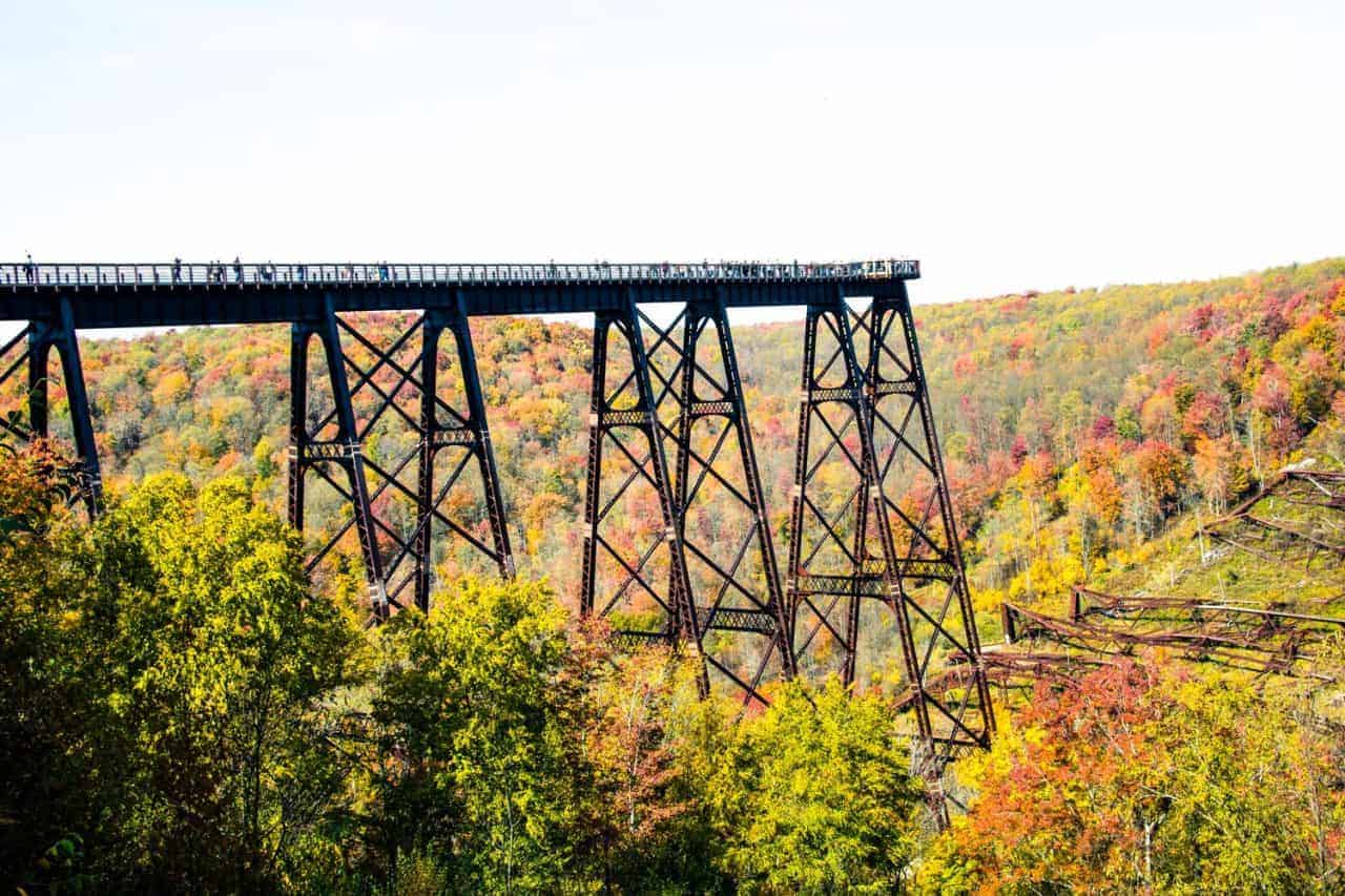
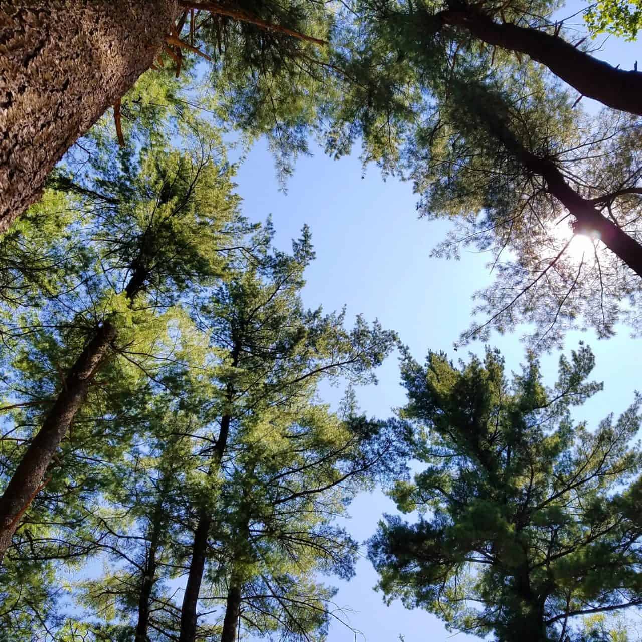
}Like these photos?
Join us on Instagram!
Those images were all taken by myself in Pennsylvania. If you happen to like that sort of thing, follow my Instagram pages for more photos!


Awesome tutorial/snippets! Thanks a lot!
You’re welcome, Elisandro! I’m glad you like it and hope you find it useful in your projects! 🙂
You bet, Nelson! Unique resource! 🙂
Thanks for this –
But I am finding that this does not work all I get is very very thin images? am I missing something?
Hi there, please share a link so I can try to see why it isn’t working for you. I’ve tested and used this many times, so I know it should work 🙂
Follow-up to my earlier message: I see now that I missed that the code is for the image module. I actually need to do this for the blog module. What changes would I make?
Hi Tim,
This same solution works for other modules, but the thing that needs changed is the css class that it is targeting. So for the blog module, use a.entry-featured-image-url instead of .et_pb_image_wrap
Thanks for the tip!! I am trying for a text module (so that I can then apply a text/image hover affect). What would I use instead? Thank you 🙂
Hi Kat,
Check out this tutorial: https://www.peeayecreative.com/add-button-text-centered-over-image-divi/
Hi again! Thanks for the quick response. I saw that tutorial but it is not what I am after because I do not want the text to be there permanently.
I would like the image to be displayed and then on hover have a gradient with text displaying overtop explaining what it is (this is for my portfolio). All images need to be square.
The projects/galleries divi modules are not flexible enough – fixed columns + image sizes and no text option for hover.
Sooo I wanted to try your 1:1 code in a text module (cause I have figured out how to overlay the text/gradient). Orr if you have another solution for how to make this work with the other divi modules I am all ears!!!
Thanks again 🙂
Hi Katrina,
In that case, just apply the code from the other tutorial on hover! So in the CSS snippet add :hover before the first {
Hi, now en english 😉
Very interesting. My question is … is there a way to combine vertical and horizontal images in the same gallery and that the thumbnails come out horizontal (for horizontal and vertical images (for vertical images. My problem is that, any layout option I choose cuts out the thumbnails. If I have combined images, I hope you understand, thanks.
Hi Nicolás,
I think I understand, you are thinking more of a grid of images that is like Pinterest where no matter what size they all stack? I will look into that for sure! Keep an eye on the blog!
Dear,
I was very glad to see your solution. In a certain way it helped me out! So thanks!
But the case is that my photo’s are all zoomed in right now.
I cut them in the right aspect ratio in photoshop but still it doesn’t work.
See the link below:
https://handirkx.com/original-artworks/
In future it have to work without photoshop aswel.
Thanking you in advance.
Hi Hendrik,
Please double check your code, the point of this tutorial is to NOT use Photoshop. It certainly does work, as you can see in the live examples.
Hi, trying to use this for the blurb module but my css isn’t taking – modified selector is e.g .pa-image-1-1 .et_pb_main_blurb_image (Iguessing this is wrong?)
Hey Gavin,
The blurb image is a bit different because of the way 100% height makes the image fill the entire blurb div. I was trying to hack it, but there is no good way to do it. However, now that we have column design options, there’s rarely a use case where you can’t use an image and a text module instead of a blurb.
I see. Thanks very much – loving your tutorials, site and approach, keep it up! 😊
I’m so glad, Gavin! Thanks for those kind words, and do let me know if you have ideas and suggestions for hacks and tutorials 🙂
Great!
Thank you, glad you like it!
Unfortunately I can’t get this to work.
You tell us to put the ‘snippet’ in the Custom CSS box, but there are THREE Custom CSS boxes: Before, Main Element, and After.
should we be putting parts of the code you gave us into more than one of these boxes? Or all into one box? WHICH ONE(s)?
Hi Jim,
Here’s what it says “As usual, you can copy and paste these CSS snippets into the Divi>Theme Options>Custom CSS box.” You need to go to your Dashboard, then click Divi, then click Theme Options, scroll down, and the custom css box there is where you put the CSS for any tutorial we have.
Thanks for this – this is working as long as I know the aspect ratio I need in advance; however, what if I don’t know the aspect ratio that is needed because the height of the element might change while the width does not? \
For instance, if I have a row where I set “Equalize Column Heights” to yes and the tallest column is a text column, how can I make sure that my image in another column actually fills the entire column height and width, even if the height of the text should change?
Hi Lance,
I think I understand what you are asking, but this is different than the tutorial. You could try setting the min-height for the image to 100%, then set the overflow (advanced tab>Visibility toggle) to hidden. Or you could try just putting the image as the background of the column, and it will do exactly what you describe (just add a divider module to keep some height in the column).
Thanks, Nelson. Yes, I realized that this was different from the tutorial, but your tutorial is the closest thing I have found to anyone explaining how to do what I was trying to do, so thought I’d ask, anyhow. As it happens, I played around and ended up deciding that making the image a background image for the column was the best way. Thanks for the reply, and for your tutorial series.
thanks however it didn’t work. As I paste the code, I get some errors in red and nothing happens to the image. I tried a few times but keep getting the same.
As I noted before, the errors are not real errors. Divi simply does not know the CSS. The CSS is perfectly valid and works even if the Divi Builder things otherwise 🙂
hello excellent your tutorials I would like to know how you put wpdiscuz in a single column thanks
Hi Cristian, what do you mean by a single column?
Hello if you look for example here https://www.dondemiveterinario.com/cuidadoybienestargatos/como-saber-si-mi-gata-esta-embarazada/. I want the comment box not to be full width if not in the row where the text is.
Hello Nelson… will this css id work on the image inside a blurb module… as the blurb height becomes same but the image height does not.. thanks
No it would not work for a blurb. You could adapt it by changing the CSS class to target the blurb image, that could work!
It’s been a while since you wrote this, but I thought I’d share the solution I found for the blurb module here. Perhaps people find it useful. Almost all credit for this goes to Tom Greer (https://trgwebdev.com/force-divi-blurb-module-images-to-a-uniform-size/)
I simply played around with his code and adapted it to your pa-image- classes..
Basically, it’s just what you suggested, but it’s a little trickier to figure out the right classes to target.
And there is one important addition, “position: relative” for the container class.
So, here goes (I just put the 1:1 example here):
/*image aspect ratio square 1:1*/
.et_pb_blurb.pa-image-1-1 .et_pb_main_blurb_image {
display: block;
position: relative; /* needed for blurb module image */
}
.et_pb_blurb.pa-image-1-1 .et_pb_image_wrap {
padding-top: 100%;
}
.et_pb_blurb.pa-image-1-1 .et_pb_image_wrap img {
position: absolute;
height: 100%;
width: 100%;
top: 0;
left: 0;
right: 0;
bottom: 0;
object-fit: cover;
}
Enjoy!
Andreas
Beautiful! You helped me soo much!! thanks a lot!
You’re welcome Elena!
Hi Nelson, Thank you for the passion of teaching and sharing your knowledge. I have a square image which I placed in my gallery module. 3 of them fit in a row inside the module.
problem: the aspect ratio is not 1:1 the height is full but the width are cropped.
I posted pa-image-1-1 in the gallery module CSS Class field. And the rest of the code to the page settings advanced > CSS field
It didn’t work. Please help.
Hi Tim,
First of all, you are saying “gallery” but this post is not about the gallery. This one here is for the gallery: https://www.peeayecreative.com/change-the-divi-gallery-image-aspect-ratio/
Secondly, if the image is not square (which is why you would be using this) then something has to be cropped, whether that is the height or width.
Try using the gallery code and then let me now if I am not understanding something.
Hi Nelson,
Thank you for responding. My images are square but the thumbnails only shows 80% of the image starting from the center.
I will study the link you provided. Try it and let you know.
Thanks.
Hi,
it seems it’s not working on my website.
I found a solution for the portfolio but not for the gallery. Thanks for any help! 🙂
Hi Claralinda,
You can always check out the alternative post here: https://www.peeayecreative.com/how-to-stop-divi-image-crop/
Hi Love this Tutorial thank you. I noticed that it will not work on the blog templates in divi. For example I have featured image that will changes to different sizes but when i apply the ratios it ignores them. I placed the code in both template and page layouts? Any thoughts
Hi Rudy,
This code would only work in the Divi Blog module because that is the code it is targeting. It would not affect images on the actual blog posts.
Wonderful explained, thank you so much.
Just tried to ‘combine’ your code within a media query to get a square ratio, but the images diesappears then, see here: http://modefolles.de/wordpress/ the bw portrait image. do you see a possibility to combine? this is the code I used:
@media all and (max-width:768px){
.et_pb_image_wrap {
padding-top: 100%;
display: block;
}
.et_pb_image_wrap img {
position: absolute;
height: 100%;
width: 100%;
top: 0;
left: 0;
right: 0;
bottom: 0;
object-fit: cover;
}
}
Hi Michael,
Adding a media query would not make it disappear. There must be something else going on, some other factor.
Thanks a lot for your awesome materials.
I’ve try this tricks with tall image 1000*1500 but unfortunately doesn’t work.
Please if you’ve any suggestion let me know it
my regards.
Hi Amine,
What have you done exactly? Can you share a link and explanation of what steps you have tried?
Thanks, Nelson – remains useful to this day. And there’s no way I would have figured this out!
My image looks much better now, although the crop is central and I would prefer it at the top.
People can also experiment object-fit depending on requirements (try contain or scale-down).
Glad this is still helpful! Thanks for sharing!
Has anybody figured out a way to make Divi crop from the top of the image rather than the center?
I’ve noticed since I last updated the Divi Theme my cropped images are no longer displaying correctly. There is space around them. Any one else having this problem?
I need help. I used this to resize images to 1:1 ratio. It initially worked but in the last couple of weeks, if I work on a web page, even though in DIVI editor, it shows the images as 1:1, when I save, the images are not showing correctly. I even deleted the images and added them back in one at a time. Not sure why this is happening. Here is an example of a web page that I just tried to update. https://potomacfiberartsguild.org/instructors/
I definitely made sure that I was applying this to images and not a different module.
Our overall page is showing this same issue on the three pictures towards the bottom of the page and again, the only difference is that I updated a picture about a week ago.
https://potomacfiberartsguild.org
Hi Kristine,
While editing in the Divi Builder everything is showing fine but when you exit the builder the result changes can be a problem of cache so could you please delete your cache by going to the Divi > Theme Options > Builder > Advanced and click on the clear button in front of static CSS file generation to clear the cache. After doing that please try opening the website in the incognito mode to see the actual visitor’s view.
Let me know if that helps. 🙂
Another great tip, thanks 🙂
It stops working if I set the image to open in a lightbox though. Is there a straightforward fix you’re aware of?
Hi Paul,
I am afraid that I am not able to replicate the issue on my end. Please make sure you are following all the steps correctly.
Hi Hemant, Sure. I’ve checked it carefully. I did notice that it doesn’t work unless I set image to force full width, which isn’t mentioned above. The moment I set image to open in a lightbox it just disappears. Switch that off, it re-appears !
I’ve setup a temporary URL to link your through to an example page where you can see it https://www.temporary-url.com/6822 . See last image on bottom of page.
It seems that the lightbox image is responding differently from the frontend image. We will look into the issue and will get back as soon as possible.
Hemant, I was able to fix it. Two issues – I had some flex CSS on the columns, which caused the image to shrink to zero size (my bad!). In the image module, the toggle to configure different heights & widths for images on desktop/tablet/mobile was toggle-on, though not actually in use. This caused images not to stretch to cover properly (they’d stretch to width, but not height). Both corrected & it now works. Thanks 🙂
I am very glad to hear that. Please let us know if you need any further assistance. 🙂
Can’t seem to get it to work on certain blurb images.
I’ve added the class ‘.ookinteressant’
.ookinteressant .et_pb_main_blurb_image a {
padding-top: 60%;
display: block;
}
.ookinteressant .et_pb_main_blurb_image a img {
position: absolute;
height: 100%;
width: 100%;
top: 0;
left: 0;
right: 0;
bottom: 0;
object-fit: cover;
}
but it doesn’t seem to work.
See: https://dev.ernstdejong.nl/ouders/wat-is-passend-onderwijs/ bottom of page
Hi Ernst,
I am afraid that this guide is the one that works for the Image Module and not the Blurb and that’s why you are facing the issue.
I find the proper use of images with Divi to be totally frustrating. It’s good that you are providing excellent tutorials such as this.
I may be misunderstanding but It seems to me changing the aspect ratio could be seen as an uncontrolled crop in as much as there is no way of knowing what parts of the image will be lost. It would have been useful to see the impact of a change in aspect ratio on an actual image rather than on the default image space.
Cropping I see as a deliberate removal of unwanted parts of the image – too much foreground, height, etc. Of course this could have the opposite effect of changing the aspect ratio while cropping.
Thanks in advance for your comments.
Hi Tony,
This guide is about how you can crop Divi Images and change the aspect ratios. It makes sense that cropping can be uncontrolled but this is a quick and working solution for the people who have already uploaded all the images in the Media Library but if you are one who feels cropping is not a good practice then you can ideally resize the image first using the image resizing tools and then upload the image in the library and use it in the image module.
It doesn’t work in iOS. I applied this css in a divi image module but in iphone it is not correctly shown.
Hey Stefano,
It would be great if you share the URL of the page so that I can replicate the issue on my end as well and look for a fix.
Excelent!!
Glad you like it John!
Hello, I tried 1 : 1 aspect ratio for my home page images and works well. but it doesn’t work for the mobile devise version. Any advice on how to fix it.
Code would not be different on different devices unless it is placed within a media query.
Very nice way to solve a simple problem. Thank you.
You’re welcome!
Hi Nelson,
great solution.
Unfortunately I have an issue with the images on which I have a scroll effect applied and the image has an absolute position so I can make it stick to top. The scroll effect is not working. Any solution to this?
UPDATE
Well I found out what is the issue. Due to the probably object fit, padding-top the scroll start is way latter… I’ve had to play with the scroll settings in order to get closer to what I had before. I will take it as a compromise since it approaches me to what I want.
If there is some css code which might overwrite what is happening now with the scroll I would appreciate it.
Any way thank you.
That sounds like you solved it. If not, you can try our new Divi Image Helper plugin which uses the aspect ratio CSS instead.
Awesome tutorial! I’m trying to create a collage with the code and it has worked nicely but, is there a way to shift the focal point for a single image, without cropping manually to keep subjects in the middle?
I need the full image for the lightbox view, but when I display it in the collage the focal point is centered, and sometimes the subject in the image is a little higher or lower.
HI Leane!
Please add another class in the Module like pa-image-spec and change the padding to it as per your requirement.
.pa-image-spec .et_pb_image_wrap {
padding-top: 40% !important;
padding-bottom: 40% !important;
}
Change the values in the code as per need. Let me know how it goes!
So clean, so nice!
Thank you so much.
As I’d thought about it I think it would b cool to have an image that could be place in a column, and always fit/fill that column width/height as long as it’s by itself. I started to sort out the code myself and then I thought you’ve probably already done it… sure enough, you’re way ahead of me!
Here is that link for anyone else who’s looking
https://www.peeayecreative.com/how-to-make-an-image-module-fill-the-column-height-in-divi/
Cheers
Thank you very much for sharing the feedback! I’m glad it worked for you.
This is awesome! Is there a way to do the same thing with images you have done here, on your Events Carousel module in the Divi Events Calendar plugin? I want the displayed images to be the same size, no matter what size of image the staff editors put in as the featured image. Thanks!
It would probably not quite work the same, but you could use the new CSS property aspect ratio and that should work. We did add settings for this to the Events Feed and Events Calendar modules.
What can I add to the CSS code in order to crop the images only on tablet and mobile devices?
Hi Geneva!
You can add the code under the media queries. Please add the code within the following query:
@media all and (max-width:980px){
//Code here
}
This has been very helpful, thank you!
I’m still having a cropping issue using Divi Gallery. The images are now appearing as squares thanks to the “pa-image-gallery-1-1” class, but it seems the Gallery Module is pulling my images cropped at 400 x 526, resulting in a cropping of my images. (eg: the images are img src = “/uploads/my-image-url-400×526.jpg” instead of any square thumbnail crop) . All of my original images are squares, so the cropping is noticeable. Do you know if there is way to fix this? I believe the module is getting this cropping information from the “Thumbnail Orientation” setting in the design.
Hi Christina!
We need to add some PHP code to uncrop the images in function.php of the child theme. Please check this guide to uncrop the Gallery images: https://www.peeayecreative.com/how-to-stop-divi-image-crop/
Another way to auto crop is to use 100% height or width. This way the image will crop according to the column size no matter the ratio and you can preview it directly.
Hi Nick!
Thank you for sharing an alternative with us. We will surely test it out.
I’m trying to use this code for my blog list modules on mobile only, but it doesn’t seem to work. Is this code only for the image module? And if so–is there another tutorial that can help me crop blog images to 3:4? Thanks!
Yes this tutorial is for the image module, but we have one for the blog which you can find by searching or by category: https://www.peeayecreative.com/change-the-divi-blog-image-aspect-ratio/
Hi! First off I love your content, it has been very helpful with navigating divi and getting the most out of it. I am struggling with the ratio image cropping on mobile. The cropping works fine on desktop but when I view it on mobile the images are not converting to the ratios I’ve set for them.
Hope to hear back soon!
Hi Liliana!
There must be some overriding CSS that would be causing the issue on mobile. Can you please share the URL of the page to investigate further?
Hi Hemant!
Yes this is the site that’s having issues. I’m sharing one page but all of the cropped images are not showing up properly. https://cwclosangeles.org/ourteam/
Thanks in advance!
I can see that the width variable is overridden on the mobile, so adding important should work. Change the code to the following one:
.pa-image-1-1 .et_pb_image_wrap {
padding-top: 100%;
display: block;
}
.pa-image-1-1 .et_pb_image_wrap img {
position: absolute;
height: 100%;
width: 100% !important;
top: 0;
left: 0;
right: 0;
bottom: 0;
object-fit: cover;
}
Let me know how it goes!
Is there anyway to do this but with the Woo Product Images slider? Right now, if the images are different aspect ratios, the slider flexes up and down to accommodate the different image heights. Instead, I’d like to automatically crop and fill the view port based on our most commonly used aspect ratio.
Hi Oscar!
We’ll look into the Woo product images slider and provide a solution in the future!
Hi there – this is brilliant! Im just having a few problems on the mobile / tablet screen sizes, on some images it seems to not crop to 1:1
https://www.sounds-better.co.uk/exhibition/
Thanks
Hi Paul!
The page needs a password. Can you please share it?
Sorry I ended up locking it down – here’s the password.
$ound$Better1980@
Thanks
I have checked and all the images seem to be in a 1:1 ratio (510px * 510px). You can inspect the page and check the dimensions. Let me know if I’m missing any specific image.