Easily Make The Blog 2 Or 4 Columns
I’m starting a series on the Divi Blog module, and what better place to start than with an extremely easy and quick snippet that changes the Divi blog module into any number of columns you want! I’m really excited about this, because it’s so quick and easy even for beginners! Only 1 lines of CSS is needed to change the Divi blog module to any column number you need! We also add a space between the columns, which technically makes 2 lines of code, which still incredible! The best part is, we are putting them directly in the Divi Blog module!
Most of the other tutorials about this are very long and involve quite a lot of code, and most of them no longer work. So I enjoy making solutions that are truly simple and easy for you! If you enjoy that, then please subscribe because this is what I do every single week!
▶️ Please watch the video above to get all the exciting details! 👆
FYI: You can do this with a setting directly in the Divi Builder with our popular Divi Responsive Helper plugin! Take a look, it is so easy!
Make Divi Blog Module Into 2 Columns
Let’s start with changing the Divi Blog module column count to two. By default, the Blog module comes in at 3 columns when the layout is set to Grid, and 1 column when the layout is set to Fullwidth.
In order to keep this very, very simple, we need to set the Layout to Fullwidth.
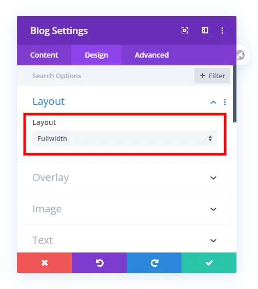
Now go ahead and copy and paste the two lines of CSS below into the Blog module. You will need to go the Advanced tab and open the Custom CSS toggle. There you will see the Main Element, which is exactly where you should paste this snippet.
column-count: 2;
column-gap: 60px;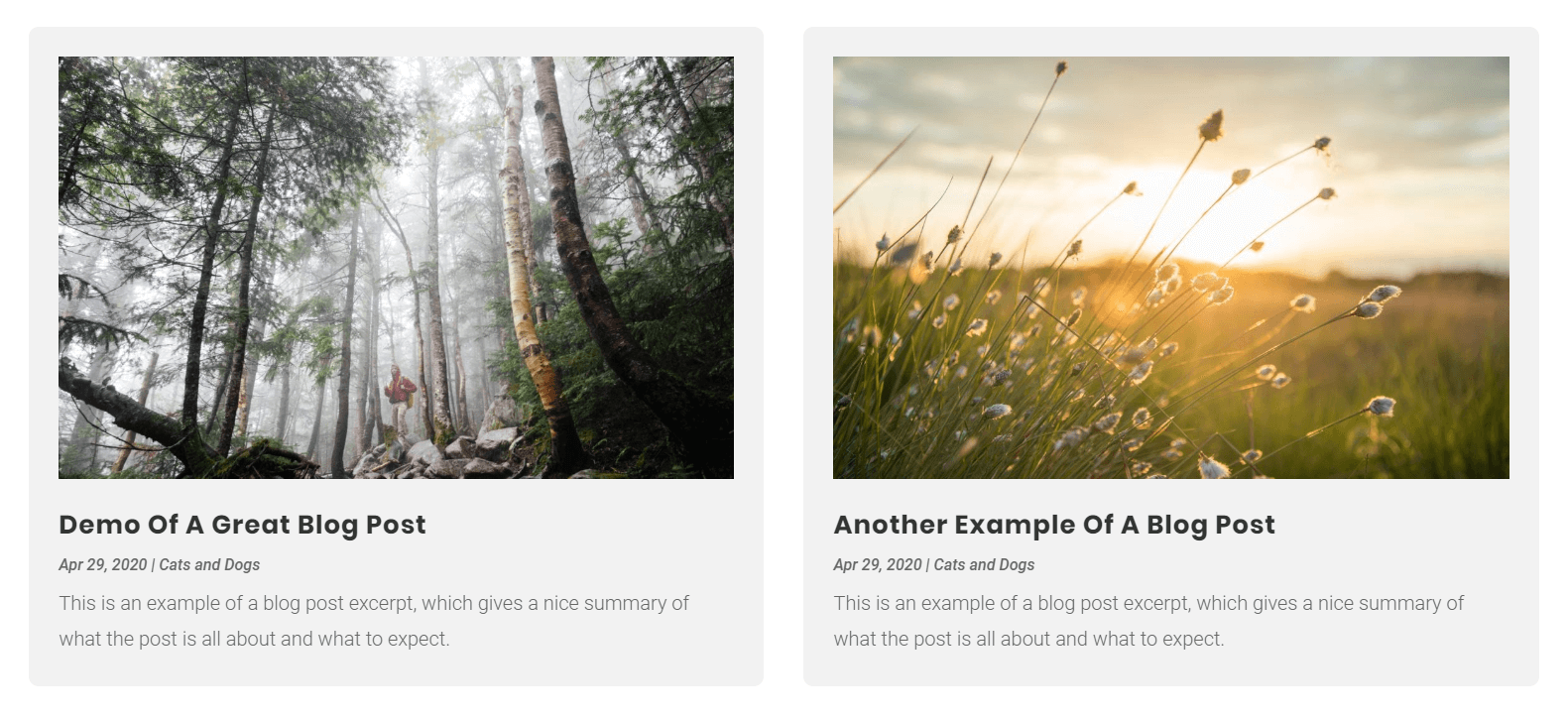
Boom! There you go! That was incredibly easy, right?
Make Divi Blog Module Into 4 Columns
Let’s try another one. You can change the count to anythign you want, but if you go too high the postt will get too small. Also note that you can’t use 3, since 3 is the default when the module is set to Grid. So let’s set the blog module column count to 4. Like before, make sure the layout is set to Fullwidth in the Design tab.
If you pasted the snippet before, just change the number to 4 instead of 2. If not, copy the CSS snippet below and paste it into the Blog module in the Advanced tab. Just open the Custom CSS toggle and you you will see the Main Element, which is where you should paste this snippet.
column-count: 4;
column-gap: 60px;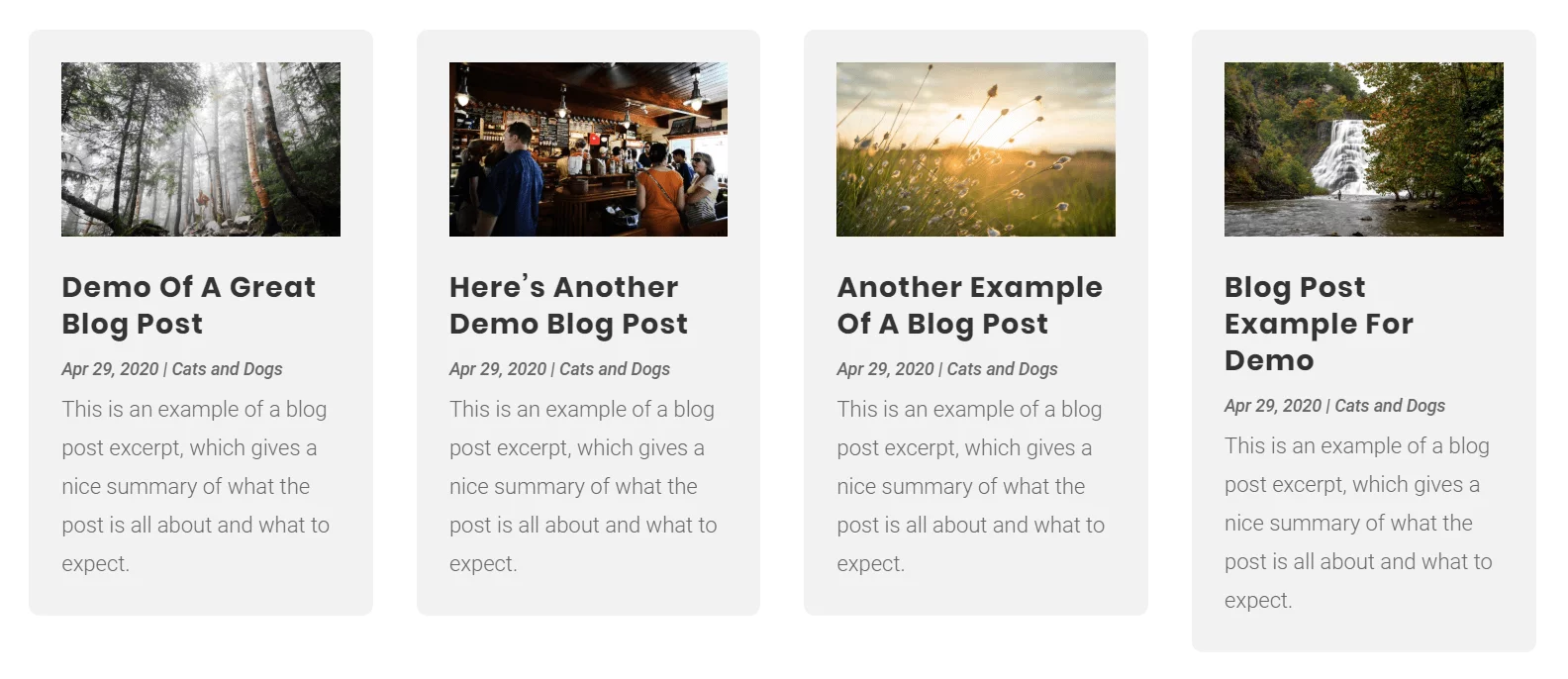
And there you go, you now changed the Divi blog module column count to 4 with this very easy method.
Change Blog Column Spacing
You may hvae noticed the line of CSS that says “column-gap” and were curous about that. Basically, this is the space between the columns. I set this at 60px because the blog module comes with a margin of 60px at the bottom of each post (in between the posts vertically) so I just wanted to match that. But you can change this number to anything you want!
Change The Divi Blog Module Column Count On Mobile
Make The Divi Blog Module Columns Responsive
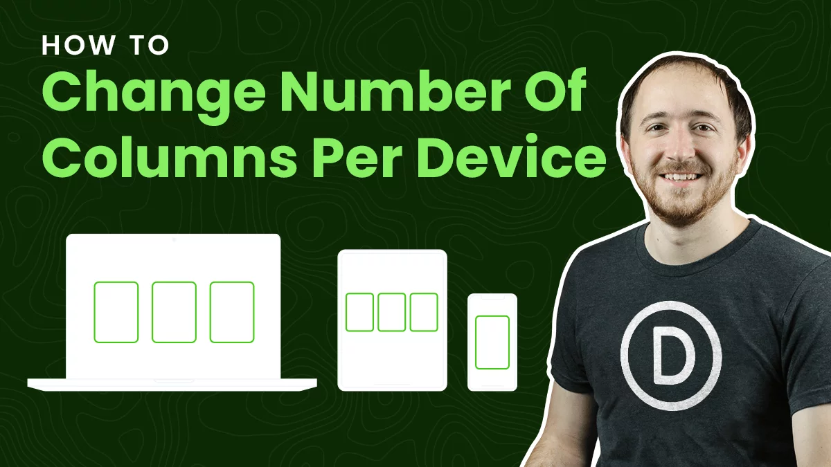
Now it’s time to make this responsive! So the column count you chose for your blog module will probably not work very well on smaller screen sizes. Thanksfully this is a very easy fix. We could use CSS media queries. But hey, I like to keep it simple. Let’s just use Divi!
It is very easy. Go to the Blog module settings again to where you pasted the code in the Main Element. Hover over it and you will see the little “phone” icon. Click that! Now you will see three tabs, Desktop, Tablet, and Phone. By default, the code we pasted affects all three, so we need to change our code for each device. I’ll walk you through an example.
Desktop
Let’s say I have set my Divi blog moluduel to “4” columns. That’s what I want for Desktop, so this is good.
Tablet
Copy the snippet, and now click on the Tablet tab. Paste the two lines again. This time, change the column count to “2.”
Phone
Copy the snippet again, and now click on the Phone tab. Paste the two lines again. This time, change the column count to “1.”
You could also change the column gap to a smaller number like “20px;”
To see this in action, please watch the video!
Add Some Fancy Styling
In our screenshots above, we included some extra styling. In the follow snippet, we are going to style each one of the posts by adding spacing around them, a background color, and a border radius.
There is also a very important part of the tutorial. The last three lines here are essentail for making this whole tutorial work right. It is too technical to explain, but the video shows what would happen without it. Basically the columns in Divi start on the left and go down, then over and down, etc. So this CSS keeps the the blog posts from getting chopped off weird.
Where To Paste The CSS Code
1. Divi Assistant
If you are using our Divi Assistant plugin, simply paste the code in the CSS tab in the custom code window in the Divi Visual Builder.
2. Child Theme
If you are using a child theme, paste this code into the style.css file. If you don't have a child theme, you can generate a child theme directly on your site or download our free child theme.
3. Divi Theme Options Integration
Otherwise, paste this code in your Divi>Theme Options>Custom CSS code box.
If you need help understanding where to paste the code, please check out our complete guide about where to add custom code In Divi.
/*style the individual posts*/

.et_pb_posts .et_pb_post {
	padding: 30px;
	background: #f2f2f2;
	border-radius: 10px;
	-webkit-column-break-inside: avoid; /* Chrome, Safari, Opera */
	page-break-inside: avoid; /* Firefox */
	break-inside: avoid; /* IE 10+ */
}
That looks a great! Feel free to play around with this, and be on the lookout for more tutorials about the Divi blog module!
Do It With A Setting!
Make life easier and use the Divi Responsive Helper instead, the ultimate Divi responsive toolkit with awesome features and settings to help make your website look and work great on all devices!





Simple & Nice Nelson! Less is more!
Hey Ramon,
Yes! 🙂 Always fun making it as simple as possible.
Hi Nelson,
You solved my Problem but now I got another one. When I am using this code on my Blog module the Pagination Is going to be on the Right hand Site. Is there a way to bring the Pagination to the Left? Or at least the back text to the left and the next text to the right?
I hope you know what I mean.
What you are asking is not related to the tutorial, but rather a separate tutorial idea. I will note this and consider publishing one on the topic!
Always like to hear your posts, your like the DIVI Whisperer. Great insight but I got a small problem. I am adjusting the blog posts to change the columns like you suggest but my posts are running amuck. What I mean by that is column one is cut off and moved to the start of column two and then column two gets cut off and moved to column three. Any thoughts?
Hello,
to bring the Pagination to the Left,
– Add a class in your blog module (ex. : pagiLeft)
– Add CSS in ‘Appearance’ -> Customize -> additionnal CSS :
.pagiLeft .alignleft {
position: absolute;
left: 0px;
}
It works for me.
Hi Nelson,
This is a great tutorial. I always enjoy your tutorials. They are simple and presented in a clear way for everyone to understand. Thanks for taking the time to create them.
Kind regards,
Neil.
Hi Neil,
I appreciate your feedback. Thanks for the encouraging words, it makes my day when I can help people like this 🙂
Thank you Nelson for this awesome tip. Will give it a shot in my sites. This is indeed the simplest way to customize number of blog columns in Divi.
Hi Hadee,
Yes, give it a try, you will love how easy this is. Keeping the code in the module is always a plus too!
Hey Nelson! This is AWESOME! One quick question…what if you wanted to equalize the grid heights to accommodate for differing excerpt and title lengths?
Hi John,
Glad you like it! What you are asking is a very difficult thing to do, but the best answer I have seen is by Elegant Themes here: https://intercom.help/elegantthemes/en/articles/3371227-blog-module-equal-height-grid-boxes-with-javascript
Wow, that was so easy! Thank you!
Hi Bernadette,
You are welcome! I’m glad you found it easy!
I put in the code but why does the image on the top second column is being cut off ?
Just add the code in the post, it describe this. -webkit-column-break-inside: avoid; /* Chrome, Safari, Opera */
page-break-inside: avoid; /* Firefox */
break-inside: avoid; /* IE 10+ */
Thank’s for these good advices. I use the layout in a test site for a list of members, in alpha sorting (via plugin Simple Custom Post Order) , with 12 items per page, with 3 rows of 4 columns, But I see that the items are to be read on each column from top to bottom and I would like them to be listed on each row from left to right. How is it possible? Luc
Hi Luc,
It seems that this method does not work well for multiple ROWs. So I’m afraid this may not be the best method for 12 items.
Thanks Nelson 😀
You’re welcome!
Dear,
thank you very much for your clear tutorial “how-to-change-the-number-of-columns-in-the-divi-blog-module”
Works great!
Still a question: why do I first see 4 and then 3 columns on one of my pages? (see: https://mijnreceptenbundel.nl/cocktails-2/cocktail-alc-vrij/)
or better, how can I adjust this?
thank you verry mutch
Hi Rita, this link is a 4040 error. Let me know if you want me to check an updated link.
I think it is now clearly visible
https://mijnreceptenbundel.nl/cocktails-2/cocktails-alc-vrij/
With multiple pages I sometimes see 3 or 2 columns instead of 4.
How can I solve that
see:
– https://mijnreceptenbundel.nl/aperitiefhapjes/hapjes-met-fruit/
– https://mijnreceptenbundel.nl/aperitiefhapjes/hapjes- with-cheese /
– https://mijnreceptenbundel.nl/cocktails-2/cocktails-alc-vrij/
– https://mijnreceptenbundel.nl/cocktails-2/dranken-alc-vrij/
– https://mijnreceptenbundel.nl /vegetarian/
Hi Rita,
I’m not sure, but I think it has to do with the way the module makes the items stack in columns top to bottom instead of left to right. It seems maybe it is related to the size of each post too, but I haven’t been able to narrow it down.
Dear Nelson,
I have already adjusted most of the titles and are now shorter, which makes the overview better. Yet I still have that some pages show 3 instead of 4 columns (pictures)
see: https://mijnreceptenbundel.nl/hoofdgerechten/schaap-lam/
Any chance there is a straightforward way to have this center the blog items. So for example, if I have a 4 column setup, per your code, but in instances where they is only 1 or 2 blog posts, to have those centered in the screen instead of off to the left?
Hi Daniel,
I don’t know but I definitely saw someone ask this a few weeks ago in a Facebook group and someone gave the answer. I just can’t think where it was, sorry!
Great tutorial, thanks alot, clean & simple!
Thanks David, glad you like it!
Thanks a lot for your posts Nelson!!!
Best Divi tutorials on the web!
Just a tip: This is needed to work properly so I would not say “add styling”….it is confusing..
-webkit-column-break-inside: avoid; /* Chrome, Safari, Opera */
page-break-inside: avoid; /* Firefox */
break-inside: avoid; /*
Got it, I will update that to make it more clear, thanks!
Hi, how can i make the order from left to right instead of top to bottom.
My magazine are displaying in weird order
Hi Marlon,
I think this is because of the weird way they are made in Divi. They go by columns, down the first one, then down the second one, etc. Really annoying, so I guess this only works with one row.
Thank you Nelson, this is a real helpful and easy tutorial! The only part where I was little bit confused was when you added the styling to the site. I first didn’t realize the code wasn’t for the blog module but for the whole website. I then checked your video and got it. Maybe you could add where to put this in in your tutorial here.
Hi Carina,
Okay not sure what you mean, but I assume you are referring to the snippet that targets all blog posts. You could certainly add a custom class, I don’t say that on every post because I hope people know but it’s a valid point if that’s what you mean.
what if I want two columns on mobile and not one?
Then write 2 instead of 1 🙂 Might get kinda tight though!
Hi Nelson, Thanks a lot for this tutorial. I have found a lot of valuable stuff on your website, and must say it is one of the best resources on DIVI. So thanks a lot for that.
I tried this code and it works great, except that the navigation for pagination on the bottom (older entries and newer entries) jumps into the second column instead of spanning both the columns. I am attaching a screenshot. Is there a way or CSS to make it span so that it is not in the middle of the page.
I am using a 2 column layout on this page.
Thanks a lot
Girish
I guess that is because it is technically thinking it is the “fullwidth” layout. Had not thought of that. Guess that is a drawback of this method.
Thanks for the update Nelson. Let me see if I can figure out a workaround for this.
Hi! Thank you for this tutorial Nelson! I have this same issue, has someone found a way to solve this in the meantime? 🙂
Ok I have a nice solution :D. I installed the plugin WP-PageNavi with the whole navigation on the right (the default) and removed the border 😀
.wp-pagenavi { border-top: 0px; }
Great idea, but didn’t work. Adding column-count:2 turned the 3 column blog into 6 rather than 2.
Hi Amy,
It sounds like you have it set to grid mode, change it to fullwidth for this to work as described.
Hi Nelson – I was having issues with this page:
https://dwnsandbox1.com/news/
After a few rounds with Elegant Themes Tech Support they suggested this article:
“Please use the following solution instead to change Blog columns:
https://www.peeayecreative.com/how-to-change-the-number-of-columns-in-the-divi-blog-module/”
Ta Da!
Coincidentally, I was reading a post from you earlier tonight about hiding/showing the hamburger menu.
Thanks for your clean and Elegant(!) solutions.
Thanks Mike, looks great, so glad you could benefit from this!
Great lesson Nelson!
I just have the problem, when I have an odd number of posts (for example 3), they looks in strage order, see attached image
Hi Rick,
Please add the code at the end of the tutorial, it is essential.
Thank you so much for this! I was ready to purchase a plugin from a Divi reseller to make columns happen on our landing page. I will check out your store and try to purchase from you instead!
One addendum could be helpful: there’s no navigation to older posts? When I tried to turn it on, it was wonky.
Thank you for checking our store. We hope that our products will surely add value to your website. Coming to the issue, just to confirm is the pagination not at its place when you are using this code?
If yes then, please go to the Blog Module Settings > Advanced > CSS ID & Classes and add a Custom Class. For example, the class is .pa-blog-module
After that, please go to WordPress Dashboard > Divi > Theme Options > Custom CSS Panel and place the CSS Code given below:
.pa-blog-module{

     position: relative;

    padding-bottom: 14vh;

}

.pa-blog-module .wp-pagenavi {

    position: absolute;

    bottom: 0;

    left: 50%;

    transform: translateX(-50%);

}
.pa-blog-module .wp-pagenavi .pages{
white-space: nowrap
}
This code will place the pagination division at the bottom center. You can change the left, bottom, and padding values to change the placement. 🙂
Hm… it works perfectly in Safari but not at all in Chrome.
Could you please share the URL of the page so that I could investigate further?
Dear Nilson,
Unfortunately, I still have some problems with the lay-out.
On my website all images are of the same size namely, width 350 px by height 250 px.
The first problem is on the cocktails page.
URL: https://mijnreceptenbundel.nl/cocktails-2/cocktails-alc-houdend/
In all cases their maximum height should be 250 px.
So the problem is that some of the images on the cocktails page are larger (that is the height is increased) compared to others.
How can I solved this problem so that each image has the same height?
The second problem is on some other pages (e.g. menues for poultry).
URL: https://mijnreceptenbundel.nl/hoofdgerechten/gevogelte/
On these pages I would like to have 4 images on each row. However, on same pages the columns are broken down too early and on some rows I see 4 images while other rows contain 3 images.
How can this be solved so that each row show 4 images?
Hi Rita,
Sorry for the delay. Have you got it solved now?
Hi Nelson, I appreciate your tutorials, they are really helpful and well done. In this particular tutorial the grid is aligned perfectly in Firefox and Chrome but it has only 3 columns. In Safari the grid also appears in 3 columns and the grid alignment is off. The weird thing is that I have 2 blog modules set up the same way but getting the feed from 2 categories. Your code works perfectly in one module but not in the other. I placed the code for the alignment in the page settings. What am I missing? thanks so much in advance.
Be sure to add the code at the bottom of the tutorial, it is needed for that.
Hi, thank you for this! So simple and great.
I’m having an issue with older entries. When I set the layout for 8 posts (I’m using 4 columns), the content is skipping some columns. When I use only 4, the “older entries” button doesn’t work. Do you have any ideia to help me with?
I’m pretty sure it’s related to height, not sure without a link. I guess you are saying the pagination doesn’t work with 4 post count?
That’s right: the older entries button appears, but when I click it doesnt work properly. The link is this one
I am afraid that I am not able to see any older entries button. Could you please share the exact URL where the issue is happening for us to investigate further?
Sorry! There were only 4 published posts, you can check now here with the button
and here without the button, showing more than 4 posts
You want the 4 column layout so for that could you please remove the code given above and place this code instead and see if that helps?
.pa-blog-image-3-4 .et_pb_ajax_pagination_container {

    display: flex;

    flex-wrap: wrap;

}
.pa-blog-image-3-4 .et_pb_ajax_pagination_container article{
width: 23%;
margin-right: 2%;
}
@media all and (max-width: 980px){
.pa-blog-image-3-4 .et_pb_ajax_pagination_container article{
width: 48%;
margin-right: 2%;
}
}
@media all and (max-width: 600px){
.pa-blog-image-3-4 .et_pb_ajax_pagination_container article{
width: 100%;
}
}
This will give you 4 columns for the desktop, 2 columns for tablets, and one column for the mobiles. Please let us know if that helps.
Hi Nelson,
Again this is a great and simple tutorial vs the rest out there.
Just one question. How can I make the blog image 0 padding while the content has around 10px padding?
Please try using this CSS Code and let us know if that helps.
/*This snippet is for the design*/.et_pb_posts .et_pb_post {
background: #f2f2f2;
border-radius: 10px;
-webkit-column-break-inside: avoid; /* Chrome, Safari, Opera */
page-break-inside: avoid; /* Firefox */
break-inside: avoid; /* IE 10+ */
}
/*This snippet is for making the padding of the image zero*/
.et_pb_posts .et_pb_post a:first-child{
padding: 0px;
}
/*This snippet is for providing 10px padding to all the other elements*/
.et_pb_posts .et_pb_post a ~ *{
padding: 10px;
}
Hi, can you tell me how to keep the size of those columns same please.
Please add this code and see if that helps:
.et_pb_posts .et_pb_post {

   min-height: 620px;

}
You can change the value of min-height as per your liking and this will equalize the height of all the posts. Let us know if that helps.
Hi, I used this solution multiple times, always work fine. Now I have a site that need pagination at the end of the page. But because of the 2 columns the pagination is placed after the last post in the second column. Is there a way to place the pagination under the two columns?
Could you please share the URL of the page where the blog module is present for me to investigate further?
Hi, I used this code along with the ‘turning the read more text to a button’ and I came up with a few issues. Firstly I wanted to use a box shadow on my posts but making the blog full width means the shadow goes round the whole module and not the posts.
Also when there are an odd number of posts (I had a 2 column grid) the button animation alters the order of the posts and pushes them around when you hover over them.
Hi Steve,
Could you please elaborate on what you are trying to achieve and provide the URL of the page for me to understand the scenario properly and investigate further?
Hi, Thanks for responding. Here’s the URL:
https://yourcomplete.co.uk/blog/
What I would like is for the box shadow to go around the posts and not the whole module. (its seems you can achieve this with a border but not a shadow?!)
Also when you hover over the buttons they appear the get bigger by a pixel or two and that looks like its pushing the order of the blog posts around.
Thanks for any help!
Hi Stephen,
I guess the mentioned points of yours are resolved now as the button and the box-shadow on the articles are looking fine.
Please let us know if you need any further assistance.
Hi,
I am using this on custom post type where few lines of excerpt and read more is coming into 2nd column.
You can check this link :
https://staging4.briskon.com/consultants/dr-cma-belliappa/
Hi there,
Could you please elaborate on the end result that you are trying to achieve for my better understanding?
Unfortunately, none of these codes work for me. I’ve cleared my cache, downloaded your child theme, and tried everything. But when I paste it in CSS some red boxes pop up in the code that say “Unexpected”
Not sure what to do with that.
Please make sure that you are placing the code inside the Blog Module Settings > Advanced Tab > Custom CSS > Main Element Panel.
Hello.
As a newbie, I have found your resources very useful. Thanks.
I have implemented this, and while it works great on Chrome, it’s not aligning to top on second column on my new iPad. Any ideas? My site is not live so I cannot link to show you!
Would appreciate a response if you can.
Best wishes, Nicola
Hi Nicola,
I am afraid that it is required to have a URL in this problem as first I need to check on my end and see if I can replicate the same issue as well or not and then investigate the problem further so could you please live the website and share the URL so that we can investigate further?
Hello Nelson, I have the same bug of Nicola: it’s not aligning to top on second column on all the OS devices (Ipad & Iphone) 🙁 if you see the link there is a row after the slider with a blog module with 7 columns..
Great idea, but doesn’t seem to work with 6 columns. Only 5 display.
See staging: http://jewishelpaso.048239d.netsolhost.com/the-jewish-voice/
Hi Chuck,
Thank you for addressing the issue. We will look into the problem and will get back on this shortly.
I am having a weird issue with the two column. The image that should be at the top of the second column is actually at the bottom of the first column. It’s happening on two pages: https://daniellegrosse.com/blog/ and https://daniellegrosse.com/danielle-grosse-home-page/ (site is in development but pages are live.)
Hi Angela,
I am afraid that I am not able to spot the issue on the first URL provided and the second one is showing a 404 error. Let me know if I am missing out on something here.
I am having an issue with the images being in the wrong column. You can see that here: https://daniellegrosse.com/home-2/. Any ideas?
Hi Angela,
I guess the page that you shared is not published as I am getting “No Results Found” when I am going to the URL provided. Please publish the page for me to investigate further.
You da man!
I desperately needed the column/page break css.
Thanks!
You are welcome!
I combined this with the “Change Blog Image Aspect Ratio” modification to make images square and now all of the excerpt text from each post is spilling into the next column. So the excerpt text from post 1 is overflowing at the top of column 2 instead of staying beneath post 1 in column 1. Any fix?
Hey Chris,
Could you please share the URL for me to investigate further?
Sure, here is the URL: https://resourcingleaders.co/rl100-members/
I am currently adding more ‘RL100 members’ on here
Hey Francesca,
Could you please tell me how many columns you want to create in a row?
Great article, many thanks for sharing! I am using this one in conjunction with various others of yours. One question, this works really well when you have the exact number of columns, but when there are more or less it reorganises it. I am trying to have a 7 column layout, and looks good if I have either 7, or 14 or 21, but if I have any other number is changes the layout. Do you know how to fix this? Thanks!!
Hey Pee- Aye Team!
Thanks for this tutorial it solved a lot of my problems in one go. Unfortunately, if I try and equalise the height of all the posts I get 4 columns in the first row (which is correct) and only three columns in the following rows.
I’ve tried a few things but have not been able to rectify this issue.
URL: https://printinal.co.za/?s=shirt&post_type=product
I’m using the blog module to display my search results.
Thank you!!
Hey Logan,
Please remove the code that you have pasted from the guide and try the code given below and see if that helps.
.pa-blog-module .et_pb_ajax_pagination_container {

    display: flex;

    flex-wrap: wrap;

    gap: 1vw;

}
.pa-blog-module .et_pb_ajax_pagination_container article{
width: 23.8%;
position: relative !important;
height: auto;
margin-bottom: 20px !important;
}
@media all and (max-width: 980px){
.pa-blog-module .et_pb_ajax_pagination_container article{
width: 48% !important;
}
.pa-blog-module .et_pb_ajax_pagination_container {
gap: 2vw;
}
}
Hello: The following code doesn’t work for me in Microsoft Edge to get rid of the weird post breaks. Do you have a solution for the Microsoft Edge browser? Thank you!
/*style the individual posts*/
.et_pb_posts .et_pb_post {
padding: 30px;
background: #f2f2f2;
border-radius: 10px;
-webkit-column-break-inside: avoid; /* Chrome, Safari, Opera */
page-break-inside: avoid; /* Firefox */
break-inside: avoid; /* IE 10+ */
If I move the code out of the Divi Child Theme and into the Divi Theme Options, it works!
Hi Nelson,
this solution has some disadvantage: Due to the layout setting “fullwidth” responisve images (srcset) aren’t used.
Having some alternative using layout “grid” would be great.
Thank you very much!
Best regards and thanks for your great solutions and tools!
Juergen
Hi Juergen!
You’re very welcome! The images srcset works for fullwidth layout as well. Can you please make sure the Responsive images option is enabled in Divi > Theme options > General?
You’re a damn legend!!! Thanks so much!
You’re welcome!
I’ve used this and it worked great – but then I noticed that if you want the posts to show in DATE order then they read from top to bottom in Column order rather than across in Row order. Or am I missing something?
Hi Wheeler!
Could you please share the URL of the page so that I could investigate further?
Hi, I think I have the same problem.
I tried this setup on 2 different sites.
1 row, blog module fullwidth, column-count:2
But in both of my tests the date order only works with 2 items.
By increasing the number of items, the order of the items changes like this:
With 2 articles: 1,2
With 4:
1.3
2.4
With 20:
1.11
2.12
3.13
4.14
5.15
6.16
7.17
8.18
9.19
10.20
is it solvable?
Thanks so much for tutorial 🙂
Hi Gabriele,
I think this is just a limitation of Divi, as their blog posts are technically in vertical columns – it is weird for sure!
Did you manage it somehow?
/*style the individual posts*/
.et_pb_posts .et_pb_post {
padding: 30px;
background: #f2f2f2;
border-radius: 10px;
-webkit-column-break-inside: avoid; /* Chrome, Safari, Opera */
page-break-inside: avoid; /* Firefox */
break-inside: avoid; /* IE 10+ */
}
this code is not doing its job
Hi there!
Please try this code instead:
.et_pb_post {
padding: 30px !important;
background: #f2f2f2 !important;
border-radius: 10px !important;
-webkit-column-break-inside: avoid;
page-break-inside: avoid;
break-inside: avoid;
}
Let me know if it helps!
Hello there Nelson!
As always with your tutorials, this one is simple, nice and very easy to implement.
I have done it here: https://panayiotiss39.sg-host.com/blog/
Using this simple CSS snippet:
/* Blog Page */
.blog-page-module {
column-count: 2;
column-gap: 38px;
}
@media (max-width: 980px) {
.blog-page-module {
column-count: 1;
}
}
Now, it might be out of the scope of this tutorial but how I used this tutorial together with this one: https://www.peeayecreative.com/how-to-add-a-load-more-posts-button-to-the-divi-blog-module/. And it works except for a small issue: when the total number of post is an odd number (let’s say, 9 posts), the meta info of the last post in the left column (5th post), breaks to the top of the second column.
Is there a way to fix this issue?
Thank you in advance,
Antonio
Hi Antonio!
I can see that the customization is not compatible with the current layout you’re using. We will look further into the issue and post a solution soon. Please avoid using both customizations together for now.
Thanks for understanding!
Thank you Nelson, Divi actually has to pay you for all your tutorials & tips. Things as simple as in this example should actually be standard, just like that a menu is not always displayed as a single line of text, but as a burger navigation system as is usual. But they prefer to integrate an AI tool – that’s ridiculous.
Hi Daniel,
I appreciate that, but please keep in mind Divi is being rebuilt right now, and it’s all going to change soon!
Thanks Nelson, I love all your tutorials. Sadly this one did not work for me 🙁 It shifted the excerpt onto the next column. Not sure why :((
That’s probably related to the note towards the end of the article, please check that.
Thanks Nelson! I should have paid more attention. You are the boss..
Hello,
Thank you for this tutorial!
I have some problems. I have set 4 colmns on desktop but for some reason the page show 3 columns instead of 4. Sometimes 4 and most of the time 3. could you help?
Hi Bart!
Could you please share the URL of the page to check further?
Hi, is there a way to make the articles not split between the columns? The text that belongs to the image ends up in the second column.
https://www.skillinge.com/AllBusinesses/?post_type=business
Hi Tindra!
It seems you have disabled the excerpt. Can you please enable it so that I can check further?
And once again you have made this so simple, Thank you.
You’re welcome Isiah, I’m so glad it was easy!