Click Outside To Close Mobile Menu
Here is another tutorial to add to our huge list of Divi menu tutorials! If you are viewing a Divi site on mobile and open the menu, but then want to close it, you may tend to click (or touch) the area around the outside of the dropdown, thinking it will work like other apps and close the menu. But not so, it does not do that in Divi. So we created a jQuery snippet to do just that, and in this tutorial I will show you how to close the Divi mobile menu by clicking or touching outside the menu dropdown area.
▶️ Please watch the video above to get all the exciting details! 👆
Add The jQuery To Your Website
I will give you the jQuery needed to do this with either the default Divi header menu or if you are using the Menu module with the Theme Builder. Either way, you will simply need to paste the code into your website.
Where To Paste The jQuery Code
1. Divi Assistant
If you are using our Divi Assistant plugin, simply paste the code in the jQuery tab in the custom code window in the Divi Visual Builder.
2. Child Theme
If you are using a child theme, paste this code into the scripts.js file (don't forget to remove the <script> tags at the beginning and end). If you don't have a child theme, you can generate a child theme directly on your site or download our free child theme.
3. Divi Theme Options Integration
Otherwise, paste this code in your Divi>Theme Options>Integrations tab in the "Add code to the < head > of your blog" code area.
If you need help understanding where to paste the code, please check out our complete guide about where to add custom code In Divi.
Default Header Menu
<script>
jQuery(document).ready(function(){
    jQuery("body").on("click", function(event){
        var clickedElement = jQuery(event.target);
        if(clickedElement.closest('.mobile_nav').length > 0){
            return;
        }
        if(jQuery(".mobile_nav").hasClass("opened")){
            jQuery(".mobile_menu_bar").click();
        }
    })
})
</script>
Menu Module
<script>

jQuery(document).ready(function(){
    jQuery("body").on("click", function(event){
        var clickedElement = jQuery(event.target);
        if(clickedElement.closest('.mobile_nav').length > 0){
            return;
        }

        if(jQuery(".mobile_nav").hasClass("opened")){
            jQuery(".mobile_nav").removeClass('opened');
            jQuery(".mobile_nav").addClass('closed')
            jQuery("ul#mobile_menu1").css("display", "none");
            jQuery('.et_pb_menu .et_mobile_nav_menu .mobile_nav.opened .mobile_menu_bar:before').css("content","a");
        }
    })
});
</script>
And that is all it takes! This tutorial was shorter than most, but it’s very simple. If you need any help, please watch the video and be sure to check out out other Divi tutorials!
Do It With A Setting!
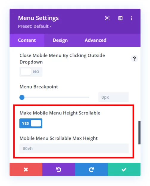
Make life easier and use the Divi Responsive Helper instead, the ultimate Divi responsive toolkit with awesome features and settings to help make your website look and work great on all devices!
Here is the setting when using our plugin, it doesn’t get easier than this!





Hey great work,
I have been searching for tutorials like this for a long time. But this code doesn’t work well with the dropdown submenus. Clicking on the mobile dropdown submenus hides the whole menu.
Please bring a solution to this too.
I did not quite understand your point, can you elaborate?
I think i have the same problem. I use your submenu css and script to collapse the divi mobile submenu. When i click on the arrow to open or hide the submenu, the whole menu will close. its like clicking outside of the dropdown menu. Do you have a solution for this problem? Thank you
Hi Manu!
Thank you for sharing the feedback. We will investigate further and update the guide.
Hi Nelson. Firstly, thank you for this fantastic set of resources. It has been a go-to for me for the last couple of years when trying to teach myself divi/coding.
Secondly, do you know if there is an easy way to combine this with a reveal section? I have basically used reveals to create a mega menu but need the “reveal” to close when clicking outside. The reveal code I am using is:
jQuery(document).ready(function() {
// Hide the div
jQuery(‘#reveal’).hide();
jQuery(‘.rv_button’).click(function(e){
e.preventDefault();jQuery(“#reveal”).slideToggle();
jQuery(‘.rv_button’).toggleClass(‘opened closed’);
});
});
I’m so glad you like our resources!
I don’t have any experience with the other thing you are asking, sorry!
Hi there … I tried the “Menu Module” code and it worked for the footer menu but not for the primary_menu on the header.
Right, the default header menu is different.
Just wanted to say a BIG “merci” and a huge “j’adore” your tutorials. I always go to your website when I’m looking for an answer. Thank you again from France!
Aww thank you very much, I’m so glad you are enjoying my resources!
I have a problem in this “Menu Module” if we open menu after that go to the dropdown menu after we click the menu was closed. I want if we click outside the menu in Mobile mode it close but it reverse we click anywhere it close.
Hi Rajat!
Thank you for sharing the feedback. We will investigate further and update the guide.
Oh did I need this now! I had not idea how to do this, and my client really wanted it and I could not argue about that. 🙂 So grateful! Thank you!
I’m glad it helped, please check our other tutorials as well for more Divi solutions.
Another great tutorial, thanks Pee Aye!!
As I use both the default Divi header and a custom header for some other pages, I found that putting your default script in my child theme functions.php file works great for both default headers and custom headers that use the menu module.
Thanks, glad you like it!
Thanks, Dear for the really great information you are sharing, I have a problem here. I have created a header in the theme builder, here are 3 headers with a hamburger menu. 1 is normal and 2 will appear when 1 will stick to the top and the 3rd one is for mobile only.
I add this code in the header section and it works with only 1 normal menu, not with the other two.
Is there any way to work with the hamburger menu?
Hi Muhammad!
Can you please share the URL of the page to investigate further?
Thanks for intent respond, I add this code it working fine with normal header but it is not working with sticky header and mobil menu, here is URL.
https://hisukh.digitalworldusman.com/
I am still designing this website but need to adjust please:
Thanks
Hi,
I already send you a message. I working with the normal menu but not with a sticky menu so and mobile menu,
have a look please:
Thanks:
https://hisukh.digitalworldusman.com/
Sorry, I’m not able to see any menu on the homepage. Can you please let me know the exact page on which I can check the issue?
Hello:
I tried adding the code the Menu module code in my website but it is not working
I see somebody els e on YouTube commented the same
Should the code be updated for 2024?
thanks in advance!
Hi Fernando,
Nothing has changed that would require any update, the code works great. If you have our plugin and need any support, just reach out.