Change The Divi Email Optin Module To A Horizontal Layout
There are other tutorials out there that do this, I’ll just say that right away. But if you know me, you know I like to make things simpler and easier for you! So that is one of the reason I decided to do this tutorial. It is just two tiny snippets of CSS to make this work beautifully!
The second reason is because I get a lot of questions about this from my previous tutorial about How To Create A Single Field Email Option In Divi. Everyone loves that but some of you asked about using 2 or 3 fields, so here you go!
This tutorial will show you how to change the Divi Email Optin module orientation into an inline horizontal single line layout. This tutorial uses some really fun math with the CSS, so I hope you enjoy that as well!
▶️ Please watch the video above to get all the exciting details! 👆
Style & Customize The Divi Email Optin Module
The first step is to simply add the Divi Email Optin module to your layout and adjust the diesign settings however you want. You can go ahead and design the input fields and button using all the available Divi settings, becasue we won’t be affecting the styling with this tutorial, just the layout. There is no built-in way to change the Divi Email Optin module layout to one line without this tutorial, and that is the focus here today.
Toggle On The Email Optin Fields
There are only a few steps that are required to be adjusted in the modules settings, and the as mentioned, the design settings are optional. The first and obvious thing to do is to turn on the input fields that you want to use. Most likely you will want to turn on toggle for “Use Single Name” if you want just a name and email field for a total of two fields.
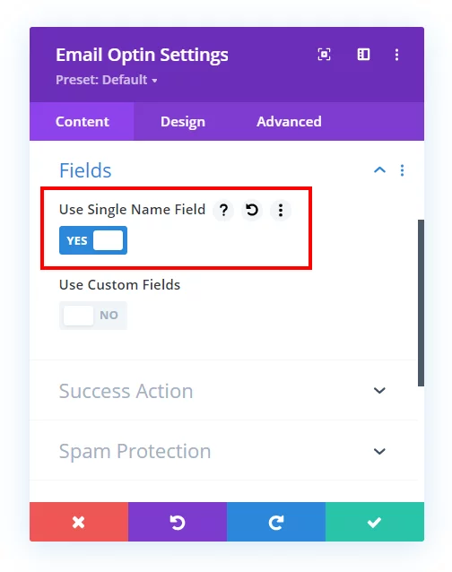
Or if you want the first and last name toggles turned on, this would create three fields total. Just toggle off the single name field and toggle on the first and last name fields.
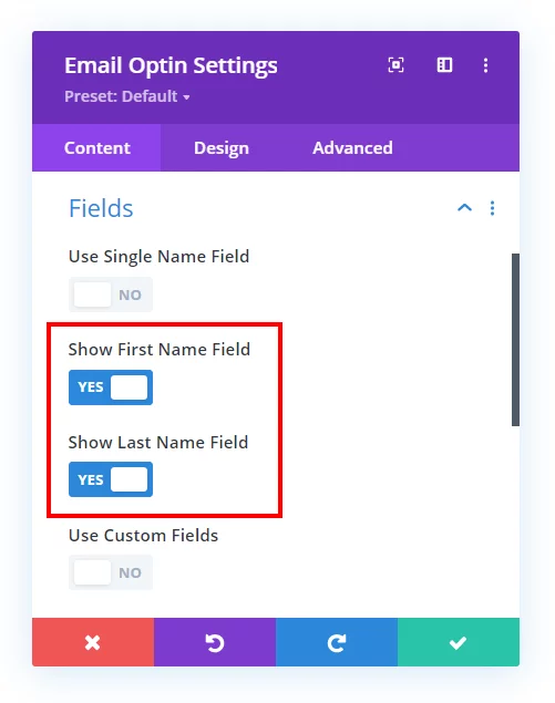
NOTE: The email input field is always on (because this is an email optin module) so there is no toggle for that, only for for the name fields.
Set The Email Optin Layout
The second required step is to set the layout in the Design tab to “Body On Top, Form On Bottom” for this to work well.
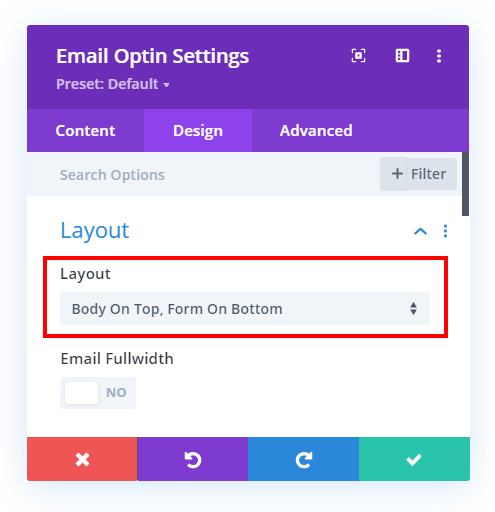
Once you have the fields and layout set, you can finish any other design adjustments and proceed to the CSS snippets below.
Add CSS To Make The Divi Email Optin Inline Horizontal
Now that we have the module set up, it’s time to add the CSS that does the tricks we need it to do. Note that we have three options below, and you will need to choose the code snippet based on what settings you set in for the fields in the previous steps.
Where To Paste The CSS Code
1. Divi Assistant
If you are using our Divi Assistant plugin, simply paste the code in the CSS tab in the custom code window in the Divi Visual Builder.
2. Child Theme
If you are using a child theme, paste this code into the style.css file. If you don't have a child theme, you can generate a child theme directly on your site or download our free child theme.
3. Divi Theme Options Integration
Otherwise, paste this code in your Divi>Theme Options>Custom CSS code box.
If you need help understanding where to paste the code, please check out our complete guide about where to add custom code In Divi.
Email Optin With One Field
@media (min-width: 767px) {
	/*set the width of the button*/
	.et_pb_newsletter_fields .et_pb_newsletter_button_wrap {
		flex-basis: 150px !important;
	}
	/*set the width of the input field minus the width of the button*/
	.et_pb_newsletter_form .et_pb_newsletter_field {
		flex-basis: calc(100% - 165px) !important;
	}
}
Email Optin With Two Fields
@media (min-width: 767px) {
	/*set the width of the button*/
	.et_pb_newsletter_fields .et_pb_newsletter_button_wrap {
		flex-basis: 150px !important;
	}
	/*set the width of the input fields minus the width of the button*/
	.et_pb_newsletter_form .et_pb_newsletter_field {
		flex-basis: calc((100% - 180px) / 2) !important;
	}
}
Email Optin With Three Fields
@media (min-width: 767px) {
	/*set the width of the button*/
	.et_pb_newsletter_fields .et_pb_newsletter_button_wrap {
		flex-basis: 150px !important;
	}
	/*set the width of the input fields minus the width of the button*/
	.et_pb_newsletter_form .et_pb_newsletter_field {
		flex-basis: calc((100% - 195px) / 3) !important;
	}
}
Things To Note And Learn
Media Query
You’ll notice a couple of things are happening here. First of all, the entire snippet of code is wrapped in a media query. The purpose of that is to allow the optin module to change to a stacked layout on screens smaller than 767px.
Learn More About Media Queries
Button Width
The first part of the code snippets is setting the width of the button to 150px. You can change this number to anything else, but just make sure to also adjust the 165px value in the second snippet. The reason for the 15px difference is to allow space for the gap between the fields and the button. Then the snippet for two fields is 180px, again to create two different 15px gaps, and the same for the three fields snippet with 195px. But of course you can change this however you want!
Input Field Width
The second part of the code snippets control the width of the fields. You will notice this is different in each of the three snippets, and it is best to watch the video to understand this well. But basically we are using some CSS and math tricks to calculate and adjust the width based on how many fields we have included.
Pretty neat, huh? Let me know what you think in the comments!




Great post and video! But I can’t see the CSS… Just 3 gray sections, see image. Using browser Vivaldi on WIndows10. I’ve turned off uBlock and cleared cache.
Hi there,
I never heard of that browser and never heard of anyone not being able to see the code, so please try Chrome, Firefox, Safari, or Edge and it should work fine.
i am using chrome and cannot see the code either, just 3 gray lines .
Hi Shay,
Check now, not sure what is going on but now today it was missing for me and I had to rewrite it. So strange!
is there a way to align horizontally on mobile device also
Please try removing that media query from the code and see if that helps. For example, if you are using one field only then the code after removing the media queries will become:
	/*set the width of the button*/

	.et_pb_newsletter_fields .et_pb_newsletter_button_wrap {

		flex-basis: 150px !important;

	}

	/*set the width of the input field minus the width of the button*/

	.et_pb_newsletter_form .et_pb_newsletter_field {

		flex-basis: calc(100% - 165px) !important;

	}
This way you can remove the media queries and use the code for all the screens.
Please let us know if this helps. 🙂
no longer useful! can you check? since Divi changed the CUSTOM CSS´ fields from the last update
Hi Talita,
I’m not sure what you mean. This tutorial does not use any of the module custom css fields, it is just CSS that goes in Divi Theme Options.
Hi Nelson,
This is very useful Tutorial. I’ve one question.
What if I want to use both Full-Width & Inline Signup Form in 1 website?
Like I created Inline Sign Up form in Homepage & now I want to use Full-Width form in Sidebar.
How can I do that? Because every form I’m creating is getting Inline by default.
I’ll appreciate that.
Sure, so with anything like this in web design, adding a custom CSS class is the answer. In this tutorial we just happen to target all on the site, but you can easily add any custom selector you want before each selector.
Good day Nelson, I am a big fan, since starting my Divi Journey. I just want to ask if there is a way for my button and form to be the same height. Adding padding gives me unequal heights on different browsers when using px and em. Thank you so much.
Hey Alecz,
Could you please share the URL of the exact page where the module is present in order for me to investigate this issue?
Hi Nelson,
In divi visual builder i see the field inline. Just like it should be.
But after saving en closing the builder, al the fields and button disapear.
Do you have any idea how that’s possbile?
Hey Marco,
It might be a cache issue so please go to the Divi > Theme Options > Builder > Advanced and clear the Static CSS File Generation cache there and see if that helps.
Hi Nelson,
First, thanks for all your tips and help for DIVI users !
Same for me here. Everything’s fine in the builder, then when exiting the field and button disapeared. (Title and Body of the optin setting are still there. Just the field and button are gone)
I cleared Static CSS with no success.
Very strange !!
Just to clarify, the email service provider email and password are selected and the list is fetched in the Email option? If yes, can you share the URL of the page?
Hi Nelson!!!
As always, Thank you SOOOOOOO much for your instructions — always helpful! This was exactly what I needed. I wanted to point out that there is a typo in the size of the button for the Email Optin With Three Fields. Should be 150px not 1500px.
Hi Linda, so glad to hear that! Ah yes, thank you for letting me know, fixed!
Hi Nelson,
I’m trying to create a list of inline entires (such as name, address, phone) and only hit submit at the end of the form. How can I create multiple inline fields within a form?
That sounds more like a contact form, not usually relevant to signing up for an email list. Some contact forms can also add to an email list, like with Zapier in our Divi Contact Form Helper plugin.
This is great stuff. I’d like to be able to replicate something like this – https://www.humangood.org/valle-verde – the form at the bottom. Want to make the fields less wide and centered like that one. Is there any way to do that?
Thanks!
Probably just change the width in the Sizing toggle?
Thank you
You’re welcome!