
An Overlooked UX Issue
Divi has a great feature we all love to use when visiting a website, the Back To Top Button. This button can be enabled in the Divi Theme Options, and then when you scroll down through a longer page on your site, the button will appear. Clicking the button of course takes you back to the top of the page. Very helpful indeed for long pages.
But there is an overlooked limitation. The button is not responsive, meaning when enable it just applies to all devices. This may seem fine, but it really is not. There are many websites that do not need a back to top button when viewing on desktop. But when the modules all stack up on Tablet and Phone, well, that’s a different story. The page gets very long, and the button comes in very handy then.
▶️ Please watch the video above to get all the exciting details! 👆
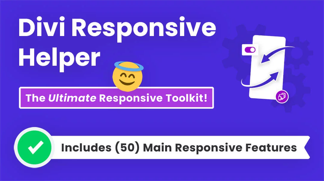
FYI: Do It With Divi Responsive Helper!
Why work so hard? You can do this easily with a setting in our Divi Responsive Helper plugin!
Procedure
Enable The Back To Top Button
The first step before we can control the visibility of the Back To Top Button in Divi is to actually turn the setting on (by default when you install Divi, this setting is not enabled). To do this, go to Divi>Theme Options to the General tab and then look for the Back To Top Button.

Possible Variations
There are six different possible responsive scenarios for showing and hiding the Back To Top Button:
- Show on Desktop only
- Show on Tablet only
- Show on Phone only
- Show on Desktop and Tablet
- Show on Tablet and Phone
- Show on Desktop and Phone
Since I have each of these six options in the Divi Responsive Helper settings, I will also show you how to do each one of these scenarios with custom CSS code.
Where To Paste The CSS Code
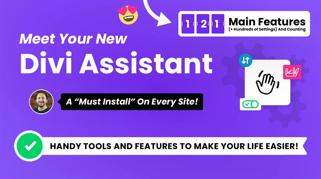
1. Divi Assistant
If you are using our Divi Assistant plugin, simply paste the code in the CSS tab in the custom code window in the Divi Visual Builder.
2. Child Theme
If you are using a child theme, paste this code into the style.css file. If you don't have a child theme, you can generate a child theme directly on your site or download our free child theme.
3. Divi Theme Options Integration
Otherwise, paste this code in your Divi>Theme Options>Custom CSS code box.
If you need help understanding where to paste the code, please check out our complete guide about where to add custom code In Divi.
Show On Desktop Only
This CSS code snippet will show the back to top button on Desktop devices only, and will hide the button on Tablet and Phone devices.
/*show the back to top button on desktop only*/

@media all and (max-width: 980px) {
	.et_pb_scroll_top.et-pb-icon {
		display: none !important;
	}
}
Show On Tablet Only
This CSS code snippet will show the back to top button on Tablet devices only, and will hide the button on Desktop and Phone devices.
/*hide the back to top button on desktop*/

@media all and (min-width: 980px) {
	.et_pb_scroll_top.et-pb-icon {
		display: none !important;
	}
}


/*hide the back to top button on phone*/

@media all and (max-width: 768px) {
	.et_pb_scroll_top.et-pb-icon {
		display: none !important;
	}
}
Show On Phone Only
This CSS code snippet will show the back to top button on Phone devices only, and will hide the button on Desktop and Tablet devices.
/*show the back to top button on phone only*/

@media all and (min-width: 768px) {
	.et_pb_scroll_top.et-pb-icon {
		display: none !important;
	}
}
Show On Desktop And Tablet
This CSS code snippet will show the back to top button on Desktop and Tablet devices only, and will hide the button on Phone devices.
/*show the back to top button on desktop and tablet only*/

@media all and (max-width: 768px) {
	.et_pb_scroll_top.et-pb-icon {
		display: none !important;
	}
}
Show On Tablet And Phone
This CSS code snippet will show the back to top button on Tablet and Phone devices only, and will hide the button on Desktop devices.
/*show the back to top button on tablet and phone only*/

@media all and (min-width: 980px) {
	.et_pb_scroll_top.et-pb-icon {
		display: none !important;
	}
}
Show On Desktop And Phone
This CSS code snippet will show the back to top button on Desktop and Phone devices only, and will hide the button on Tablet devices.
/*hide the back to top button on desktop*/

@media all and (min-width: 980px) {
	.et_pb_scroll_top.et-pb-icon {
		display: none !important;
	}
}


/*hide the back to top button on phone*/

@media all and (max-width: 768px) {
	.et_pb_scroll_top.et-pb-icon {
		display: none !important;
	}
}
Do It With A Setting!
Make life easier and use the Divi Responsive Helper instead, the ultimate Divi responsive toolkit with awesome features and settings to help make your website look and work great on all devices!


0 Comments