A Simple Solution To The Post Content Width Issue
We absolutely love the Divi Theme Builder! It is an exceptional tool that makes building websites with Divi a lot easier. We love it so much we wanted others to learn to use it too, so we created the Divi Theme Builder Course for you that is only $20 and will get you started with this great too. But something you may run into as you start to use the Theme Builder is an issue with the width of the content in the Post Content module. This only happens when you use the Divi Builder on the page/post. The reason it does this is not a bug, but it actually makes sense. Watch the quick video to learn how easy this is!
▶️ Please watch the video above to get all the exciting details! 👆
What Is The Divi Post Content Module Width Issue
So what exactly is the issue with the content width in the Divi Post Content module? Like I said, it is not a bug. It happens when yo use the Divi Builder to build the page or post content. All rows in Divi are set to a default width, so within the sections of the post or page you are adding rows that are not fullwidth. Again, this does not happen if you use Gutenberg to build the content of the post or page, but only when you use the Divi Builder.
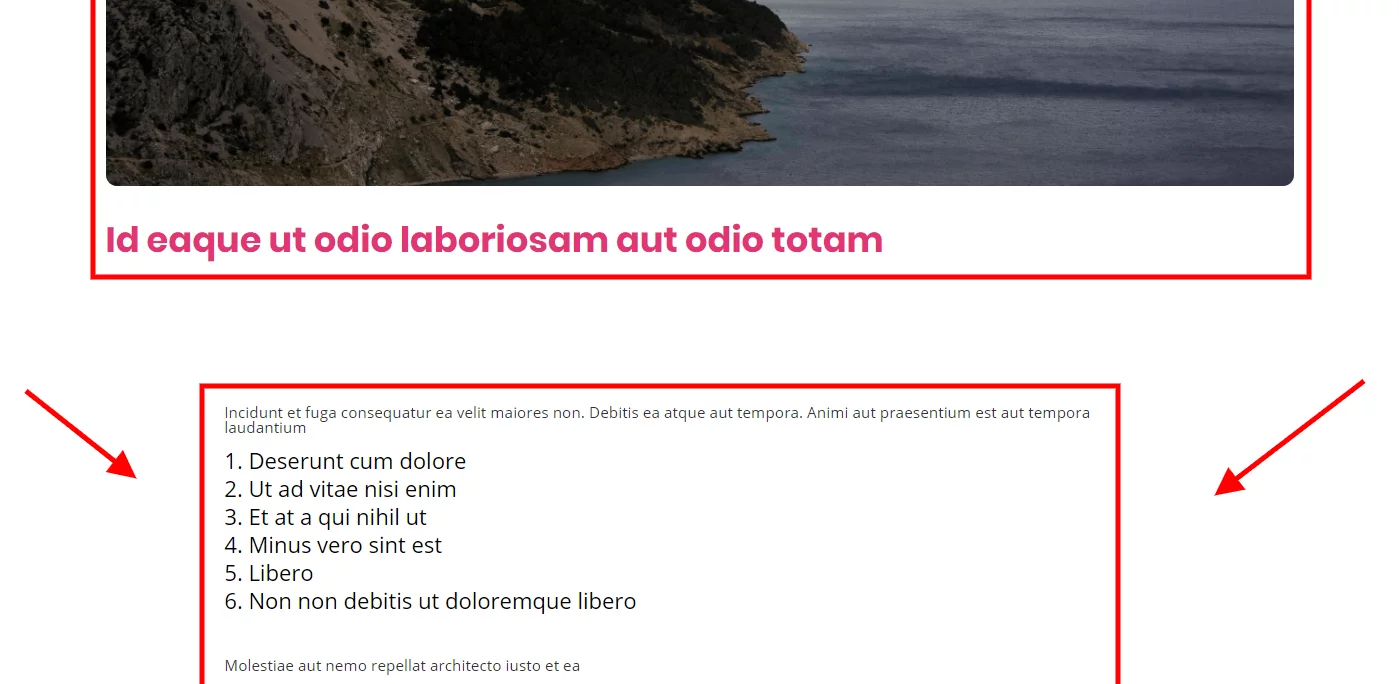
Notice how the row in the Post Content module is so much more narrower than the other items in the image below.
How To Make The Rows Wider In the Divi Post Content Module
Technically you could adjust the width and max width of all of your rows on any page or post that you know is going to be within a Divi Theme Builder template. But wow, that would get annoying. Why not just solve it once and for all?
I have a very simple CSS snippet that solves the issue and makes your rows fullwidth automatically. You can copy and paste the code below into your website.
Where To Paste The CSS Code
1. Divi Assistant
If you are using our Divi Assistant plugin, simply paste the code in the CSS tab in the custom code window in the Divi Visual Builder.
2. Child Theme
If you are using a child theme, paste this code into the style.css file. If you don't have a child theme, you can generate a child theme directly on your site or download our free child theme.
3. Divi Theme Options Integration
Otherwise, paste this code in your Divi>Theme Options>Custom CSS code box.
If you need help understanding where to paste the code, please check out our complete guide about where to add custom code In Divi.
/*set the width of the rows inside the Post Content module*/
.et-db #et-boc .et-l .et-l--post .et_builder_inner_content .et_pb_row {
	width: 100%;
}
In the image below you can see the instant result. The width issue is solved!
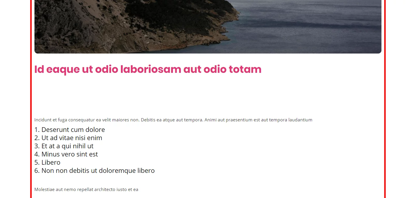
Be sure to watch the video to see this all in action and to see how simple this solution is! We use it on our sites and couldn’t be happier. Let me know in the comments if you enjoyed this!
If you keep putting off learning about the Divi Theme Builder or have tried and need some help, be sure to check our Divi Theme Builder Course! Just look at the reviews :)
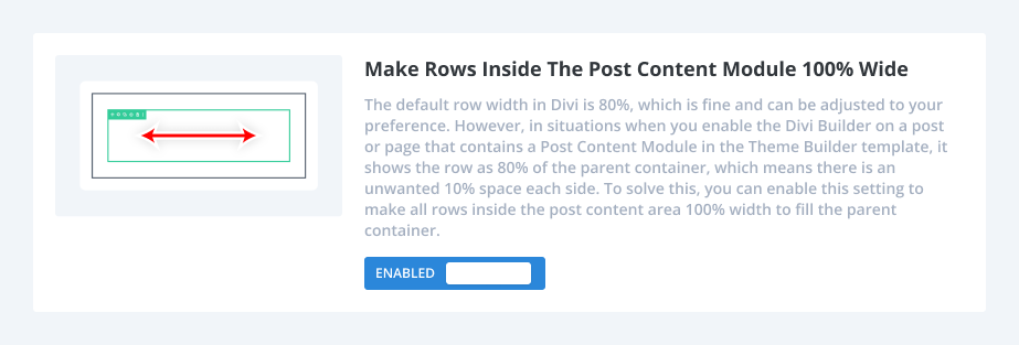
How To Make Rows Inside The Post Content Module 100% wide Using Divi Assistant
Here are the simple steps to make rows inside the Divi Post Content module 100% wide using our popular Divi Assistant plugin:
- Install and activate the Divi Assistant plugin
- Click on the Utility Helper tab and the Visual Builder subtab
- Enable the setting
I hope that is easy enough for you! 😉


![Beyond the Builder Course Featured Image [template] Divi Theme Builder Course YouTube Thumbnail](https://www.peeayecreative.com/wp-content/uploads/2020/06/Divi-Theme-Builder-Course-YouTube-Thumbnail.jpg)


Nice one
DO you know if there is also a solution for all the annoying top and bottom padding.
when you look at it closely its div within div, within div, within div, within div etc. and most have of these divs have a padding 2 of 4%
Hey Erik,
Sure it should be the exact same method, just changing the top/bottom padding. If you have a link let me know and I’ll check it for you.
I do not have a link yet but you can see it in the image i linked
https://imgur.com/a/ewE2KuI
I am curious how to change the top and bottom padding as well. Do you know the solution?
The same method/snippet should work for that, have you tried it?
Hey Nelson, have you experienced any problem with making a section fullwidth? If I set the width of a section to 100vw the section gets the right width but it appears with an offset to the right with respect to the viewport.
Thanks for any suggestion!
Hi Dan,
I dont’ think I have ever encountered that. Try 100% instead, not sure.
1 hour of pain to find an out of the box solution … where is none lol … thx for this snippet! made my day and saved a complex template
Hi Andi, I’m glad I could help! 🙂
Awesome, this has been annoying me for a long time.
Yes me too, glad you could benefit from this!
Nelson,
Thank you. Do you have a css snippet to reduce the top and bottom padding of the post content template?
Hi Richard,
Keep in mind the padding is not from the Post Content module, but rather the sections and rows shown within it. If the content is all within one section on the page, then you could do something like this:
.et-l .et-l–post .et_builder_inner_content .et_pb_section {
padding: 0;
}
I tried this, but it didn’t work. There is still a huge space between the post image and the post body. Any other tips?
Can you clarify what you mean, what you tried, and what you want to do?
Teacher included a typo – code needs an extra dash:
.et-l .et-l–post .et_builder_inner_content .et_pb_section
Actually, if you have multiple sections and rows in your content, divi numbers them automatically. So you can zero/adjust the top padding on the first scetion and therein contained first row by adding the following custom css:
.et-l .et-l–post .et_builder_inner_content .et_pb_row_0 {
width: 100%;
padding-top: 0;
}
.et-l .et-l–post .et_builder_inner_content .et_pb_section_0 {
padding-top: 0;
}
Thank you!
This saved my day.
That is great to hear, so happy I could help!
Thank you so much for saving the day, Nelson! I’ve been playing with this for a couple of hours, and I’m so relieved to have this problem fixed.
That’s great Betsy, I’m really happy I could help!
OMG thank you so much! Grateful for you.
You’re welcome Kathryn! 🙂
That’s awesome Nelson. Couldn’t figure out why where the width was coming from.
Thanks for the post!
You’re welcome, glad to help!
I was fighting this issue, did a google search and either google knows I like you a lot or you have great SEO. 🙂
Then I was still stuck with a right margin, shown in “inspect”, but I couldn’t find where it was set. It turns out it wasn’t really a margin setting but rather the 80% max-width setting for the row that I had added to the post content. So I learned a bit about what inspect is telling me.
That’s great George, I’m so glad Google likes me and you could find that confirmation!
Nice one
Thanks!
I’m not sure why, but this CSS addition didn’t work for me. Did anything change on Divi’s end since this was published? Does it matter in what Divi container (Column, section, etc) the Blog Content generates? Thanks for your tutorials!
EDIT: I take it back, it’s working now! Not sure what changed 🙂 Thanks for your help!
Hi Nelson,
I was able to fix the width with your help.
But unfortunately, I am not able to remove the padding at the top.
There is still a wide gap between the text and the “inhoudsopgave” button.
Can you help me solve this? Thanks in advance!
Kind regards!
That’s because the section has it’s own padding also, so you would use this same method and target the section and say padding: 0;
Thanks for your swift reply.
It worked! Thanks! I really appreciate your help!
For everyone trying to solve the same thing:
I used this code in the custom CSS settings:
.et-l .et-l–post .et_builder_inner_content .et_pb_section {
padding: 0;
}
I had to remove the space in the first class:
/*set the width of the rows inside the Post Content module*/
.et-l.et-l–post .et_builder_inner_content .et_pb_row {
width: 100%;
}
DiviVersion: 4.14.4
Hi,
this is great thanks. Unfortunatley, it is only working on my first blog module, not on the second one where I have a blog offset 1. Do I need a different snippet, please?
Thanks
This tutorial is not related to the blog module.
Thank you! I wanted to add that this worked on my default post types but when I built a custom post type, it didn’t work and I solved by adding “!important”. That fixed it. So if anyone finds that it isn’t working on certain post types, you might have to use this:
/*set the width of the rows inside the Post Content module*/
.et-l .et-l–post .et_builder_inner_content .et_pb_row {
width: 100%!important;
}
man, you are a blessing thanks for saving my ass
You’re welcome!
Hello,
After few years i updated wordpress and Divi, and my fullwidth were not fullwidth anymore. Or they were, but all rows were 80% (I have 100% in options of my rows). And this is a reason:
.et_pb_pagebuilder_layout.single-post:not(.et-tb-has-body) #main-content .et_pb_row {
width: 80%;
}
I would love to know how to switch off that in Divi…
Best regards
Hi!
I’m unsure of the actual cause of the problem. Make sure you are using the most recent version of the Divi theme. Is still getting the issue, can you please share the URL of the page for me so I can check it?
Works like a charm! Thanks
You’re welcome!
Hi Nelson,
I am strangely having the opposite effect, our content with is too wide, but once we open the page builder and then exit the styles are applied
Do you know why this may be happening?
The blog post I attached was fixed by enabling divi builder then exiting – so strange?
Here is an example as well without auto styling?
https://realestatedynamics.com.au/242341-2/
Hi Stell!
I have opened the above page and it does not exist. Can you please check again and provide an alternative page if the page is deleted?
Thanks for this tutorial. What if the post content module is in an own column itself (1 column divided in 3 columns, where the post content module is in the middle) ?
I’m not sure, did you try it and you mean it does not work?
This code works great on desktop and mobile, but not on tablet. I’m using a CSS snippet to show two columns on tablet, but I can’t see how that would interfere. Any ideas on how to get this to work so I have both two columns on tablet and a post that fills 100%?
Hi Raquel,
That is strange because this code is not in a media query, it is not limited to device and would apply to all devices.
Nelson, as you pointed out above, this snippet would apply to all devices. Which ends up not being a workable alternative in my opinion, for it puts the article text *right up to the very last pixel* of width on a mobile device. Though Divi’s 80% width default is obnoxious on desktop, for tablet and mobile it is appropriate. See example of what 100% width for post content looks like on mobile.
Not great.
Is there ANY way to force the 100% width **for desktop ONLY?**
I can see you misunderstood something. You would still have the spacing from the normal row in your Theme Builder template, which is where you can adjust those things if needed.
Thanks a lot! An easy fix for a this problem I had. Works like a charm.
This might be a bit of topic and related to other posts you already made. I’m already struggling a while in getting the image size in the dynamic post content to change.
In my blog posts I usually add a media item and set it to ‘big.
Unfortunately this is giving rather big images in my blog post. So, I changed it from to 2 or 3 rows. This is ok on desktop view, but on mobile they then appear too small.
In what way could you have this image say presented 16-9 scale, for all images in one row?
I tried with css adding on the divi theme builder side, but this does not work.
Any thoughts?
Hi Rolph!
The CSS in the theme builder won’t work in this case. The issue could be due to the different image size rendering on the mobile view or any image optimization plugin that comes to play. Can you please share URL of any post where I can check the issue?
Life saver
I’m so glad to hear this was helpful!