I’ve seen a few people ask how to do this several times, so I thought I would make the answer official. This could technically be done easily using a background image in a column, but then the image would not have any SEO value, so people ask how to do with an Image module. It’s actually pretty easy, and in this tutorial I will show you how to make an Image module automatically fill the entire height of the column in Divi.
▶️ Please watch the video above to get all the exciting details! 👆
1. Set Up The Row, Column, And Image
The first step is to add a row to your layout. In our example, we will be using two columns, so select the two column layout.
Place an Image module into the first column on the left. In the other column, you can place any other modules you want, but in my example I’ll use a Text module. To make the text taller, I am duplicating the placeholder text two times.
Open the Row settings and go to the Design tab to the Sizing toggle and enable the Equalize Column Heights setting.
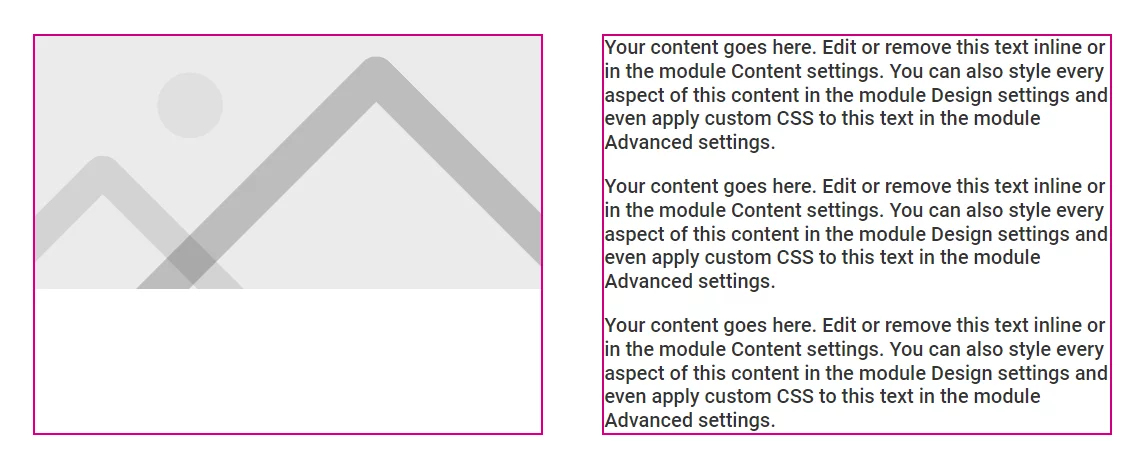
The screenshot below shows what I have so far:
NOTE: I added the red borders to the column for demonstrations purposes to show the height of the columns, but you would not need to do that.
2. Add A Custom CSS Class To The Divi Image Module
The first step is to add a custom CSS class to the Divi Image module. Using a custom class like this will make sure that our code only affects this particular image module with this class, rather than affecting all the images on your site.
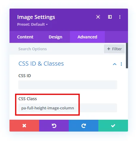
Open the Divi Image module settings and go to the Advanced tab and open the CSS ID & Classes toggle. From there, copy and paste or write “pa-full-height-image-column” into the CSS Class input field, as shown in the screenshot.
3. Add The Custom CSS Code Snippets To Your Website
Where To Add The Code Snippets
Now that you have set up the row layout, image, and added the custom CSS class to the module, you can proceed to adding the code snippet below.
Where To Paste The CSS Code
1. Divi Assistant
If you are using our Divi Assistant plugin, simply paste the code in the CSS tab in the custom code window in the Divi Visual Builder.
2. Child Theme
If you are using a child theme, paste this code into the style.css file. If you don't have a child theme, you can generate a child theme directly on your site or download our free child theme.
3. Divi Theme Options Integration
Otherwise, paste this code in your Divi>Theme Options>Custom CSS code box.
If you need help understanding where to paste the code, please check out our complete guide about where to add custom code In Divi.
/*this sets the height of the image module*/
.pa-full-height-image-column {
	height: 100%;
}

/*this sets the height of the image container*/

.pa-full-height-image-column .et_pb_image_wrap {
	height: 100%;
}

/*this sets the height and fit of the actual image*/
.pa-full-height-image-column img {
	object-fit: cover;
	height: 100%;
}
The code is labeled with a few notes. Basically we need to set the height of the module, the image container, and the image itself to 100%. Then the last step is setting the image to object-fit: cover; which means the image will maintain it’s original aspect ratio and simply zoom in so that it fills the entire height and width of the container. Keep in mind, the image will appear “cropped” as the layout and column width changes, but this is necessary to achieve the effect.






Even if I know how-to of many Divi ‘issues’ , I am happy to read your tutorials, I have learnt so much thanks to you. Keep on doing such a good job, thanks very much from France !!
I’m so glad to hear that! Enjoy!
Your tutorials are really really helpful for students like me .
I’m really glad to hear they are helpful!
This is very handy. I’ve been setting a background image on the column on desktops and using the image module on smaller devices. Your technique is so much better. Thank you!
Hey Jules,
We are glad to hear that we could offer some help.
Hi,
Just what I was looking for!
I’ve got a gallery slider though trying to make the same effect where the image seem to place itself at the top.
I added the class to the gallery module but didn’t get the same effect.. what should I change?
I don’t know, since the tutorial is not about that.
Hey,
Is it working with images from gallery module ? In the fullwidth mode.
Thanks you for your help
Note this is the “Image Module” 🙂
Hello just wondering if this is still working? I have tried it on the latest Divi version and while the CSS is applied correctly nothing seems to be happening. Thank you!
I just published this, so yes it is still working.
Cant I simply add the CSS to the custom CSS of the model? Why would I need to add this to the CSS of the full site?
No, notice the notes below the snippet explaining it.
Thank you SO MUCH for this!!!
You are very welcome, Jessie!
Mmm did not work for me. I have to adjust the settings in the image module to 100%, then it does work (it ‘covers’ so I know it uses the pa-full-height-image-column css.
So, the first part (making it 100% height) does not work somehow. Any idea on that?
Hi Maarten!
I’m not sure exactly what is causing the issue. Could you please share the URL of the page for me so I can check it?
I love your presentation style and clarity and you have solved many DIVI issues for me! I’m having a problem with this one and I was hoping you might have some feedback. I am trying to display a very tall infographic (1080X5300 px, 700k) in a DVI image module on a single column page. I found a plugin that allows me to upload the image without getting scaled and your CSS code for “How To Make An Image Module Fill The Column Height In Divi” worked perfectly… at first. For some reason the code stops working after a few refreshes or page revisions. Do you have any ideas about what could be the issue?
Hi Roger!
I’m not sure exactly what is causing the issue. Can you please try disabling the responsive images option in Theme options.
If that doesn’t help, could you please share the URL of the page for me so I can check it?
This isn’t working for me, either … at least not in all cases.
The issue is that the columns are being set to 100% of each other. I.e., whichever is taller. So if the image is taller than the text (or whatever is in the other column), the image column won’t shrink. Rather, the text column next to it will grow.
So the only way this works is if the image aspect ratio is such that when scaled to fit (not cover), the image would be shorter than the other column. This CSS then tells it to cover the container, so it scales it up to fit vertically (i.e., cover). That’s why it works with the Divi placeholder image. If you use it with a vertical image, for example, whose height is more than the height of the text column, it will not work.
So if we want to use this code, the solution is to crop the image to be as wide as possible.
I don’t understand what you mean, our tutorial works fine as is.
I also have the same issue when using a portrait picture it dictates the height of the row not the text column.
I don’t totally understand what you mean. If the image is taller than the other column text, then yes that will make the column taller.
How did you solve that issue?. I have the same problem when using vertical images. I tried with horizontal images and it works fine, but not with vertical.
Thanks a lot for this tutorial. If you put #page-container in front of the last selector, the changes are also visible in the visual builder!
Thank you for letting us know. We will check further about it.
Hi,
I’m having an issue on a gallery page I’m working on. In some cases along the page one of the images will appear shorter than the others in its row. Is there something I am missing?
If the context you are describing is outside the scope of this tutorial, then I am not sure.
How do you do this? and vertically center text in a column next to the image. I can’t get the copy to not align to the top
I can confirm this works however how can the CSS be adjusted for when the height of the image is too big for the content in the adjacent column? Is there any way to use CSS to crop the bottom of the image appropriately so the height of the image becomes the same as the height of the content column?
Hi Mike!
Add the property object-position in the img code to set the position of the image. Ex:
.pa-full-height-image-column img {
object-fit: cover;
height: 100%;
object-position: 20px 80px;
}
You can change the values in the property as per your requirements. Hope it helps!
Hi Nelson, thanks for sharing this fantastic post. I have an issue, and by reading the comment I see that more people us having it when applying this code to vertical images, I created a page to show you what I mean.
I would love to know how can I resize automatically the first image, so that the container don’t show it all when my text beside it is not that long. Maybe it could crop it from the bottom and make it mora 1:1 aspect ratio.
Well here is my example https://arminfigo.com/test/ and here a site that does the crop just how I would like it to behave, is the About section https://www.deniselipman.com
Hope to hear from you.
Sorry for my English, I’m not a native speaker
Hi Armin!
The image used here is too large. You need to change the image size using paint or any other photo software.
Hi Nelson,
I am having trouble getting this to work in the Must-Haves About Sponsorships Section. The lady with the square color background. I want this image to fill the column. Thanks.
Hi Vince!
Can you share the URL of the page to check further?