Change Logo Position On Scroll
By default the Divi Menu module only comes with a few layout options. Many people complain that we are missing the features that the old default header menu had (in the Customizer). And because I always recommend using the Theme Builder and never using the old header, I would like to create some solutions for you to recreate some of the missing features. So in this tutorial I will show you a simple way to change the placement of your menu’s logo from top center by default to the left on scroll. This functionality is easy to achieve and adds a nice effect to the website.
Here is the result we will achieve:

Be sure to watch the video to learn the best. Also check out our many other Divi Menu module tutorials!
▶️ Please watch the video above to get all the exciting details! 👆
Add The Divi Menu Module
The first step of course is to add the Divi Menu module to your layout. You can add this anywhere, and the effect will always work on scroll.
Optional: Create Theme Builder Template
But I would assume that the most common place to use this would be in a Theme Builder header template. If you don’t already have this created, just go to the WordPress Dashboard>Divi>Theme Builder and click “Add Global Header” in the first template.
Optional: Set The Section To Fixed Or Sticky Position
The best way to see the changes when the users scrolls is to set the section which contains the menu module to a fixed or sticky position. This means that when the website visitors scrolls, the logo will change position in the Menu module from top center to left.
You have a few options here. You can go to the Advanced tab of the section to the Position toggle and set the position to Fixed. Or you can open the Scroll Effects toggle instead and set the Sticky Position to Stick to Top.
Add A Logo Image
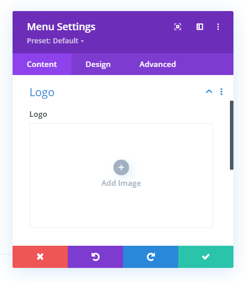
Now go ahead and edit the template and add the Divi Menu Module to your layout. Then open the Menu settings and add a logo image.
Set Layout To Centered
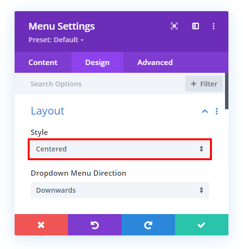
This tutorial is all about changing the Divi Menu logo position from top centered to left on scroll. So we need to set the default layout as “Centered” and then later we will add some code to change this position when the visitors scrolls. You can find this setting in the Design tab in the Layout toggle.
Add Custom CSS Class
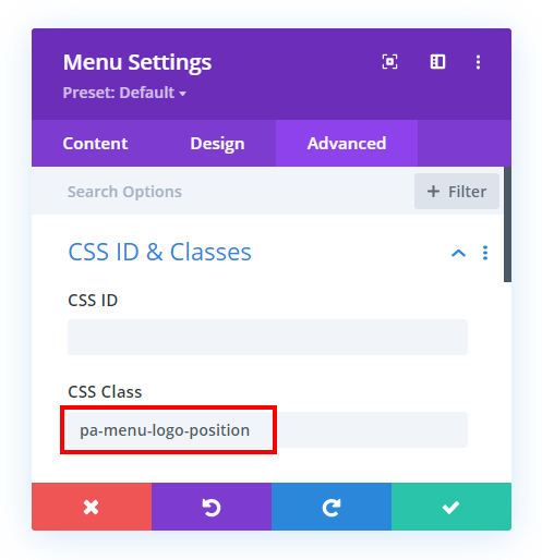
In order to only target this particular Menu module on the site, we need to set a custom CSS class in the module. This same class will also be used in the jQuery snippet and CSS snippet. So go go to the Menu settings>Advanced tab>CSS ID & Classes toggle and add “pa-menu-logo-position” to the CSS Class input field.
Add The jQuery Code
Now that the Divi Menu module is properly set up, we can proceed with the code portion of this tutorial. Since our goal is not possible by default, we need to use two types of code in order to achieve it. But it is easy, I will provide all the steps you need.
Where To Paste The jQuery Code
1. Divi Assistant
If you are using our Divi Assistant plugin, simply paste the code in the jQuery tab in the custom code window in the Divi Visual Builder.
2. Child Theme
If you are using a child theme, paste this code into the scripts.js file (don't forget to remove the <script> tags at the beginning and end). If you don't have a child theme, you can generate a child theme directly on your site or download our free child theme.
3. Divi Theme Options Integration
Otherwise, paste this code in your Divi>Theme Options>Integrations tab in the "Add code to the < head > of your blog" code area.
If you need help understanding where to paste the code, please check out our complete guide about where to add custom code In Divi.
<script>

jQuery(document).ready(function() {
    jQuery(window).scroll(function() {
        var scroll = jQuery(window).scrollTop();
        if (scroll > 80) {
            jQuery(".pa-menu-logo-position").removeClass("et_pb_menu--style-centered");
            jQuery(".pa-menu-logo-position").addClass("et_pb_menu--style-left");
            jQuery(".pa-menu-logo-position").addClass("pa-onscroll");
        } else {
            jQuery(".pa-menu-logo-position").addClass("et_pb_menu--style-centered");
            jQuery(".pa-menu-logo-position").removeClass("et_pb_menu--style-left");
            jQuery(".pa-menu-logo-position").removeClass("pa-onscroll");
        }
    });

});

</script>
What Is The Code Doing?
A class is created in the Menu module by default depending on which layout option is chosen. Our code is adding the left-styled class and removing the centered style class so that we can get the left alignment and
It is also adding one more class “pa-onscroll” to the menu. This is a custom class which will be used to add the CSS styling only when the scroll happens.
If you want to increase or decrease the distance of the scroll effect you can change the “80” value which can be seen in the code.
Add The CSS Code
The next step is to add some CSS that correpsondes to the new “pa-onscroll” class that is being added when the website visitor scrolls.
Where To Paste The CSS Code
1. Divi Assistant
If you are using our Divi Assistant plugin, simply paste the code in the CSS tab in the custom code window in the Divi Visual Builder.
2. Child Theme
If you are using a child theme, paste this code into the style.css file. If you don't have a child theme, you can generate a child theme directly on your site or download our free child theme.
3. Divi Theme Options Integration
Otherwise, paste this code in your Divi>Theme Options>Custom CSS code box.
If you need help understanding where to paste the code, please check out our complete guide about where to add custom code In Divi.
/*place everything in a single row and align them vertically*/

.pa-menu-logo-position.pa-onscroll .et_pb_menu_inner_container {
	display: flex;
	align-items: center;
}


/*position the menu navigation items to right*/

.pa-menu-logo-position.pa-onscroll .et_pb_menu__wrap {
	justify-content: flex-end;
}


/*position everything if the search bar is enabled*/

.pa-menu-logo-position.pa-onscroll .et_pb_menu__search-form {
	display: flex;
	justify-content: flex-end;
}


/*restrict the width of the search bar if it is used*/

.pa-menu-logo-position.pa-onscroll .et_pb_menu__search-input {
	max-width: 400px;
}




This is a great tutorial, thank you. However, I found an error in the code, all pa-onscroll should be pa_onscroll
Hi Shaun,
I think this is all good. Am I missing something? It’s just a custom class so it can be either way, but they would have to match.
Hi Nelson, After the scroll, I want to reduce the size of the logo, How to do that. Please help?
Hi Dave,
In the URL that you mentioned, the header is not fixed for any screen then I guess there will be no point in reducing the logo size as it will be out of the viewport when you will scroll the page.
Please let me know if there is another URL where you facing this issue.
Hi there, is there any way to make the transition smoother from centered to left alignment, the logo jump to quick? Any CSS that would assist here?
Hey Genee,
Could you please share the website URL for me to investigate further?
Hey great article. I’d like to make the height of the menu area transition smoothly rather than jump instantly. I guess I would use CSS transition but I’m not sure which element/selector to add that to. Can you help? I would share the URL but the site is currently hidden and in dev. (the site listed below is the current old one)
Hey Kieron,
I have checked the website and I think you have not placed any code yet to change the logo placement on scroll. I would request you to place the code first and then share the URL and I’ll fix the transition after analyzing the issue that is happening because on my end everything is working fine.
Thank you for your great tutorials Nelson, appreciated!
Is there a way that once you scroll and the logo changes position, to swap out the logo for another one?
I want to use a large logo for the center position then a simplified smaller one on scroll.
Sure, you can check our other tutorial: https://www.peeayecreative.com/how-to-replace-the-divi-theme-builder-logo-when-scrolling/
Unfortunately, this doesn’t work for me. I copied all steps verbatim, and the menu looks worse than it used to.
I don’t know, maybe the new version of Divi doesn’t support that? I’ve had different kinds of bugs all throughout the page I’ve been building.
Hey Stanislaw,
I have checked the code and it’s working fine on my end. Could you please share the URL and list the issues that you are facing thought-out so I can check all of them and provide you with a couple of solutions in order to fix things?
Is it possible to achieve this effect of moving the logo from the top center to the left on using Theme Customizer (Old Header). I would be very grateful if you could help me achieve this with some additional code. I tried something but the search box appears on my mobile, and I just want the logo on the left and the search icon
and the hamburger icon on the right, and on the desktop the effect you achieved with Divi Theme Builder. I know you prefer Theme Builder, but for some inexplicable reason I really like Old Header in Customizer. Thank you very much in advance and for all the wonderful, best regards!
Hey Nenad,
By default, we need to place the logo in the center and as we don’t have the access to your website so could you please go to the Theme Customizer and set the header style to centered or centered inline and then comment again so that I can check the scenario and provide you the snippet?
You can do that on the staging site and provide us that link and after finalizing everything, you can push it live.
This is a link to a staging site https://www.nvsolutions.rs/1650970621473/.
If you need anything else, please tell me. Sorry I didn’t answer right away. I took a few days off for the holidays.
Hey Nenad,
This link is also taking me to a page where I need to place the credentials. Please remove this step so I can check the page.
Hi Hemant,
I did what you asked. It’s OK now, I checked the staging site. In a post from April 21, I was wrong when I said that the search box appears on the mobile version. The “Select page” box actually appears. I want to remove that, so that the mobile version looks the same as on the current site, and also on the desktop to achieve the effect that you achieved. Best regards!
Hi Hemant,
if it will be of any help to you, I found an example of how I would like the mobile version to look. This is the website: http://andrewkingslow.co.uk/. One difference is that on this site the inline logo is on the desktop version, but the result achieved on the mobile is more or less what I would like to achieve at https://www.nvsolutions.rs/1650970621473/. I tried to figure out how they achieved it, but I didn’t quite succeed. Limited knowledge :). Best regards.
Hi Nenad,
I noticed you have had 5 comments on this post, but are not using the threaded comments, which makes it really difficult to follow and reply. In the future, please reply in the threaded comment. Also, just to clarify, we are not a free customization service. Hemant is only supposed to help with issues related to the code in the tutorial, but it would be crazy for us to provide free customization service to our blog readers. Thanks for understanding.
I’m sorry to bother you. Thank you for the precise clarification. I wish you all the best.
Hi I found that I had to target the full-width menu module row by adding:
.pa-menu-logo-position.pa-onscroll .et_pb_row { display:flex; }
if that helps anyone otherwise it wouldn’t move the logo to be inline with the navigation.
Is there a way to trigger the javascript that on mobile it is always left aligned? I tried adding:
if(jQuery(window).width() < 981 ) {
and it works to make it left aligned as it loads and on scroll down but it changes back to center aligned header when you scroll back up.
Thanks
Strictly speaking syntactically, the last two closing brackets should end with a semi-colon like this:
}
});
});
This won’t prevent the script from executing, but it will throw a warning with any decent JavaScript editor.
Thanks Ken, updated!
Hi Nelson,
Thanks for the many handy Divi tutorials you’ve got here.
I have a related question. What’s the secret to getting the Divi menu module to align the logo to the far left and the menu to the far right? I see PeeAyeCreative has it displaying that way. Yet I’ve had a heck of a time getting Divi menu to do it. The logo is always hard up against the left end of the menu, irrespective of how wide the page container is.
Do you have a tutorial covering this? I looked, but didn’t find one. It was my search for such that lead me to a number of your Divi menu related tutorials.
Cheers … Jonathan
Hmm… Right after asking, I figured it out. It’s the “Menu text” alignment setting. All good. That was easy.
Hi Jonathan!
I’m glad the issue is resolved. We will consider creating more guides for Divi menu.
Let us know more suggestions in the comments. Thank you!