
Open The Mobile Hamburger Menu
On almost every site I make and every child theme I design, I like to show a menu in the footer of a site with the terms and conditions and privacy policy. But sometimes I also have another menu for other things, and so before long, we have hamburger menus all over the place. To solve this, I like to keep one or more of the menus open on mobile. So this tutorial will show you how to change the mobile hamburger menu into an open menu just like on desktop.
FYI, this tutorial will be the opposite of a tutorial we did before about how to show a Divi hamburger menu on desktop.
▶️ Please watch the video above to get all the exciting details! 👆
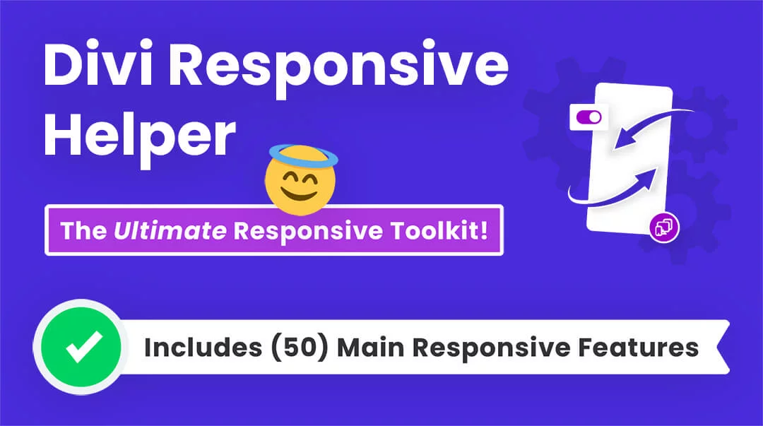
FYI: Do It With Divi Responsive Helper!
Why work so hard? You can do this easily with a setting in our Divi Responsive Helper plugin!
Show Divi Desktop Menu On Mobile
As I mentioned in the intro, there are many times when the hamburger menu is not idea. If you want to see this in action you can check out the demo of most of our Divi child themes that we have for sale.
The first step is to add a custom CSS class to the specific Menu module that you want to keep open on mobile. We do this so that the snippet does not affect all the menu modules, which allows us to choose which ones remain like normal and which ones are affected. Open the Divi Menu module settings and go to the Advanced tab. Got the CSS IDs & Classes toggle and find the CSS Class input field. Place the class “pa-open-mobile-menu” in the input field.
HINT: If you need help with any of this, be sure to watch the video!
Where To Paste The CSS Code
1. Divi Assistant
If you are using our Divi Assistant plugin, simply paste the code in the CSS tab in the custom code window in the Divi Visual Builder.
2. Child Theme
If you are using a child theme, paste this code into the style.css file. If you don't have a child theme, you can generate a child theme directly on your site or download our free child theme.
3. Divi Theme Options Integration
Otherwise, paste this code in your Divi>Theme Options>Custom CSS code box.
If you need help understanding where to paste the code, please check out our complete guide about where to add custom code In Divi.
/*show desktop menu on phone*/

@media (max-width: 980px) {
	.pa-open-mobile-menu .et_pb_menu__menu {
		display: flex!important;
	}
	.pa-open-mobile-menu .et_mobile_nav_menu {
		display: none!important;
	}
}
And that my friends is how to change the hamburger icon into an open menu! I really like this effect and hope you do too.
Want To Do The Oppposite?
We have a separate tutorial on how to change the normal menu into a closed hamburger icon menu on Desktop! You can even use this to show both a normal desktop menu AND a hamburger menu at the same time. Go check it out!

Do It With A Setting!
Make life easier and use the Divi Responsive Helper instead, the ultimate Divi responsive toolkit with awesome features and settings to help make your website look and work great on all devices!


Works perfectly!
Thank you!
That’s great, you are welcome! 🙂
It has worked great, however it has creates an horinzontal scroll!
Thank you so much
You’re quite welcome!
Very useful and smart! Well done
Thank you, glad it is useful 🙂
Great hack! man, it’s working perfectly. Thanks buddy.
You’re welcome Anthony, glad to hear it is working great for you!
Hi Nelson,
I am a beginner in DIVI, some times I found DIVI is not flexible and capable in designing good looking websites. Accidentally I came across one of your tutorials in YouTube. A link in the video description took me to your website. let me admire the good looking of your website and the work you put in it . I was curious and would like to ask you, did you built your website using DIVI? or use DIVI with plugins or you bought a commercial theme from designing company from the internet? I subscribed to your channel and news paper and I love to have communication bridge with you.
thanks
Wael
Hello Wael,
It’s nice to meet you and I hope you enjoy my tutorials. Yes, I build this entire website myself with Divi 🙂
Your tutorials are so helpful, thank you! I used this on my site I’m working on. Only one issue because I have multiple menus stacked. With the drop down the text/border of the other menus shows through the background (I attached a photo below). Any tips to get rid of this? Thanks so much!
Could you please share the URL of the page on which this issue is happening so that I can investigate further?
Yes, here you are just scroll down to procedures section and it’s there. Thank you so much! https://areteplasticsurgery.com/
The overlapping is occurring because the dropdown is set to absolute which is a default setting of the Menu item. There are two things that we can do here, first is to provide the gap of the dropdown between the modules and the second is to go to the Column Settings > Advanced > Position and increase the value of the z-index for each column. This will show the dropdown content clearly.
Thank you so much!! Worked beautifully.
Beautiful tutoring!
Quick question, how do you do with header menu to reach the : “Divi Menu module settings”. My only main menu is build on my Header. And somehow i can’t reach it. Any tips?
Thanks
I am afraid that I am not able to understand the issue that you are facing. Could you please elaborate on the issue a little more and provide us the URL of the page for our better understanding?
Hi,
So there are 2 steps.
1) Open the Divi Menu module settings and go to the Advanced tab, custom CSS and paste : pa-open-mobile-menu
2) paste the snippet there Divi>Theme Options>Custom CSS.
Unfortunately, I can’t find the “Divi module settings” in order to type in the CSS
http://www.sandrorupp.com
The steps that you have mentioned will work with the Theme Builder header or Custom Header but the header you are using is the Default Header so that these steps will not help. Please go to the Divi > Theme Options > Custom CSS and paste the code given below:
@media all and (max-width: 980px){

    ul#top-menu {

        display: block !important;

        margin-top: 2em;

    }
div#et_mobile_nav_menu {
display: none !important;
}
#top-menu-nav{
display: block !important;
}
}
This code will show the Menu Items on the small screens as well. Let us know if that helps. 🙂
Wow that’s fabulous! Thanks a lot! any ways to change the size of the menu?
Could you please try using this code and see if that helps?
@media all and (max-width: 980px){

    ul#top-menu li a{

        padding-bottom: 1em !important;

        font-size: 16px;

    }

    ul#top-menu li{

        padding-right: 10px;

    }

}
Let us know how it goes. 🙂
Hello,
It doesn’t work on my site.
Can you help me?
I can see it working fine on your site 🙂
It doesn’t work 🙁
Can you help?
http://www.denkvabrik.de
Hi Sarah,
Could you please try this snippet and see if that helps?
@media all and (max-width: 980px){
.et_pb_menu_0_tb_header .et_pb_menu__menu{
display: block !important
}
.et_pb_menu_0_tb_header .et_mobile_nav_menu{
display: none;
}
}
Let me know how it goes.
Hi, I tried your solution, but what I’m facing is that next to the open menu, it also still shows the hamburger icon (in greyish color). This is only the case on some pages (the pages in which my shop items are listed (categories/shop pages), so I’m not really getting why it only malfunctions on these pages. Can you please help me?
Kind regards,
Marjolein
Hey Marjolein,
Could you please try this code and see if that helps?
@media all and (max-width: 980px){

    .et_pb_menu__menu{

        display: block !important;

    }

    .et_mobile_nav_menu{

        display: none !important;

    }

    .et_pb_menu__wrap{

        justify-content: center !important;

    }

}
Let me know how it goes. 🙂
Hi, this is a great useful tutorial however I would like the menu centered, I tried the code above (and it shows centered in the divi builder but on an actual device it is still aligned to the right. Any ideas?
You can center the menu by setting the menu text to center in the module.
Hallo,
I read already a lot of your tutorials and they helped me a lot – thank you so much!
However, I have an issue that drives me crazy… I have my open divi menu now at my mobile and that works, but it adds blank space on the right. That wouldn’t be an issue if I could set the horizontal scrolling to invisible. But when I do this, the drop down menu is not working anymore (I assume because it is behind the other elements then like you have it in an other tutorial).
Do you know any help?
Hey Sara,
I have read your query and do provide you with any valid solution for the same, I could like to check the page where this issue is present so it would be great if you can share the URL of the page for me to investigate further.
Hi Hermant and Sara, I have the exact same issue than Sara. This solution works great but create horizontal navigation scroll bar on mobile. If I hide the overflow, then I can not see the dropdown on mobile. Any ideas? It’s the menu under the search bar here: florentfischer.com. Right not I have the horizontal and vertical overflow hidden on mobile in the Menu settings. Row and section are default.
Hey Flo,
I cannot see the horizontal bar and also not able to see the overflow hidden property that you are using so could you please elaborate on where you have placed the property so that I see the issue?
Hi Hermant,
Thank you for responding.
So after my header (blue background), I have this one global section with the search bar and the menu.
Example 1: no change, the menu works great but there is the horizontal scroll bar and the extra white space on the right end side, see screenshot via link below:
http://florentfischer.com/wp-content/uploads/2022/07/capture_default_dropdownOK_scrollbar-scaled.jpg
Example 2: I set the section overflow to “hidden”, no more horizontal scrollbar and white space on the right, but the menu doesn’t display all the sections in the dropdown as I’m assuming they’re now
“hidden”. See screenshot:
http://florentfischer.com/wp-content/uploads/2022/07/capture_hidden_dropdownNOTOK_NOscrollbar2-scaled.jpg
I tried to put the “hidden” in the row settings or menu settings but it didn’t work neither.
Any ideas? Thanks,
Flo
Hey Flo,
I have checked the website and I cannot see any of the issue that you have mentioned in the comment so I am assuming that the problem is solved. Please let me know if you have any other query.
This is great!
One thing however is that the menu items aren’t stacking one of top of the other but rather going side by side.
Any idea what I might be doing wrong?
Hey Mercy,
I have checked the website and the query you have asked seems completely different from the header that is placed on the website. Could you please guide me in the right direction so that I could help?
Hi, thank you SO MUCH for this. I’m struggling with something, if you would be so kind to help… I only want my secondary menu to be open on mobile. My secondary menu is really just one link “My Account” in the top right of website. The main menu is the main navigation on the site. Right now my secondary and main menu are both hamburgers, and it looks weird. I want to keep the main menu humburgered. How do I open the secondary but keep the main closed? I tried adding “secondary-menu” in the code where “main-menu” was mentioned but that didn’t work (and I’m def not a developer, so not sure that would even work, was just trying things). Thank you so much!
Hey Meaghan,
Could you please use this code and let me know if that solves the issue or not?
@media all and (max-width: 980px){

    .et_pb_menu_0_tb_header .et_pb_menu__menu {

        display: block !important;

    }

    .et_pb_menu_0_tb_header .et_mobile_nav_menu{

        display: none !important;

    }

}
You are brilliant, thank you! It worked perfectly. Thank you so much
You’re welcome, I’m glad that it worked. 🙂
How can I get the menu items to stack in a list format?
Hi Jay,
Perhaps this is what you are asking about: https://www.peeayecreative.com/how-to-make-a-vertical-divi-menu/
Thank you very much for this tutorial.
I have the problem with the submenus on my mobile phone. The submenus are opened next by, but there is no space to get to this submenu. Do you know any advice?
Hey Ann,
I saw the issue and here we can adjust the position of the submenu to keep it inside the screen. Could you please try this code and see if that helps?
#menu-hauptmenue-1 ul.sub-menu {
left: -70px !important
}
Place this code in Divi > Theme Options > Custom CSS Panel.
With -40px it was perfect for my case, thank you so much!
I am glad that the issue is resolved now. Please let us know if you need any further assistance. 🙂
not working for me when adding css on the module, or to the page or the the additional CSS of theme customize
This tutorial is for the Menu module, and would need to be modified for the default header of Fullwidth Menu like you are using.
Hi Nelson,
Can you add to this:
1- Stack the menu items vertically
2- Can show a custom icon before each menu item instead of a bullet
3- All menu items align center (horizontally)
4 -Adjust padding between each menu item
Thank you
Hi Pablo,
I already have tutorials on all of those topics 🙂
can you post the links here please
Our blog is self-serve, you can easily find them by using the search and categories.
So this tutorial shows the regular horizontal menu on mobile:
https://www.peeayecreative.com/how-to-show-an-open-divi-menu-on-mobile-instead-of-the-hamburger-icon/
Now this one shows you how to customize the menu + show it vertically:
https://www.peeayecreative.com/how-to-make-a-vertical-divi-menu/
But. I couldn’t combine the code all in one.
🙁
Yes of course, they are both different. The first one opens the menu, the second one is how to make it vertical on desktop. If there is something you are unable to achieve, you are welcome to hire a developer to help you get this fixed.
Here is the answer from Elegant’s Theme Support.
In addition to your code. to show the menu layout vertically and center here is the code:
To correct your footer on mobile, Please, go to your WordPress Dashboard > Divi > Theme Options > Custom CSS and add the following:
@media(max-width: 767px){
ul#menu-footer-menu {
flex-direction: column !important;
gap: 20px;
}
ul#menu-footer-menu li {
justify-content: center;
}
}
They were very nice and quick to answer my request.
Are you implying that I was not nice and not quick?
I am using the code below and it works fine. I was wondering how I would tweek this to have the logo centered inlined logo In the theme customizer. I would like the mobile to match. Thanks in advance for your help with this matter.
@media all and (max-width: 980px){
ul#top-menu {
display: block !important;
margin-top: 2em;
}
div#et_mobile_nav_menu {
display: none !important;
}
#top-menu-nav{
display: block !important;
}
}
Hey ML,
Could you please share the URL of the page for me to investigate it further?
Hi there…
Thanks for helping others, but I have a week testing this and it doesnt work, so I setup a brand new site to see if you can help me …
Probably because you are using the default header menu. This is for the Menu module.
Many thanks for the very useful code. I am struggling to work out how to change the link color on hover. Any assistance with this would be very much appreciated!
Hi Joel,
I don’t think that is related to this tutorial. You should be able to change the hover color in the Menu module design settings.
Hi, is there a way I can make this apply only to tablet mode, but then turn back into hamburger icon on phone?
Hi Dan!
Yes, you can use the given code below in the WP Dashboard > Divi > Theme Options > Custom CSS:
@media only screen and (min-width: 769px) and (max-width: 980px) {
.pa-open-mobile-menu .et_pb_menu__menu {
display: flex !important;
}
.pa-open-mobile-menu .et_mobile_nav_menu {
display: none !important;
}
}
Let me know how it goes. 🙂
I tried using the code above to not have a hamburger menu on a tablet, but for it to show on phone. I’m still seeing the hamburger menu on the tablet.
Hi Patti!
Can you make sure you have added the class pa-open-mobile-menu in the Menu module? If already added, could you please share the URL of the website? It will help me to understand the issue better.
Thanks for the code! It works well but if I try to close the menu clicking on the small arrow it doesn’t close. So the menu remain opened until I click outside the dropdown. Can I ask you if is possible to close it also on the arrow? Thanks!!
Hi, I recently asked help for this menu because to close it the little arrow doesn’t work, so I have to click outside the menu to close it. Is there a solution to make the arrow able to open and close the menu? Thank you.
The default menu has an icon, so maybe you should not use this tutorial if you want an icon to open and close the menu.
Followed directions, but Not working on mobile site; upskillmedia.co
Can you clarify what is not working?
works – thanks. for some reason the mobile menu will not display 3rd level of drop down.
Hmm I never tested it with 3rd level, but our class is not specific, so I don’t see any reason off hand why it wouldn’t work for any level.
Hi Guys, Love the tutorials.
I created a custom menu in my header, but I want to have a normal menu at the footer to show off basic links for the menu, without the dropdowns.
What code can I use to show the menu on the phone without it affecting the main menu in the header?
I dont want to show the hamburger icon in my footer.
Hi Lambert!
You just need to add the class pa-open-mobile-menu in the footer menu and follow the above guide’s instructions. Avoid adding the class in the header menu.
Hope it helps!
Hi, This is fantastic thanks! however, unfortunately I am having an issue where the dropdown menu is going off page and causing a horizontal scroll on mobile. please help. Thank you so much! Its on this page: https://thesafetysystem.co.nz/our-safety-system
Hi Isabelle, you can check our guide about the horizontal scroll issue here: https://www.peeayecreative.com/how-to-solve-the-horizontal-scroll-issue-in-divi/
Hi, love your work!
We have some trouble at the website deli-news.dk. The menu simply disappears when we add the code. Do you have any idea why this happens?
Hi Cornelius!
Try this code instead and see if it helps:
@media all and (max-width: 980px) {
.pa-open-mobile-menu .et_pb_menu__menu {
display: flex!important;
}
.pa-open-mobile-menu .et_mobile_nav_menu {
display: none!important;
}
.et-db #et-boc .pa-open-mobile-menu .et_pb_menu__menu li{
display: block !important;
}
}
Thank you so much for this!
You’re welcome, Katie!