Solving A User Experience Issue
Have you ever noticed horizontal scrollbars appear on your site, especially on mobile? When scroll on your phone, does the screen move back and forth sideways? This is not good for user experience! This issue can make the website look very unprofessional, and it is also confusing. Many Divi websites have this problem and it often goes unnoticed.
This issue is very common no matter what theme you use, so it’s not Divi’s fault! Usually it is user error, although not always. Thankfully there are several solutions.
▶️ Please watch the video above to get all the exciting details! 👆
What Is The Horizontal Scroll Issue In Divi?
The issue we are referring to can appear in couple different ways. Sometimes users see a horizontal scrollbar appear at the bottom. This is added by the browser because some content is too wide for the screen. Others do not see any scrollbar, but notice the site moves sideways when scrolling. This is especially common on mobile devices when scrolling with your finger and you are able to move the content left and right on the screen.
This issue is occurring because something is making the page container larger than the browser window. It is usually caused by an element being wider than its container so it hangs off the edge of the page. There is a possibility that the content of your website may cut off or be hidden.
Whichever type of issue you face, it simply should not be happening! It does not look good. It can confuse users and makes the site feel broken and unprofessional.
What Is Causing The Horizontal Scroll Issue In Divi?
Now that you have a description of the issue, let’s consider some possible causes for why this is happening. Unfortunately it not always one specific common reason, but rather several possible scenarios which have been know to cause it.
Common Causes
- Often this is caused by margin, padding, and sizing that has not been properly optimized for Tablet and Phone devices sizes. Due to these settings, the elements may be overflowing the browser viewport.
- The menu dropdown submenus are another thing to check. These can sometimes be off the side of the screen.
- The navigation menu could be too wide for the page.
- I’ve even heard of a logo being too wide and there wasn’t enough space for it.
- There could be some width or min-width issue in the Sizing settings in a module, row, or section.
- I’ve read of cases where an animation was causing it, due to the movement beyond the container.
- If you are adding advanced custom styling to Divi in general. Sometimes you want to achieve a specific effect but overlook this issue.
Let me know what I missed and I will update the list!
Solutions To The Horizontal Scroll Issue In Divi
Find The Cause
There are some quick solutions, but it would be wise to at least try to identify what is causing the issue first. The key here is that something is causing the problem. The ideal solution will always be to find the element or code or setting and undo the cause. Easier said than done!
Solutions
There are several solutions, but it all depends on the cause. Without knowing the cause it’s pretty hard to give a specific solution. So the next steps are to review the common causes and then take some action on those.
A great place to start is to simply load on your phone, and also on desktop. Use the responsive tools in your browser to check for anything obvious.
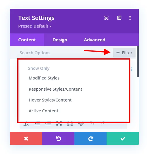
When you are inside the Visual Builder, change the responsive views back and forth between Desktop, Tablet, and Phone. Notice anything odd? If you do, open some of the sections, rows, and modules and check the sizing, width, padding, and margin settings. To make it easy, you can use the filters and choose Responsive Styles/Content to see only the settings that have been modified on Tablet and Phone. You can also choose to filter by Modified Styles in general, as the issue may not be specific to the responsive settings..

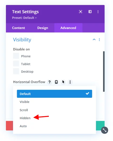
If you narrow it down to some row, column, etc. but do not have any settings wrong, you can solve this by opening the element and going to the Advanced tab to the Visibility toggle and setting the Horizontal Overflow to Hidden.

The alternative to the Divi setting is to add “overflow: hidden;” in the Main Element of the section, row, column, or module that is the culprit.
Solve It With A CSS Snippet
If the above methods fail, you can always use CSS. This snippet targets the body element and sets the horizontal overflow to hidden and the position to relative. It should work in most cases. I can’t guaruntee it will every time, but it is the best way I know of to handle this.
If you are using our free Divi child theme, place this snippet into the style.css file. Otherwise, place this in your Divi>Theme Options>Custom CSS code box. If you need help, check out our complete guide on Where To Add Custom Code In Divi.
/*prevent horizontal scroll on mobile*/

@media all and (max-width: 980px) {
	html,
	body {
		overflow-x: hidden;
	}
	body {
		position: relative
	}
}
How To Disable Horizontal Scroll Movement Using Divi Assistant
Here are the simple steps to disable horizontal scroll movement using our popular Divi Assistant plugin:
- Install and activate the Divi Assistant plugin
- Click on the Frontend Helper tab and the Miscellaneous subtab
- Enable the setting
I hope that is easy enough for you! 😉


Hi, Nelson. I just encountered this today after reading your blog post yesterday, and it turned out that my issue was a dropdown menu that was close enough to the right side of the viewport to cause the entire page to “allow” for the width of the menu links even if it wasn’t active (showing the dropdown links). In my case I just moved that menu item over to the left and swapped it with one that had no dropdown links, although that doesn’t seem to be a true “fix.”
Anyway, thank you for covering this as it gave me an idea of where to look, and your CSS snippet did fix it so I could show my clients the site this morning, but it was bugging me so I removed the CSS and made sure I figured out what was going on.
That’s really great to hear the tutorial helped! Thanks for sharing!
Exact solution thanksss alott Sir
You’re welcome!
Hi, Nelson. One more thing on this I just noticed, that if you have horizontal motion Scroll Effects enabled, and your scroll start is outside of the viewport, either left or right, that will cause this issue to occur. I guess it’s sorta obvious in that the browser has to allow for that extra content outside of the viewport, but that’s a super-easy fix. In this case, your code snippet did not work ;-(
Hey Gil,
Could you please share the URL of the page where I can check the mentioned issue and investigate it further?
This was just what I needed.
However, when I turn my mobile phone sideways… it leaves a lot of space at the bottom when I turn it back vertical. The Horizontal scroll is fixed but how do you fix the vertical?
Happens on this website: theofficialchiefers.com
I’m definitely gonna check out your plugin!
Thanks!
Hey There!
The URL you have provided is not working on our end. Could you please check it and send it again?
Thanks, this helped me solve the problem on my site. I didn’t use the snippet but I identified that it was my global header causing the issue, so in Theme Builder I used the overflow settings of the whole header to switch it to hidden on the x-axis. Thanks for the clue what to look for.
Nice one, good job!
Hey there, we have the responsive helper and both solutions worked, however they caused another problem. When horizontal scroll is hidden it makes scrolling normally on a page stick and sometimes more than not won’t let you scroll further. Is there a way to fix this and keep the mobile version from having that horizontal scroll issue?
I’m not familiar with the issue that you described. You could wrap it in a media query for just mobile.
Nice thanks for the video and info. I have the overflow problem on a row with slide in animations. I cant restrict them on mobile so i had to use this. Thanks for everything keep doing it
Best regards P
You’re welcome, glad it could help!
I appreciate your efforts in providing information about the fix.
Whenever I encounter a problem with Divi, I always turn to Peeayecreative to find a solution. I know that I will always be able to find what I need here.
Thanks a lot.
That’s so great to know, thank you for sharing!
Hi Nelson,
i have created verstical full width menu by followed your tutorial but for the sub menu is not working as i expected. the sub menu should extented towards left when mouse hover on the menu. i were used refer your tutorials to achieve certain things in divi theme. but this one became very challenging. kindly check it out https://hexonv2stg.wpengine.com/check-conditional-logics/
Hi Navya!
I can see that the Desktop menu is not collapsible, as the mobile menu is used on desktop. Create the fullscreen menu using the guide: https://www.peeayecreative.com/how-to-create-a-fullscreen-overlay-menu-with-the-divi-menu-module/
Let me know how it goes!
This code was extremely helpful for a client site. After fixing the overflow-x issue globally, I found that the client added a pop-up in the theme builder that did not work correctly on mobile. Thanks again for another great article!
You are very welcome!
Hi Nelson, very useful post thanks again for the great tips. After combing my page for any unusual padding in sections and rows, or mobile responsive sizes, and finding nothing, I opted to add the css snippet in my child theme and hey presto, no more horisontal scrolling, a very frustrating issue as I dont like not knowing the problem, but at this stage I am ready to accept the free advise and move on!
I used this in the child theme:
/*prevent horizontal scroll on mobile*/
@media all and (max-width: 980px) {
html,
body {
overflow-x: hidden;
}
body {
position: relative
}
}
Hi Tasmin!
I’m glad the code works for you. However, you can share the page URL for me to investigate the culprit element here.
It Worked!! Thank God! Thank you so much for providing this information. I just felt about 50 pounds of weight come off my shoulder. I was unable to resolve the issue until I saw your post. I followed your directions and it worked. You’re a lifesaver. For real, thank you man.
Blessings
Alex
That’s awesome to hear, Alex! I am so glad you found our resource!