As we move into the exciting future of WordPress and our favorite builder, Divi, we will have lots of new things to discuss related to the foundational changes and visual changes in Divi 5.0 and beyond. Divi 5.0 not only is a complete rebuild of the software, but also brings a refreshed builder interface. This will certainly come with mixed feelings. One of the reasons I think people loved Divi was its interface was better than all the other builders. Now this is all changing, for better or worse, and it will be wise to embrace it and learn as much as we can about using it efficiently. So in this tutorial, I will give you an overview of the new Divi 5 interface, point out the changes, and share some tips about using it.
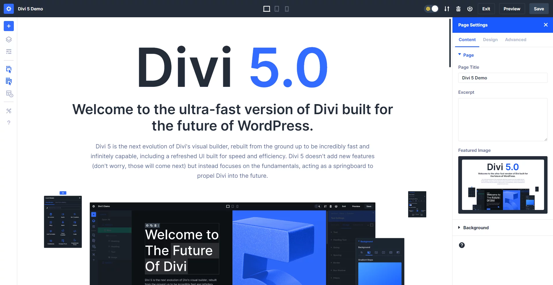
▶️ Please watch the video above to get all the exciting details! 👆
List of Notable Changes In The Divi 5 Interface
I am creating this list from personal experience using and comparing the Divi 4 and Divi 5 builders. Most likely, I will miss some things, so just let me know in the comment section!
💭 I would also love to hear your thoughts on all the changes, so let’s discuss it in the comments!
You can play around with the new interface with a live Divi 5 demo on the Elegant Themes website. Note that some features are not applicable to the demo.
Page Settings Location
In Divi 5, the page settings are no longer at the bottom by default. Instead, some are in the toolbar on the left and some in the toolbar at the top.
Left Side
- Page Settings
- Add Layout
- Layers
- Wireframe View
- Action Icons On Hover (new)
- Parent Actions Icons On Hover (new)
- X-Ray (new)
- Builder Settings
- Help
Top
- Page Title
- Responsive Icons
- Dark/Light Mode Toggle
- Export & Import
- Clear Layout
- Add To Library
- Exit (new)
- Preview (new)
- Save

Docking
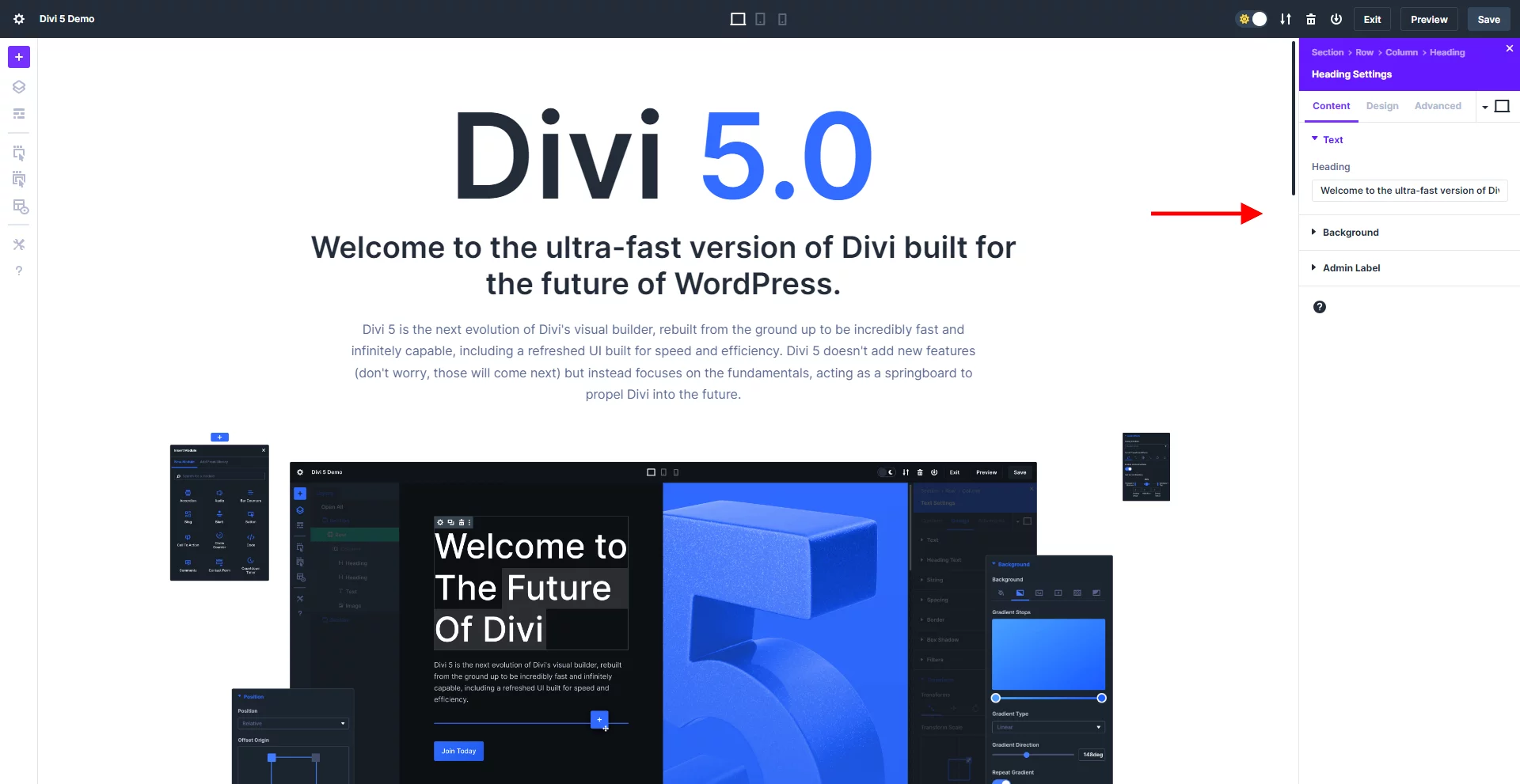
When you load the builder, the pages settings will be open and docked on the right side of the screen. If you click a section, row, or module, that window is replaced in that same docked position. You can dock any window by dragging to the side, and a vertical line will appear indicating it is docking into place.
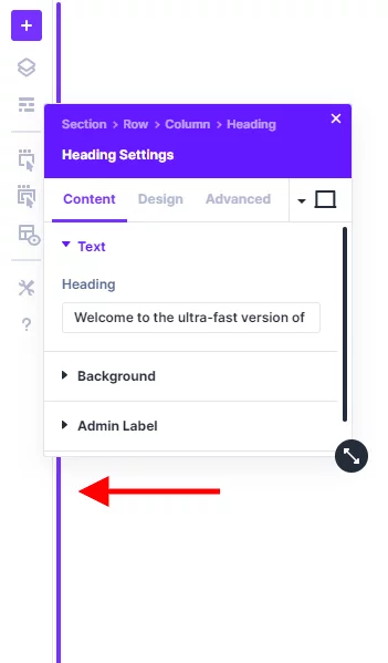
NOTE: If you want to dock the windows on the left, you first need to drag the window out into the main are and release, then click again and drag it to the left side until it snaps into place.
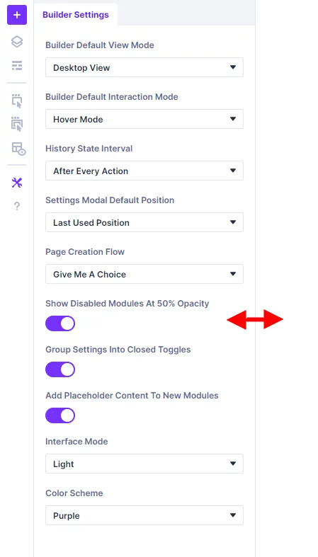
Drag To Resize Width
You can also resize the width of the docked sidebar panel by moving your cursor near the edge and dragging.
Tabbed Windows Within Docked Panel
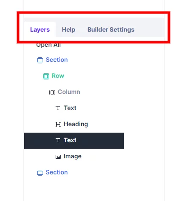
You can also add multiple windows into one panel, which adds tabs similar to how windows work in Photoshop. For exmaple, you could have the Layers, Help, and Builder settings as tabs within one docked panel.
Add New Module Screen
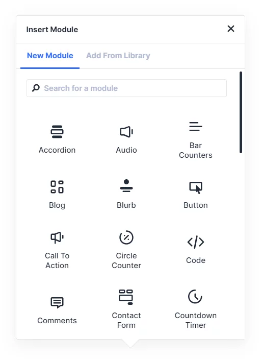
The add new module screen now looks very similar to the Gutenberg block editor, with black icons instead of blue and 3 columns instead of two.
Open Window By Double-Clicking
In the past, you had to click the gear icon on any module, row, or section in order to open its settings. You can still do that, but now you can also just double click when hovering over it.
No More X Or Checkmark Buttons
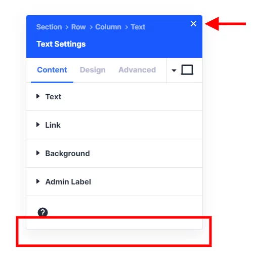
You will notice the module settings windows in the new interface do not have the familiar red x cancel button or the green checkmark save button at the bottom. Instead, you can simply click the X icon in the top-right corner. All changes you make in the window before closing it will be saved
Breadcrumbs
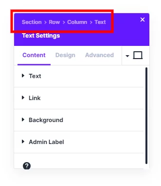
Each settings window now shows breadcrumbs, like Section>Row>Column>[Module Name]. This allows you to easily jump to the parent element. For example, if you are editing a Text module, you can click the Row link in the breadcrumbs and now you will be editing the Row settings instead of the module.
Color Scheme
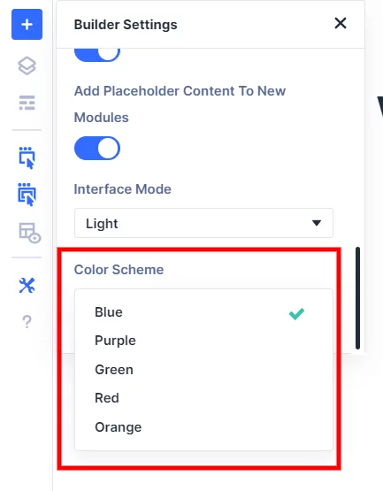
The new interface now used blue as the default color instead of the familiar Divi purple color. However, you can change the Divi 5.0 interface back to purple from the page settings. There are five options, blue, purple, green, red, and orange. This color option changes things like icons in the settings, the window headers, the tab text and underlines, opened setting toggle names, and the hover color on dropdown selectors.
Responsive Editing Changes
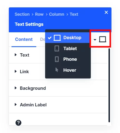
A very important change to note is how to make everything responsive in the new builder interface. In the past, there was some confusion about making edits while on the desktop, table, or phone view. In order to make a change, you had to click the responsive icon on each setting to open the responsive desktop, tablet, and phone tabs in order to make your change take effect on that device size. However, in Divi 5, there are no longer responsive tabs on each setting, but instead they are in a dropdown in the top right corner of the settings windows. You can also change this with the responsive icons in the top center of the page settings. Now, any change you make while viewing that size will take effect for that size. This may seem small, but this is a fundamental change to how it works!
Button To Exit Visual Builder
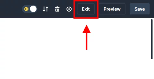
In the past, the button to exit the visual builder was in the WordPress admin bar. But in Divi 5, the WordPress admin bar is hidden, so I guess this is why they needed to add an Exit button.
Preview Button
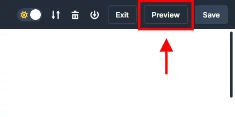
There is also a new “Preview” button in the Divi 5 interface. This button simply opens the frontend of the website in a new tab. So basically this button is a way to preview changes on the frontend in new tab.
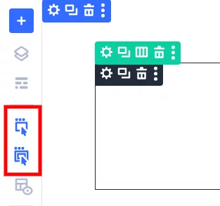
Interaction Mode – Action Icons On Hover
In the past, Divi had an “Interaction Mode” which allowed you to choose to show the action icons on modules, rows, or sections in hover mode, click mode, or all the time in grid mode. This feature has reevaluated in Divi 5 with a layered approach, allowing you to choose more than one at a time.
The first icon works like before, showing the action icons when you hover over the individual module, row, or section. Enabling only this first icon and not the second is my personal preference, since this is how it worked in Divi 4.
The second icon hides the action icons on the child element, but shows them instead on the parent elements. I don’t think you would ever use only the second icon by itself without the first one also enabled.
When they are both enabled, the action icons for the section, row, and module all show. I assume this is a replacement for the grid view in Divi 4.
X-Ray Mode
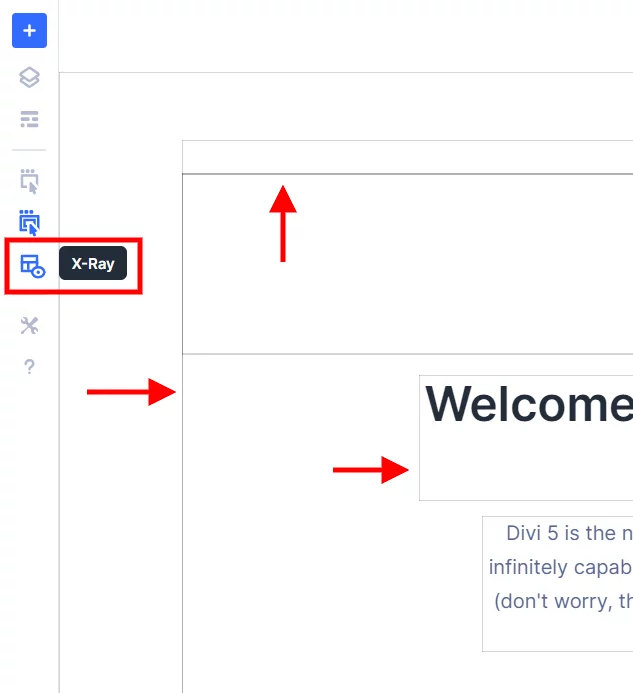
A new feature in Divi 5 is an X-Ray mode which you can enable or disable by clicking its icon in the left toolbar. This mode adds a small outline around all the sections, rows, and modules.
NOTE: This is totally different from Wireframe Mode, which still exists like before.
Right-click Anywhere For More Options
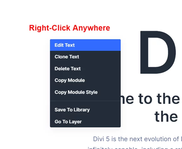
Like before, you can click the three dots menu to access additional options like copy module, go to layer, save to library, etc. The reason I am highlighting it now is that you may need to use this now if you disable the action icons.
Layers Panel On Left
The layers panel is now more prominent on the left side. Clicking the layers icon will open the layers window in the left docked panel area.
We have a page on our website with Divi 5 FAQs related to our products. Be sure to check it out and let us know any questions you have!





0 Comments