Overview
Welcome to the Layout Settings documentation for the Divi Social Sharing Buttons module. In this guide, you will learn everything you need to know about the many different layout options that are available in the module and how they work.
As you set up and use the module, I highly recommend you also reference our document, which lists all the settings and features included in this module. You should also check out the demos to get some inspiration on the different layouts and styling options!
Select A Layout
The module has five different layout options to choose from for displaying the social network buttons. These settings are found in the module’s Design tab in the Layout toggle. The layout options include various combinations of number of columns, alignment, with or without text, with or without the icon, left, right, top, bottom, etc. All of these possibilities make the module extremely versatile and user-friendly, providing a great experience for both admins and website visitors.
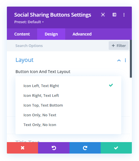
The first main layout setting called “Button Icon And Text Layout” is a dropdown with five options. These available layout options include:
- Icon Left, Text Right
- Icon Right, Text Left
- Icon Top, Text Bottom
- Icon Only, No Text
- Text Only, No Icon
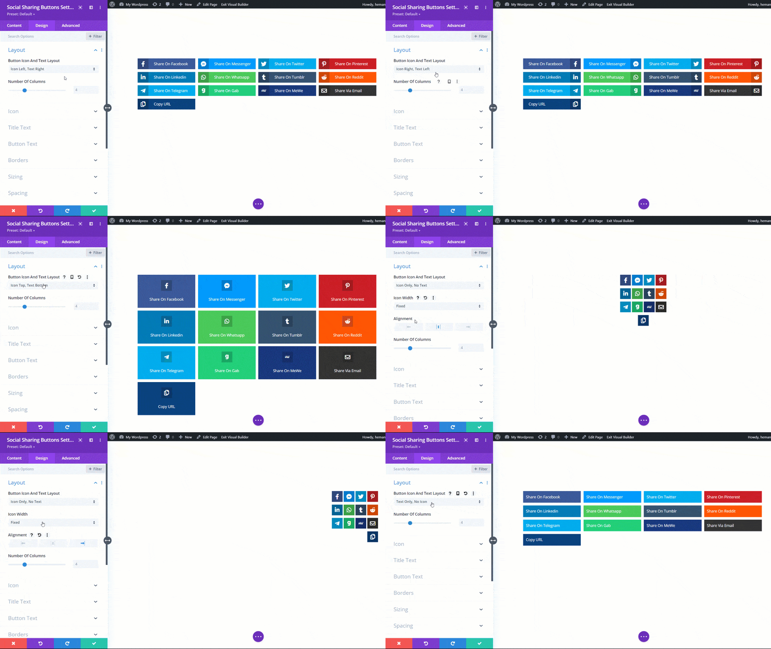
Depending on which option is selected, additional settings will appear that are applicable to that layout type.
Icon Left, Text Right
This option places the icon on the left and the text on the right. This option is set by default and whenever you add the module.
Icon Right, Text Left
This option is the opposite of the first one and places the text on the left and the icon on the right.
Icon Top, Text Bottom
This option stacks the icon on top and the text on the bottom.
Icon Only, No Text
This option hides the text and only shows the icon. When you select this option you will see an additional option appear to set the width:
Icon Width
- Equalize
- Fixed
Equalize means the width of the icon is evenly spread across the width of the column. The width will be determined automatically be the number of columns that fill the width of the module. This option is set by default.
Fixed means the buttons are square, based on the width of the icon.
Alignment
If the Fixed Width option is selected, a new setting appears. This alignment setting aligns the entire group of social media buttons/icons to the left, center, or right. Their width will still be maintained by the number of columns.
Text Only, No Icon
This option shows the text only and hides the icon.
Number Of Columns
This option allows you to define how many columns you want to use to display the social sharing buttons. This setting applies to any of the layout options above, and can can be adjusted however you want.
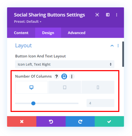
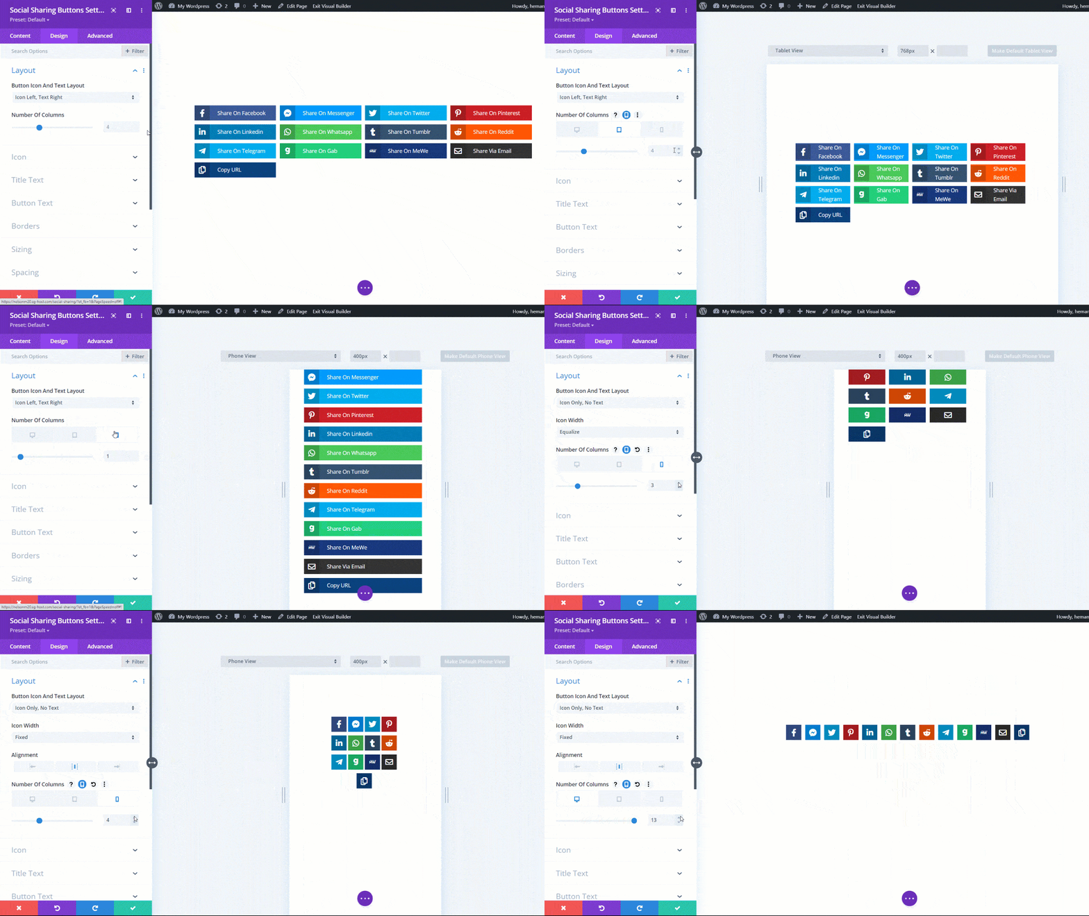
For some examples, let’s say you have added four sharing buttons for four different social networks, so if you set the column number to 1 in this option then all the four buttons will be stacked on top of each other. Likewise, if you set the number of columns to 2 then the first two social sharing buttons will be stacked side by side in the first column and the other two side by side in the second column.
Layout Responsiveness
Perhaps the greatest features of the layout system are the responsive options. Not only can you choose the number of columns or the type of layout, but you can choose a different layout or a different number of columns per device! That’s right, this new system allows you to change each setting for Desktop, Tablet, or Phone!
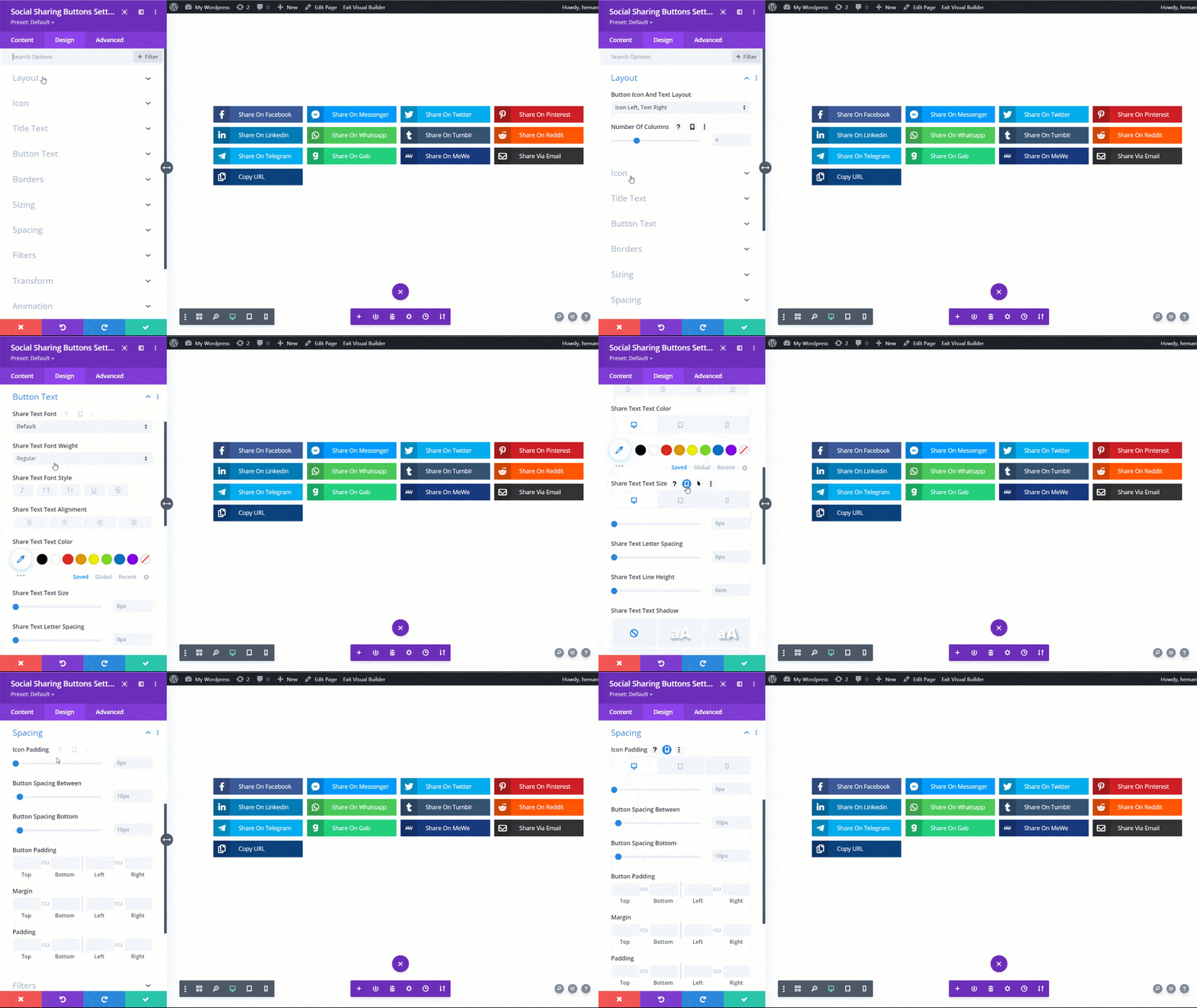
Like all the other responsive options in the Divi Builder, these options can be enabled by clicking on the phone icon that appears beside the setting name when you hover over it.
Recommendations:
- Change the layout of the button per device
- Change the number of columns per device.
It is highly recommended that you adjust the responsive layout options! This is mostly due to the nature of the buttons. You wouldn’t want to try to smash a dozen buttons side by side with Icon Top, Text Bottom. Neither would you want to stack a dozen of those one after the other on Phone. So maybe change to Icon Only, No Text on Phone. Or Change the number of columns.
As you can see, the responsive settings provide total control over how the social sharing buttons should look on all screen sizes. The key is to make sure you check how it looks on each device and adjust the settings accordingly.
