Overview
Welcome to the Responsive Settings documentation for the Divi Social Sharing Buttons module. In this guide, you will learn everything you need to know about the many responsive settings in the module and how they work.
Our goal is to make it easy for you to control all the settings on Desktop, Tablet, and Phone. These responsive settings can be found on all the settings throughout the module. Some are standard responsive options like you would expect and can find in default Divi modules, but some go beyond that like the ability to change the layout per device! All of these options make it easy for the web designer to design and the website visitor to use the site and share the amazing content.

As you set up and use the module, I highly recommend you also reference our document, which lists all the settings and features included in this module. You should also check out the demos to get some inspiration on the different layouts and styling options!
How Responsive Settings Work
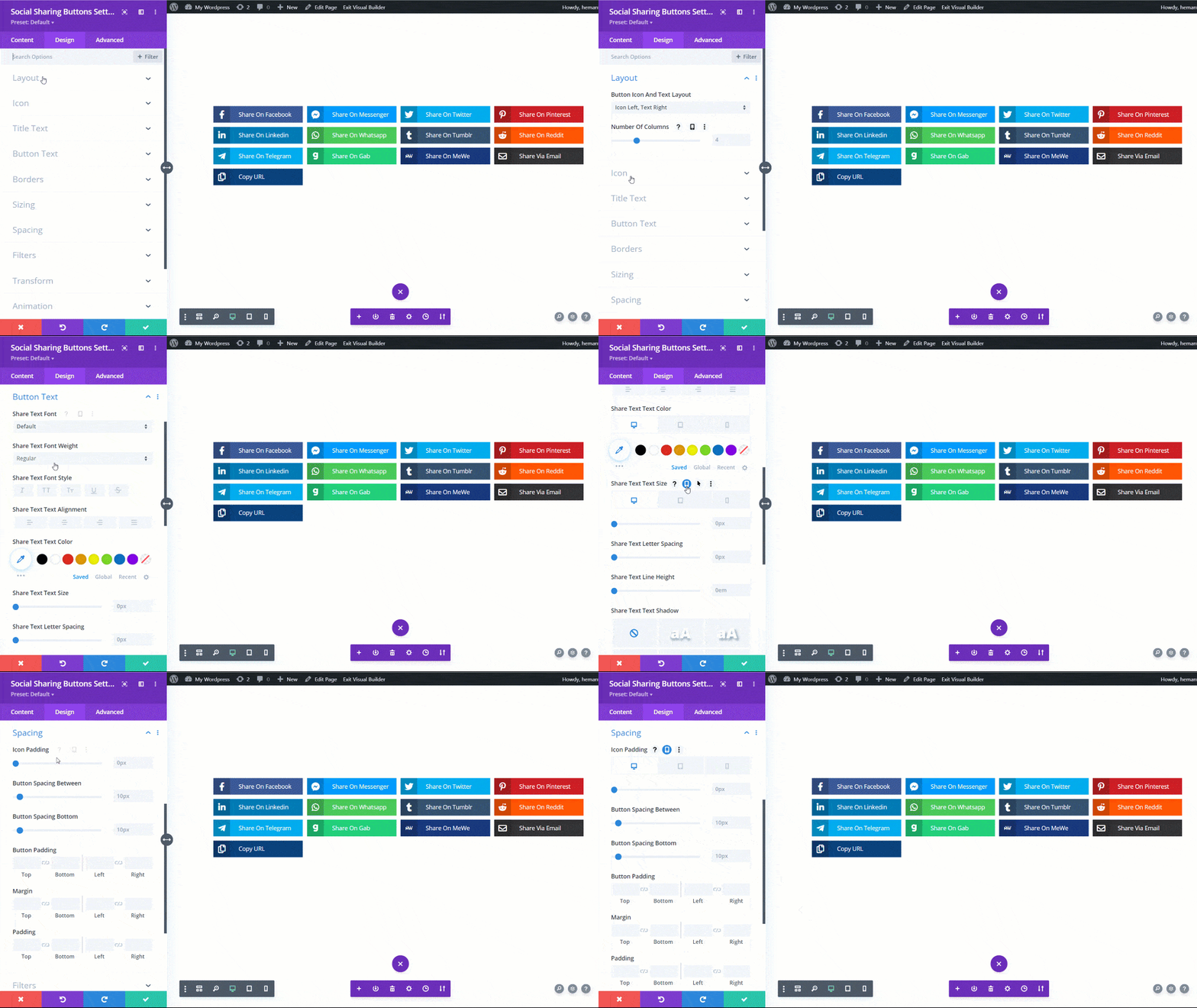
Responsive settings allow us to change the values or the options of the properties according to different screen sizes. The Divi Social Sharing Buttons module has responsive settings for most of the settings, exactly like other modules in the Divi Builder. When you hover over any setting name, you will see several icons, one of which is a phone icon. After clicking on the phone icon, there will be three different tabs, Desktop, Tablet, and Phone. As you set up the module, keep these responsive settings in mind and feel free to adjust any of the module settings according to these three device size tabs.
Which Responsive Settings Should You Adjust?
It is totally up to you if you feel your design requires different setting values for Desktop, Tablet, or Phone. You can change pretty much every possible setting, like colors, font sizes, icon sizes, layout, number of columns, button border color, background color, etc.
Some settings are fine across devices, while others would be better if they are adjusted. There are a few specific settings that are more important than others, and that would be the layout settings. You can learn more about those in our Button Layout Settings documentation.

