Styling The Divi Mobile Menu Module
Another One For The Menu Module Series
By now our Divi Menu Module series is quite hug. By popular demand, we are now going to show you how to customize and style the Divi mobile menu using the Theme Builder Menu module! We are so excited for this one!
Learn, Not Just Copy
The format will be like our submenu and mega menu tutorials, with graphics and snippets to not only copy but to practice learning as well! With this tutorial, you will be able to style and customize the Divi Theme Builder mobile menu module, along with the image, hamburger menu, dropdown, menu items, and submenu items. You will learn how to change things like the colors, border, spacing, hover effects, and more!
▶️ Please watch the video above to get all the exciting details! 👆
Understanding The Divi Mobile Menu Structure
First, we need to understand how the Divi mobile menu is made so we can target individual elements of it separately to create your own design style. There are a lot of parts, but we are only going to cover the most essential and helpful parts here. Those include:
- The Header
- Logo Image
- Hamburger Icon
- The Dropdown Menu
- Menu Items & Links
- Submenu Items & Links
Here is an example of how the Divi Menu module looks by default on mobile:
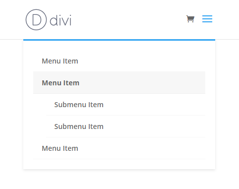
Here is an example of how the Divi Menu module looks by default on mobile:
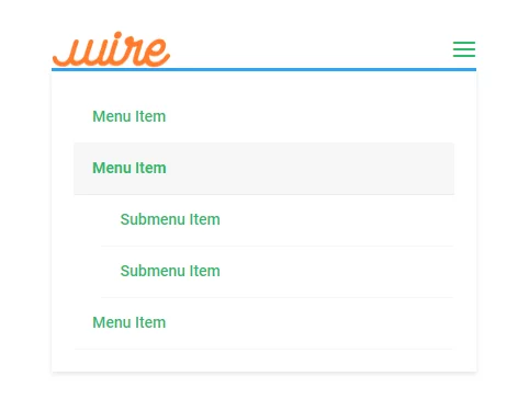
Let’s get started! The tutoral is divided into sections. Each section represents a different part of the mobil menu:
- A heading title
- An intro parapraph
- A graphic representation of that specific element
- The CSS selector to target that element
- Some code styling ideas
Where To Place And Customize The Code Snippets
You will find a snippet for each part of the menu in each section of the tutorial. Once you have our CSS selector ready, you can start adding custom code where it says “YOUR CSS HERE.” (be sure to remove that text)
Where To Paste The CSS Code
1. Divi Assistant
If you are using our Divi Assistant plugin, simply paste the code in the CSS tab in the custom code window in the Divi Visual Builder.
2. Child Theme
If you are using a child theme, paste this code into the style.css file. If you don't have a child theme, you can generate a child theme directly on your site or download our free child theme.
3. Divi Theme Options Integration
Otherwise, paste this code in your Divi>Theme Options>Custom CSS code box.
If you need help understanding where to paste the code, please check out our complete guide about where to add custom code In Divi.
Default Mobile Menu header
Let’s start with the menu header. This is the part that holds the logo and hamburger menu. There are limited settings in Divi, so this CSS is going to be needed any time you want to change the color or adjust spacing.
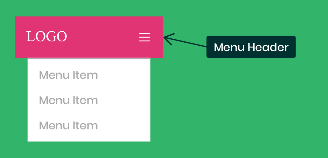
Edit The Default Menu Header
/*edit the default Divi mobile menu header*/
#main-header {
YOUR CSS HERE
}
Custom Style Ideas
The following is a list of some ideas for things you might want to do to style the overall submenu. You can choose to do this by placing the snippets into the selector shown above.
Remove Or Adjust The Spacing
padding: 0!important;Change The Background Color
background: #000000!important;Divi Mobile Menu Logo Image
You can do a couple things to the logo image as well. On our site, we have the logo overlapping the header and page content, which requires some spacing and sizing adjustments. You could also apply a border or box shadow.
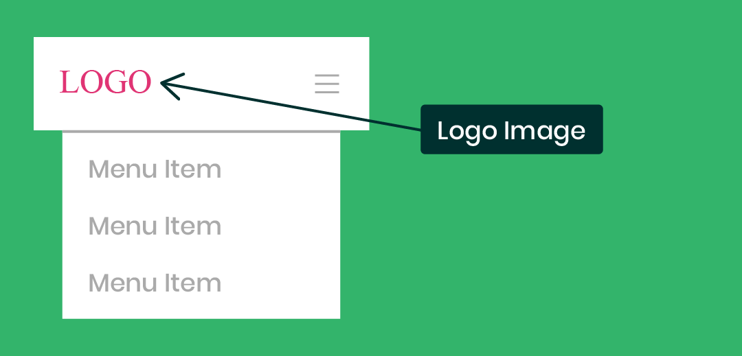
Edit The Divi Default Mobile Menu Logo Image
/*edit the Divi default mobile menu logo image*/
#logo {
YOUR CSS HERE
}
Edit The Divi Mobile Menu Module Logo Image
/*edit the Divi mobile menu logo image*/
.et_pb_menu__logo img {
YOUR CSS HERE
}
Custom Style Ideas
Here are some ideas you could do to style the Divi mobile logo image. You can choose to do this by placing the snippets into the selector shown above.
Adjust The Spacing
padding: 30px;Adjust The Width
width: 80%;Set A Max Width
max-width: 200px;Add A Box Shadow
box-shadow: 0 2px 5px rgba(0, 0, 0, 0.1);Divi Mobile Menu Hamburger Icon
If you want to change some settings with the mobile menu hamburger icon, you can do so with CSS. Remember, the Menu module has a few settings like size and color, but the default menu has no settings for this.
Edit The Divi Mobile Menu Hamburger Icon
/*edit the Divi mobile hamburger icon*/
.mobile_menu_bar:before {
YOUR CSS HERE
}
Custom Style Ideas
The following is a list of some ideas for things you might want to do to style the Divi menu hamburger icon. You can choose to do this by placing the snippets into the selector shown above.
Set The Color
color: #000000;Add A Background Color
background: #ff0000;Set The Size
font-size: 48px;Change The Icon
content: "\63";Add A Border
border: 2px solid #ff0000;Make The Border Rounded
border-radius: 100px;Change The Icon To An X When Opened
Check out this fun quick snippet: How To Change The Divi Hamburger Menu To An X When Opened
Divi Mobile Menu Dropdown
One of the first things you may want to adjust is the ugly blue thick like at the top of the mobile menu dropdown. Or maybe you want to remove some spacing around the outside, make it wider, change the background color, or adjust the shadow.
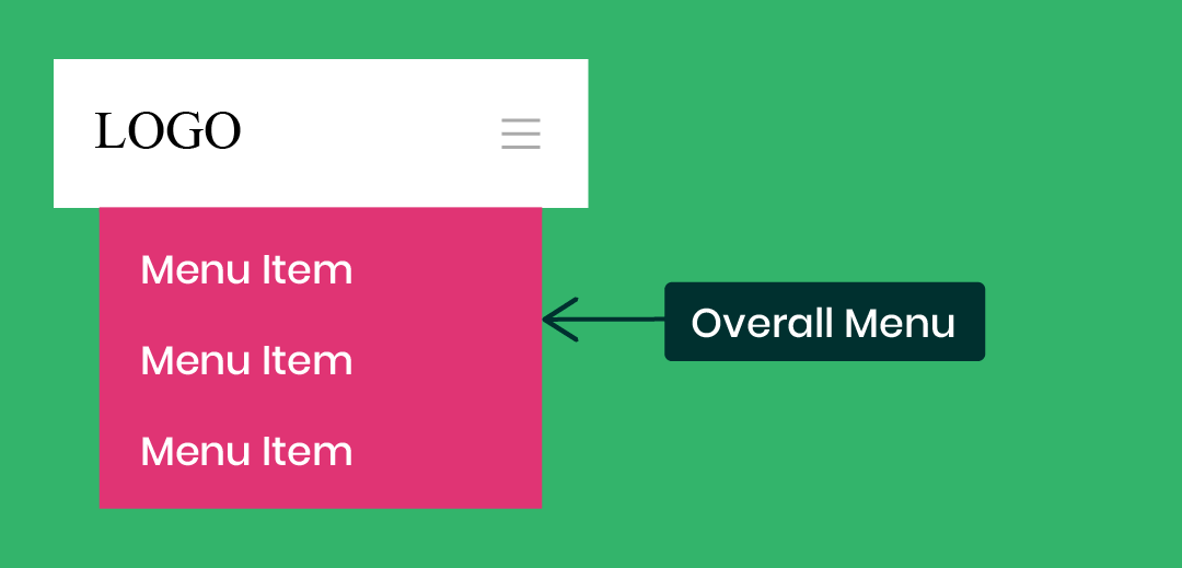
Edit The Divi Mobile Menu Dropdown
/*edit the Divi mobile menu dropdown*/
.et_mobile_menu {
YOUR CSS HERE
}
Custom Style Ideas
The following is a list of ideas of some things you might want to do to the Divi mobile menu dropdown. You can choose to do this by placing the snippets into the correct selector shown above.
Remove The Top Border
border-top: 0px;Adjust The Spacing
padding: 0px!important;Add Or Adjust The Shadow
box-shadow: 0 2px 5px rgba(0, 0, 0, 0.1);Make It Wider
width: 112%;
margin-left: -6%;
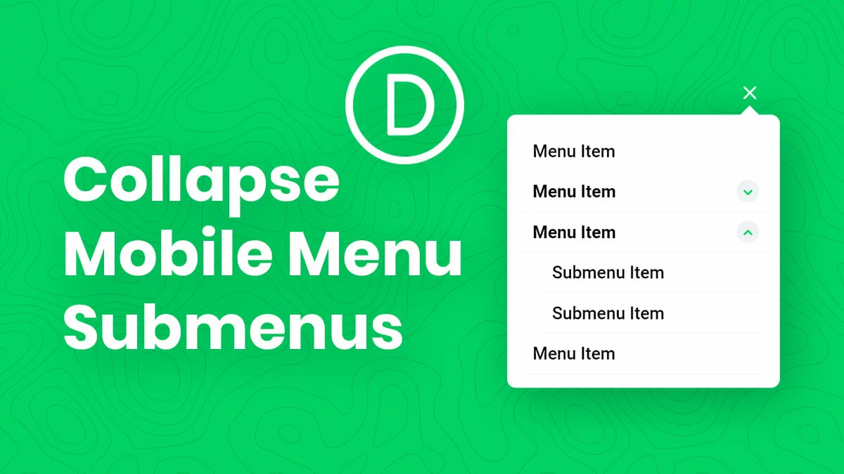
Collapse The Divi Mobile Menu Submenus
Check out this related tutorial: How To Collapse Divi Mobile Menu Submenus
Divi Mobile Menu Parent Links
Now we come to the menu item links. You can do a lot of adjustments here, like color, spacing, background, opacity, and even get rid of the tiny bottom border.
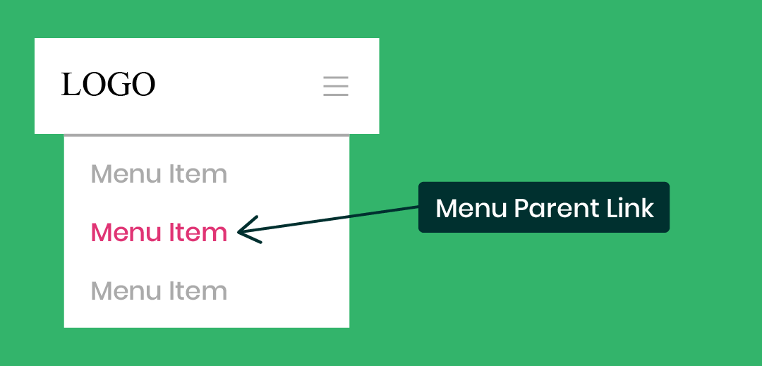
Edit The Mobile Menu Parent Links
/*Divi mobile menu parent links*/
.et_mobile_menu li a {
YOUR CSS HERE
}
Custom Style Ideas
The following is a list of ideas of some things you might want to do to style the Divi mobile menu parent links. You can choose to do this by default, or on hover, by placing the snippets into the correct selector shown above.
Adjust The Spacing
padding: 10px 20px;Change The Opacity (Especially On Hover)
opacity: 1;Change The Background Color (Especially On Hover)
background: #ffffff;Change The Font Size
font-size: 20px!important;Change The Link Color
color: #2cba6c;Add Letter Spacing
letter-spacing: 2px;Adjust The Border
border-bottom: 2px solid #000000!important;Divi Mobile Menu Submenu Child Links
Similar to the previous section, you can also adjust the submenu items. These appear by default with a small indent on the left. The styling suggestions here shoud probably be similar to the previous section about the parent links.
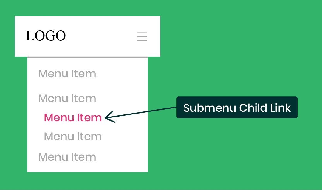
Edit The Mobile Menu Child Links
/*Divi mobile menu submenu links*/
.et_mobile_menu .menu-item-has-children li a {
YOUR CSS HERE
}
Custom Style Ideas
The following is a list of ideas of some things you might want to do to style the Divi mobile menu submenu links. You can choose to do this by default, or on hover, by placing the snippets into the correct selector shown above.
Adjust The Spacing
padding: 10px 20px;Change The Opacity (Especially On Hover)
opacity: 1;Change The Background Color (Especially On Hover)
background: #ffffff;Change The Font Size
font-size: 20px!important;Change The Link Color
color: #2cba6c;Add Letter Spacing
letter-spacing: 2px;Adjust The Border
border-bottom: 2px solid #000000!important;Prefer To Use A Plugin?
If this is all a little too much code for you, I get it. You might want to check out a plugin my friend Peter at Divi Engine made called Divi Mobile.
The Divi Mobile plugin allows you to create custom looking, beautiful mobile menus for your Divi site without having to write any code.




You are the best! So easy to learning with you. Tnx
Thank Robi, so glad you enjoy my videos! 🙂
Love the post. I get so much out of your content. It’s so frustrating having the mobile menu size be determined by its column and not easily finding which selector to target. This post was exactly what I was looking for for my company website mobile menu. Wish ET would add the CSS targets to the query buttons. Would make CSS easier. Another menu to look at is the divicio[.]us Divi Mad Menu that just launched.
Hi Jacob, glad you like this and it is helpful! Thanks so much for the feedback! 🙂
Hey Nelson, thanks for sharing this! I just subscribed. Could you share how we can place a functional cart icon next to or above the hamburger icon in mobile?
Hi Ejay, glad to have you along! The cart icon shows when you have WooCommerce installed, so make sure you have that. Is there something beyond that you were referring to?
Thanks Nelson! I no longer google, I come straight to pee aye!
Do you know if it is possible to make columns with the menu child links?
Hi Lucia, that’s so cool to hear! I’m so glad you find our stuff helpful!
About the columns, I believe you mean having two menu items side by side on mobile, correct? You could try something like
.et_mobile_menu ul li a {
width: 50%;
float: left;
}
Great tutorial! You had one before that showed how to add icons to the menu with ET and Font Awesome icons. Do you have any code to make that work with the mobile menus?
Hi Jason,
Sure, you could target just the mobile menu if you want and use that in the code instead, like .et_mobile_menu ul li a
Yes, that does work. It works well with the Elegant Themes icons across all devices but it seems to have trouble with the Font Awesome icons on IOS mobile devices. In the mobile menu I just get a rectangle where the icon should be. Both work great on desktop though.
great tutorial you have here on your site!
Thank you very much, I hope you find it helpful!
Hi! Do you happen to have a guide for Divi menu not working on mobile? How to fix it?
Hi Erica,
What is not working? If there is some bug please reach out to Elegant Themes. I usually only make guides for common issues.
hey 🙂 nice tut! one little thing. I am trying to align the menu items horizontaly so evrything is in a like line. i cant get it to work .-. any ideas?
Hi Denis,
Could you give me some info about what you mean? You are trying to align mobile menu items in a horizontal line?
mine has truly conflicted with main menu settings and dosent seem to work no matter what i do
I am so sorry to hear that. Could you please share the URL of the website and explain what you are trying to achieve with the Menu for better clarity?
Great content! Definitely helped adding some cool new features to the site. I played around with the code and managed to create a fullscreen dropdown menu on both desktop and mobile. Currently, the menu items are centered at the top… is there a way to move them down and put them centered in the middle of the page? Regardless of device…
Thanks 😀
We are glad that our guides are helping you in some way. Could you please share the URL of the page which has the Menu as that will make it easy to understand what you are exactly referring to?
Thanks for your reply 🙂
Of course, website url is: zerotolaunch.nl
Please try this snippet:
.opened ul#mobile_menu1 {

    display: flex !important;

    flex-direction: column;

    justify-content: center;

}

.et_mobile_menu{

    padding: 0 !important;

}
This will place the Menu Items in the center regardless of the screen size. Let us know if that helps.
Thank you so much for this tutorial! Exactly what I needed to style the hamburger menu on my Divi Theme Builder header. 🙂
That’s great, Janis, so happy to help!
Your tutorials are great – do you have anything around being able to click anywhere outside the menu to close it? We have been asked to use the mobile menu on desktop too, but to have the option to click any where on the page and not just the cross to close the menu.
Could you please share the URL of the page for me to investigate further?
Hi, great tutorial! I’m curious, is there any possibility to change the padding or the position of the hamburger menu? Thanks in advance.
Thank you! Can you be more specific? You want to move just the icon? And please share a link also.
how to change divi theme mobile version sub menu color
Could you please try the snippet given below and see if that helps?
@media all and (max-width: 980px){

    #mobile_menu1 li ul.sub-menu{

        background-color: #fff !important;

    }
#mobile_menu1 li ul.sub-menu li a{
color: #E09900 !important;
}
}
You can change the color and the background-color in the above snippet as per your liking.
Let me know how it goes. 🙂
Hi Nelson. Thanks for this tutorial. If I want to hide the 3rd level of the menu on mobiles what css would impact that?
Hey Paul,
Could you please share the URL of the website for me to investigate further on that?
Hello, can I somehow disable that rolling down and rolling up animation when mobile menu is opened/close, please?
Hey David,
Could you please share the URL for me to investigate further?
Hi Nelson – great tutorial as always. When I tried to use the below code to change the mobile menu background color, it changed the desktop version too – is it intended to just change the mobile menu?
/*edit the default Divi mobile menu header*/
#main-header {
YOUR CSS HERE
}
In fact, what I am actually trying to do is change the mobile menu color for one page only and leave it the other color for all pages. Is there a better way of coding this?
Hey Chris,
Could you please share the URL of the page for me to write the exact code for you?
Hi Nelson
Regarding making Parent menu text being clickable.
@media (max-width: 980px){
.tippy-popper {display: none !important;}
Hope this hep with your post
Hi Nelson!
I managed to customize my desktop sub-menus thanks to your great explanation!!! Thank you for your work!!
But I do struggle with my according mobile version of this menu. All the css applies to the whole menu and I can´t see where/how to differ between desktop / table / mobile. I watched your tutorial for the mobile menu but couldn´t find the answer there.
I hope I could explain my problem and it would be great, if you´d could help!
Thanks
Hey Willy,
Could you please share the URL of the website? It will help me to understand the issue better.
Hi, Happy New Year!
Just wondering if you can tell me how to make all Mobile Menu Parent Links bold please? Currently just 1 of the parent links is bold but I would like all parent links on mobiles to be bold please 🙂
/*Divi mobile menu parent links*/
.et_mobile_menu li a {
YOUR CSS HERE
}
Thanks very much for your help,
Caroline
Sure, just use font-weight: bold;
Hi Nelson! I am having issues with making my mobile menu clickable to unfold the next layer of menu options… Is there a code that I can use for that?
Hi Joanne!
Could you please share the URL of the website? It will help me to understand the issue better.
Hi, I am a beginner with DIVI and I am having a problem getting to see the hamburger icon in the mobile and tablet forms. What can I do?
Thanks
Cecilia
I’m not sure, please reach out to Elegant Themes support about that.
Hello – always find your stuff super helpful thank you!
Could you advise around changing the weight of the burger icon? ie – I’d like a thinner burger/ three lines.
Thanks!
Hi Josh,
I’m not totally sure if it would work, but you can always try font-weight: bold; or change the icon completely.
I am just exploring divi theme for a landscaping service in Regina and you helped me a lot to fix my menu items specially in mobile.
I hope you can also show us how to customize the slider in a way that will overlap the body without breaking the design.
Cheers!
I’m glad to hear our resources have been helpful!
Just came across this post while browsing for Divi tips. Very useful indeed! Keep up the good work and let’s hope Divi 5 gets released soon and is all it should be!