If you have been using our resources, you may already know we have several responsive solutions like how to change the Divi column stacking order on mobile and how to change the width of Divi columns on any device. Which those are helpful, they didn’t directly explain how to change the number of columns per device, so I am back with a new tutorial for you.
▶️ Please watch the video above to get all the exciting details! 👆
1. Determine How Many Divi Columns You Want Side By Side On Each Device
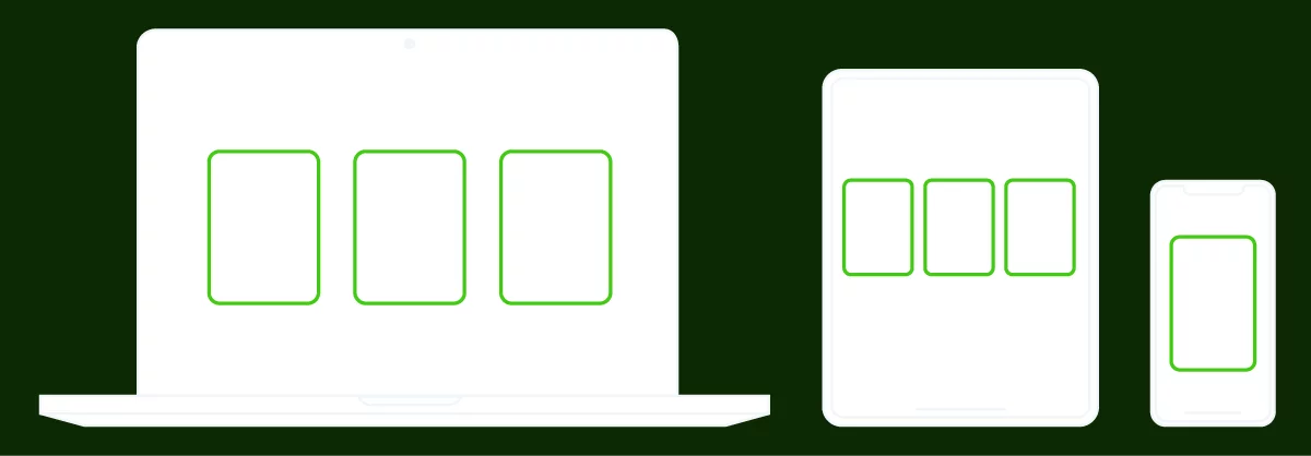
The first step is to simply set up your row and column layout and think about how many Divi columns you want to show side by side on each device. This is totally up to you and your design. You may start with 4 columns on Desktop, and want 2 columns on Tablet, and 1 column on Phone! Or you may want 3 columns on Desktop and Tablet, and 1 column on Phone. These are just examples of common layouts you will probably face when building responsive websites with Divi.
2. Set The Percentage Width Of Each Column Per Device
This is actually much easier than you may expect. It does involve CSS, but it is probably the easiest CSS related tutorial possible. Please don’t be intimidated, it’s incredibly easy!
To achieve this, simply add a row with the desired number of columns. Open the row settings and follow these steps:
- Open the individual column settings
- Go to the Advanced tab
- Open the Custom CSS toggle
- Click the Module Elements tab
- Locate the Main Element code box
- Click the responsive icon to open the device tabs
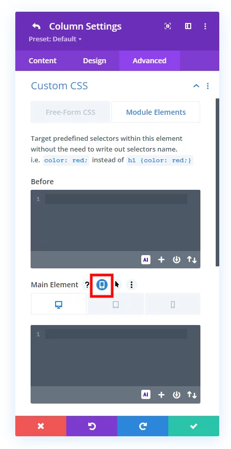
This is where you will add the width value with CSS in the Tablet and Phone tabs. I will give you two common examples which will help demonstrate how easy this is to achieve!
Example 1
- I have a row with 3 columns on Desktop
- I also want 3 columns on Tablet
- I only want 1 column on Phone
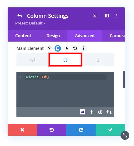
For this scenario, I will add “width: 33%;” to the Tablet tab, since this is roughly 1/3 of 100% since I want 3 columns.
Next, I will add “width: 100%” in the Phone tab, since I only want 1 column which is like saying fullwidth for that column.
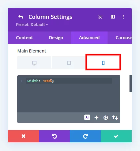
NOTE: Be sure to add the same values for each colum in the row!
Example 2
- I have a row with 4 columns on Desktop
- I want 2 columns on Tablet
- I also want 2 columns on Phone
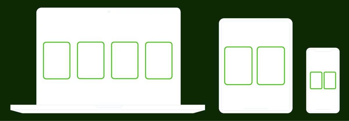
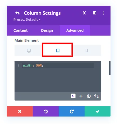
For this scenario, I only need to add “width: 50%;” to the Tablet tab, since this is 1/2 of 100%. Since I want the same number on Phase as well, I don’t need to add any value in the Phone tab because in Divi the larger device size value always applies to the smaller device size unless it is specifically overridden.
Do It With A Setting!
Make life easier and use the Divi Responsive Helper instead, the ultimate Divi responsive toolkit with awesome features and settings to help make your website look and work great on all devices!
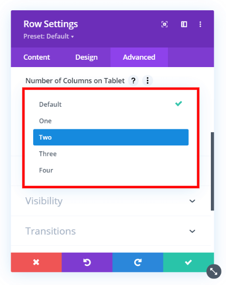
Here is how easy you can do this in our Divi Responsive Helper plugin!






0 Comments