
Can You Resize Divi Columns? Yes! It’s Easy Too!
The Divi Builder is incredible and we absolutely love it. But I recently was trying to create a header on my personal religious blog and wanted to be able to resize Divi column widths. I knew there were no solutions to this within the Divi Builder, so I came up with my own clever system and it works extremely well! This tutorial will help you do this too, and I hope you love it enough to share it around with others!
▶️ Please watch the video above to get all the exciting details! 👆
Why Do We Need Resizeable Divi Columns?
I know that other popular page builders have resizeable columns, but I never thought it was necessary until Divi 4.0 came out and I started playing around with the header area on my personal blog website. Notice that the header columns here do not match anything default in Divi. Pretty cool, huh? I’ll be showing you exactly how I did this later on in the tutorial.

Divi Comes with A nice Selection of Column Options
I set up an example here with 4 columns set to 1/4 each, but there are many more column layouts in Divi. All of those will work with this tutorial, so it doesn’t matter what column layout you are using.

Here’s a quick visual on how Divi works by default
I set up an example here with 4 columns set to 1/4 each, but there are many more column layouts in Divi. All of those will work with this tutorial, so it doesn’t matter what column layout you are using.


So We Need More Options…But What About All The Extra Coding?
You won’t need any special code snippets and CSS classes that get confusing and messy. Instead, I’m going to show you how to do this right in the Divi Builder!
I wanted to make a solution that was easy for others to use and avoid confusing CSS media queries and custom classes. Good news…it couldn’t be easier!
I am very happy to say that I have a solution that is easy and very versatile.
Here’s How To Resize Divi Column Widths
Step #1. Adjust Your Row Settings
Before we begin the main part of the tutorial, you need to make sure your row has a few settings in place first.
- Make sure the row Width and row Max-Width are both set to 100%;
- Be sure the row has a Custom Gutter Width toggled on and set to 1.


Step #2. Choose The Best Divi Column Structure
The most important thing here is to select the correct number of columns. Don’t worry about the width of each column yet. If you look at my example below, you can see that I chose 4 columns, all at 1/4 each. So by default, each of those was 25% wide.
Step #3. Do Some Math
Since we have set the row width to 100%, it makes sense that all the columns within that row need to equal 100%. Anything less won’t be wide enough, and anything more will bump to a new line and look awful. You can use any percentage width you want, but always be sure it equals 100% exactly.
Step #4. Paste One Line of CSS
The last step is to override the default width. We can resize the Divi column widths by using some CSS to force the columns to any size we desire. Simply copy the CSS code snippet below and paste it in each column. Go to the Row settings, then go into each column to the Advanced Tab>Custom CSS>Main Element.
width: 10%!important;
Obviously, you will need to change the 10% to suit your needs.
Be sure to past this in each column and change the numbers so that altogether they equal 100%.
Adjusting for Tablet and Phone
In case you missed it, you can now set CSS to apply to desktop, tablet, or phone within the builder. Be sure to check your tablet and mobile when you are resizing columns! If you forget to change the columns back to 25% each for example, they will look very bad. You may probably want to change the width of each column to 50% or 100% on the phone. NOTE: Stay tuned for another post on mobile columns stacking order and width coming here to the blog very soon!

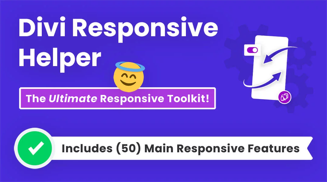
FYI: Do It With Divi Responsive Helper!
Why work so hard? You can do this easily with a setting in our Divi Responsive Helper plugin!
Example: How I Chose To Resize Divi Column Widths In My Blog Header
I’m going to show you an example of what I created to help you see what was needed and what I used. Here is a screenshot from my personal blog site. Notice how the header has 4 columns, and yet they do not match any of the standard column layouts available in Divi. The only thing I could do to get the layout I wanted was to resize the Divi column widths to something that worked. It took some trial and error to get the right percentages, but I’m happy with how it turned out.

- I started with 4 columns set to 1/4 each.
- In the row sizing, I set the row with and max-width to 100%.
- While I was there I changed the gutter to 1.
- In the first column with the logo, I set the width to 10%.
- The second column with the menu is larger, so I set the width to 65%.
- In the third column with the button, I set the width to 10%.
- Lastly, in the fourth column with the social follow, I set the width to 15%.
This is just one example. You can resize Divi column widths with as many columns as you want and in any increment. I’d love to see what you come up with, so please share in the comments!
Do It With A Setting!
Make life easier and use the Divi Responsive Helper instead, the ultimate Divi responsive toolkit with awesome features and settings to help make your website look and work great on all devices!


Awesome. Very useful tutorial. Thank you.
You are welcome, so glad you found it helpful!
Thank´s Nelson !!!!!.
Have a nice day.
You are welcome!
Superb – you have got a great teaching and presentation style. Thanks very much
Thank you Tilak, I’m very glad you like it!
Thanks for sharing this Nelson. I just tried this with a 4 column footer on my website and it worked great on the desktop view. However, Divi automatically carried the “Desktop” Custom CSS code over to the “Tablet” and “Phone” views. So then things look super squished on those mobile views. I can’t find a way to get Divi to behave properly and not allow the Custom CSS to automatically overflow into the mobile views.
Hi Josh,
Yes, by default with anything responsive it carries over. If you have the Desktop, Tablet, and Phone enabled when you paste the code in the Desktop, then it sounds like a bug, but you can simply override the width for each device. So maybe you want to put 50% in the phone instead of 25%. Let me know how it goes!
I have the same issue with CSS. For example. I have a four column layout for my desktop. I’ve changed the settings for column one to 10% in desktop via the CSS width :10% !important; Then I change in the tablet CSS mode to 20%. Whatever CSS Width setting i use it goes across all devices. So my original setting of 10% desktop is now 20% due to the fact that I changed it for my tablet. Am I doing something wrong? Would this be resovled w/ your helper plugin?
Thank you.
Hi Mike,
By default that is how Divi works, any setting you apply to desktop applies to tablet and phone. So it should work if you make sure you are placing a specific width in each device. Put it this way, it should work and it does for me, so otherwise if you are doing that and it’s not working, I’m not sure…
oh… I thought the CSS was per device meaning I could set column A desktop to 25% and tablet to 50%.. sounds like what ever I make column A will be the same across all devices….
Sound right?
PS.. I really appreciate you taking the time to help!
Update: It appears to work as advertised at the row level with different CSS settings per device. I was hung up trying to change the individual column widths inside the row settings which doesn’t work. Thanks again
Hey Mike,
It should work fine on columns too. Responsive CSS works in any section, row, column, and module. You can see the lesson in my course about that: https://youtu.be/ACxhkLRaRGU If you want to send me a Loom video of it you can feel free to do so.
Great tutorial. So I have implemented the CSS using 4 column. Looks great on desktop and the landscape view. But I can’t see the logo or menu in the mobile or tablet vertical view. I even tried adjusting the columns %. I see them trying to load but they are far below the header. Any suggestions?
See Example: https://bsf.live-website.com/pastors-blog/
vertical tablet and mobile view
Hi there,
Did you get this resolved? I can see the logo and menu just fine.
Whew.. a lot of trial and error. I followed your tutorial on resizing columns.
So far it’s working, except for one thing. When the menu drops down it is not wide enough. And looks off centered.
Any thoughts how to fix this?
Perfect solution! Thank you so much!
Glad you like it!
Hey. This didn’t work for me. In my row settings the max width is shown as pixels not a percentage like in your example. Is there any way to change this? Any help appreciated. Thanks
Hi Martin,
Yes, just change it to 100% by typing the % sign. 🙂
Hi, your tutorial looks amazing however I cannot find the options in my divi builder. Can you please help. As you can see i have no option in row settings to modify structure’s. All I can do is setup structure type please advise.
Here is a picture
https://ibb.co/rdtBd3R
Hi Joel,
I’m not sure what you mean, it sounds like you did not read the post? Please let me know.
Wow, Thank you so much!! This was very helpful with a client’s request.
Glad you found it helpful, Carol! We are also adding this to our Divi Responsive Helper plugin 🙂
Hi Nelson!
Thanks so much for this tutorial … It works smooth when using a regular column layout!
Now my client wants to have a more complex layout, so I got to use one of the speciality column layouts. Unfortunately I can’t adjust the widths in the same way, since I can’t address each columns’ CSS individually …
Do you have any idea about a workaround?
Thanks so much in advance!!!
Cheers, Tim
Hi Tim,
I haven’t tried it with the Specialty sections but I’m wondering if it would work the same way. You should still be able to adjust each column’s CSS, right?
Nope, doesn’t appear you can adjust specialty sections. I really can’t believe Divi hasn’t allowed for nested column creation and easily customized widths by now. So frustrating!
This great. I design all my layouts on sketch app before I jump on divi and I struggled to match what I did in sketch when using divi modules. this is amazing solved all my problems thank you Nelson.
That’s really good to hear! So glad I can help solve problems like that! 🙂
Hi there,
I am trying to do the same with a 3 columns row in a speciality section. Unfortunately for some reason the row in speciality section doesn’t provide you with the ability to use a custom gutter. Any thoughts on how I can do this?
Hi Phil,
There is a setting for gutter width in the Specialty Section, and in the columns. But yeah, I don’t see any way to make it work in Specialty Sections.
Hi Nelson. New to WP and DIVI. But experienced CSS/HTML/JS programmer. This tutorial is what I needed to solve a current WP/divi site design. Created a row with 4 equal columns. Setup the Row styles as you indicated. Changed my individual columns to 15%, 50%, 15% and 20%. Everything sized correctly. As an example, I added another row with the default 4 equal columns. I placed Text, Text, Button, Button in the 4 columns of each row. We have lost something with the special row w/ CSS. When on mobile, or on desktop and you reduce the width of the display, the columns no longer stack underneath each other as they do with the default 4-Col test row. Instead, each column stays on the same horizontal plane and grows in height. This is somewhat OK for the Text Modules, but the button modules overlap each other. I have played around with your settings and it seems that ‘row width’, ‘max row width’, nor ‘gutter’ settings make any difference. In other words, if I just leave those at their default setting, everything works exactly the same, the row is just a different total width.
It seems that Josh had this same question 4 months ago, and I don’t understand your answer or what the solution was. I don’t seem to have an option for ‘desktop, tablet, or phone’ when adding the CSS code. But perhaps I am missing the setting. I do have the latest/greatest DIVI code as far as I can tell.
So, please, what am I missing here?
Hi Jeff,
Sure, so this is simply a matter of enabling the responsive settings and changing the value (percentage number) for each device. You can find the little phone icon in every Divi setting to enable the responsive breakpoints. I would suggest taking a look at my free course, How To Make Divi Responsive: https://www.peeayecreative.com/product/how-to-make-divi-responsive/
Hi Nelson. Thanks. I watched your course. I now know, being new to divi/WP, how to set different settings for desktop/tablet/phone. Of course, being a hidden feature unless you mouse-over is not intuitive for a newbie, but I get it now.
I have discovered a few things now that are also not intuitive that I think others in previous posts have stumbled over. So, in the interest of sharing (and thanks for all you have shared to get us all started), I will list those things for other newbies.
Now, once one knows these things, probably will never make the mistake again, and will plow ahead productively. But until one knows these tidbits, frustration and much wasted time.
Thanks again for the tutorials and your availability to fill in the cracks via these questions/answers.
OMG thank you so much, Jeff, for mentioning the hidden mouse-overs to change the views in which you are editing! You would think that it would automatically switch to those views when that’s the view that you are editing in. This for me is one of the many frustrations about Divi. But thanks for pointing this out to us newbies.
Thanks!! This helped a lot.
Hi Melody,
Glad you like this! It’s pretty cool what you can do.
Your explanations are simple and easy to understand 👌👌
I’m so glad you like them! 😉
Hello, yeah, thanks a lot. Very usefull.
Great Erwan, I’m happy to hear this!
Thank you! This is so useful
Hi Alice,
Thanks for sharing, I’m so glad you found this helpful!
This is probably the most important Divi tutorials I’ve found online – super powerful! You’ve solved one of my biggest headaches!
Thanks Rob, appreciate you sharing this!
Thanks Nelson, this was very useful.
What i discovered is that you also need to set the min-width and max-width for it to work. I dont know if it is the Extra theme that requires so or it is the latest update
Hi,
I used your tutorial and works great to my desktop view, however, for cell phone all the column stays compress in the same row, I didn’t understand why, can you help me?
Thank you
Hi Erminio,
I’m not sure what you mean. Do you mean the columns are side by side on mobile? That normally is what people want to achieve, as this is not default behavior. So I suggest checking if you have added width to Tablet and Phone tabs in the columns.
Can columns in the Divi full width slider be adjusted? I would like to give my images a little bit more than the copy. Thanks!
Hi Mark, I’m sure it could be done with CSS yes.
Really Thanks!!! i normally when we find some issues or need to do something like this think ” i need i new plugin” and start to search, try, install, uninstall so at the end the website finish with a big list of plugins only to solve little things, when the solution be into a little bit effort to learn and work more efficient.
Thank for your help.
Yes, simple. Although for much more than this you would get overwhelmed by code. In that case, be sure to check out our Divi Responsive Helper plugin! 🙂
Thank´s Nelson!! From now on it’s easy! 🙂 You have helped me out of a jam many times! I have only one particular case that gives me trouble. A layout with 4 columns. But I want the two in the middle to behave exactly like the standard content, so for example a left-aligned text above and below have the same alignment. With percentages, of course, everything moves. But with exact pixel specification I lose the responsiveness. Is there a definition for this like flex-px-px-flex?
(Can be found at: ERFAHRUNGSBERICHTE VON ÄRZTEN)
Thanks in advance for your help
Hi Gerhard,
I am not sure that I completely understood what you are stating so could you please provide a reference URL of the page containing the result that you are trying to achieve so that I can guide you in the right direction?
Hi Nelson,
Thanks for the great tutorial! Your helpful direction encouraged me to create a handy tool that auto calculates the CSS column “width” properties based on Divi’s gutter choices and desired number of columns (2 – 6).
This tool works for both a fixed width or full width container as well. Now all you need to do is select the Gutter and Columns, then enter the desired width values for each column in the “Column X: % Width” fields (left side of form). The “Combined Width %” field up top will tell you when your columns = 100%.
The tool takes into account the last column having no right margin and adjusts accordingly.
An example would be selecting Divi’s default Gutter of 3 and also selecting 4 Columns. Then enter 20, 30, 30, 20 for the Column % inputs 1-4. The resulting width values in the right column can then be entered into Divi’s CSS, as seen in your tutorial.
Divi Custom Columns
https://form.jotform.com/221164415544147
Hopefully this helps someone and piggybacks on your great work here!
Best,
Zechariah
It’s nice to see folks inspired by Nelson and pithing in with great little tools like your form. I’ve used it more than a few times and extend my warm thanks and regards to you, Zechariah, and to Nelson.
Great information and I am a customer of the product! Thanks! Question though; So what does the red error [Expected RBRACE] mean when putting the width value in main element CSS area? That’s what happens for me.
Hi Kirk!
Ensure that you properly added the suggested code in the Advanced Tab > Custom CSS > Main Element. Verify your spellings.
For more details on [Expected RBRACE]: https://help.elegantthemes.com/en/articles/2373240-css-error-expected-brace-unexpected-token
I am having the same problem. The Divi article was no help. Here is an example of my syntax and is seems that it should work, based on the Divi article:
width:60%!important!;
When entered I get the red Expected RBRACE box beneath it. Any suggestions?
Hi Bob!
There is an extra exclamation mark at the end of important. The property should be:
width:60% !important;
Is there any way to make the column widths automatically fit the contents? For instance — if you have 3 images of different widths and you want them lined up with equal spacing between them it would be nice if the columns could adapt to the size of the images and same with different width buttons or other graphics.
I have never tried anything like that. You could explore the CSS property of width: fit-content; and see if anything works with that.
Hello, you are mentioning that this is a feature in Responsive Helper, but I cannot find that feature anywhere. I also looked into the documentation, also cannot find anything on this. How can I easily change the width of the columns with the Responsive Helper as mentioned in the article? Would appreciate if you can point me into the right direction, thanks!
Well it’s not actual “resizing” but it does the column stacking like choosing the number of columns per device, so that is confusion.
Excellent article. I knew I could resize with some code, but this is so much easier! Thanks.
You’re welcome!
Hello, I have a question for which I’m sure many developers are looking for an answer.
Can I apply CSS to the Advanced Tab > Custom CSS > Main Element, for example?
“`
selector h2 {color: red;}
selector h2 > span {color: red;}
.my-row .my-column h2.main-headings {}
.my-blurb .people-wrapper .people-block {display: grid;}
“`
I want add these in Advanced Tab > Custom CSS > Main Element. Is it possible?
Why this question.
I have a text module (text or blurb module) having many h2, h3, p, span and I want to change font-weight to 400 for heading and font-weight 500 for paragraphs, “`font-weight:400;“` isn’t present in editor so, i add a custom CSS class to that module and write CSS in theme editor E.g
“`
style.css
.wag-heading-font-weight-400 h1,
.wag-heading-font-weight-400 h2,
.wag-heading-font-weight-400 h3,
.wag-heading-font-weight-400 h4,
.wag-heading-font-weight-400 h5,
.wag-heading-font-weight-400 h6 {
font-weight: 400;
}
“`
Instead I want to add these in “`Advanced Tab > Custom CSS > Main Element“` is that possible in any way.
That would be impossible. The main element is already a selector like in a text module it is .et_pb_text so placing your code there would not make sense, which is why it does not work. I’ll make a tutorial to explain this more.
I followed your tutorial and thanks for it”
however, configuring the columns this way, when placing an icon or ‘blurb’ that is linked to a page, for example, the link occupies the entire extension of the column. instead of just the image. what am i doing wrong, or what should i do to make the link appear only when hovering over the image/blurb rather than the entire column?
It is not clear to me what you mean, it sounds like you are asking something about links, which is not anything related to this tutorial. Be sure your links are on the module level and not the column level.
10% + 65% + 15% + 15% = 105% ! Shoudn’t they equals exactly to 100%?
Hi Gioacchino!
The first and third column width is given to be 10% and the other two are 15% and 65%. Please check again!
Hi Nelson — this works great for doing full width of browser. However, I want the custom columns widths within the “content width” of the browser (not sure what to call it). In other words, I want blank space to the left and right of the footer. I have 3 columns “inside” the content area. I could try making 5 columns instead of 3, but then my left and right columns won’t align correctly with the edges. Do I simply put something other than 100% in those two widths? I did try putting 1080px as the max width. But that didn’t fix my problem.
Hi Wyn!
There must be some calculation error in the width value. You need to consider the margins between the columns and add the value accordingly. To provide the exact values, please share the URL of the page.
This is a great tutorial, and helps replace the extended column layouts plugin by sean barton. I wonder if you’d consider offering extended/alternative column layouts as part of the responsive helper plugin. Specifically it would be cool to see some alternative options like offered in the speciality sections, or more options in specialty sections. Thanks!
Hi Greg!
Sure, we will look further into it, thanks!
Hi Nelson! I applied your suggestion on the theme builder in the content area. I have a menu at the left, the content (post list, 1 column usually), and a column with some widgets at right. Well… the client didn´t like the list of posts in 1 column, so I used a workaround with grid (in the main content I add a HTML code block after the row with this code):
.et-blog-css-grid > div {
display: grid;
grid-template-columns: repeat(auto-fill, minmax(300px, 1fr));
gap: 3%;
}
And it does the trick. Splits the column in two.
But when the time comes to show the pagination in the bottom (there are many posts), … the pagination appears in the last “place” (I think the remaining last cell in the (hacked) grid.
I tried with custom CSS in the advanced tab, in MAIN CONTENT…
.pagination {
grid-column: 1/2;
}
.pagination .alignleft a, .pagination .alignright a {
color: #ffffff;
background: #4a62c7;
border: 2px solid #4a62c7;
padding: .7em 1.3em;
border-radius: 50px;
text-transform: capitalize;
transition: all 0.3s ease-in-out;
}
.pagination .alignleft a:hover, .pagination .alignright a:hover {
background: transparent;
color: #4a62c7;
border: 2px solid #4a62c7;
transition: all 0.3s ease-in-out;
}
But it not fixes anything. I guess the pagination resides in the blog column, (inside the loop that generates the post list) so the grid trick affects the pagination as well… and cannot make my mind how to fix it.
Also: Cannot change the “Read More” text to change to “Read recipy” if the post belongs to RECIPY category… And change “older.. newer posts” pagination to a numbered one ” 1 , 2, 3 … 8″ for example.
I think I will need a BIG plugin to resolve this problem. Or maybe it´s wrong-builted from the start… Any help welcome!!!
Hi Mauro!
Can you share the URL of the page so that I can check further?