What’s New In Divi Responsive Helper
We love hearing from our customers, and we are back with another round up updates based on feature requests you have shared. Our Divi Responsive Helper plugin continues to be one of the most popular 3rd party products in the Divi world, and we want to continue making it better and better. In this update, we have several new menu related features, responsive lightbox setting for the image link, some design settings, and a viewport size display in the admin bar.
▶️ Please watch the video above to get all the exciting details! 👆
New Features
Improve Menu Settings
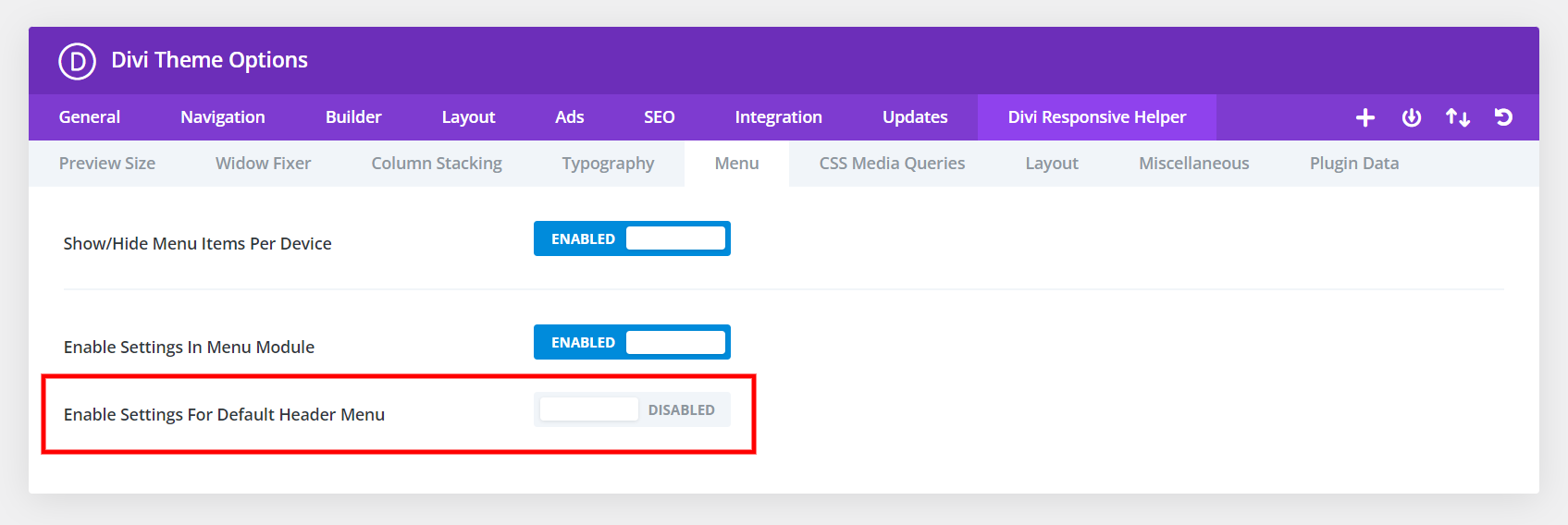
We noticed one of the main points of confusion was the settings for either the Menu module in the Theme Builder or the default header menu. To make this as clear as possible, we have added a new setting “Enable Settings For Default Header Menu” which will hide all the default header settings when disabled, and reveal them when enabled. This will be disabled by default.
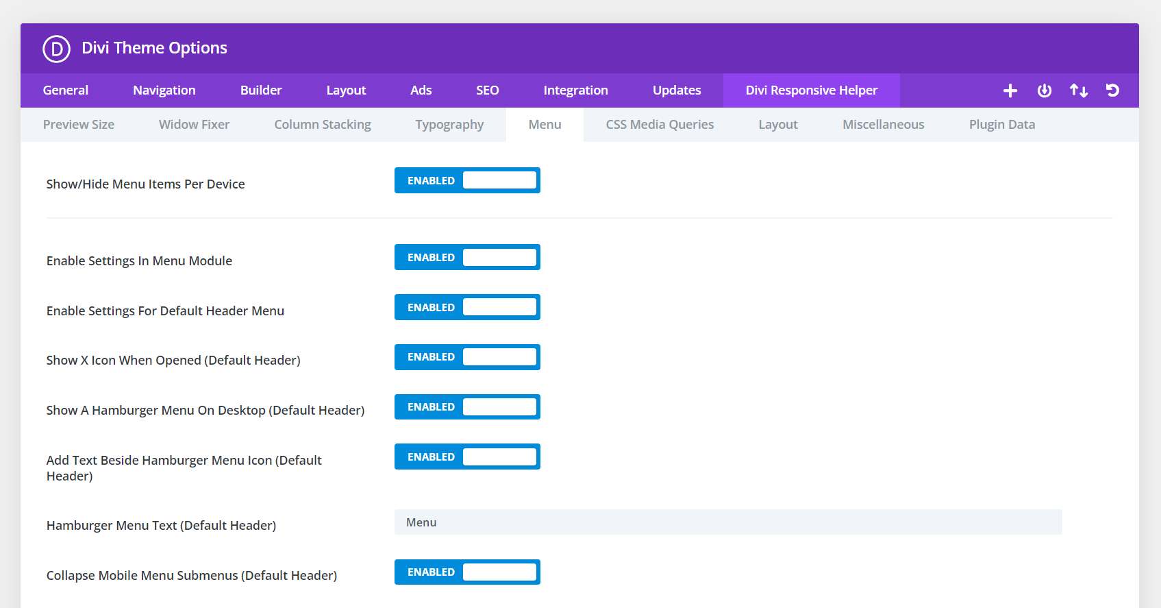
In an effort to make it as clear as possible, we also added (Default Header) to each of the setting labels.
Added Responsive Setting For Image Module Lightbox
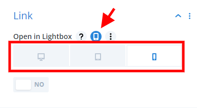
We are excited to add the missing responsive tabs for the Image module link to open in a lightbox or not per device. So now you can enable this or disable this setting per device, such as to disable it on mobile.
Collapsible Submenu Icon And Background Color Settings
By default, the icon color for the icon that appears when you enable the collapse submenu feature inherits the theme accent color for the Customizer. However, we heard from users that they wanted control over this, so we have added color picker settings for both the icon and the icon background color.
Inherit Design Settings For Menu Text Beside Hamburger Icon
One of the common feature requests we get is about styling the “Menu” text feature beside the hamburger icon on mobile. Instead of adding separate new design settings for this, we decided on a better idea to inherit the same styles as the “Menu Text” toggle in the Design tab.
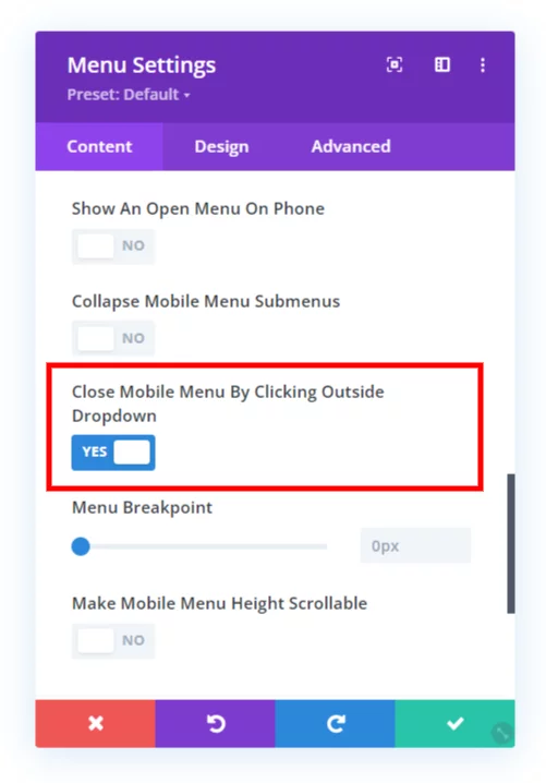
Added New Feature Close Mobile Menu By Clicking Outside The Dropdown
If you are viewing a Divi site on mobile and open the menu, but then want to close it, you may tend to click (or touch) the area around the outside of the dropdown, thinking it will work like other apps and close the menu. But not so, it does not do that in Divi. So we created a setting to do just that, now you can close the mobile menu by clicking outside it!
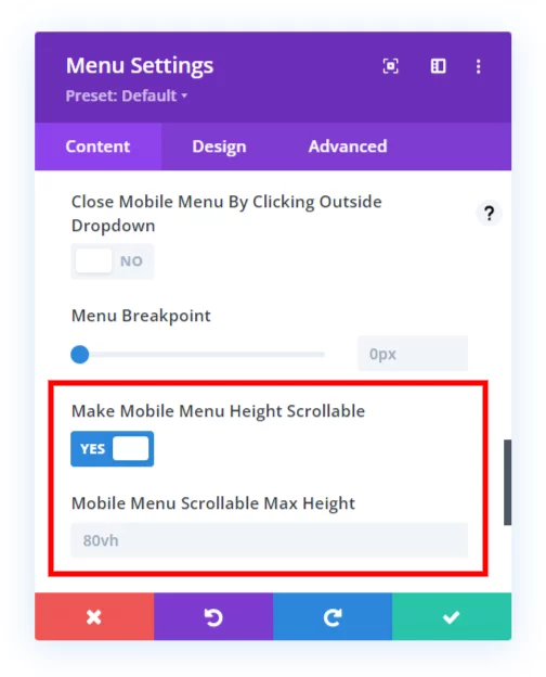
Added New Feature Mobile Menu Scrollable Height
You may find if you have too many menu items in your Divi menu that it will expand down below the screen, making some of the items cut off and out of reach. The background of the page scrolls, but the dropdown menu remains stationary by default. This quite the problem, and I am happy to say that our plugin solves this with a new setting that will allow you to make the mobile menu scrollable and set the height of the scrollable area.
Added Feature To Show Viewport Size In Admin Bar
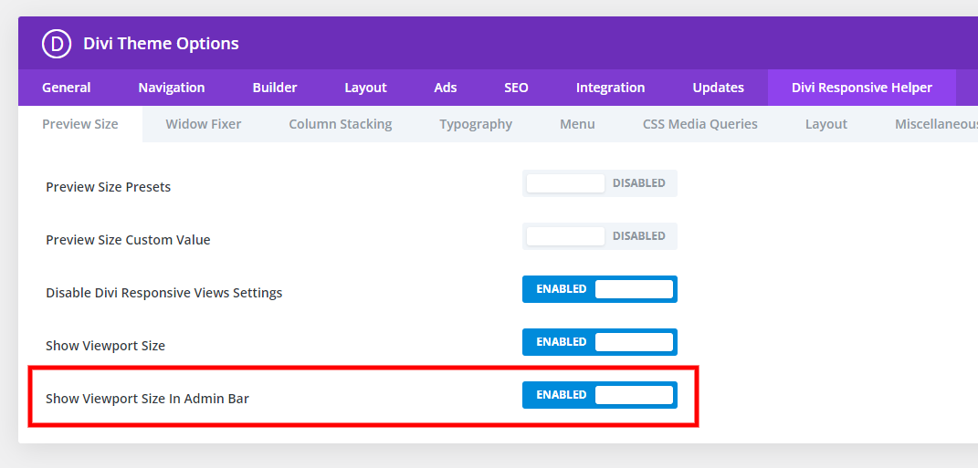
We already had the feature to show the viewport size in the Visual Builder when you are adjusting the preview size, but now we also added this optional feature to the top right corner of the WordPress admin bar.

Documentation & Demos
Don’t forget, we have a live demo site showing all the features. We keep our changelog updated always. And be sure to browse the documentation to see everything in detail.
Learn More About Divi Responsive Helper
If you are not using this plugin yet, please visit the product page and learn how you can use make your website look great and function well on all devices with the help of our huge suite of over 50 awesome features and unique settings in this ultimate Divi responsive toolkit!





0 Comments