


The Ultimate Divi Responsive Toolkit!
Need a hand? Our helper plugin is here to make your life a lot easier!
Over (50) Main Features And Counting!


Choose The Number of Row Columns
If you want to have two columns side-by-side on mobile…what do you do? You can’t! But with the Divi Responsive Helper, you can! Our super helpful column number feature allows you to choose the number of columns that stack side-by-side on Desktop and Phone device sizes.
Set Row Column Stacking Order
You no longer have to add crazy code or pull your hair out trying to change the column stacking order. This feature allows you to manually choose the order in which the columns stack on top of each other on Desktop and Phone device sizes.


Choose The Number of Blog Columns
The Divi Blog module uses a default number of columns based on the column width or device size, but has no setting to change it. The Divi Responsive Helper settings allow you to choose the number of blog post columns that stack side-by-side in the Blog module on Desktop, Tablet, and Phone device sizes.
Choose The Number Of Gallery Image Columns
The Divi Gallery module shows four images by default on Desktop, three on Tablet, and one on Phone. There is no setting to change these numbers. The Divi Responsive Helper settings allow you to choose the number of image columns that stack side-by-side in the Gallery module on Desktop, Tablet, and Phone device sizes.


Choose The Number of Portfolio Project Columns
The Divi Portfolio module and Divi Filterable Portfolio module has four columns by default on Desktop, two on Tablet, and one on Phone. But there is no way to change these numbers. The Divi Responsive Helper settings allow you to choose the number of portfolio project columns that stack side-by-side on Desktop, Tablet, and Phone device sizes.
Choose The Number Of Woo Product Columns
The Divi Woo Products module (formerly named Shop module) has four columns by default on Desktop, two on Tablet, and most recently updated to two on Phone as well. This almost always looks terrible, and there are no settings to change it. The Divi Responsive Helper settings allow you to choose the number of WooCommerce product columns that stack side-by-side in the Shop module on Desktop, Tablet, and Phone device sizes.


Choose The Number Of Columns – Woo Related Products Module
The default Woo Related Products module has no column settings, so we have added responsive column layout options!

Choose The Number Of Columns – Woo Cross Sells Module
We added responsive number of columns options to the Woo Cross Sells module!

Choose The Number Of Columns – Woo Product Upsell Module
The default Woo Product Upsell module has no column settings, so we have added responsive column layout options!
Custom Gutter Width
The default gutter width setting in Rows is limited to 1-4, with each number representing a percentage. But what if you want to use pixels or other units? And What if you want a different gutter width value on Desktop, Tablet, and Phone? Until now, it was impossible. But We have added a new feature in the Layout tab of the Divi Theme Options to enable a custom gutter width option in the Divi Builder rows. First, enable the setting in Theme Options. Then in any Row, after turning on the Use Custom Gutter Width setting, you will see our new setting:
Note this custom gutter width feature does not work with any of our custom number of columns features, as this would require a lot of work to make this compatible. It will work for default rows and columns and also in Specialty Sections.


Automatically Solve Widow Words On The Last Line Of Text
Are you getting annoyed by those pesky single words at the end of a heading or paragraph that sit on their own line? This happens a lot on Divi sites, especially on mobile, and many users don’t even realize it. Many Divi users find themselves trying all kinds of tricks to eliminate these widows, including soft-returns, resizing text, or CSS methods that simply don’t work.
The Divi Responsive Helper makes this easy with a real solution that prevents widows throughout your website. The plugin checks your paragraph and heading text to see how many words are on the last line at any screen size and automatically forces the words to match the desired setting that you choose.
Preview How Your Site Will Look On Any Device Size Directly In The Builder
The Divi Responsive Helper plugin adds custom preview sizes directly in the Divi Visual Builder. The new set of options allows you to quickly choose one of the customizable presets, or enter custom value. Take advantage of the full power of the three default responsive breakpoints in Divi by using our instant, customizable preview size, enabling you to make your Divi website responsive down to the pixel!


Completely Disable The Built-In Divi Responsive Views Feature
You probably know by now that Divi released their own built-in preview size feature after our plugin became popular. However, the new feature is limited and frustrating. Because of these limitations and frustrations, we created a setting in the Divi Responsive Helper to completely disable this Divi feature and use ours instead!
Quickly Set Global Sitewide Text Sizes & Line Height
The Divi Responsive Helper gives you input fields in the Divi Theme Options to set each of your heading (H1-H6) and paragraph (text, body text, etc.) text sizes and line height on each device. Every module on your website will now have consistent text sizes and line height, and it only takes a few minutes to set up! You can use whatever value you prefer, like px, em, rem, etc.! And the best part is that you can override any of these settings at any time in any of the module settings!


Convenient Custom CSS Media Queries Code Boxes
Divi comes with only one main Custom CSS input area, but if you want your CSS to only apply on certain device sizes you would need to specifically write your own custom media queries. This can be difficult and intimidating, especially for beginners. The Divi Responsive Helper plugin provides you with several new custom CSS input boxes that correspond to all of the built in Divi breakpoint sizes.

Totally Custom CSS Media Queries For Any Device Size
You can now create your own media queries! Simply enter a min-width and max-width value into the settings, and write or paste any CSS code into the box. Any code in the box will apply on your website between those custom sizes! No need to mess around with writing your own media queries anymore! Once you add the min and max width values, go ahead and add your CSS to the boxes. Remember, there is no need to wrap the code in a media query, the plugin does that for you!
Responsive Settings For Post Count Per Device
The Divi Blog, Gallery, Portfolio, and Woo Products modules have a setting to enter the desired number of items to show. However, this is very limited because it does not have responsive settings, meaning the number of items that looks good on desktop will get super long on phones, and this is not a good user experience. It would be great to have responsive options for this, which is exactly what our plugin provides!
The Divi Responsive Helper plugin includes a responsive icon and tabs inside the existing Blog, Gallery, Portfolio, Filterable Portfolio, and Woo Products modules which allows you to enter the number of items you want to display on Desktop, Tablet, and Phone devices.


Show A Hamburger Menu On Desktop

Opened/Closed Icon Picker For Menu Module
Choose which icons you want to use for both the opened and closed hamburger menu icons. The icon picker allows you to choose any icon included with Divi.
Show Text Beside Hamburger Menu Icon
Enable this feature to show a word or text to the left side the of the hamburger menu icon. This gives the visitor a visual indication or prompt to make it clear that it is the menu.

Show An Open Menu On Mobile
Sometimes you want to remove the hamburger menu icon and open the menu instead on Phone devices. There are many use cases for this, and it’s nice to have this as a simple setting. Enabling the setting in Theme Options activates an additional setting in the Menu module for showing an open menu instead of a hamburger menu.
Collapse Mobile Menu Submenus
This feature allows you to collapse the submenus rather than keep them open, which is the default behavior. This really helps tidy up the menu and makes it much shorter as well.


Collapse Submenu When Another Is Opened
This setting makes any open submenu closes as soon as another submenu is clicked open. This way, there is only one submenu open at one time.
Open/Close Submenus By Clicking Parent Menu Item
This next new setting takes it a step further. After the submenus are collapsed, you can also choose to open and close the submenu by clicking the parent menu item. So for this, just keep in mind that it effectively disables the parent menu link. The parent link becomes the clicking point to open or close the submenu, just like the icon.


Close Mobile Menu By Clicking Outside Dropdown
If you are viewing a Divi site on mobile and open the menu, but then want to close it, you may tend to click (or touch) the area around the outside of the dropdown, thinking it will work like other apps and close the menu. But not so, it does not do that in Divi. So we created a setting to do just that, now you can close the mobile menu by clicking outside it!
Menu Breakpoint
Enter the screen width pixel value for the responsive breakpoint for when the menu changes between desktop and mobile versions. This is helpful especially when you have a larger number of menu items that start to overlap due to space issues. Increasing the breakpoint higher than the default 981px allows the hamburger menu to appear on larger device sizes to prevent the ugly and unprofessional stacking issue.

Make Mobile Menu Height Scrollable
You may find if you have too many menu items in your Divi menu that it will expand down below the screen, making some of the items cut off and out of reach. The background of the page scrolls, but the dropdown menu remains stationary by default. This quite the problem, and I am happy to say that our plugin solves this with a new setting that will allow you to make the mobile menu scrollable and set the height of the scrollable area.

Choose Navigation Menu Per Device In Menu Module
The Divi Menu module is limited because it only allows you to select one WordPress navigation menu, and that menu shows on all devices. So we hacked the Divi Menu module and added responsive settings to the menu selection dropdown! Now you can choose a completely different navigation menu to show on Desktop, Tablet, and Phone!
Change The Blurb Image/Icon Position On Phone
When you use a Blurb module with an icon or image on the left, the mobile version gets really awkward with spacing. The title and text get really narrow, and this looks very unprofessional. To remedy this, some would say to duplicate the module and adjust the visibility settings, but that is not recommended at all. The easier solution is to use our setting in the Design tab of the Divi Blurb module to move the icon or image to the top on mobile, but keep the desktop version the same. Much better!

Automatically Open The Desktop, Tablet, And Phone Tabs
Use the Divi Responsive Helper to automatically toggle open the three responsive tabs for Desktop, Tablet, and Phone in the Divi Builder. This annoying task is made easy with a switch of a toggle! Now when you are ready to make your site responsive you can adjust the Divi settings for each device without clicking to open the tabs for every setting!
Tabs Module Tab Layout
By default, the tabs in the Divi Tabs module are horizontal on Tablet and only stack vertically on Phone. But what if you want them to stack vertically on Tablet, or maintain a horizontal layout on Phone? With the Divi Responsive Helper plugin, you now have the options in the Design tab of the Divi Tabs moduleto stack the tabs vertically on Tablet, and horizontally on Phone.


Show/Hide Menu Items Per Device
WordPress navigation menus do not have any way to control which items show on which device. This Divi Responsive Helper feature allows you to control which menu items to show or hide on Desktop, Tablet, or Phone. Once enabled, each menu item in Appearance>Menus will have checkmark boxes which allow you to choose on which device sizes you want that particular menu item to be visible.
Back To Top Button Visibility
Choose on which devices to show the Back To Top Button. This feature first requires the main Back To Top Button to be enabled in Divi>Theme Options>General. This feature is very handy and practical. For example, if your layouts are fairly short on desktop and the button is not needed, the layout may get really long on mobile when all the content is stacked. This would cause the user to need to scroll and scroll just to get back to the top. In this use case, you may want to only show the Back To Top Button on Phone.


Mobile Address Bar Color
Set a color for the mobile address bar header for Android devices using the Chrome browser. This is a really nice effect to add that extra touch of branding and personalization.
Default Layout Settings
These settings allow you to easily set the defaults for the entire website. These new settings in Theme Options correspond to those found in the Customizer, and each location updates when you change the other. It is important to note which settings use percentage units and which ones use pixel units. The Divi Customizer uses a percentage value for the top and bottom padding on Desktop, and a pixel value for the top and bottom padding on Tablet and Phone. Also note that these global settings are default, but can be overridden by adjusting the settings in any section/row.

Set The Section Top/Bottom Default Padding
These three settings allow you to easily set the default top and bottom padding on Desktop, Tablet, and Phone for all the sections on your website.
Set The Row Top/Bottom Default Padding
These three settings allow you to easily set the default top and bottom padding on Desktop, Tablet, and Phone for all the rows on your website.
Set The Row Default Width
These three settings allow you to easily set the default width on Desktop, Tablet, and Phone for all the rows on your website. The new settings in Theme Options correspond to those found in the Divi Builder in the Row settings in the Design tab in the Sizing toggle. Note that Divi uses percentage units by default. Also note that each of these global settings can be overridden by adjusting the width setting in any row.
Set The Row Default Max Width
These three settings allow you to easily set the default max width on Desktop, Tablet, and Phone for all the rows on your website. The new settings in Theme Options correspond to those found in the Divi Builder in the Row settings in the Design tab in the Sizing toggle. Note that Divi uses pixel units by default. Also note that each of these global settings can be overridden by adjusting the max width setting in any row.
Miscellaneous Settings
The Divi Responsive Helper plugin includes several features that are very helpful by themselves, but do not fit into any of the bigger categories. The purpose of these features is to make it easier for you to make your Divi website responsive. Please refer to our miscellaneous settings documentation to learn more about each of these features and how to use them.

Enable Parallax Effect On Mobile
Divi has a parallax background effect feature within any section, row, column, or module. However, the built-in feature only works on Desktop! The Divi Responsive Helper plugin solves that limitation and applies it to all devices. Once you enable the feature, it automatically adds support for the parallax effect on mobile devices whenever the Use Parallax Effect setting is enabled.
Disable Hover Effects On Touch Devices
Hover effects do not work well on devices without a mouse, and this has always been an issue in Divi. Now with our new toggle, you can simply disable any hover effects added in Divi modules on devices that are touchscreens. So now hover effects will not awkwardly appear after touching something on tablets and phone.
Disable Animations On Mobile
The Divi animation effects do not have responsive settings to change them or turn them off per device, so we included this feature to disable animations on mobile. Usually, animations increase the website load time and are sometimes annoying to view on a phone, so we hope this allows you to improve site performance and user experience.
Prevent Horizontal Scroll
Enable this feature to prevent a common issue with Divi which causes the mobile site to scroll sideways with a horizontal scroll bar. Many Divi websites have this problem and it often goes unnoticed, so we recommend using this on all your sites.
Mobile Pinch Zooming
Enable this feature to allow users to pinch and zoom on mobile. By default, Divi does not allow you to do this. This can be really helpful for visitors who are struggling to read text or to click links, or who may need to enlarge the screen to see images, charts, etc.
Different Mobile Logo
This feature allows you to set a different logo image to appear in the default header menu on tablet and phone devices. This is great if you need your logo to have a different size or shape for desktop and mobile. (Keep in mind this is for the default header, not the Menu module since that module already has this ability.)
Ease The Pain. Enjoy The Benefits!
This plugin solves the struggles and creates an intuitive interface of toggles and settings for making your Divi website responsive on all devices!
Very Simple To Use
A Remarkable Time Saver
Get An Accurate Preview
Stop The Confusion
Quickly Pays for Itself
Avoid Costly Mistakes
Divi Responsive Helper Is Created By Divi Experts!
Why Choose This Product?
- The only utility tool for responsive design in Divi on the market
- One of the best-selling Divi products of all time
- Integrates settings into the existing Divi Theme Options and Divi modules
- We are a top-rated Divi product creator and community leader
- Our proven track record of continuous feature updates and improvements
- We are known for fast, friendly, and personal support
- Our products come with thorough and helpful documentation
- Thousands of happy customers who love and trust our products

Hello, I’m Nelson Miller, the owner of this company. I created the Divi Responsive Helper plugin so you can quickly make Divi responsive on all devices! I hope you enjoy this game-changing plugin!


FAQs
Get answers to common questions you may have about this product. If you have other pre-sale questions not mentioned here, just send us a message and we’ll be happy to help!
How does this plugin work?
This plugin adds many new settings and features that improve Divi. Some of the settings are global and work from the Theme Options settings, while others are located inside Divi Visual Builder in the settings for modules, rows, columns, and sections. Please be sure to browse our documentation for more info on all the features.
Why is there no visual preview?
Please note that Divi unfortunately cannot render a preview of our custom settings inside the Visual Builder. The custom settings provided by our plugin will take effect on the frontend when you exit the builder.
In the future, we expect Divi version 5.0 to be able to render custom settings, but until then we cannot do anything about it. We recommend keeping your page open in two separate tabs in your browser, one with the Divi builder enabled, and the other on the frontend. Whenever you save changes in the builder, you can immediately refresh the other tab to see the changes take effect.
We apologize for this inconvenience, but hope you can appreciate the value of our helpful and innovative features! The unique nature of our plugin which modifies the existing Divi Builder is too far ahead of its time! 😊
Does this work with the Divi Builder plugin?
No sorry, if you are using the Divi Builder plugin with another theme, then unfortunately you would not have access to any of the plugin settings located in the backend in the Divi Theme Options, since the “Theme Options” are only in the Divi Theme.
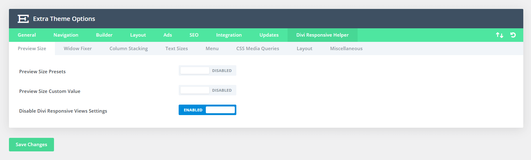
Does this work with the Extra theme?
Yes, we do have support for the Extra Theme by Elegant Themes. Here is a screenshot of the Theme Options settings.
Does this plugin add more breakpoints?
Our plugin gives you live custom preview sizes. The custom preview sizes are not CSS breakpoints. Most of the time you do not actually need more breakpoints. Instead, you should use our plugin’s custom preview size or presets to find the perfect balance of settings for the existing Desktop, Tablet, and Phone breakpoints.
Learn more about breakpoints vs preview size in our Preview Size feature documentation.
Which purchase option should I choose?
Great question! As you can see we offer several purchase options. These are the licenses that determine how your product can be used.
The Annual Unlimited license is great for anyone who wants to use this product on multiple websites for an affordable yearly fee.
The Lifetime Single license is perfect if you only plan to use the plugin on one site and you don't want to pay recurring fees.
The Lifetime Unlimited license is ideal for anyone who wants use this product on multiple sites and is okay with spending a lot more upfront to advoid recurring fees.
Please review our Product License Policy to learn more about what each license means and what is included.
How do I receive updates?
Our products are eligible for automatic updates to all customers with an active product license. Any time we push out an update with new features, improvements, or bug fixes, you will see a notification in your WordPress dashboard. If we have a big update with important information, we may also send out an email, so be sure to stay subscribed for that information.
Please refer to our Product Updates guide for more information about how you can receive product updates.
Do you offer product support?
Absolutely, we are always happy to help you with anything related to our products. We strongly encourage you to follow our product documentation, especially the "getting started" guide for each plugin. If you still have questions or need technical support, you can submit a support ticket. You can learn what steps to take first and what to expect in our Product Support Policy.
Do you offer refunds?
Our products come with a 30-day money-back guarantee based on some fair but important criteria which is clearly detailed in our Product Refund Policy. We encourage you to review the policy and reach out to us if you have any questions about your purchase. We are down-to-earth folks who will treat you with integrity, so feel free to start a friendly conversation with us at any time.
How do I use and manage the license keys?
Our plugins use license keys to verify the authenticity of your purchase and allow you to receive automatic updates and support. We have created a full Product License Key Management guide for you to learn how to find, add, delete, deactivate, and generate license keys.
Phil Ward (verified owner) –
Divi Responsive Helper is a gamechanger to more productive development. We now add clamp font sizing to all of our sites and Divi Responsive helper makes the process of clamp management easy – would be nice to see a clamp calculator built in but hey it doesn’t detract from the overall massive functionality gain. I tend to use it in conjunction with Divi Assistant along with Divi Dynamic Helper, between them they cover most of my requirements and have cut back on many additional plugins. We use them on all sites now.
Crispyviews (verified owner) –
Absolutely impressed! I cannot express my gratitude enough for the Divi Responsive Helper plugin. For years, I’ve been in discussions with Divi Support, advocating for the integration of features akin to what your plugin offers. Your creation not only realized my long-held aspirations but also enhanced them beyond my expectations. A heartfelt thank you for your remarkable work. You’ve certainly earned positive karma with this contribution. Wishing you a wonderful day, with best regards from Germany!
Nelson Lee Miller (aka The Divi Teacher) <span class="comment-author-role-label author-label">Author</span> (verified owner) –
Thank you so much! I am so pleased to hear that the plugin has all the features you were hoping to see in Divi, and thrilled that your experience has been so positive! Thanks so much for sharing!
Suffian Ahmed <span class="comment-author-role-label"><a href="https://www.peeayecreative.com/product/divi-adventure-club/" class="comment-author-role-link" rel="external nofollow" target="_blank">Divi Adventure Club Member</a></span> –
One of the best plugin so far!
Nelson Lee Miller (aka The Divi Teacher) <span class="comment-author-role-label author-label">Author</span> (verified owner) –
Thank you, I’m so glad you love it!
Rory (verified owner) –
Another brilliant addition to Divi from Pee-Aye Creative. Thank you Nelson for your all you do for the Divi Community, not just adding great plugins like Responsive Helper which make our lives easier but also the invaluable knowledge base you have put together for us all to share.
This plugin made a painful column responsive ordering problem disappear with ease. 🎉👏🏆
Thank you.
Nelson Lee Miller (aka The Divi Teacher) <span class="comment-author-role-label author-label">Author</span> (verified owner) –
Hi Rory,
It means so much to hear this, thank you for sharing. I am very pleased that my content and products are helping so many people!
James Williamson (verified owner) –
Another brilliant product from Pee-Aye Creative. I had held off buying the Responsive Helper thinking I could do it all through module settings and using Google Web Design Tester. Then I got to the stage of improving my sites responsiveness for tablet and mobile – Oh what a chore switching back and forth from Divi design view to Google test. I took the plunge and made the purchase. So far I’ve only used the Preview utility, it’s amazing. Make a change and get instant results at different viewpoints. Thank you Nelson and team for helping me get back my productivity.
Nelson Lee Miller (aka The Divi Teacher) <span class="comment-author-role-label author-label">Author</span> (verified owner) –
Thanks James, I’m so glad you like this! We now have over 44 features with version 2.2, so I’m sure you will be enjoying more features as well!
George Corrigan (verified owner) –
Just a great product that helps design so much! Thank you. Somewhere “down the road” in a future release of the product, I know I would love an additional breakpoint at 1024. Not sure about demand for this, but I thought I would mention. Again, great product. All the best …and just read the Custom Presets! Great documentation
Nelson Lee Miller (aka The Divi Teacher) <span class="comment-author-role-label author-label">Author</span> (verified owner) –
Thank you George, I am glad you like this product! Custom breakpoints are pretty much impossible unless Elegant Themes does it, but we hear ya! I appreciate your feedback and review!
Deborah Kaplan <span class="comment-author-role-label"><a href="https://www.peeayecreative.com/product/divi-adventure-club/" class="comment-author-role-link" rel="external nofollow" target="_blank">Divi Adventure Club Member</a></span> (verified owner) –
This plugin is totally amazing. It has saved me so much time and aggregation. Easy to use and great examples in Nelson’s blog posts etc. This is one of the better plugins for WP I have ever used. So easy to use, and has saved me a lot of time and aggravation. Kudos!
Nelson Lee Miller (aka The Divi Teacher) <span class="comment-author-role-label author-label">Author</span> (verified owner) –
Thank you so much Deborah! I am really pleased to hear your review and kind words, thank you for sharing! We will continue to make it even better!
Ignacio Lopez –
Is this plugging real???? OMG this will be my next purchase it is A-MA-ZING! Thank you so much for this!!
Hemant Gaba –
Hi Ignacio Lopez,
We are greatful that you are liking our product. Thank you for choosing us. 🙂
mircostockhausen-it.de (verified owner) –
A very helpful plugin, which closes exactly the gaps that DIVI leaves open. In addition, there is great support and incredibly helpful tips, you couldn’t want more.
Nelson Lee Miller (aka The Divi Teacher) <span class="comment-author-role-label author-label">Author</span> (verified owner) –
I’m so happy to hear this, thank you for sharing! Excited to be thinking of and add even more features to this!
Russ Clarke –
Love the plug-in! 24 hrs since installing and it has saved me a bunch of time and I am pretty much a divi newbie.
Nelson Lee Miller (aka The Divi Teacher) <span class="comment-author-role-label author-label">Author</span> (verified owner) –
That’s awesome Russ! I think you are happy with the current version of the plugin you are going to be overjoyed with 2.0! 🙂
Carlos (verified owner) –
Without a doubt, this is a necessary plugin for the Divi community to save many hours in creating sites that we need to look good on mobile devices. Also the service received by Nelson a 10.
Sin duda, este es un plugin necesario para la comunidad Divi para ahorrar muchas horas en la creación de sitios que necesitemos que se vean bien en los dispositivos móviles. Además el servicio recibido por Nelson un 10.
Nelson Lee Miller (aka The Divi Teacher) <span class="comment-author-role-label author-label">Author</span> (verified owner) –
Thank you so much Carlos! I really appreciate you sharing and I am so glad our products are helping so many people with their Divi websites. We look forward to continuing to innovate and update the plugin as well!
Carl Cyphers (verified owner) –
This is my go-to plugin for responsive settings. Another super project from Nelson!
Nelson Lee Miller (aka The Divi Teacher) <span class="comment-author-role-label author-label">Author</span> (verified owner) –
Thank you so much Carl! Really appreciate your feedback 🙂
Hurri Nett <span class="comment-author-role-label"><a href="https://www.peeayecreative.com/product/divi-adventure-club/" class="comment-author-role-link" rel="external nofollow" target="_blank">Divi Adventure Club Member</a></span> (verified owner) –
Although I have only used this plugin on a single project so far, it has already proved to be enormously helpful with my responsive layouts, which anyone who knows Divi, knows this can be challenging with the default Divi responsive views. A fantastic added bonus is the Column Stacking and Number of Columns options which I have always had to do using custom CSS.
Thanks Nelson, what a truly seamlessly integrated plugin and a massive time saver that I am eager to recommend!
I am impatiently looking forward to your version 2.0 release as I cannot wait to see what you have done.
Nelson Lee Miller (aka The Divi Teacher) <span class="comment-author-role-label author-label">Author</span> (verified owner) –
Thank you so much Hurri, I appreciate your review and we are very excited to release 2.0 and will do so as soon as possible! 🙂
Thomas Bogan <span class="comment-author-role-label"><a href="https://www.peeayecreative.com/product/divi-adventure-club/" class="comment-author-role-link" rel="external nofollow" target="_blank">Divi Adventure Club Member</a></span> (verified owner) –
Divi has come a long way in making the site responsive, BUT with what you have with Divi Responsive Helper from Pee-Aye Creative is a God send. Nelson has really helped me out with this one, being a relative newbie to Divi, this plugin makes things sooooooo easy.
Nelson Lee Miller (aka The Divi Teacher) <span class="comment-author-role-label author-label">Author</span> (verified owner) –
I’m so glad you like it! Stay tuned for the release of 2.0 which quadruples the amount of settings!
Daniele (verified owner) –
Great plugin that really saves time when creating responsive pages.
Thank you, not only for this plugin but also for all the ideas and suggestions you always provide in your tutorials and for the clarity and simplicity with which you explain.
5 star
Nelson Lee Miller (aka The Divi Teacher) <span class="comment-author-role-label author-label">Author</span> –
Thank you Daniele,
I really appreciate you sharing this! I’m so glad to hear you are enjoying all our resources! 🙂
khurshed (verified owner) –
Hey Nelson – The responsive helper is the ONE plug in I would recommend to absolutely anyone who wants to do any sort of website creation with Divi. I am a total beginner and have so far made exactly 1 website and to make life easier for me (or so I thought), I purchased some plug-ins from the Divi market place.
The responsive helper is the only one that’s still installed. All the others had some sort of glitch or made my site much slower.
I especially LOVE the fact that you can change the order of how the mobile shows your columns in a row section – that itself was worth the price.
Thanks a lot!!
Nelson Lee Miller (aka The Divi Teacher) <span class="comment-author-role-label author-label">Author</span> –
Thank you so much! We are releasing even more amazing features for this plugin soon!
Dean Olmstead (verified owner) –
Easy 5 stars on this plugin. If you’ve been struggling to get mobile looking like it should with Divi, give this plugin a go. My life just got so much easier when designing! I also tried the Widow Fixer and man, you are just knocking it out the park here. I don’t know how much time I’ve wasted trying to get one word to not break to the next line. Time saver x100. And I haven’t even tried the Columns Stacking Order part of the plugin but I’m sure it is a big help as well. Tech support is stellar beyond belief as well. I had set some sizes outside the boundary of what was allowable and they figured it out. I never would have.
Nelson Lee Miller (aka The Divi Teacher) <span class="comment-author-role-label author-label">Author</span> –
I really appreciate this, Dean! So glad to hear how you are putting this to good use! Exciting to keep adding new features as well!
Thorsten Ley –
Works reallly good for me and makes me significantly faster in my work, Thanks a lot
Nelson Lee Miller (aka The Divi Teacher) <span class="comment-author-role-label author-label">Author</span> –
Thanks Thorsten, I’m so glad this is helping to speed up your work!
Chris <span class="comment-author-role-label"><a href="https://www.peeayecreative.com/product/divi-adventure-club/" class="comment-author-role-link" rel="external nofollow" target="_blank">Divi Adventure Club Member</a></span> (verified owner) –
Bravo for another useful plugin! It’s been awesome to have the Responsive Helper plugin. I thought I was really going to like the option to show the mobile icons when editing a modules design.
There is a slight delay (minuscule really) before they appear. I am able to interact with the design settings for a second before the mobile icons show up… sometimes I click to edit a value and end up switching views because the icons appeared at that exact instant, moving the view of the design window slightly.
It just makes me slow down a bit when first entering a design tab then working with modules.
Still debating whether the time saved evoking the mobile icons is a good trade off for switching mobile views unintentionally from time to time is worth it. Easy to disable though, so no complaints here.
Highly recommend this plugin for any serious Divi designers and builders.
Thanks Nelson!
Nelson Lee Miller (aka The Divi Teacher) <span class="comment-author-role-label author-label">Author</span> –
Thanks Chris! So happy to hear you are enjoying the plugin.
About the delay, three is no issue with that. I believe you are referring to the Auto-Open Responsive Tabs feature. Actually the delay is intentional, or at least necessary. The only physical way to show the tabs is for the module to load first, then our code “clicks” the icon and opens the tabs. I hope that makes sense.
Thanks for recommending our plugin, really appreciate it!
Ellie (verified owner) –
I was struggling with changing for the various screen sizes and the Divi Responsive Helper plugin has been a huge help. At 75, I’m still learning a LOT, but I was able to make some updates without totally messing up the site. I also love Nelson’s tutorials. And they respond in a very timely manner when you have a question. So glad I found PeeAyeCreative!
Nelson Lee Miller (aka The Divi Teacher) <span class="comment-author-role-label author-label">Author</span> –
Hi Ellie, we are glad to found us too! It was a pleasure talking with you and I am so glad you are finding our content and plugin helpful!
Tah Terence T-Boi –
Woow, Awesome plugin Nelson, Pee-Aye Creative is indeed creative.
Nelson Lee Miller (aka The Divi Teacher) <span class="comment-author-role-label author-label">Author</span> –
Thank you so much for your review!
Antoine Morales (verified owner) –
I was hating divi, because of the bad mobile preview, really too wide… I’m really happy I found this plugin, it’s really very helpful for creating responsive page, without switching every minute to the google developer page… Developpers are very responsive too and correct minor bugs when reported. Is really a must for creating a website, should be created from the DIVI team. Maybe you should contact them and sell them your product, it’s really a very important feature
Nelson Lee Miller (aka The Divi Teacher) <span class="comment-author-role-label author-label">Author</span> –
Thank you Antoine, I love your feedback and enthusiasm! Your kind words mean a lot to us!
Ron Linders –
Hi Nelson, what a great job man! This is really a big step forward in designer responsive websites! Love it and use it all the time when developing me websites but also to review older ones. Keep up the good work!
Greg Merriman (verified owner) –
I discovered Nelson’s videos when looking for solutions to restrictions I came across when using Divi and always found them short, to the point and the information provided always worked. Well done.
Through using the blog videos I discovered the Divi Responsive Helper plug-in. It works really well and makes designing your site with great responsiveness at ANY size really simple. I love the fact that the team behind it seem determined to keep improving and adding to the plugin. I also like the easy, straightforward purchasing options. Buy it or don’t! No bundle packages, no licences for this amount of sites or that amount of sites. Just buy the plugin and use it.
I’m really pleased that I discovered PEE-AYE Creative and I hope that they design and release lots more plugins to help overcome Divi’s quirkiness and shortcomings.
Nelson Lee Miller (aka The Divi Teacher) <span class="comment-author-role-label author-label">Author</span> –
I really appreciate this, Greg! This is a tremendous testimonial and I am so honored. 🙂
Sharyn Fraser (verified owner) –
Brilliant plugin! Especially as I am not that technical, so this saved my bacon with launching a new site that had columns and were displaying the images out of order on mobile. It does all the work and saves me so much time ensuring that the mobile view of my Divi sites is optimal – 5 stars!
Nelson Lee Miller (aka The Divi Teacher) <span class="comment-author-role-label author-label">Author</span> –
Thank you so much, Sharyn! I’m so glad it is helpful and we are also excited for upcoming updates with more features that I think you are going to like as well 🙂
Barrie Simpson <span class="comment-author-role-label"><a href="https://www.peeayecreative.com/product/divi-adventure-club/" class="comment-author-role-link" rel="external nofollow" target="_blank">Divi Adventure Club Member</a></span> (verified owner) –
Column stacking – what a time saver.
Nelson, you are the man – the column stacking feature certainly makes for speeding up page displays and without the need for creating three sets of modules for each – desktop, tablet and phone. ET/Divi please take note!
Michael Gerontides –
I really like your plugin and I must say that it helps a lot in designing a truly responsive site. However, unfolding the options really elongates the list, and sometimes it seems that I must do a lot of scrolling. What I would ultimately like to see, is to be able to just use the 3 icons for responsiveness (at the bottom left of the screen) and by choosing one view to be able to do all the changes, without having to select them individually, even through your plugin. I really like the ability to define your own size, fantastic feature. Great job, great plugin most definitely saves time and frustration. Thank you.
Nelson Lee Miller (aka The Divi Teacher) <span class="comment-author-role-label author-label">Author</span> –
Thank-you Michael, glad you are finding it helpful! Actually we are doing what you describe in version 1.2 to have the custom preview size Presets and Custom Value settings moved out of the modules down to the bottom left as you said! 🙂
Christoph Neis (verified owner) –
I just started using the Divi Responsible Helper – and it’s a fine little tool that has a big impact to my work. Saves me lots of time because finally I can build my pages responsive in one-stop. Thanks a lot.
One thing I would see as a future improvement: Sometimes the options in each single object get a bit crowded with all this responsive settings. Maybe a button would be great to turn it on or off in each module/row/section while working in it – might be too much effort or technically tough because it could collide with Divi Builder code… but I would love it.
Stephane –
What a top plugin ! I use it for all my client’s websites ! Thank you so much.
WR Mercier (verified owner) –
Nelson takes a simple approach to create programs that solve common sense issues and time related problems. His program, Divi Responsive Helper eliminates excessive time spent creating websites that look and perform GREAT on all devices. Nelson is also ultra quick to responds to questions and/or problems. Great work Nelson!
Alan McDonald (verified owner) –
Definitely solves a couple useage problems with Divi and helps streamline new builds!
Jacques Vreugdenhil (verified owner) –
Another great plugin from Nelson. This one is really going to help save time in developing sites for mobile screens.
Nick Morgan (verified owner) –
Hey Nelson, just wanted to say that I love The Divi Responsive Helper plugin I just purchased. It has helped my workflow as well as saved me time. I can see how you came up with the name. Lol
You’ve put out some very helpful and informative videos on YouTube alongside your many resources and Blog Content. I just wanted to show my appreciation for your work and the things you do for the Divi Community. Keep it up, I look forward to the next awesome plugin from Pee-Aye Creative.
Hope all is well with you, your family and your business! 🙌
Anna Stansbie (verified owner) –
What a fantastic plug-in, from the most SUPER-HELPFUL company – PEE-AYE CREATIVE! Instant, polite and informative answers to any questions. Just the best, thank you so much Nelson!
Nelson Lee Miller (aka The Divi Teacher) <span class="comment-author-role-label author-label">Author</span> –
Thank you Anna for such a wonderful review. We are so happy you enjoy this plugin and all we do here to help the Divi community! 🙂
Vera Schafer –
Responsiveness is my main concern when I deliver a website. Design may look beautiful on a desktop but we all know this is not the device most people browse and evaluate our work. It is good to find developers that listen to our priority requests and work on it first. Thank you, Nelson! You made my day today!