There are times when you want to build a template in the Divi Theme Builder, but need a menu as a sidebar. This would work perfectly to build a documentation site, or to show a sidebar navigation for blog posts. It is not meant for full site navigation, but it could work if you make some adjustments. So in this tutorial I will show you how to make a fixed and collapsible Divi sidebar menu.
▶️ Please watch the video above to get all the exciting details! 👆
Before We Start
The best place I can think to use this tutorial is by placing the Menu module in a Theme Builder template in a small column with a Post content module in a wider column. This could be for the entire site, or it could be for a custom post type, for example to make a documentation area on your site. This would be perfect for that!
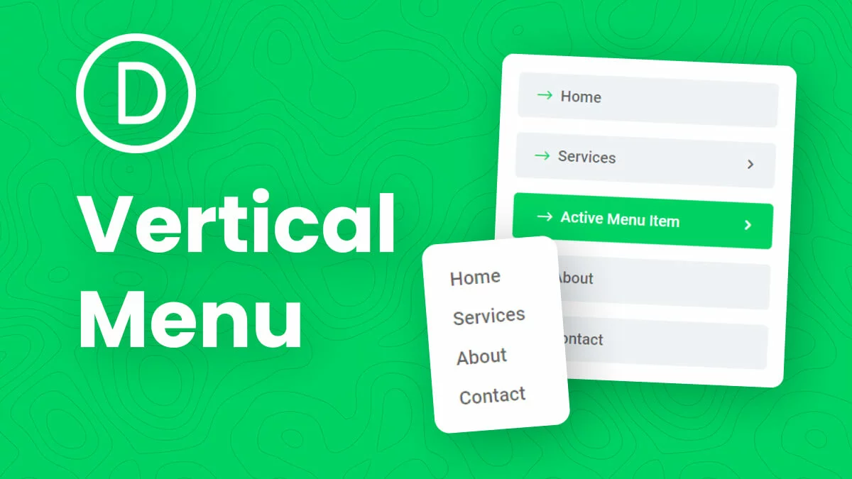
If you want to keep it simple, I recommend checking our previous tutorial about How To Make A Vertical Menu. Chances are you actually need that tutorial instead of this one.
1. Complete A Separate Tutorial About Collapsing the Mobile Menu Submenus
This tutorial builds on one of our previous tutorials. You will need to complete the other tutorial together with this one to achieve the final result. The other tutorial is about How To Collapse Divi Mobile Menu Submenus.
2. Add A Custom CSS Class To The Menu
The first main step would be to add a custom CSS class to the menu module. We are doing this so that our code only affects this specific module on your site. Open the Divi Menu module settings and go to the Advanced tab. Go to the CSS IDs & Classes toggle. Place the class “pa-sidebar-menu” in the CSS Class input field.
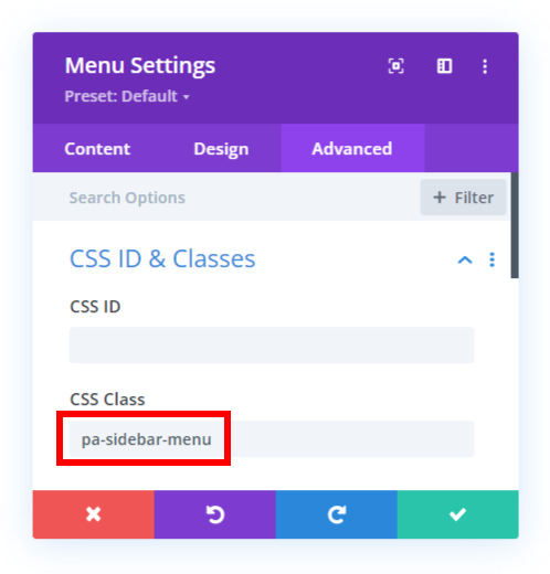
3. Add Some CSS To Adjust The Divi Menu Styling
The next step is to add CSS code which will do most of the work. The CSS is hiding the desktop menu and showing the mobile menu. This is needed since they are totally different, and it would only be relevant to use the mobile menu to create the desired effect. The code is also used to modify some of the styling of the menu. One important part of the code sets a maximum height for the menu, and has an overflow. This means that the as the content of the menu, the links and submenus, get longer, the menu will show a scrollbar and scroll down. You can choose to modify or even remove this as needed. There is also code that styles the scrollbar to make it look nice.
Where To Paste The CSS Code
1. Divi Assistant
If you are using our Divi Assistant plugin, simply paste the code in the CSS tab in the custom code window in the Divi Visual Builder.
2. Child Theme
If you are using a child theme, paste this code into the style.css file. If you don't have a child theme, you can generate a child theme directly on your site or download our free child theme.
3. Divi Theme Options Integration
Otherwise, paste this code in your Divi>Theme Options>Custom CSS code box.
If you need help understanding where to paste the code, please check out our complete guide about where to add custom code In Divi.
/*hide desktop menu*/
.pa-sidebar-menu .et_pb_menu__menu,
.pa-sidebar-menu .mobile_menu_bar:before {
	display: none !important;
}

/*display mobile menu container on desktop*/
.pa-sidebar-menu .et_mobile_nav_menu {
	display: block !important;
	width: 100%;
}

/*display mobile menu on desktop*/
.pa-sidebar-menu .et_mobile_menu {
	display: block !important;
	position: relative;
	border-top: none;
}

/*hide point on top from prerequisite tutorial*/
.pa-sidebar .et_mobile_menu:after{
  display: none;
}

/*hide bullet lists from menu*/
.pa-sidebar-menu li {
	list-style: none;
}

/*style the menu, add overflow, set height*/
.pa-sidebar-menu {
	max-height: 50vh !important;
	overflow-y: auto;
	border: 2px solid #000;
	box-shadow: none;
}

/*adjust the width of the entire scrollbar*/
.pa-sidebar-menu::-webkit-scrollbar {
	width: 10px;
}

/*set a color for the scrollbar track*/
.pa-sidebar-menu::-webkit-scrollbar-track {
	background: #ffffff;
}

/*style the scrollbar thumb*/
.pa-sidebar-menu::-webkit-scrollbar-thumb {
	background-color: #00d263;
	border-radius: 20px;
	border: 2px solid #ffffff;
}
As you can see, each of the snippets are labeled and hopefully helps explain what each one does. As always, the video embedded in the post above will be the best resource to learn about what the code is doing and see it in action.
4. Add Some jQuery To Open The current Divi Menu Submenu
This last step is not required, but is a pretty cool bonus that I wanted to include. This is something I created when I wanted to build a documentation site for some of my WordPress plugins. The jQuery code automatically will open a specific submenu if the current page link is inside that submenu. In other words, if all the submenus are closed but you click a link to a menu item that is in a submenu, that submenu will be opened on page load and remain open.
Where To Paste The jQuery Code
1. Divi Assistant
If you are using our Divi Assistant plugin, simply paste the code in the jQuery tab in the custom code window in the Divi Visual Builder.
2. Child Theme
If you are using a child theme, paste this code into the scripts.js file (don't forget to remove the <script> tags at the beginning and end). If you don't have a child theme, you can generate a child theme directly on your site or download our free child theme.
3. Divi Theme Options Integration
Otherwise, paste this code in your Divi>Theme Options>Integrations tab in the "Add code to the < head > of your blog" code area.
If you need help understanding where to paste the code, please check out our complete guide about where to add custom code In Divi.
<script>
jQuery(document).ready(function() {
    if(jQuery('.pa-sidebar-menu .menu-item-has-children').hasClass('current-menu-parent')){
        jQuery('.pa-sidebar-menu .current-menu-parent ul.sub-menu').addClass('visible');
        jQuery('.pa-sidebar-menu .current-menu-ancestor > ul.sub-menu').addClass('visible');
    }
 });
</script>





Hey Nelson I have a menu with categorias and categories and products, but wen I click on one of the categories all show all the products of the father, can you help me with that?
https://conradof86.sg-host.com/
I am not sure what you mean.
Hey Nelson, I need a collapse menu, but just for Desktop, how we gonna do it?
Are you asking a question about this tutorial? Or a different one?
Hi Nels, this doesn’t work for me.
Any expected errors?
Hi Akhil!
Can you please share the URL of the page so that I can investigate further?
Hi Team,
I having some problem with the side bar menu. I have added the custom css class as shown in the article and added the css code as well.
But my menu toggle feature didn’t come in the design. The menu is showing sub-menu items with out clicking on the parent menu.
I want my sub menu items to be hidden until some one click on the toggle icon. Can you please help me with this issue.
Hi Naga!
Please make sure to follow this guide to have collapsable menu: https://www.peeayecreative.com/how-to-collapse-divi-mobile-menu-submenus/
Thank you once again for a top tutorial. Everthing is working fine, but got one challenge. As you also see in your video, the menu is overlapping with the footer. My footer is a bit bigger, so the overlapping is a thing to address. How did you solve this?
Hi Thommy!
I need to check the footer height. Can you share the URL of the page?