Add Any Content To The Contact Form
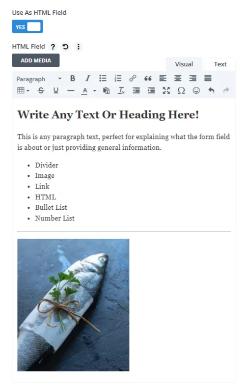
Need to break your form into sections with headings? Now you can! Need to break your form into sections with a divider line? Now you can! What about adding a paragraph, image, link, bullet list, number list, or any other HMTL? Now you can with our popular 3rd party addon Divi Contact Form Helper! In this tutorial, I will show you how to personalize the Divi contact Form module success message using dynamic merge tags.
▶️ Please watch the video above to get all the exciting details! 👆
1. Install The Divi Contact Form Helper Plugin
The first step is to install the Divi Contact Form Helper plugin. Hopefully by now, most of my weekly blog post readers already use the plugin or are members of our all-access Divi Adventure Club, but if not, you can check it out to learn more. The plugin adds tons of settings and features directly to the existing Contact Form module, which will be used for this tutorial to add pretty much anything you want into the contact form.
2. Add The HTML Field
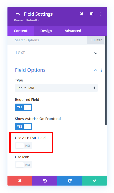
One of the things the plugin does is add new types of fields to the existing module, like a file upload field, datepicker, and of course this HTML field. Just open the Divi Contact Form module settings and go to the Field Options toggle and make sure to have the Type dropdown set to Input Field (this is not an input field, but this setting is replied for our plugin’s custom fields). Next, enable the setting called User As HTML Field. This will open a text editor for you to add anything you want
4. Adjust The design
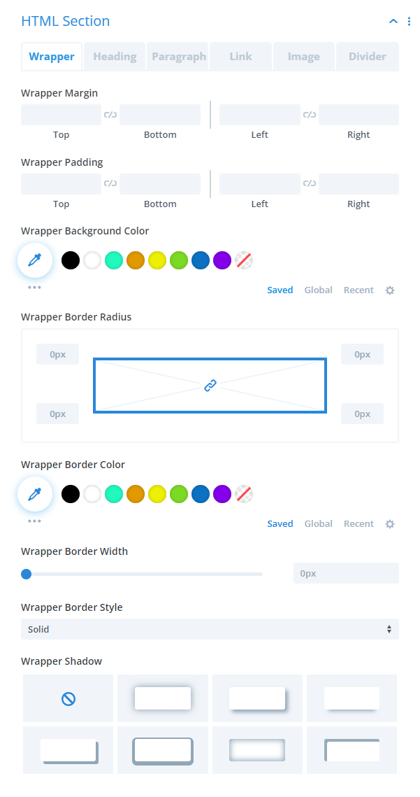
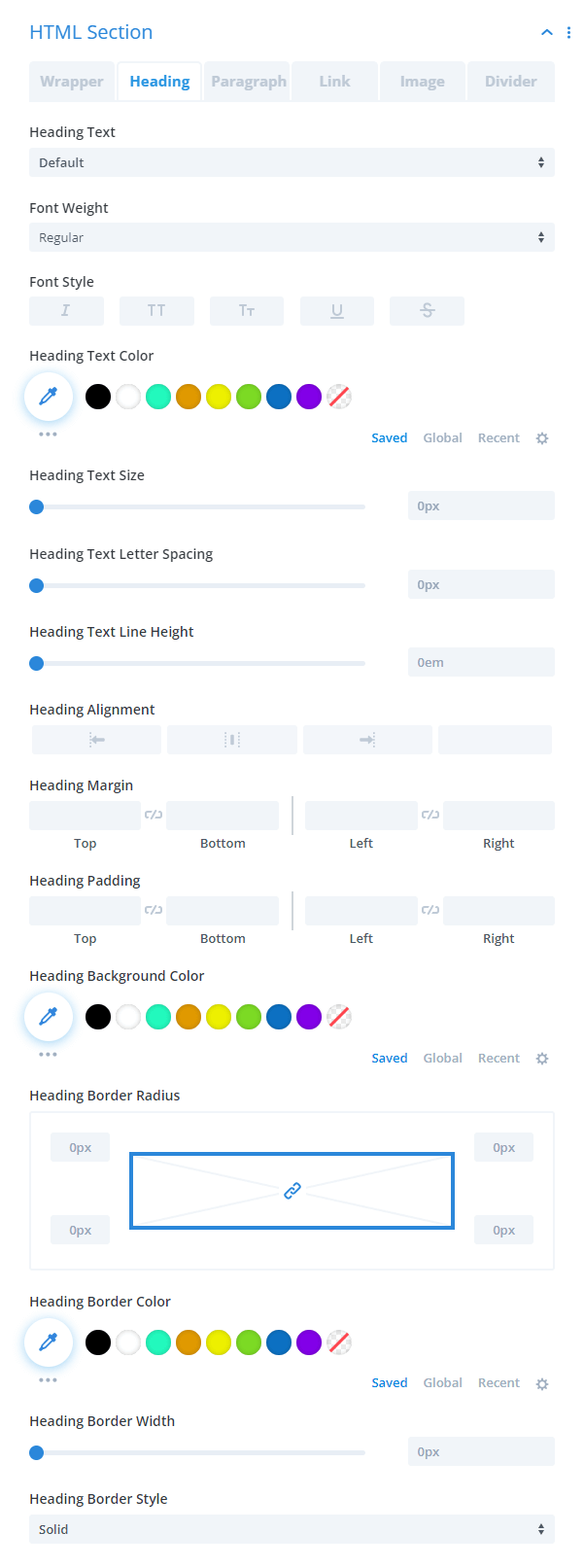
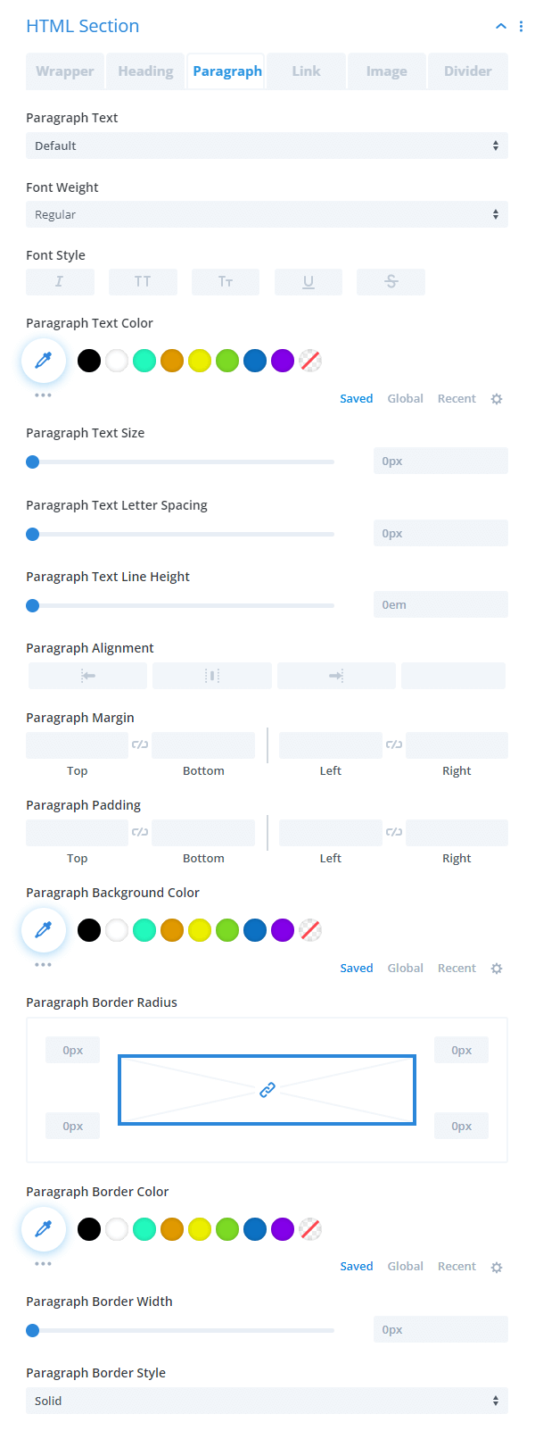
We always try to include as many design settings as possible, and this field is no exception. In the screenshot below, you can see a wide range of design options related to different types of content that you add to the field. To find these, open the individual field where you have enabled the HTML field and click the Design tab, then look for the HTML Section toggle. (Note there is no main Design tab, but rather a separate Design tab within each HTML field.)
Wrapper
The Wrapper tab has design settings to style the entire field with spacing, background color, border setting, and box shadow settings.
Heading
The Heading tab has the standard text and font design settings for styling any headers.
Paragraph
The Paragraph tab has the standard text and font design settings for styling any paragraph text.
Link
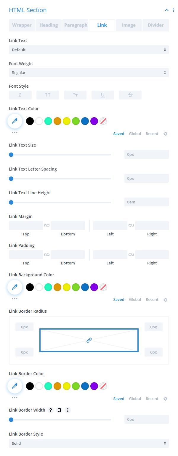
The Link tab has the standard text and font design settings for styling any links.
Image
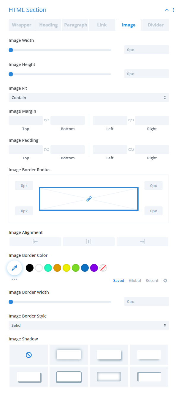
The Image tab has design settings to style any images you may add with width, height, object fit options, spacing, border settings, and box shadow settings.
Divider
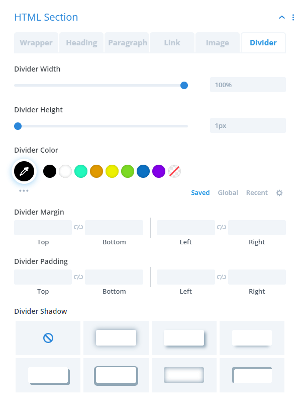
The Divider tab has all the design settings to make dividers like width, height, color, spacing, and shadow.







0 Comments