Improve The Divi Blurb Module
If you are like me, you love the Divi Blurb module. But there is one thing I often seem to face as I am using the module. There is no good way to vertically center align the text with the image or icon when it is on the left side. I have been using some CSS to achieve this for quite a while, and I finally realized I needed to share it with others. You can see it live on our help center page or on our WP Inbox Integrations page. So here is the code, in this tutorial I will show you how to vertically align the Divi Blurb module image/icon and text when the image/icon is placed on the left.
▶️ Please watch the video above to get all the exciting details! 👆
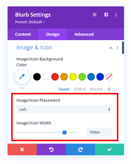
1. Adjust The Divi Blurb Image settings
This tutorial is specifically for the Divi Blurb module when the image position is on the left, rather than the top, so before going further, be sure to adjust the settings as needed.
- Set the Image/Icon Placement to Left
- Set the Image/Icon Width to any pixel value
You can set any width that you need. You can also change the image/icon placement and width for Desktop, Tablet, and Phone by enabling the responsive feature.
2. Add A Custom CSS Class To The Divi Blurb Module
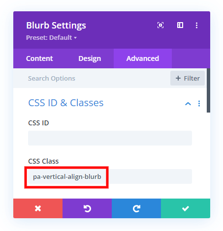
The second step is to add a custom CSS class to the Divi Blurb module. This is used to target this specific module with the CSS snippet in step #3. Go to the Blurb module settings>Advanced tab>CSS ID & Classes toggle and add the class “pa-vertical-align-blurb” to the CSS Class input field.
3. Add The CSS Code Snippet
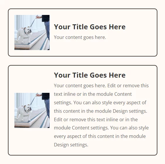
The last step is to simply copy and paste this CSS code snippet below into your site. The code is targeting the HTML divs that are holding the Blurb module image on the left and the title and body text on the right, and making them both display their content as flex to vertically align the image with the combined title and body text. Please watch the video above for more explanation of this.
The code is wrapped in a media query, so please not this is affecting Desktop and Tablet only, but not Phone. If you want the code to apply to all device sizes, simply remove the media query. Or to change to affect Desktop only, and not Tablet and Phone, change the 767px value to 981px (these are the default breakpoints in Divi).
Where To Paste The CSS Code
1. Divi Assistant
If you are using our Divi Assistant plugin, simply paste the code in the CSS tab in the custom code window in the Divi Visual Builder.
2. Child Theme
If you are using a child theme, paste this code into the style.css file. If you don't have a child theme, you can generate a child theme directly on your site or download our free child theme.
3. Divi Theme Options Integration
Otherwise, paste this code in your Divi>Theme Options>Custom CSS code box.
If you need help understanding where to paste the code, please check out our complete guide about where to add custom code In Divi.
/* Media query for devices with a minimum width of 767 pixels */
@media (min-width: 767px) {
    /* Flexbox display for blurb content */
    .pa-vertical-align-blurb .et_pb_blurb_content {
        display: flex!important;
    }

    /* Flexbox display for blurb container */
    .pa-vertical-align-blurb .et_pb_blurb_container {
        display: flex!important;
        justify-content: center; /* Center align blurb container horizontally */
        flex-direction: column; /* Arrange blurb container content in a column */
    }

    /* Flexbox display for main blurb image */
    .et-db #et-boc .et-l .pa-vertical-align-blurb .et_pb_main_blurb_image {
        display: flex;
        width: auto!important; /* Ensure blurb image width adjusts automatically */
        margin-bottom: 0px!important; /* Remove bottom margin for better alignment */
    }
}
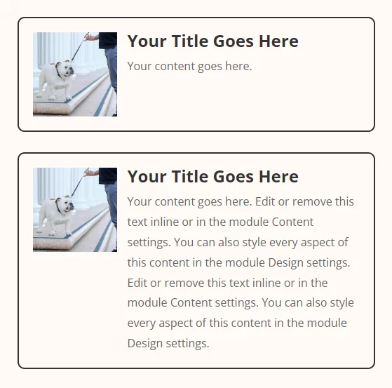
Before
After




This is a great fix — but sometimes (and why this is I have NO idea, in terms of code) and only on arbitrary pages, it doesn’t work. I frequently use blurbs as de facto buttons and only utilize the title and no body content. I wonder if the problem lies with the fact that I’m not adding any content. Any thoughts? I was able to get this CSS to work, but your flexbox solution seems more reliable:
.vert_centered_blurb.et_pb_blurb_position_left .et_pb_blurb_container {
vertical-align: middle !important;
position: relative !important;
}
I added the initial custom class to target the blurb I’m aligning. It works for when there’s only a blurb title. I wish I could figure out why sometimes the other CSS goes haywire — the title gets backed up to the left too far and too much space gets added to the bottom of the blurb. Like I said, it only happens on certain pages — I thought maybe there was some conflicting blurb CSS on these pages, but I haven’t added anything else. It’s odd, and could just be some bug…
Hi Stacey,
I’m not sure! If your solution is working, then that sounds great!
Thanks, that was just what I was looking for. Unfortunately though, I have a minimum height set for the blurb module (to keep them all the same size) and that seems to be stopping it from centering in the module. Is there a way to overcome that?
Hi Chris!
Please add the following code along with the above other codes and see if it helps:
.pa-vertical-align-blurb{
display: flex;
}