
Use Any Image Size or Shape!
Change Divi Gallery Images to Square or Any Other Proportion
Everyone seems to love our other post on changing the image aspect ratio of Divi images, but that tutorial only shows how to do it on the Image Module. In this tutorial, we will be using the same math, same code, and the same process to change the Divi Gallery image aspect ratio using the Divi Gallery Module. You can soon be adding any combination of landscape, portrait, or odd sizes images to the gallery, and they will automatically become uniform.
▶️ Please watch the video above to get all the exciting details! 👆
NOTE: You might want to also check out a similar but very different tutorial called How To Stop Divi Image Crop. That one actually make the gallery use the original uploaded image aspect ratio instead.

Explanation & Calculations
How To Force Divi Gallery Image Aspect Ratios
Most of us are familiar with image or video aspect ratios. Lots of times our devices are made to these proportions as well. The first number in the ratio is the width, and the second number is the height. As you can see in the CSS examples below, the CSS trick works with padding and uses a percentage. Basically, the percentage is the height divided by width. To calculate what percentage to use in the CSS for the Divi image gallery item aspect ratios, just use this math formula.
- Divide the second number by the first number
- Move the decimal over two places to the right
- Add a percent sign
Square 1:1 – 1 / 1 = 1.00 = 100%
Landscape 16:9 – 9 / 16 = 0.5625 = 56.25%
Landscape 4:3 – 3 / 4 = 0.75 = 75%
Landscape 3:2 – 2 / 3 = 0.6667 = 66.67%
Portrait 9:16 – 16 /9 = 1.7778 = 177.78%
Portrait 3:4 – 4 / 3 = 1.3334 = 133.34%
Portrait 2:3 – 3 / 2 = 1.5 = 150%
Now you can use this formula for other sizes as well!
Examples & CSS Snippets
NOTE: Always be sure to add the correct class to the Divi Image Gallery Module so that it can change to the desired aspect ratio. In this tutorial, I kept it very simple! (Just take out the dot at the beginning.)

Where To Paste The CSS Code
1. Divi Assistant
If you are using our Divi Assistant plugin, simply paste the code in the CSS tab in the custom code window in the Divi Visual Builder.
2. Child Theme
If you are using a child theme, paste this code into the style.css file. If you don't have a child theme, you can generate a child theme directly on your site or download our free child theme.
3. Divi Theme Options Integration
Otherwise, paste this code in your Divi>Theme Options>Custom CSS code box.
If you need help understanding where to paste the code, please check out our complete guide about where to add custom code In Divi.
Square 1:1
/*image gallery item aspect ratio square 1:1*/

.pa-image-gallery-1-1 .et_pb_gallery_image {
  padding-top: 100%;
  display: block;
}

.pa-image-gallery-1-1 .et_pb_gallery_item img {
  position: absolute;
  height: 100%;
  width: 100%;
  top: 0;
  left: 0;
  right: 0;
  bottom: 0;
  object-fit: cover;
}
Landscape 16:9
/*image gallery item aspect ratio landscape 16:9*/

.pa-image-gallery-16-9 .et_pb_gallery_image {
  padding-top: 56.25%;
  display: block;
}

.pa-image-gallery-16-9 .et_pb_gallery_item img {
  position: absolute;
  height: 100%;
  width: 100%;
  top: 0;
  left: 0;
  right: 0;
  bottom: 0;
  object-fit: cover;
}
Landscape 4:3
/*image gallery item aspect ratio landscape 4:3*/

.pa-image-gallery-4-3 .et_pb_gallery_image {
  padding-top: 75%;
  display: block;
}

.pa-image-gallery-4-3 .et_pb_gallery_item img {
  position: absolute;
  height: 100%;
  width: 100%;
  top: 0;
  left: 0;
  right: 0;
  bottom: 0;
  object-fit: cover;
}
Landscape 3:2
/*image gallery item aspect ratio landscape 4:3*/

.pa-image-gallery-3-2 .et_pb_gallery_image {
  padding-top: 66.66%;
  display: block;
}

.pa-image-gallery-3-2 .et_pb_gallery_item img {
  position: absolute;
  height: 100%;
  width: 100%;
  top: 0;
  left: 0;
  right: 0;
  bottom: 0;
  object-fit: cover;
}
Portrait 9:16
/*image gallery item aspect ratio portrait 9:16*/

.pa-image-gallery-9-16 .et_pb_gallery_image {
  padding-top: 177.77%;
  display: block;
}

.pa-image-gallery-9-16 .et_pb_gallery_item img {
  position: absolute;
  height: 100%;
  width: 100%;
  top: 0;
  left: 0;
  right: 0;
  bottom: 0;
  object-fit: cover;
}
Portrait 3:4
/*image gallery item aspect ratio portrait 3:4*/

.pa-image-gallery-3-4 .et_pb_gallery_image {
  padding-top: 133.33%;
  display: block;
}

.pa-image-gallery-3-4 .et_pb_gallery_item img {
  position: absolute;
  height: 100%;
  width: 100%;
  top: 0;
  left: 0;
  right: 0;
  bottom: 0;
  object-fit: cover;
}
Portrait 2:3
/*image gallery tiem aspect ratio portrait 2:3*/
.pa-image-gallery-2-3 .et_pb_gallery_image {
padding-top: 150%;
display: block;
}
.pa-image-gallery-2-3 .et_pb_gallery_item img {
position: absolute;
height: 100%;
width: 100%;
top: 0;
left: 0;
right: 0;
bottom: 0;
object-fit: cover;
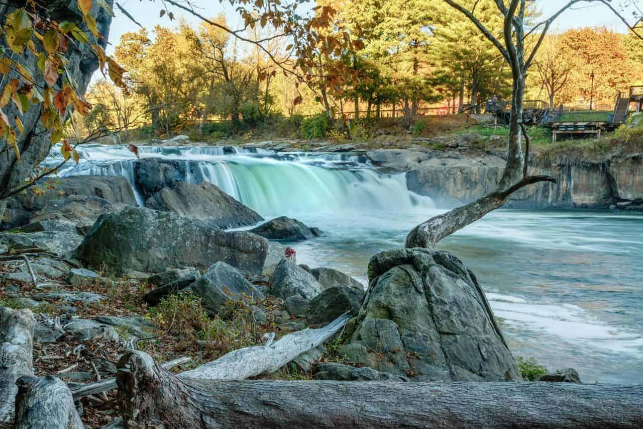
}Like these photos?
Join us on Instagram!
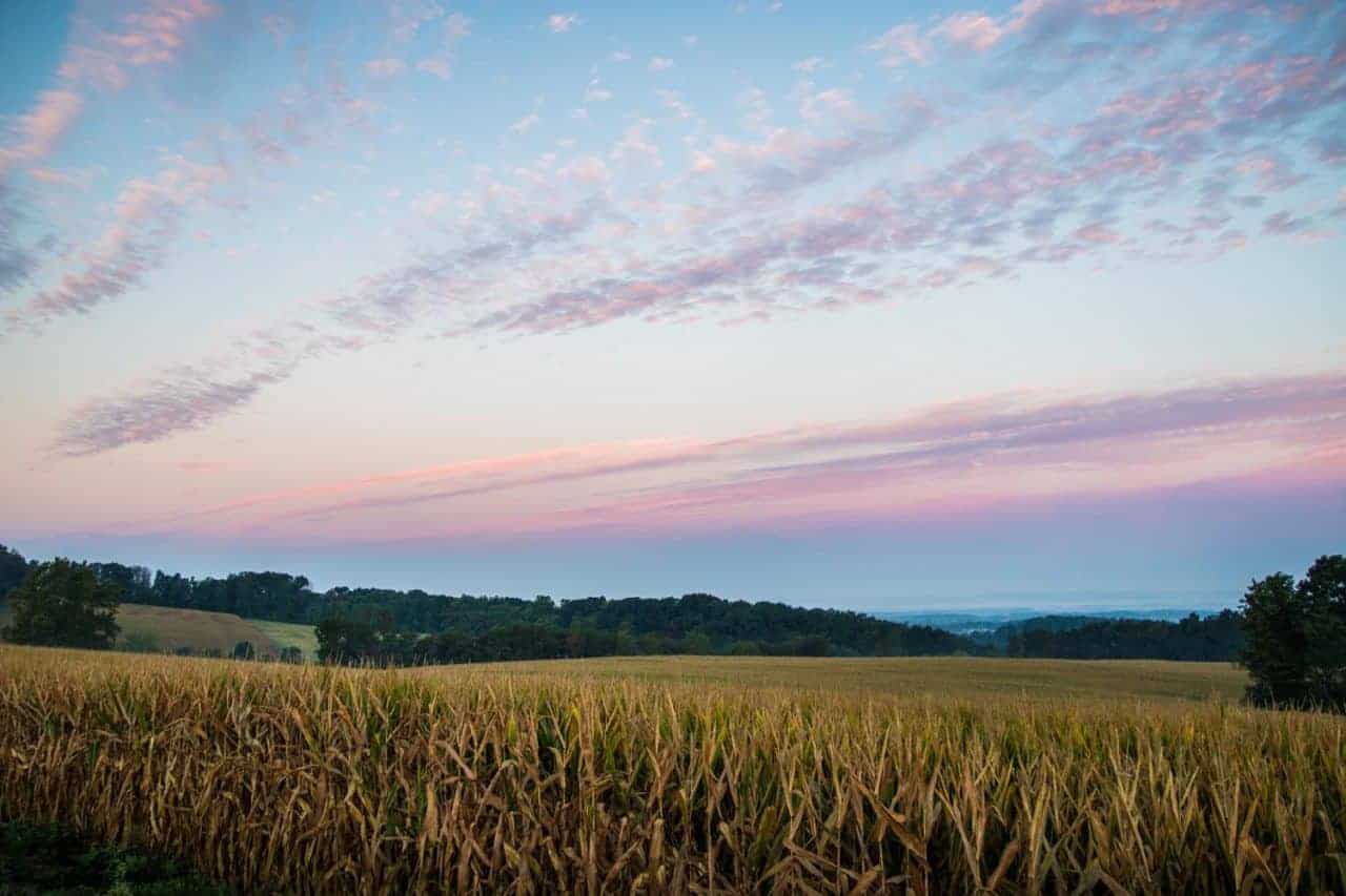
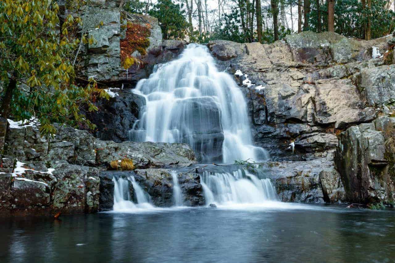
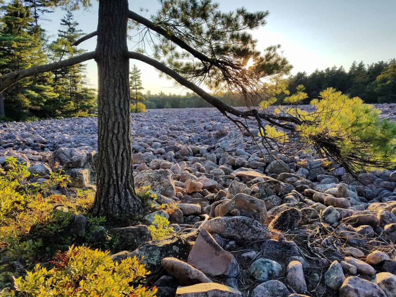
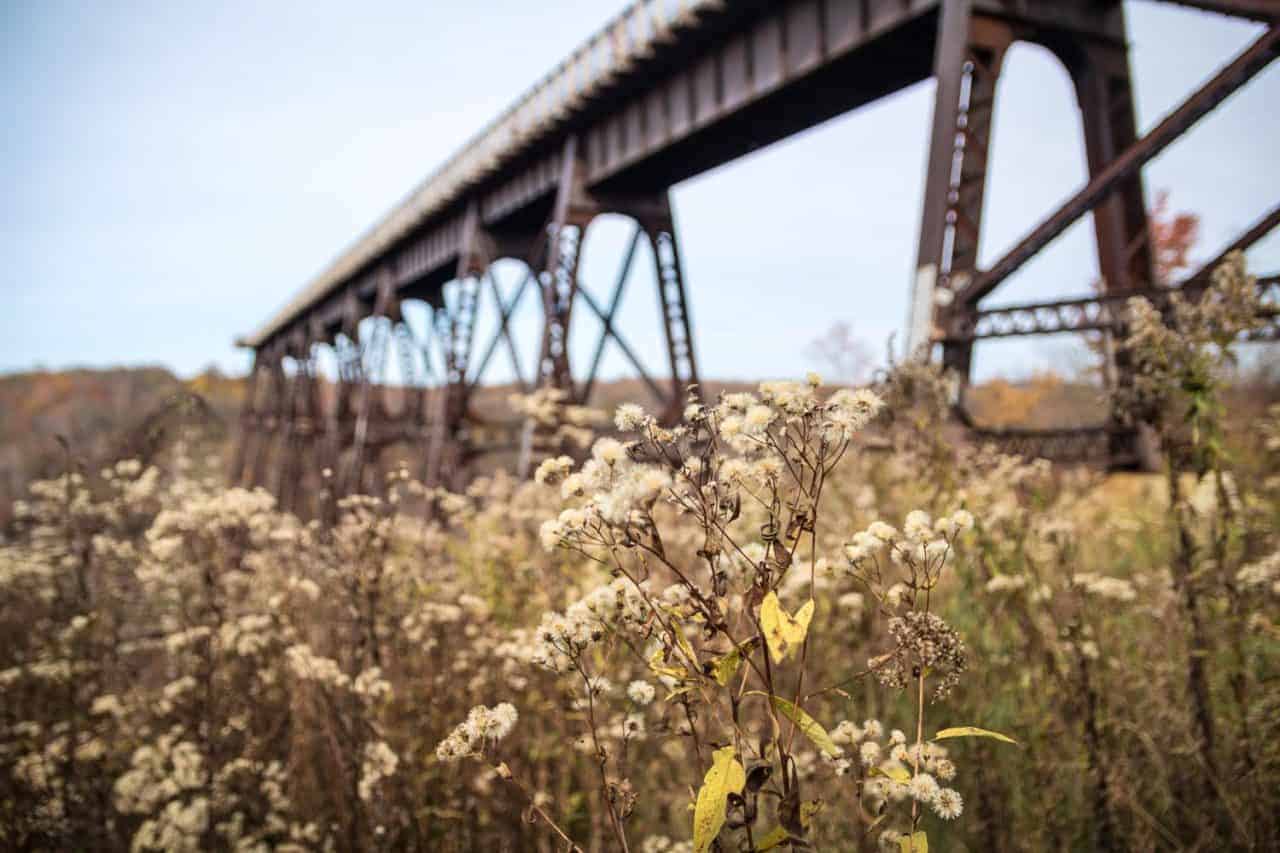
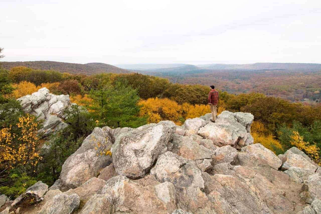
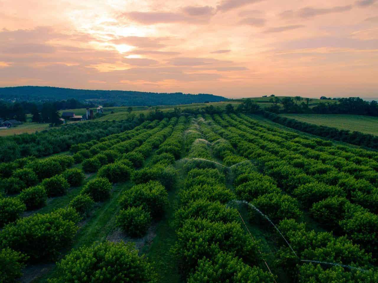
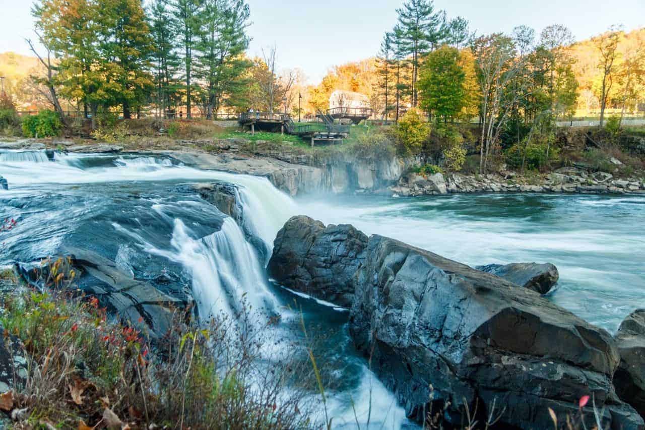
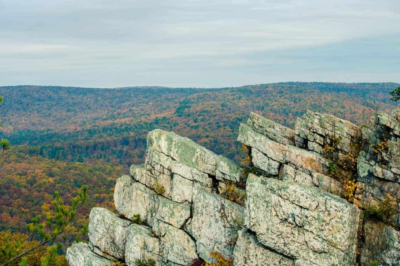
Those images were all taken by myself in Pennsylvania. If you happen to like that sort of thing, follow my Instagram pages for more photos!


there is no logical reason why “padding-top” works for that…but it does I guess…very weird, but thank you! Somebody is a CSS master!
Hi Donna,
Haha, I agree it seems odd, but it actually does make sense if you go deep into the logic of the heights and widths.
That’s a little bit of awesome right there!
Trying to do this with the Fullwidth Portfolio with the Square 1-1 Option. What do I need to add to the 1-1 CSS to fix?
Thanks for any help you can addd here!
Hey Paul, I do have another tutorial for the Portfolio and Filterable Portfolio, so you can try those. https://www.peeayecreative.com/change-the-divi-portfolio-image-aspect-ratio/
However, I do not use nor do I recommend using the Fullwidth Portfolio (or any “fullwidth” modules) because they are not up to date and are very awkward to customize. I suggest using a regular Portfolio and making the row fullwidth instead.
Hi, Im getting “expected RBRACE” shown below. THANKS!
.pa-image-gallery-1-1 .et_pb_gallery_image {
EXPECTED RBRACE
padding-top: 100%;
display: block;
Hi Doug,
You are missing the curly brace } at the end. Give that a try and let me know how it goes!
You fixed my issue with the different thumbnails sizes. Thanks!
Hi Juan,
So glad for that! You are welcome! 🙂
Hi There,
When I add this into the Main Element box under Custom CSS of my Divi Gallery Module, I get EXPECTED colon between lines 2 & 3 and well as UNEXPECTED token “}” at the end.
Here is what I am pasting (and removing the . at begining):
/*image gallery item aspect ratio square 1:1*/
pa-image-gallery-1-1 .et_pb_gallery_image {
padding-top: 100%;
display: block;
}
pa-image-gallery-1-1 .et_pb_gallery_item img {
position: absolute;
height: 100%;
width: 100%;
top: 0;
left: 0;
right: 0;
bottom: 0;
object-fit: cover;
}
Am I putting it in the wrong box? Which . do I remove? I’d really appreciate any feedback you can give. Thanks!
Hi Laurie,
You need the . at the beginning. You only need to remove the period in the Divi module when you paste just the class there, like “pa-image-1-1”
Bro, this Gallery module was killing me! But then I found your Tutorial.
THANK’S mate!!! Solved all my problems.
Hi Jan, I’m so glad you found it! We have lots of fun solving problems here as you can see! 🙂
Hi, thanks for sharing this code. I am having the same issue as some of the others.
I paste the code and double checked it. this is what my main element in divi shows once I do. It throws in Expected RBRACE and Unexpected Token ‘ } ‘/
/*image gallery item aspect ratio square 1:1*/
.pa-image-gallery-1-1 .et_pb_gallery_image {
padding-top: 100%;
“Expected RBRACE.”
display: block;
}
.pa-image-gallery-1-1 .et_pb_gallery_item img {
position: absolute;
height: 100%;
width: 100%;
top: 0;
left: 0;
right: 0;
bottom: 0;
object-fit: cover;
}
Unexpected Token ‘ } ‘.
Hi Benjamin,
You can’t place CSS like this in the module. You need to add the class “pa-image-gallery-1-1” to the module, then add the CSS snippet in Theme Options.
Hey there,
I’ve read all the previous comments and I’m still having issues.
I pasted the class in the module and the CSS snippet under Theme Options. But nothing changes in the module. What could be going wrong? I checked to make sure I have brackets and dots in the right places.
Hi there, if you share the link we can take a look!
Hi Nelson,
Thanks for the code I’m finding it very useful.
I am having a bit of trouble with it though.
My images are square to begin with – but for some reason your code is not showing the whole image. It is showing square- but missing around 10% from around all edges of the image. I really would love to show the whole image.
Any help greatly appreciated.
Thanks
Eoin
Hey Eoin,
In that case you shouldn’t be using this tutorial, if they are already square. You can check out this other one here: https://www.peeayecreative.com/how-to-stop-divi-image-crop/
Hey I’m having this same issue, but I don’t want to apply your crop fix to the entire page, just a specific gallery. Do you have a do not crop image code for an “advanced tab” custom css section?
Hey Nick,
I am afraid that the PHP code can’t be module-specific and using the PHP code is the optimum solution for the cropping issue. If you want we can provide you with a condition to run the code on a specific page.
Great tutorial and thanks for the help. Anyone having any weird stuttering/lagging/freezing on Chrome when implementing the “object-fit: cover” line specifically? It seems to be the cover attribute messing stuff up… contain causes no issues but doesn’t achieve the desired result. I have tried it on Edge as well, where things seem to behave normally…
I have tried this on a friends site and it works perfect using the blog module on any given page but when viewing the actual blog entry the image overlay is overflows upwards leaving the bottom of the image without overlay 🙁 Is there a fix for this please??
Hi Giggs,
I’m not sure what you mean by the actual blog entry. Can you explain that and give me a url?
Hey Thanks for your fast answer.
This is the main page where I am using the blog module to show blog entries: https://chuspazos.com/ and this is a single blog entry: https://chuspazos.com/the-manueles-nuevo-disco/ where the image overlay is shown wrong.
Hi Giggs,
First of all, I was really confused because this tutorial is about a gallery and you keep saying blog.
The issue is unrelated to my post, you have some custom css there doing this: #left-area .hentry img:not(.wp-smiley) {
margin-top: 20px;
}
Well you are right, many thanks for your help!!
Hi! thanks for the code snippets! They are great! I’m having some trouble with getting it to work. I added the following to my theme editor:
/*image gallery item aspect ratio square 1:1*/
.pa-image-gallery-1-1 .et_pb_gallery_image {
padding-top: 100%;
display: block;
}
.pa-image-gallery-1-1 .et_pb_gallery_item img {
position: absolute;
height: 100%;
width: 100%;
top: 0;
left: 0;
right: 0;
bottom: 0;
object-fit: cover;
}
and then this to the CSS ID & Classes in my gallery settings:
pa-image-gallery-1-1
But somehow my gallery is still showing all kinds of different aspect ratios. Am I doing something wrong?
It looks good to me. Can you share the link? Be sure to clear the cache as well!
Clearing the cache worked! So dumb of me to forget haha
That’s great, we all forget that!
Hi Nelson,
thanks for this very helpful and perfect explanation. A good way to show the gallery images nice and clean. But my biggest concern, and I did not found any solution for it with divi, is the resizing of images – means, any gallery image is loaded in it’s full size and resized via css.
This method ends up in a really bad performance rating regarding loading time measured by GTMetrix or Google Page Speed – especially when Galleries like Photographers Portfolios contains a lot of images. The recommendation is “Serve scaled images”!
Sorry, my question is a bit off-topic but is there any chance to get rid of this in Divi?
Hi Marco,
Very good question. I’m not an expert at that, but I’d love to know more myself. I know that SRCset is part of that, and Divi has that now, but it is more to it than that. I’ll see if I can get an answer for this and if I do I’ll be sure to share it on the blog.
Yesterday I spent an unnecessary amount of time trying to surf the internet looking for this. Your blog post was EXACTLY what I was looking for. It was short, to the point and you had the code snippet right there with screenshots. Some of these blogs wax poetic with the whole back story…I just wish they’d get to the point like you did.
I will say, however, I had the same error message as others, but saw your response to someone else clarifying to put the code snippet in the Theme Settings, not in the module. I mean, you said it in bold but for some reason we seem to be skimming over that part.
It’s subtle, but important to know where that code needs to go. Maybe add a screen shot making it more obvious?
Once I put the code in the right place it turned out great! Thank you.
I’m so glad you found our site, Rick! I updated the post with our instructions about where to add code to make it clear as mud 🙂
Great tutorial! Did exactly what I wanted – but I have a further question! LOL
How can I set the focus for each image in its square? So need to be shifted right and down – others left and up…
https://lavenderpromotions.com/drag-events/
Is the page in question!
Thanks for looking!!!
Hi James, If I understand what you want to do, I don’t think it would be practical to try to do that, and I don’t know how you would.
Hi Nelson, is there a way to make the images varied through CSS? I’m currently trying to create a gallery for a client, but his images all come out in the wrong sizes or cropped. I added the link under the website link option. I tried fiddling around with the different examples here, but couldn’t get it to work properly, and I’m not confident enough to try and edit in the function.php like shown in your other tutorial.
(client’s old website to show proper size of his images: https://peterravn.com/work-2013-2/
My attempt at using the gallery module
http://katjsoeg.dk/petrravn2/ptrravnwp/wordpress/project/paintings-2018-2019 )
Hi Katja,
So to start, yes, that’s what our tutorial does. I noticed what could be the issue is you are using the “Fullwidth” gallery, do not use that at all, just use the regular Gallery module. Our tutorial would not work for the “fullwidth” ones as they are outdated. Depending on your needs you could also look at this tutorial: https://www.peeayecreative.com/how-to-stop-divi-image-crop/
As far as I’m aware I am using the regular gallery module? Even then, I have no choice with it, as my client wants the slider function for the gallery module. Thank you for your help otherwise.
Hi Nelson,
Thank you providing the excellent tutorials. You have a great presentation and it’s very easy to follow.
I’m trying to implement the image cropping using your CSS code.
I’m wanting to get this to work on the Divi Carousel Module. So far, I haven’t had any success. I seen that using this on Gallery images has a slight change in calling the CSS code. Does Divi Carousel require anything different?
I’ve been testing the following for a 100% square crop. I can’t see to get it to work.
/*image aspect ratio square 1:1*/
.pa-image-1-1 .et_pb_image_wrap {
padding-top: 100%;
display: block;
}
.pa-image-1-1 .et_pb_image_wrap img {
position: absolute;
height: 100%;
width: 100%;
top: 0;
left: 0;
right: 0;
bottom: 0;
object-fit: cover;
}
Thank you!!!
Jerry
Hi Jerry, I’m not familiar with it but most likely, yes. If you check our new Divi Carousel Maker it is better, you can use default Divi modules!
Great tutorial! Is there any way to avoid cropping them all together and have mixed vertical and horizontal thumbnails that fit via max height? This creates a nice mix of vertical and horizontal thumbnails that all align on the tops and bottom, and vary in their widths. I’ve done this with a gallery plugin, but I was hoping to do this via the Divi gallery module.
We have not given any thoughts regarding that right now but as of now by default, it is not possible. One thing you can do is to upload the images with the different aspect ratios and it will give you that variation look.
Great tutorial. Is there a way to change the space between each photo? My client likes the photos to almost butt up against each other.
Hi Susan
If you want to change the spacing between the gallery images then please go to the Gallery Module Settings > Advanced > Custom CSS > Gallery Item Panel and place the code given below:
margin-right: 1% !important;
width: 24% !important;
Margin right value will increase or decrease the gap between the images and the width value is used to adjust the width of the images. You can change the values as per your liking. 🙂
Please let us know how it goes.
I am unable to do the above in the latest version of DIVI
The version of Divi has nothing to do with it, my tutorials are always up to date and this is just CSS, so this will always be relevant.
Thanks. I feel like I just waved a magic wand. 🙂
You’re welcome 🙂
Thanks for your css 🙂 I’ve used the square option. I already made square images but they are being cropped anyway. Is there a tweek possible so the tumbs can be displayed as they are?
I’m sure what you are asking. Maybe check this other tutorial? https://www.peeayecreative.com/how-to-stop-divi-image-crop/
Hi.
Works fine, but the problem is the size of the thumbnails. Now I see pixelated pictures and i can’t fix it:
https://mega.nz/folder/6J8m3ZrS#fxMyEu0acVny_6b6Uk_Xbg
I installed “Simple Image Sizes”, but doesn’t work. Any idea?
Thanks a lot
Hi dani,
The pixelation of the picture depends upon its quality and there is no connection of the issue with the guide. The workaround could be to edit the images exactly to a resolution that you want and then upload that.
Other than that Simple Image Sizes is a third-party plugin and their support team will be the best to guide you in the right direction.
How about a square grid (3 columns) with the thumbs all in their original size ratio? All centre aligned both horizontal and vertical within their squares.
Practically every photo gallery plugin I can find crops the image or if they don’t the masonry format is used.
What you are describing is “masonry” or “mosaic” gallery and Divi cannot do that by default but I will have a solution to that in the future.
Hi Nelson, did you ever bring out a gallery masonry effect solution?
this is amazing method. Thank you so much.
You’re welcome!
Brilliant, thanks. Cleared up some other thought’s I had floating around in my mind as well.
That’s great to hear!
Hey Nelson, I tried to post a question today but it did not go through I guess.Let me thank you first for the great tweak. It used to work for me and I’ve been really super happy with your CSS snippet. Great work, I have to say. Now suddenly it stopped working or let’s say it does not work anymore as expected.
http://karen.interstanding.com/errol-trotman-harewood-2/
Could you have a look at my staging site maybe?
When I upload new pics to the gallery, they’re oversized and blurry.
Like the first image in the gallery. The older images (starting from image 2 in the gallery) are fine. I have not changed anything in media sitting or elsewhere.
Do you have an idea what could be wrong here?
Would be also very appreciated if somebody else here would have an idea, which could help me.
Best regards and keep up the good work!
Robert
Hey Robert,
I have checked the URL and every image seems to look perfectly fine on my end. Could you please try using a different browser and see if that helps?
Hi,
I try to do this but it does not work. The image stays weirdly cropped. Not sure what is going on? It does not show the full image
Hey Lauren,
Could you please share the URL of the website for me to investigate further?
Hi,
How can I prevent divi from cropping the gallery images?
Please check the linked tutorial: https://www.peeayecreative.com/how-to-stop-divi-image-crop/
Hey there sir, first off thank you for making all this content. But I just tried this solution and I don’t think it works anymore.
Hey there,
Will check this on our end and get back to you on this.
Thank you for your tutorial! After applying the 1:1 ratio and making my images square, I am also experiencing a blurred pixelation of each thumbnail. It appears WordPress or Divi is creating a thumbnail for each image and is much too low. How do I prevent this from happening? Thanks!
I don’t think your question is related to this post, unless I am misunderstanding.
You can try our new Divi Image Helper plugin which uses the CSS aspect ratio feature instead of the method described here.
Thank you for this awesome tutorial! I have a question though. Is there a way to make it so it always shows the top portion of the images in the thumbnails, rather than vertically centered? I have some photos where a few heads are being cut off in the thumbnails, so it would be better if it always positioned the thumbnails at the upper-most portion, if that makes sense.
Hi Chris!
The better way is to uncrop the images. You can do it by following this guide: https://www.peeayecreative.com/how-to-stop-divi-image-crop/
Let me know how it goes!
Thank you for the great tutorial. I noticed using it on square images it does not work if you have selected Landscape orientations for the thumbnail orientation. If you selecte Portrait it works.
Thanks for sharing!
This is a great tutorial. Thanks!
Do you have any idea how to increase the actual image size (dimensions) of the video thumbnails? Divi currently creates YouTube thumbs at a measly 480×360, which looks fine for the tiny ones in the navigation, but horrible for the one in the currently playing section up top. If I click “Generate from Video” in the Overlay tab it causes the nice Divi play icon to disappear and also adds glitched .php characters to the code—overall a mess. I really want to be be able to increase the thumbnail size to something like 1920×1080 or similar, or at least the size of the container width (eg: 1400px).
Hi Zechariah!
You can try using the medium or full size of the image while uploading, and if something is not working please contact Elegant Themes.
For the overlay generated automatically by the video module, we will check further and come up with a solution in our upcoming guides. Thank you!
Thank You! I love this blog <3
You’re welcome, so glad you like our resources!
I just wanted to say THANK YOU! Your website is absolutely awesome, and it’s so kind of you to offer so much help and advice. I’d been struggling with this, but you quickly and easily resolved this for me! Thank you!