Keep The Mobile Menu Open
If you want to keep your menu open on mobile rather than have it close into a hamburger menu, then you do have a few solutions. For one, you can check our other tutorial about opening the hamburger menu on mobile. But another option is to force the menu items to remain horizontal regardless of the space and scroll back and forth. In this tutorial, I will show you how to make the Divi Menu module navigation remain open and scroll horizontally on mobile devices. This is rather unique, and I hope you find it interesting.
▶️ Please watch the video above to get all the exciting details! 👆
Setting Up The Menu Module
The very first and obvious thing to do is to add a Menu module to your layout. The one thing I would note here is that you probably do not want to have any logo image added to this menu. Otherwise, the amount of space needed to see the menu items will not be enough. So just add the menu as it is and do not add a logo.
Add A Custom CSS Class To The Menu
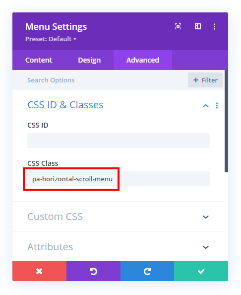
We do not want this code to affect every Menu module on our site, so we will start by adding a custom CSS class to the specific Menu module that you want to target. Open the Divi Menu module settings and go to the Advanced tab. Got the CSS IDs & Classes toggle. Place the class “pa-horizontal-scroll-menu” in the CSS Class input field.

Add The CSS Snippet To Your Site
The rest of the tutorial is handled by the CSS code. This step involves copying the CSS snippet below and pasting it into your website.
Where To Paste The CSS Code
1. Divi Assistant
If you are using our Divi Assistant plugin, simply paste the code in the CSS tab in the custom code window in the Divi Visual Builder.
2. Child Theme
If you are using a child theme, paste this code into the style.css file. If you don't have a child theme, you can generate a child theme directly on your site or download our free child theme.
3. Divi Theme Options Integration
Otherwise, paste this code in your Divi>Theme Options>Custom CSS code box.
If you need help understanding where to paste the code, please check out our complete guide about where to add custom code In Divi.
/*diplay the desktop menu on all devices*/

.pa-horizontal-scroll-menu .et_pb_menu__menu {
	display: block !important
}


/*hide the mobile menu*/

.pa-horizontal-scroll-menu .et_mobile_nav_menu {
	display: none !important;
}


/*force the menu to fullwidth to allow for the menu to scroll within it*/

.pa-horizontal-scroll-menu .et_pb_menu__menu {
	width: 100%;
}


/*set the menu to automatically overflow*/

.pa-horizontal-scroll-menu .et_pb_menu__wrap {
	overflow: auto;
}


/*keep the menu items horizontal and avoid stacking*/

.pa-horizontal-scroll-menu .et_pb_menu__menu ul.et-menu {
	white-space: nowrap !important;
	flex-wrap: nowrap !important;
	margin: 10px auto;
}


/*hide scrollbar on IE, Edge, and Firefox*/

.pa-horizontal-scroll-menu .et_pb_menu__wrap {
	-ms-overflow-style: none;
	scrollbar-width: none;
}


/*hide scrollbar on Chrome, Safari, and Opera*/

.pa-horizontal-scroll-menu .et_pb_menu__wrap::-webkit-scrollbar {
	display: none;
}
Code Summary Explanation
You can see each snippet of the code has a comment with a brief explanation of what it does. This should explain it pretty well, but here is a summary of what is happening.
The code is opening up the default mobile hamburger menu and displaying the menu items instead. Then it is forcing the width of the menu to be fullwidth to make space for the menu items to scroll back and forth within it. Then it is setting the menu items to automatically overflow the boundary of the menu. After that, it is making sure the menu items do not try to stack, but remain horizontal inline. Then the last part is simply hiding any scrollbar that may appear.


Overflow: auto; it hides the dropdown menu.
is there a solution to that?
It would not make sense to use a dropdown with this scrollable menu.
brother, yes it would, a lot. struggling with it right now otherwise, decent stuff Nelson
Okay
Dear Nelson
Many thanks for this amazing piece of content. Really appreciated. I was trying to imitate that same style as Amazon website and with this tutorial I made it after trying so many options.
Thank you again!!
You’re welcome Jose, I am glad this is helpful!
Love the scroll for the “Menu Module”. Is there a way to use an arrow icon ie as a visual clue that there is more menu to scroll to?
Hey Kathryn,
It’s a good catch, we will work on this little visual clue arrow and will get back to you on this shortly.
Hey, thank you for this tutorial.
Is the arrow to be inserted ready? 🙂
Without an indicator it is not clear that there are elements to scroll
Hey Claudio,
Could you please share the URL of your website so I can check the code and provide it to you?
Hi! That would be a great addition to the horizontal scroll menu.
Would love to hear how to add that.
Hey, thank you for the tutorial. I am also interested in the arrow solution, can you send the code for me as well?
Thank you for this tutorial. I am also interested in the arrow solution, can you send the code ?
You’re welcome. I don’t have any other code?
Hi Nelson! Thanks a lot…Is there a way to use an arrow icon ie as a visual clue that there is more menu to scroll to?
Hi Tom!
Please add the following code for the arrow icon on tablet and mobile view:
@media all and (max-width:980px){
.pa-horizontal-scroll-menu .et_pb_menu__menu ul.et-menu:before {
content: “\24”;
right: 0;
position: absolute;
font-family: ‘ETmodules’;
top: -18px;}
}
Let me know how it goes!
Nelson – THANK you so much for all your helpfull info! Please asssit – I cant code to save my life so am following your instructions step by step. I have added the code to add the arrow icons, but nothing seems to appear?
I cant code to save my life so am following your instructions step by step. *I have added the code to add the arrow icons, but nothing seems to appear?* – no arrows appear to the left and right of the menu?
Hi Karin!
Can you please share the URL of the page to investigate further?
I am getting side-scroll on the page when using this snippet. I’m a noob, please forgive silly questions, any help appreciated.
Fixed it, I had messed up the rows.
Hello and thank you for the code! This is exactly what I needed 👍
Can we have small vertical separation bars between each menu item?
Hi Jerome!
Please add the following code:
.pa-horizontal-scroll-menu .nav li a{
border-bottom: 1px solid #000;
}
.pa-horizontal-scroll-menu .nav li{
padding-bottom: 5px;
}
Let me know if it helps!
When there are many horizontal menus and the selected menu is outside the screen, is there a way to center it?
menu
menu1 menu2 menu3 menu4 menu5 menu6 menu7 menu8 menu9
mobile view
menu1 menu2 menu3 menu4 // I can’t see it on the screen…
If you select menu7
mobile view
menu6 menu7 menu8 menu9
If you select menu5
mobile view
menu4 menu5 menu6 menu7
or
menu3 menu4 menu5 menu6
I think I need JavaScript, but I don’t know any code.
I am not sure about this scenario, sorry. I suggest working with a developer to get it configured properly.
Hi I tried to add navigational arrows as per your reply to a previous request but it doens’t show. Can you help me thanks https://kandsbespoke.co.uk/
The code you are referring to is not part of the tutorial, but was shared by Hemant as a bonus. Unfortunately we could not provide customization services at this time, but a developer should be able to help with it.
Ah ok no problem, looking at their code though, do you see where it can be fixed?
I can see the navigational arrow on the mobile dropdown. Are you referring to any other icon?
Hello and thank you for sharing!
I installed this code on my site in August and it worked very well but since an update of divi we can no longer scroll to the right as you can see on this page https://singulier-paris.com/the-boutique/ (in mobile view of course 😉)
Do you have a code fix to make this work again please?
Thanks in advance
Hi Jerome!
It seems you have undo the changes. Can you please apply the customization again so that I can check?