What’s New In Divi Responsive Helper Version 2.0
A Huge Game Changing Update
Our Divi Responsive Helper plugin has already been one of the best selling products in the world of Divi, and as with all of our products we are committed to making them even better and better. This new update includes a ton of new features and settings making this plugin the ultimate Divi responsive toolkit!
We could not be more excited to tell you about everything that is new, so let’s get started! This post and video is the best place to learn what is new in detail, but you can also check out the updated changelog and new documentation.
Improvements
Widow Fixer Heading Number Selection
We added the ability to choose the number of widow words to allow for heading (H1-H6) text. In the past, this defaulted to 2, but we change this to work like the paragraphs where you can select 2, 3, or 4. This actually sets the stage for a major addition to this feature in the next update to allow overrides per section, row, and module. But don’t tell anyone yet 🙂
Column Stacking Now Supports Different Gutter Sizes
We totally rewrote all the code for our column stacking feature! This allowes our feature to work and adjust for any gutter width on any device size! So now when you set the row gutter to 1, all the spacing is removed from the columns and our settings still work. Or if you choose 2, 3, or 4 as the gutter, the spacing adjusts and the number of columns you choose to stack side-by-side still works!
Increased Row Column Stacking Numbers Up To Six
In the previous versions, we only had settings for up to four columns to stack side by side on any device. But now we increased this to six! So you could now use 6 columns on Tablet, for example!
Terminology Updates
You may notice a few minor changes to various settings labels and help text throughout Theme Options and the Divi Builder. These are all minor and help bring consistency and clarity to each setting.
New Features
Choose The Number of Blog Columns
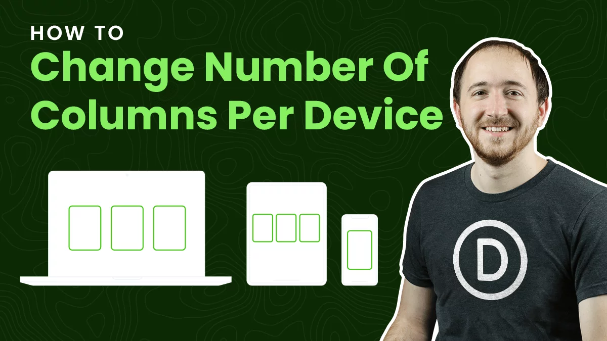
The Divi Blog module uses a default number of columns based on the column width or device size, but has no setting to change it. The Divi Responsive Helper settings allow you to choose the number of blog post columns that stack side-by-side in the Blog module on Desktop, Tablet, and Phone device sizes.
Choose The Number Of Gallery Image Columns
The Divi Gallery module shows four images by default on Desktop, three on Tablet, and one on Phone. There is no setting to change these numbers. The Divi Responsive Helper settings allow you to choose the number of image columns that stack side-by-side in the Gallery module on Desktop, Tablet, and Phone device sizes.
Choose The Number of Portfolio Project Columns
The Divi Portfolio module and Divi Filterable Portfolio module has four columns by default on Desktop, two on Tablet, and one on Phone. But there is no way to change these numbers. The Divi Responsive Helper settings allow you to choose the number of portfolio project columns that stack side-by-side on Desktop, Tablet, and Phone device sizes.
Choose The Number Of Shop WooCommerce Product Columns
The Divi Shop module has four columns by default on Desktop, two on Tablet, and most recently updated to two on Phone as well. This almost always looks terrible, and there are no settings to change it. The Divi Responsive Helper settings allow you to choose the number of WooCommerce product columns that stack side-by-side in the Shop module on Desktop, Tablet, and Phone device sizes.
Completely Disable The Built-In Divi Responsive Views Feature
You probably know by now that Divi released their own built-in preview size feature after our plugin became popular. However, the new feature is limited and frustrating. Because of these limitations and frustrations, we created a setting in the Divi Responsive Helper to completely disable this Divi feature and use ours instead!
Quickly Set Global Sitewide Text Sizes For Desktop, Tablet, And Phone
The Divi Responsive Helper gives you input fields in the Divi Theme Options to set each of your heading (H1-H6) and paragraph (text, body text, etc) text on each device. Every module on your website will now have consistent text sizes and it only takes a few minutes to set up! You can use whatever value you prefer, like px, em, rem, etc! And the best part is that you can override any of these settings at any time in any of the module settings!
Convenient Custom CSS Media Queries For Any Device Size
Divi comes with only one main Custom CSS input area, but if you want your CSS to only apply on certain device sizes you would need to specifically write your own custom media queries. This can be difficult and intimidating, especially for beginners. The Divi Responsive Helper plugin provides you with several new custom CSS input boxes that correspond to all of the built in Divi breakpoint sizes.
Enable Parallax Effect On Mobile
Divi has a parallax background effect feature within any section, row, column, or module. However, the built-in feature only works on Desktop! The Divi Responsive Helper plugin solves that limitation and applies it to all devices. Once you enable the feature, it automatically adds support for the parallax effect on mobile devices whenever the Use Parallax Effect setting is enabled.
Change The Blurb Image/Icon Position On Phone
When you use a Blurb module with an icon or image on the left, the mobile version gets really awkward with spacing. The title and text get really narrow, and this looks very unprofessional. To remedy this, some would say to duplicate the module and adjust the visibility settings, but that is not recommended at all. The easier solution is to use our setting in the Design tab of the Divi Blurb module to move the icon or image to the top on mobile, but keep the desktop version the same. Much better!
Show/Hide Menu Items Per Device
WordPress navigation menus do not have any way to control which items show on which device. This Divi Responsive Helper feature allows you to control which menu items to show or hide on Desktop, Tablet, or Phone. Once enabled, each menu item in Appearance>Menus will have checkmark boxes which allow you to choose on which device sizes you want that particular menu item to be visible.
Tabs Module Tab Layout
By default, the tabs in the Divi Tabs module are horizontal on Tablet and only stack vertically on Phone. But what if you want them to stack vertically on Tablet, or maintain a horizontal layout on Phone? With the Divi Responsive Helper plugin, you now have the options in the Design tab of the Divi Tabs module to stack the tabs vertically on Tablet, and horizontally on Phone.
Section Default Top/Bottom Padding
These three settings allow you to easily set the default top and bottom padding on Desktop, Tablet, and Phone for all the sections on your website. The new settings in Theme Options correspond to those found in the Customizer, and each location updates when you change the other. It is important to note which settings use percentage units and which ones use pixel units. The Divi Customizer uses a percentage value for the top and bottom padding on Desktop, and a pixel value for the top and bottom padding on Tablet and Phone. Also note that these global settings are default but can be overridden by adjusting the padding in any section.
Row Default Top/Bottom Padding
These three settings allow you to easily set the default top and bottom padding on Desktop, Tablet, and Phone for all the rows on your website. The new settings in Theme Options correspond to those found in the Customizer, and each location updates when you change the other. It is important to note which settings use percentage units and which ones use pixel units. The Divi Customizer uses a percentage value for the top and bottom padding on Desktop, and a pixel value for the top and bottom padding on Tablet and Phone. Also note that these global settings are default but can be overridden by adjusting the padding in any row.
Set The Row Default Width
These three settings allow you to easily set the default width on Desktop, Tablet, and Phone for all the rows on your website. The new settings in Theme Options correspond to those found in the Divi Builder in the Row settings in the Design tab in the Sizing toggle. Note that Divi uses percentage units by default. Also note that each of these global settings can be overridden by adjusting the width setting in any row.
Row Default Max Width
These three settings allow you to easily set the default max width on Desktop, Tablet, and Phone for all the rows on your website. The new settings in Theme Options correspond to those found in the Divi Builder in the Row settings in the Design tab in the Sizing toggle. Note that Divi uses pixel units by default. Also note that each of these global settings can be overridden by adjusting the max width setting in any row.
Mobile Menu Opened Icon
Enable this feature to change the mobile menu hamburger icon to an X when the dropdown menu is toggled open. An X gives the visitor a visual indication that the menu has been opened, and can be clicked to close it again. This is a simple feature that improves the user experience.
Mobile Menu Breakpoint
Enter the screen width pixel value for the responsive breakpoint for when the menu changes between desktop and mobile versions. This is helpful especially when you have a larger number of menu items that start to overlap due to space issues. Increasing the breakpoint higher than the default 981px allows the hamburger menu to appear on larger device sizes to prevent the ugly and unprofessional stacking issue.
Disable Animations On Mobile
The Divi animation effects do not have responsive settings to change them or turn them off per device, so we included this feature to disable animations on mobile. Usually, animations increase the website load time and are sometimes annoying to view on a phone, so we hope this allows you to improve site performance and user experience.
Prevent Horizontal Scroll
Enable this feature to prevent a common issue with Divi which causes the mobile site to scroll sideways with a horizontal scroll bar. Many Divi websites have this problem and it often goes unnoticed, so we recommend using this on all your sites.
Mobile Pinch Zooming
Enable this feature to allow users to pinch and zoom on mobile. By default, Divi does not allow you to do this. This can be really helpful for visitors who are struggling to read text or to click links, or who may need to enlarge the screen to see images, charts, etc.
Different Mobile Logo
This feature allows you to set a different logo image to appear in the default header menu on tablet and phone devices. This is great if you need your logo to have a different size or shape for desktop and mobile. (Keep in mind this is for the default header, not the Menu module since that module already has this ability.)
Mobile Header Bar Color
Set a color for the mobile address bar header for Android devices using the Chrome browser. This is a really nice effect to add that extra touch of branding and personalization.
Back To Top Button Visibility
Choose on which devices to show the Back To Top Button. This feature first requires the main Back To Top Button to be enabled in Divi>Theme Options>General. This feature is very handy and practical. For example, if your layouts are fairly short on desktop and the button is not needed, the layout may get really long on mobile when all the content is stacked. This would cause the user to need to scroll and scroll just to get back to the top. In this use case, you may want to only show the Back To Top Button on Phone.
#3. New Docs & Demo Site
With the release of version 2.0, we now have a new live demo site to showcase the features and settings. Some settings are easy to demonstrate on a live site, while others by their nature are more difficult to show. And of course we always keep our documentation up to date, so be sure to check the updated documentation area to learn more about any of the plugin features and settings.
Learn More About Divi Responsive Helper
If you are not using this plugin yet, please visit the product page and learn how you can use make your website look great and function well on all devices with the help of our huge suite of over 50 awesome features and unique settings in this ultimate Divi responsive toolkit!




0 Comments