Missing The Fullscreen Menu Option
You know how much I love the Divi Theme Builder if follow my tutorials, but one things I miss in the default header is the fullscreen menu option. Along with our tons of other header tutorials and menu tutorials, now you can add another one to the list for a fullscreen menu! That’s right, in this tutorial I am going to show you how to create a fullscreen overlay menu that works on desktop and mobile alike. This tutorial was very difficult to create, so I hope you enjoy it and consider subscribing!
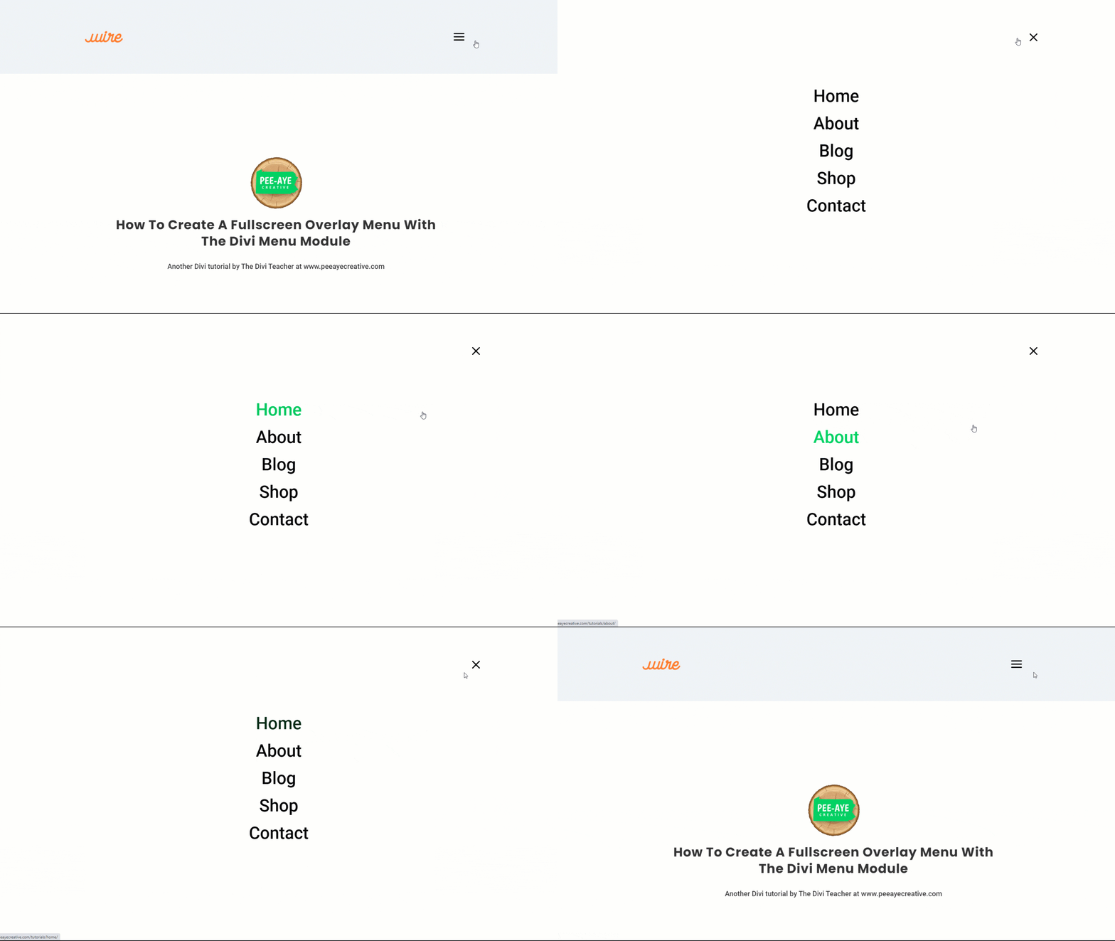
Here’s what you will make in this tutorial!
▶️ Please watch the video above to get all the exciting details! 👆
1. Create A Theme Builder Header
In order for this to work, it is required to use the Menu module in a Theme Builder header template. I hope by now that you are very familiar with the Theme Builder, but if not you can check our our Divi Theme Builder mini course. Anyhow, the first step is to go to Divi>Theme Builder and add or edit the header template. If you want the menu to show up on every page of your site, then use the first template to make a global header template. If you only want this on certain pages, or you just want to test it out, then you can create a new template and use a custom header.
NOTE: I’m not showing screenshots of these first few steps because they are quite basic and common, but if you are unsure of what to do you can follow the video to see how to do it!
2. Add And Adjust The Menu Module
Once you are in the header template, add a single column row and add the Menu module. At this point, there are no required adjustments needed for the Menu module settings, but here are some that I would recommend.
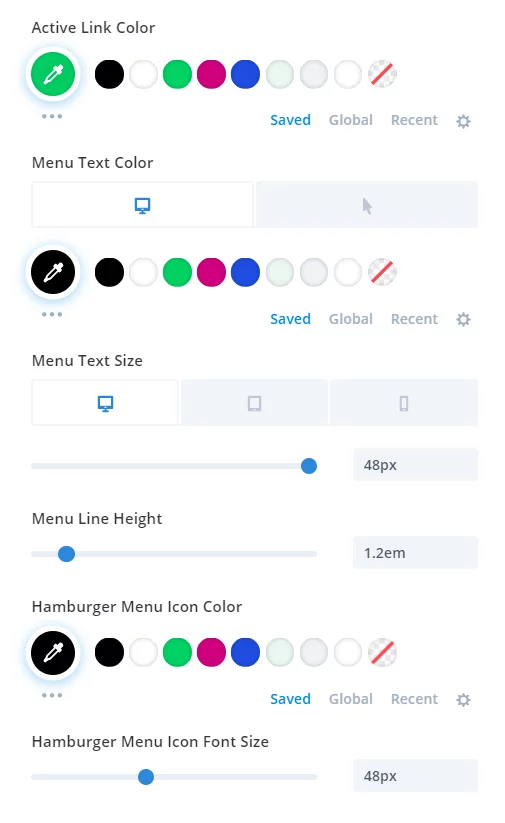
- Set the text color in the Design tab>Menu Text toggle
- Make the text font size bigger in the Design tab>Menu Text toggle and adjust for responsive Desktop, Tablet, and Phone
- Set the text line height to 1.2em
- Set the hamburger menu color in the Design tab>Icons toggle
- Make the hamburger menu icon font size bigger in the Design tab>Icons toggle
These are totally optional, but if you do this you can achieve an amazing design very quickly. Scroll down to the bottom to see a screenshot of the menu I made, it is really beautiful!
Here are my modified styles in the Menu module if you want to replicate what I did:
3. Add A Custom CSS Class To the Section
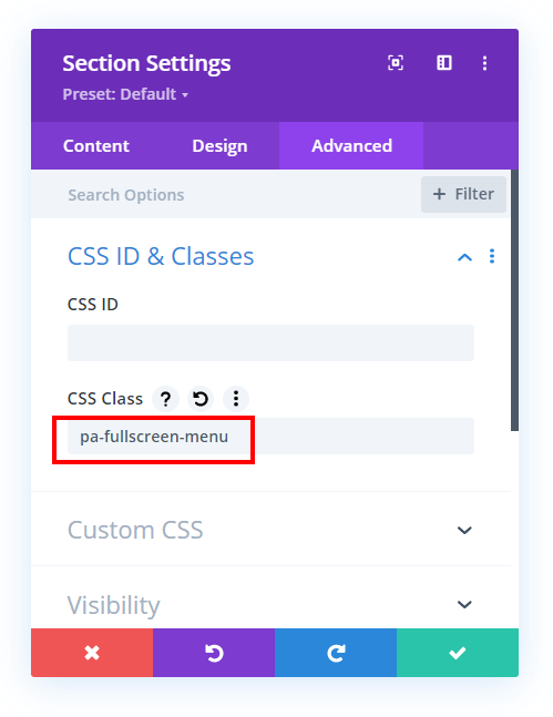
Normally we add a CSS class to the module, but in this tutorial, we need to add the custom CSS class to the blue section. This is the same section where you added the Menu module to in the previous step. Open the section settings and go to the Advanced tab and open the Custom CSS & IDs toggle. There you need to write “pa-fullscreen-menu” in the CSS Class input field.
4. Add The Custom CSS To Make the Menu Fullscreen
Now for the main part of the tutorial, the free code snippets! This code is doing a lot of things, so please reference both the video and the comments if you want to understand it. Otherwise, copy and paste away!
Where To Paste The CSS Code
1. Divi Assistant
If you are using our Divi Assistant plugin, simply paste the code in the CSS tab in the custom code window in the Divi Visual Builder.
2. Child Theme
If you are using a child theme, paste this code into the style.css file. If you don't have a child theme, you can generate a child theme directly on your site or download our free child theme.
3. Divi Theme Options Integration
Otherwise, paste this code in your Divi>Theme Options>Custom CSS code box.
If you need help understanding where to paste the code, please check out our complete guide about where to add custom code In Divi.
/*align the hamburger menu to the right right*/

.pa-fullscreen-menu .et_pb_menu__wrap {
	justify-content: flex-end !important;
}


/*hide the desktop version of the menu*/

.pa-fullscreen-menu .et_pb_menu__wrap .et_pb_menu__menu {
	display: none !important;
}


/*show the mobile version of the menu on desktop*/

.pa-fullscreen-menu .et_pb_menu__wrap .et_mobile_nav_menu {
	display: block !important;
	align-items: center !important;
}


/*style the opened menu*/

.pa-fullscreen-menu .opened #mobile_menu1 {
	width: 100vw !important;
	position: fixed !important;
	top: 0em !important;
	left: 0vw !important;
	height: 100vh !important;
	display: flex !important;
	justify-content: center !important;
	flex-direction: column !important;
	opacity: 1 !important;
	visibility: visible !important;
	transition: visibility 0.3s, opacity 0.3s ease-in-out;
	padding: 0 !important;
}


/*style the closed menu*/

.pa-fullscreen-menu .closed #mobile_menu1 {
	background-color: #fff !important;
	text-align: center !important;
	width: 100vw !important;
	position: fixed !important;
	left: 100vw !important;
	top: 0em !important;
	height: 100vh !important;
	display: flex !important;
	justify-content: center !important;
	align-items: center !important;
	flex-direction: column !important;
	transition: visibility 0.3s, opacity 0.3s, left 1s, ease-in-out;
	opacity: 0 !important;
	visibility: hidden !important;
}


/*remove the bullet points from the list items*/

.pa-fullscreen-menu #mobile_menu1 li {
	list-style: none !important;
	text-align: center !important;
	width: 100%
}


/*move the menu to the top above other elements*/

.pa-fullscreen-menu .et_pb_menu__wrap span.mobile_menu_bar {
	z-index: 999999 !important;
}


/*change the opened menu icon*/

.pa-fullscreen-menu .et_pb_menu__wrap .opened .mobile_menu_bar:before {
	content: "\4d" !important;
}


/*make the hamburger menu fixed position on mobile*/

.pa-fullscreen-menu .opened .mobile_menu_bar {
	position: fixed !important;
}


/*remove the default blue border top on the mobile menu*/

.pa-fullscreen-menu .et_mobile_menu {
	border-top: none;
}


/*remove the default background color on menu items*/

.pa-fullscreen-menu .et_mobile_menu .menu-item-has-children>a {
	background-color: transparent;
}


/*remove the default hover background color and adjust opacity*/

.et_mobile_menu li a:hover {
	background-color: transparent;
	opacity: 1;
}


/*remove the default border bottom on menu items*/

.pa-fullscreen-menu .et_mobile_menu li a {
	border-bottom: none;
}
5. Enjoy Your Fullscreen Divi Menu!
Now go take a look at your site and make sure everything is working well. Following the adjustments that I made in step 2 and the code in step 3, my menu looks like this:




Very cool, Nelson. I tried it on an unpublished post:
https://share.getcloudapp.com/rRubvGDG
The problems likely stem from all of the other crap that I have going on!
If you have any other menu code then it will certainly need to be checked for conflicts.
Great, it works perfectly.
Hi Nelson, does it also work with submenus? On desktop open submenu on hover and on other devices on click.
I love to follow your explenations. Sorry cannot show the website as its under construction. But i did your hamburger icon on desktop tutorial. Later on i tweaking around….to get a fullwith menu but its not full working…im still on it…
but if your new tutorial works with submenus i would redoo everything
kind regards sabine
I’m not exactly sure what you are asking. Are you asking if you can have submenus in the menu? I don’t think that is relevant to our tutorial as far as I know.
Sorry for the confusion. Yes, if i have submenus will the submenus show on hover?
Yes sure, this tutorial does not affect that.
Hey, how do I get it to not force the mobile menu on the desktop? I have tried everything I can think of. @media screen, having multiple menus on divi, taking some of the code out, etc. nothing seems to work.
Nevermind i got it. i was doing @media wrong *insert face palm*
Hi Nelson!
is it possible to be transparent the menu bar?
and only have background color in fullscreen menu?
also the burger row section should be transparent and
when pressing the burger then the background color should not be transparent anymore.
Hi Chris,
I am afraid that I am not completely sure about what you are trying to achieve. Could you please elaborate a little more and provide the URL of the website as well for better clarity?
I think I understand what they are trying to say. The menu which is awesome by the way is set to a white background as it is necessary to take up the whole screen on activation. But they want it transparent when not activated to show a background picture without showing the background (white) of the menu on top. I am looking for the same adjustment.
Hey Nate,
Thank you for explaining, could you please provide the URL of the website so that I can check and customize the CSS?
Hi Nelson
How I can make Author quote in post at the top?
Hi there,
I guess the question you asked is not related to the guide in view so it would be great if you ask a question that is related to the guide as it will help other visitors as well to find a solution.
To answer your question, you can create a template for all posts in the Theme Builder and there you can dynamically show author details using the text module.
Hi Nelson,
Thank you so much for this! I had to edit the snippet a bit to make it work – maybe it’s a mistake, so I’ll just put it up here:
.pa-fullscreen-menu .closed #mobile_menu1 {
background-color: #fff !important;
*** Shouldn’t this be when menu is .opened? ***
and
.pa-fullscreen-menu .et_pb_menu__wrap .opened .mobile_menu_bar:before {
content: “d” !important;
*** The content is missing “\4” 🙂 ***
All the best!
Hmm, the forward slash is showing fine on my end on the post. You can customize the snipet however you want.
Thanks for the tutorial!
Is there a way to shrink the clickable area for each link so that it’s not larger than the link text? Currently each link is full width, so someone might accidentally click a link without meaning to.
Sorry if this is a dumb question, I’m not the most experienced with CSS
Hi Matthew,
First of all the question, you asked is not dumb at all and I will definitely help you with the issue. But for me to provide a snippet I want the URL of the website where this overlay is placed so that I can investigate further.
This is a great method! Thank you! I was wondering if it is possible to add extra modules into the open menu. For example social media follows and a logo?
Thanks for putting together such clear and easy to follow tutorials, much appreciated.
(I’m building on a dev site so can’t post it at this stage…)
Hi Alison,
It would not be a simple way to do this. I’m not aware of any way to do this, sorry.
Hi Nelson, Once again an amazing, clear and simple to follow tutorial, thank you. Is it possible to change the thickness of the lines in the hamburger?
Hi Taylor,
Could you please use this snippet and see if that helps?
.pa-fullscreen-menu .et_pb_menu__wrap .closed .mobile_menu_bar:before {

	font-weight: bold !important;

}
Let me know how it goes. 🙂
I couldn’t get the x to show for me with the open menu but I added “\2715” into the css and now it works perfectly for anyone that is struggling with the same situation
sarah, where did you exactly put in the “\2715”? I have the same problems…
Is it possible to make the ‘close transition’ smoother? At the moment it’s very abrupt and menu closes sometime before the new selected page is visible (Apologies if I have missed something). https://iamavenuestaging.co.uk/
Thanks
Hi Taylor,
While investigating the URL provided, I have not seen any transition issues. Please check the website in incognito mode and see if that helps.
Hi Taylor, I have the same problem with my new project. Checked your site and it looks quite perfect now. How did you solve this?
Hi! I’m pretty new to divi and I just added this code, however, I’m still getting lines and the hover effect. Am I missing something?
Hi Ashley,
Can you share the link? I’m not sure what you mean, nothing in this tutorial is about lines or hover effects.
Hello 🙂 since I installed this amazing menu, I am very happy! But unfortunately there is a bug that I cannot solve: I have a horizontal scrollbar at the bottom! Can you help me, it is about this site: https://www.lesequinoxes.fr/
Hi there, you could try this tutorial: https://www.peeayecreative.com/how-to-solve-the-horizontal-scroll-issue-in-divi/
Hello Nelson, I love your tuts!
Is there an easy way to use this great looking fullscreen menu just for for mobile?
For my actual project I built a transparent Header with a sticky instance like described by elegant themes: https://www.elegantthemes.com/blog/divi-resources/how-to-make-your-transparent-header-sticky-on-scroll-with-divi
And now I want an additional fullscreen menu just for mobile. tried some other solutions which did not work.
Do you think the ET sticky menu is combinable with your fullscreen menu for mobile?
Thnk you so much.
Hey Michael,
Could you please share the URL for me to investigate this further for you?
Hi there,
I was wondering if there was an answer to Michael’s question?
I’m looking for a way to implement this fullscreen menu method in combination with a sticky menu.
Thanks in advance for your feedback.
Hi Frank, did you see Hemant’s question? If you need help with it, then he will also need a link 😉
You’re a life saver Nelson, I’ve been trying to work out how to do this for a week!
One question; is there a way to stop the user scrolling down the page?
I’d like it so that they have to click the X to go back, at the moment, they can scroll down past the open menu.
Hey John,
The URL that you provided has a completely different Menu so could you please share the URL which has a fullscreen overlay menu so that I can check where the issue is happening?
Hi Nelson, one more question if you don’t mind.
Is there an easy way to put the word MENU to the left of the hamburger icon?
I’m new to Divi and your tutorials help a lot, thanks!
Hey John,
Could you please try this code and see if that helps?
span.mobile_menu_bar:after{

    content: "Menu";

    font-family: sans-serif !important;

    color: #fff;
}
span.mobile_menu_bar{
display: flex;
flex-direction: row-reverse;
align-items: center;
}
Let me know how it goes.
Hello,
Is there a solution to REPLACE the hamburger menu by the word “MENU” please ?
Thank you very much
Hey Julien,
If you want to completely remove the hamburger icon and place the menu text instead. Please use the code given below:
span.mobile_menu_bar:before {

    content: "MENU";

    font-family: Roxie Rossa!important;

    font-size: 28px;

    color: #2E3333;

}
.pa-fullscreen-menu .et_pb_menu__wrap .opened .mobile_menu_bar:before{
content: "MENU" !important;
}
span.mobile_menu_bar:after{
display: none;
}
Let me know how it goes.
Thank you very much !
Hi ! Thank you very much.
But please, tell me how to use it only on mobile screen ?
Hey Mamour,
Could you please share the URL of the website so that I can create a snippet for the query you asked?
Hi!
One question: Is there a way to open the hamburgermenu on desktop to the top? It opens downward and it’s not visible.
Hey Valerie,
Could you please share the URL of the website for me to investigate further on this issue?
Hello, I am trying to use your mobile menu in combination with some other code that allows for interior dropdowns for subpages on mobile. I’m running into an issue where the “X” icon will disappear if I try to scroll within the mobile menu, do you have any idea why that is? I’ve tried overflow:hidden on the body when opening the mobile menu but it doesn’t seem to solve the issue. Any help is appreciated!
Hey Jon,
The solution for this issue usually is to position the span in which the icon is to fixed and then it will not move even if you scroll. This fix is already implemented on the your website but the issue is the icon placement as right now the icon is going out of the screen for mobile devices. In order to fix that please use the code given below and see if that helps:
.pa-fullscreen-menu .opened .mobile_menu_bar{

    right: 0;

}
Let me know how it goes.
That worked, thank you for the help!
hello…is it possible to show in the left corner, the logo from the home page?
thank you
Hey Miiamin,
Could you please share the URL in order for me to investigate it further?
Hello
Is it possible to have on the left corner, the logo?
Hey Miiamim,
As I could see on the URL provided, the logo is on the left corner already so I am guessing that the issue is resolved now.
Hi, same issu here:
http://2dev.perfectaccident.com
is it possible to bring the logo in z-index up to the closed fullscreen menu?
Thanks so far!
Hi Sabine!
Please add the following code:
.et_pb_menu__logo-wrap{
z-index: 99999;
}
You can add custom class in the Menu module and in the code. Let me know how it goes!
Hello,
Thank you so much for the Great Tutorial.
I am trying to get the full screen on mobile, How Can I get that done please ?
I watch many of the tutorials and have been able to create first time in two years my own transparent Menu and I am so happy.
Hi Nelson,
Excellent tutorial as normal. Can you please tell me how to add social icons to the bottom of the full screen menu.
Hey Dom,
Could you please share the URL of the website for me to investigate it further?
I tried this code and word, but i have aligned the menu to the right.
I need to apply a padding left to bring the menu a little bit more to right.
Try a lot os ways but doesnt work. Someone know how to do this?
Hello,
I try to replace the hamburger icon by text “MENU”.
Is it possible ?
Thank you
Hey Julien,
I guess the solution for this query is already given to you and I can see the menu text instead of the Hamburger icon on the URL provided.
Hi Nelson, thank you for this code – what a time saver – how can I make sub-menus collapsable, so they open on click?
Mine appear offset under the parent which makes the menu a little messy. Thanks!
You can try some of our other tutorials on this topic and see if that will work.
Hi Nelson,
You’ve been a life saver several times. I have a complicated project that you made much easier to handle. Thank you for that!
Now, I’ve used your code for having a burger menu and a normal menu and this code doesn’t seem to work in this situation. Am I missing something? I’ve changed #menu_menu1 with the name I had for the menu, but it does nothing. I’m stuck and don’t see a way out. Could you help or point me in the right direction? Here’s a link in case it might help: https://urbio.ro/home/
Hey there,
I am not able to see the Fullscreen Overlay Menu on the URL you have shared. Could you please place the code provided in the code so I can check where the issue is happening?
Hi Nelson,
Thank you for this great tutorial! It has worked perfectly on desktop but I am having some trouble getting the same full page menu to display on mobile and table. Can you please advise?
Thanks so much! Melissa
Hey Melissa,
I have checked the URL provide and will provide you the solution on this very soon.
Hi there,
Very nice but now on desktop it is also creating the hamburger and fullscreen menu. Is there a way to only have a fullscreen menu on mobile/tablet?
Thanks.
Hi Bertus,
The code in this tutorial is actually taking the mobile and applying ti to desktop. So you could try leaving out /*hide the desktop version of the menu*/
.pa-fullscreen-menu .et_pb_menu__wrap .et_pb_menu__menu {
display: none !important;
}
/*show the mobile version of the menu on desktop*/
.pa-fullscreen-menu .et_pb_menu__wrap .et_mobile_nav_menu {
display: block !important;
align-items: center !important;
}
How can I show the x in the mobile menu? it is totally missing.
And is there a possibility to align subpoints in the center? subpoints menu points are not exactly in the center – they are a little bit more on the right side.
Hi Christina!
1. The x icon should work fine in mobile menu. Can you please share the URL of the page where I can check further?
2. To align the sub menu in center, add the following code:
.pa-fullscreen-menu .et_mobile_menu ul{
padding-left: 0 !important;
}
.pa-fullscreen-menu .et_mobile_menu li li {
padding-left: 0 !important;
}
Let me know how it goes!
Hi thanks for the tutorial. One issue i have is on mobile the opened menu items are in the middle which leaves a lot of space above the items which looks very odd. Is there away to move the items a little towards the top.Any help will be appreciated.
Anything in the code can be adjusted as needed.
Hay, I need to have a separate fixed nav to the top nav… it appears to only work on one menu per page, is there anything that I can add so the it will work on more than one menu per page?…
Thank you for the great tutorials, you have been a life saver many times.
Hi Will!
The customization should work fine for multiple Menu modules. Could you please share the URL for me to investigate this further for you?
Hi, great as well, but there is a little problem for me, when i open menu the icon to close menu, goes for half, out of the screen and on mobile menu is decenter. Can you help on that? thank you so much
Hi Davide!
Could you please provide the URL of the website so that I can check and customize the CSS?
hi! this tutorial is perfect , thank you , i have a issue tho , in my page i have another menu , and when i open the fullscreen menu the other one stay in front !
Can you please tell me if you have a solution 🙂
I’m not sure, I guess it is some z-index issue, but not sure which element it needs adjusted in.
hey! is there a way to change the hamburger icon to text that says ‘menu’ and for the text to match my website font? i could use an image or plain text. I can see how to change the close icon just not the hamburger. thank you!
Hi Emily!
Please add the following code for it:
body #page-container .pa-fullscreen-menu .et_mobile_nav_menu .mobile_nav.closed .mobile_menu_bar:before{
content: “Menu” !important;
font-size: 32px;
font-family: ‘Roboto’ !important;
}
Please change the font size as per your requirement in the code. Let me know how it goes!
This works great across the entire site. Is there a way to add the custom CSS to a specific page, or does this method only work as a site wide CSS adjustment? My specific need is to change the menu color based on the page background color. Essentialy I can do everyting I want with the responsive helper in the menu mod with the exception of the full size menu.
Thank you in advance
Hi Mike!
You can create custom header in the theme builder for the specific pages and add the menu with CSS in it.
Other than that, get the page Id class in the body tag by inspecting the page and add the class in front of each property in the code. Ex:
.page-id-218 .pa-fullscreen-menu .et_pb_menu__wrap {
justify-content: flex-end !important;
}
Let me know how it goes!
Hi,
Is it possible to have the X for closing the menu not move to the right when its fixed?
Im using the menu only on mobile on my site sa-media.at
Hi Andre!
I have checked the URL and seems you’re not using the fixed header. Also, the hamburger and cross icon are on the right by default.
Hey Nelson,
What a great tutorial. I want to appear this menu only on tablet and mobile and tried this CSS plus removing some lines you talked about in an earlier comment. But the menu does nothing on mobile or tablet…Even if I try to replicate your menu, it’s still not full width. What am I doing wrong?
Hi Lisa!
Could you please provide the URL of the website so that I can check and customize the CSS?
Hey!
Thanks for the tutorial. I use the fullscreen menu on mobile only. Everything works fine, except when I scroll down a bit and the open the menu. Then, all the content shifts a bit left from the center. Is it possible to fix it?
PS! I have some CSS from the “How To Collapse Divi Mobile Menu Submenus” tutorial there as well but the issue was there before adding additional CSS.
Hi Sander!
Could you please share the URL for me to investigate this further for you?
Hi Nelson, perfect explained as always. I have the problem, that there’s a delay after klicking a menue item. The Menues disappears, but the current site is still visible for a moment, which could be confusing. My first thought was that loading time increases because of big images, but it still happens if you choose a site without images.Do you have an idea to get switching immediately? See here: http://dev.rechtsanwaelte-bbsw.de
Hi Michael!
The issue is happening due to the loading speed. Please check the issue with the page in Gtmetrix or pagespeed insight for details.
Hello!
When I click on the hamburger icon, it switches to “x” but jumps to the right.
How can I make the X-icon appear exactly where the hamburger was?
https://www.soulkitchendxb.com/home1-light
Thanks a lot!
Hi Hassib!
Please remove the following code from the list of codes from above:
.pa-fullscreen-menu .opened .mobile_menu_bar {
position: fixed !important;
}
Let me know how it goes!
Is it possibile to do menu list in 2 columns? not in 1 , as now.
Hi Gunay!
Please remove the change the display from flex to block in the above code, and the add the following code:
.pa-fullscreen-menu #mobile_menu1 li{
width: 50% !important;
}
.pa-fullscreen-menu #mobile_menu1 li:nth-child(2n){
float: right;
}
.pa-fullscreen-menu #mobile_menu1 li:nth-child(2n+1){
float: left;
}
Let me know if It helps.
Is there a way to prevent the scrolling in the background, when the menu is opened? I tried to write a code via JS but it didn’t work for me …
Hi Luca!
It requires a great deal of customization to stop the scroll when the menu is opened which is outside the scope of the guide. We’ll look into further.
Is there a way to make the menu itself vertically scroll on mobile?
Hello! Thanks for the tutorial. Is there a way to keep the animation when closing? It opens fine but closes very abruptly. Thank you!
Hi – I’m hoping for some help please, https://joelindley.co.uk/
Is there any way I can adjust spacing on the open menu icon?
It’s a bit too much out of align compared to the hamburger icon
Hi, thanks for the great tutorial – is it possible to amend the position of the ‘X’ on the open menu?
Hi Joe!
Please use the following code and change the value as per your requirement.
.pa-fullscreen-menu .mobile_nav.opened .mobile_menu_bar{
transform: translateX(11px);
}
Hi Nelson, I followed your tutorial and created the Fullscreen overlay menu. There is one thing I can not figure out. With this menu I also have the transparent header from your other tutorial https://www.peeayecreative.com/divi-theme-builder-header-transparent-background/. It works great except when I click the hamburger icon, my background is transparent. When I made it white in the menu settings I see a white background before clicking the hamburger. How can I set this to transparent (before clicking) and white when you have the overlay?
Hi Roeby!
Try adding the following code and see if it helps:
.pa-fullscreen-menu .opened #mobile_menu1{
background-color: #fff !important;
}
Loved this tutorial. Very helpful! One question / issue: Seems my “X” close icon pushes almost off screen on mobile (both as previewed on a desktop browser and as viewed on a mobile device). If you have a look at: https://alltimesupply.com/unusual/ and try to close the expanded menu you will see what I mean. Any ideas as to how to solve would be welcome, and thanks!
Hi Nick!
Please remove the following code and see if it helps:
.at-fullscreen-menu .opened .mobile_menu_bar {
position: fixed !important;
}
Hi, I’m having a hard time with the menu. It looks great with only one level of items, but when the menu includes a submenu, the primary level of items is not getting centered, only the children of them. How do I center them properly?
My link: https://polishcuisine.eu/terms-conditions/
Hi Matthew!
I have checked and able to see the top menu items are centered. Can you try clearing the cache and check again?
Thanks for the Tutorial. How do I change the color of the full-screen menu’s background? The hamburger menu icon is white on a black/dark grey navigation header. When I open the menu, the closing X disappears as its white like the icon, so how do I change the background color?
Hi Samantha!
Please go to Menu settings > Design > Dropdown menu > Mobile menu background color and change the color.