Overview
As you design your site, you may have specific device sizes in mind as you adjust the fonts, spacing, and other elements, or when you preview your design in the builder or in the browser dev tools preview. There is no way to know which viewport you are viewing, so we have added this feature in the Divi Responsive Helper plugin to make it super convenient to see the viewport size at a glance anytime. Just enable the settings shown below, and enjoy this feature.
How To Use
Configure The Settings (Divi 4)
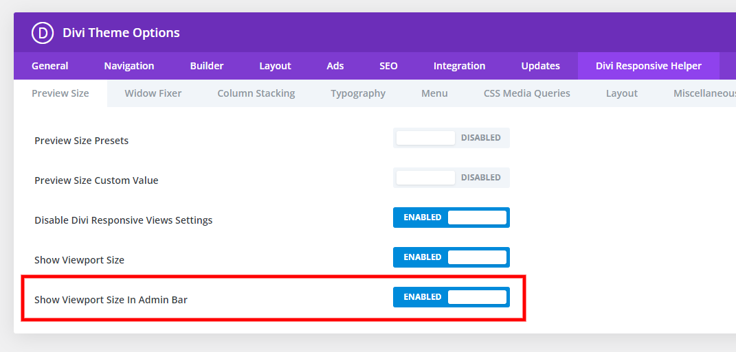
To start using the viewport size display feature in Divi 4, go to the Divi > Theme Options menu in your WordPress backend, then select the Divi Responsive Helper tab, which our plugin adds. Select the Preview Size subtab and adjust the settings as needed.
Show Viewport Size In Visual Builder
Enable the setting to display the current viewport width and height in the Visual Builder page settings.
Show Viewport Size In Admin Bar
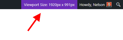
In addition to displaying the viewport size in the Visual Builder while adjusting the preview size, you can also add this optional feature to the top right corner of the WordPress admin bar.
Configure The Settings (Divi 5)
To start using the viewport size display feature in Divi 5, go to the Pee-Aye Creative menu in your WordPress backend, then select Divi Responsive Helper. In the plugin settings interface, open the Miscellaneous tab from the left sidebar, and enable the setting Show View Size In Admin Bar.
NOTE: Be sure to check your device size! We made a list of the popular device viewport sizes that you can use to reference and then set the preview accordingly.